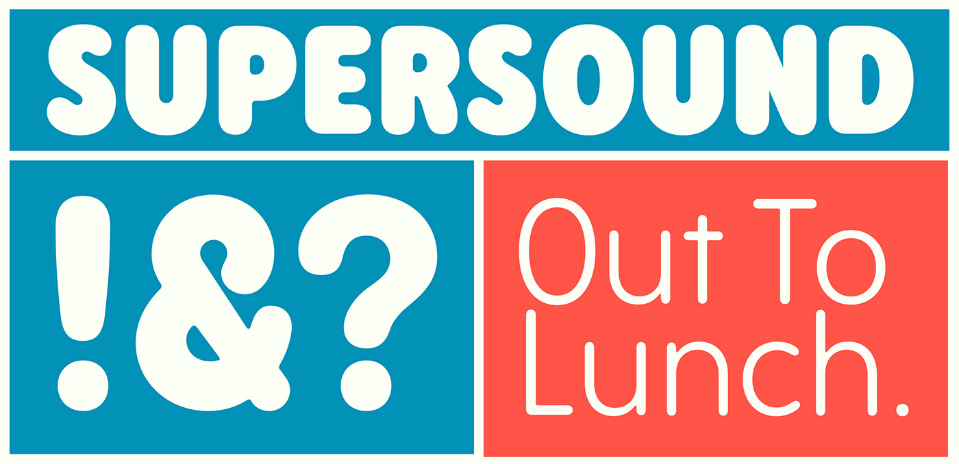
The Rodger typeface family’s main source of inspiration came from rounded display faces of the 1960s and 70s, but it also references sans serif, rounded typefaces found in wood type collections of the 19th century. Despite its vintage roots, Rodger is not a revival, but rather a contemporary interpretation of a classic style.
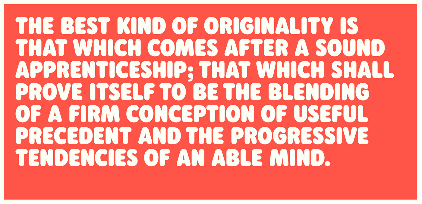
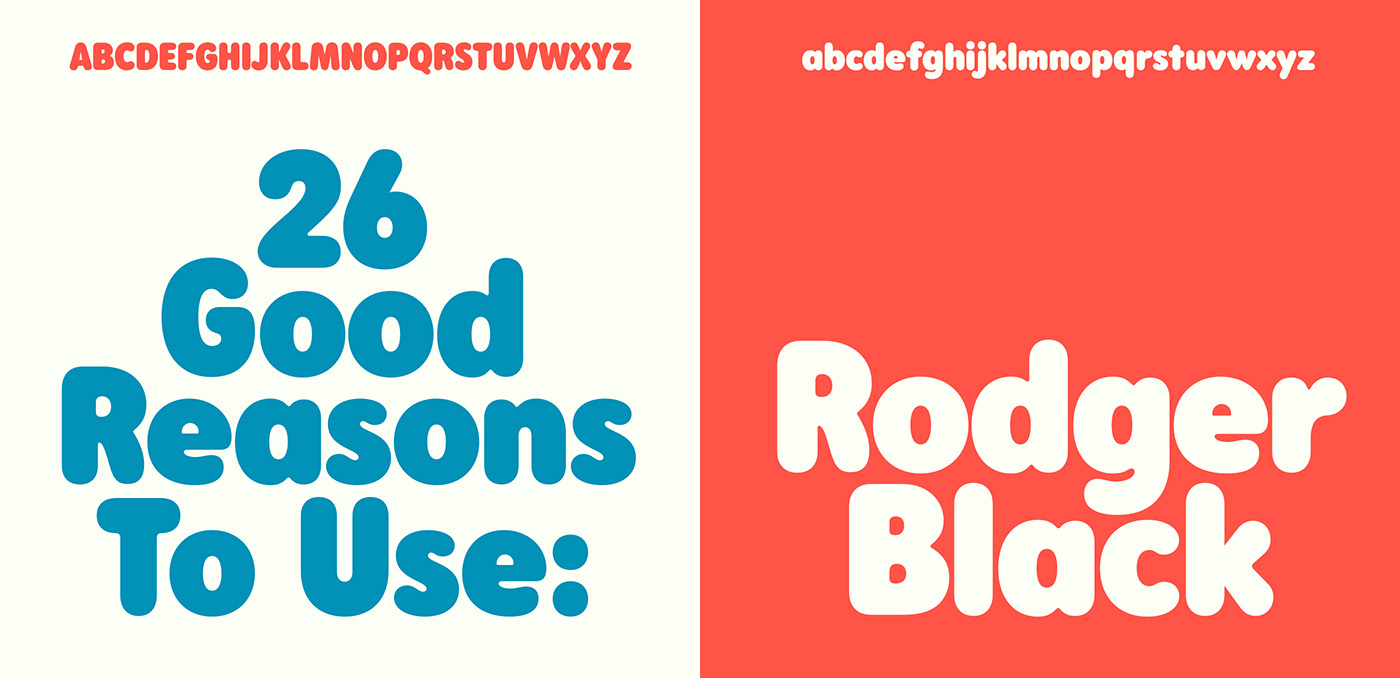
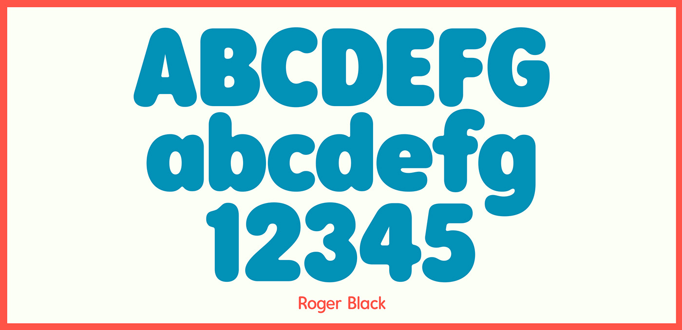
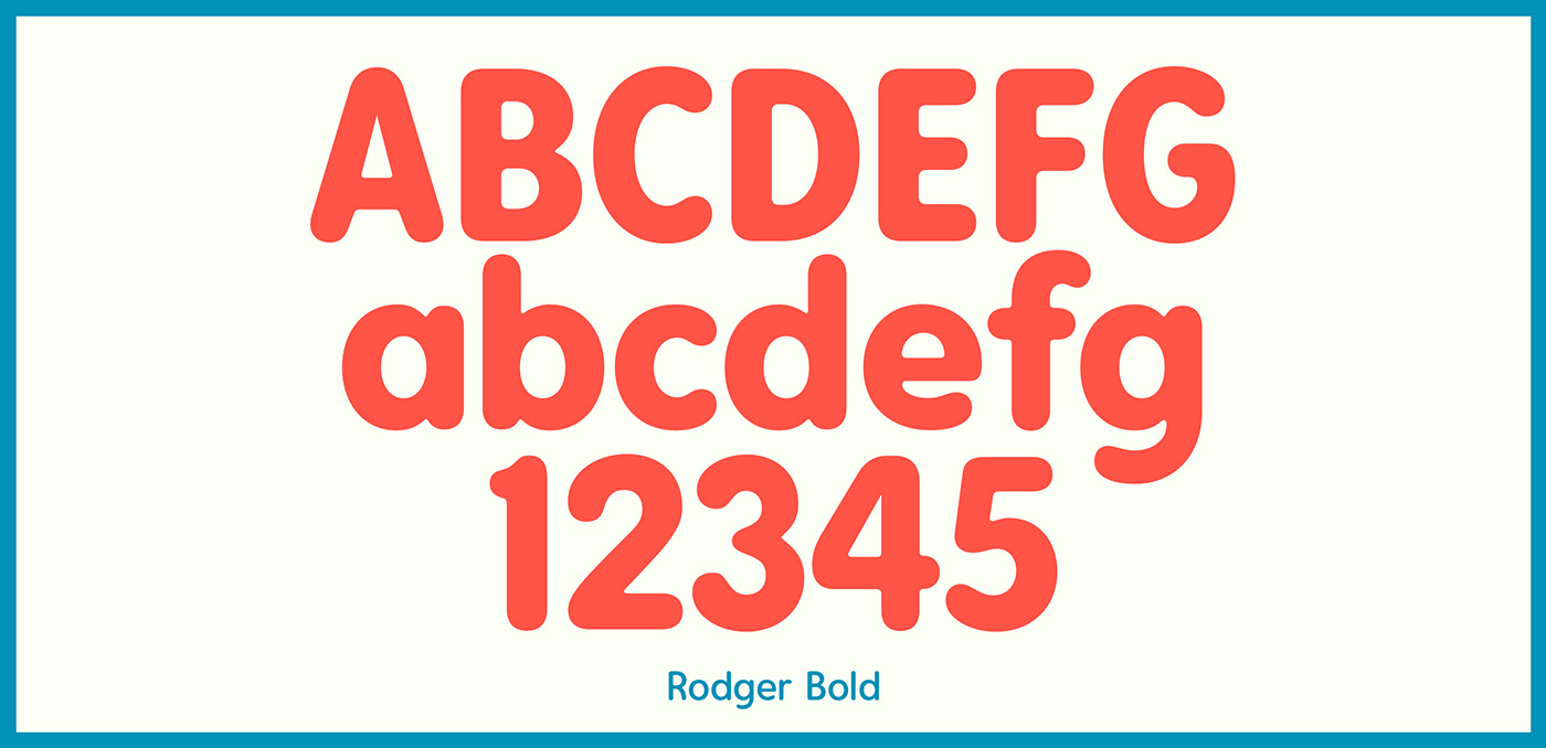
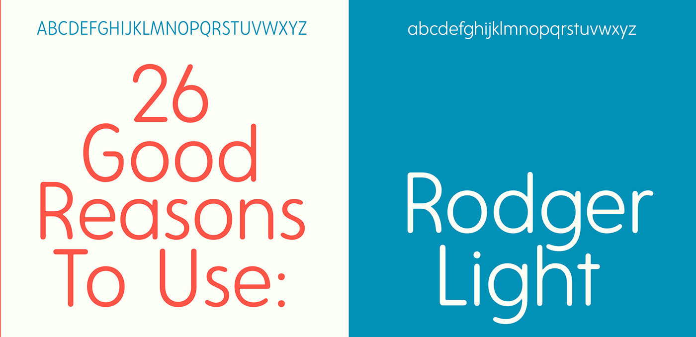
Too often typefaces in this genre overly rely on strict geometry that results in mechanical, lifeless letters. Instead of just adding rounded ends to a standard sans serif, Rodger's proportions and letterforms were created to specifically complement the rounded style. Its organic, yet refined curves walk a fine line between casualness and formality. Rodger's 5 weights range from the delicate yet sturdy “Thin”, to the vaguely psychedelic, plump (not swollen) “Black”.
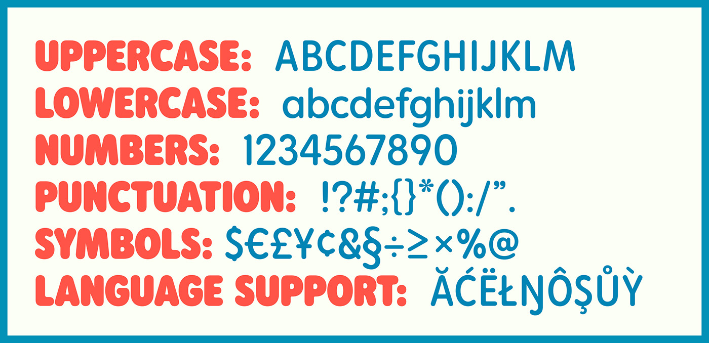
Rodger is topped off with 367 glyphs with thorough language support. Making it a useful, fun, and versatile tool for the contemporary designer.
The Rodger typeface family was designed and created using the application Glyphs. I began using Glyphs around 3 years ago in an effort to improve my letter drawing and to bring a more high end, professional level to my typeface designs. The Rodger family took around 8 months to develop, but it really couldn't have happened without the help of Glyphs and it's brilliant set of tools and user friendly interface. I'd highly recommend it to anyone looking to get a little deeper into typeface design.
Rodger can be purchased here: