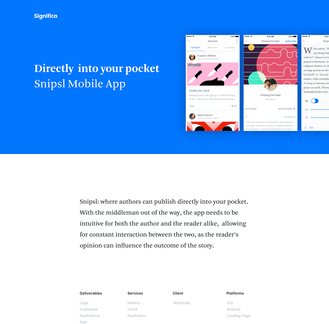
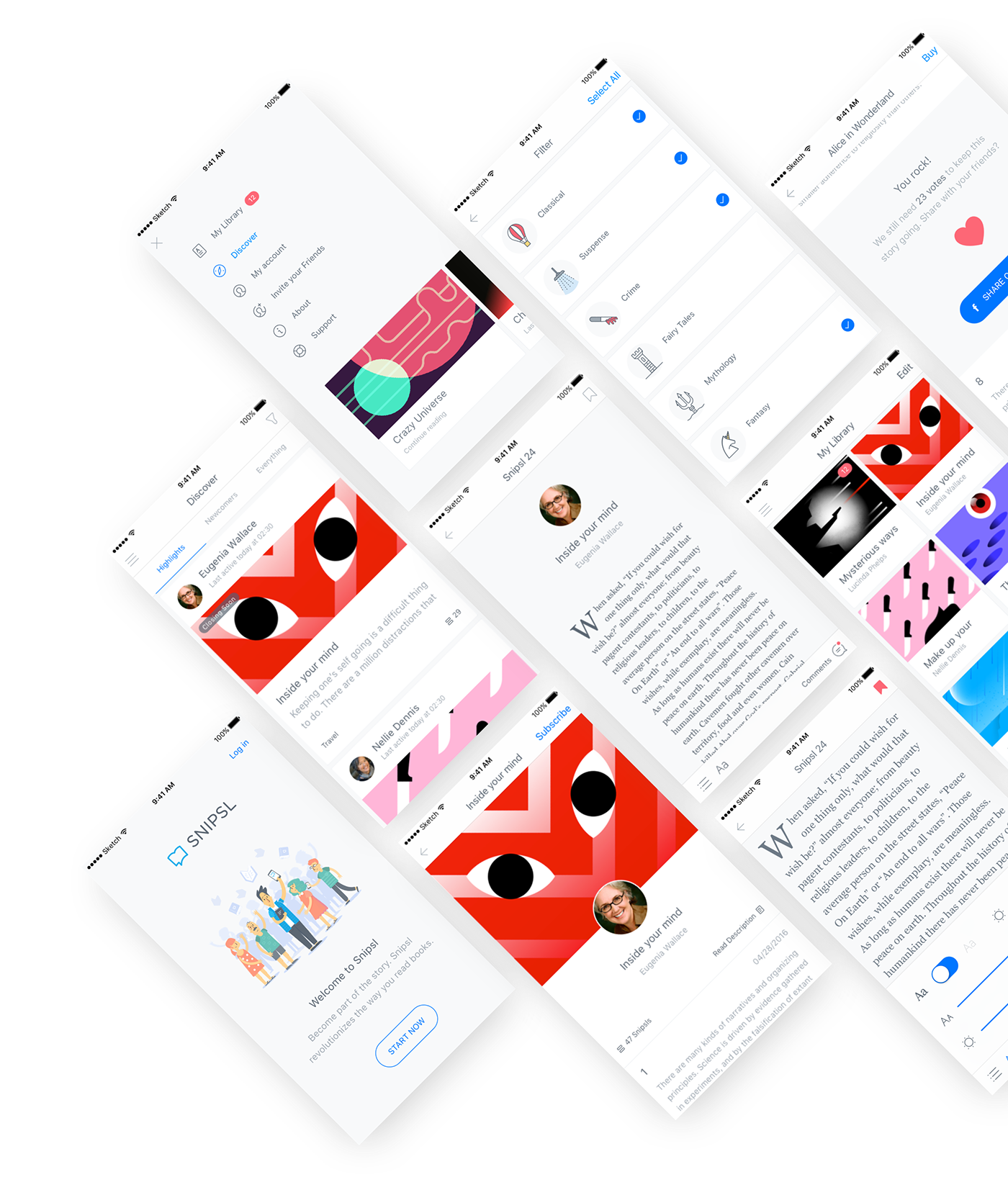
The App
As the author releases a Snipsl (story segments) at a time, you, the reader, can shape the outcome of the story by voting on story driven polls and share your thoughts on the latest chapter, by commenting directly to the author. Snipsl, the app, gives you an online platform for you to browse your favourite books and authors, plus a personal library where you can find all the books you have subscribed to.
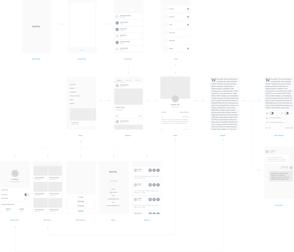
User Flow
The user, a reader in this context, should easily find new content to read, seamlessly get involved in a good book, effortlessly interact with the author, and then organize all of his favourite books into a structured personal library. As this can happen in any random order, the app’s flow has to be instinctive, almost automatic, so the user can focus on the core purpose of the app: reading.
iOS vs Android
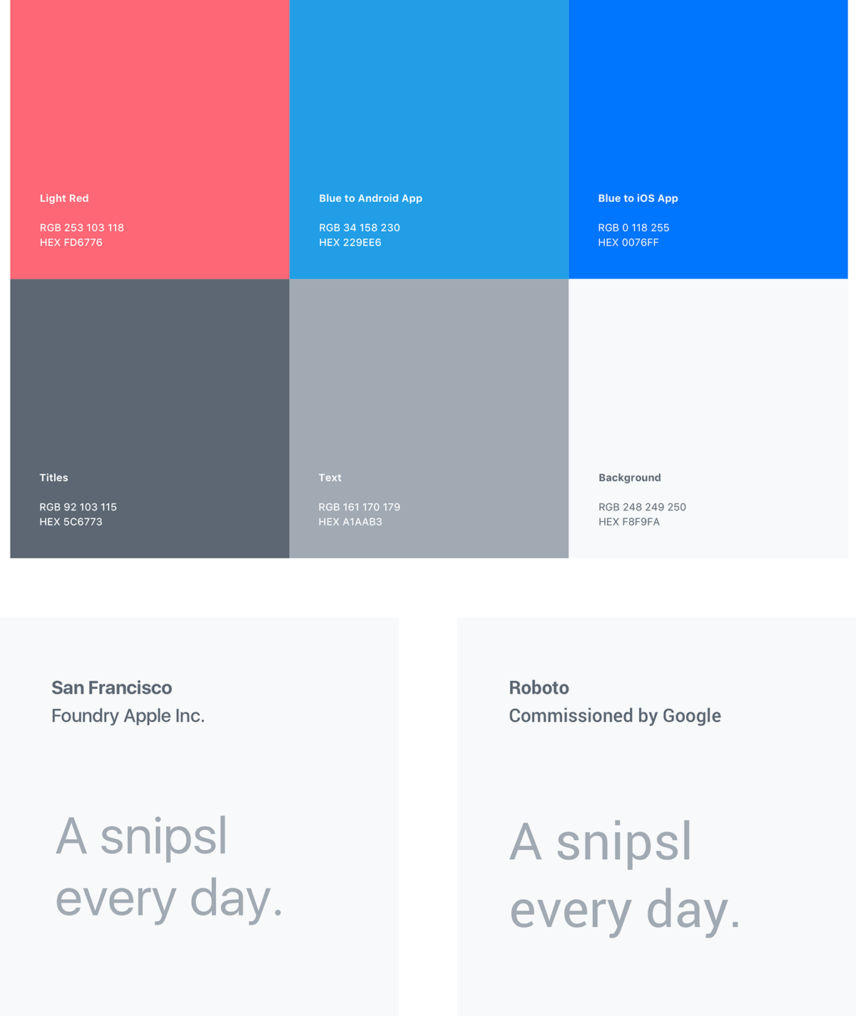
The biggest challenge was creating an app that remained true to itself while respecting the guidelines of two very distinct platforms: IOS and Android. When you look side by side, the difference between the two versions is considerable, but it’s when you look in detail that you can fully understand the reasons for these visual and structural differences.
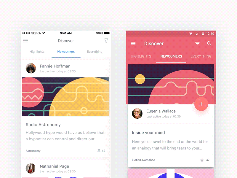
As we designed Snipsl, we started with the Android version, taking full advantage of Google’s Material Design. Here’s what’s specific to the Android platform:
· Choosing Roboto as the main font;
· Using all the icons with a 2 pixel stroke;
· Adopting the use of a FAB (Floating Action Button) for main tasks in the workflow;
· Using strong shadows on graphic elements to determine a layered effect;
When designing Snipsl for IOS, some options were also instantly automatic as part of Apple’s iOS Human Interface Guidelines:
· Add a back button to navigate;
· Have a constant app bar;
· Use IOS native San Francisco typeface;
· Make the shadows more subtle and uniform;
· Use 1px stroke icons;
· As some of theses changes had a great impact on the look and feel of the app, creating interesting challenges bringing not only problems but various solutions;
With different approaches, the same features had to work with flawless consistency in both platforms. As the skeleton is the same, you get two very different results that achieve very similar results.
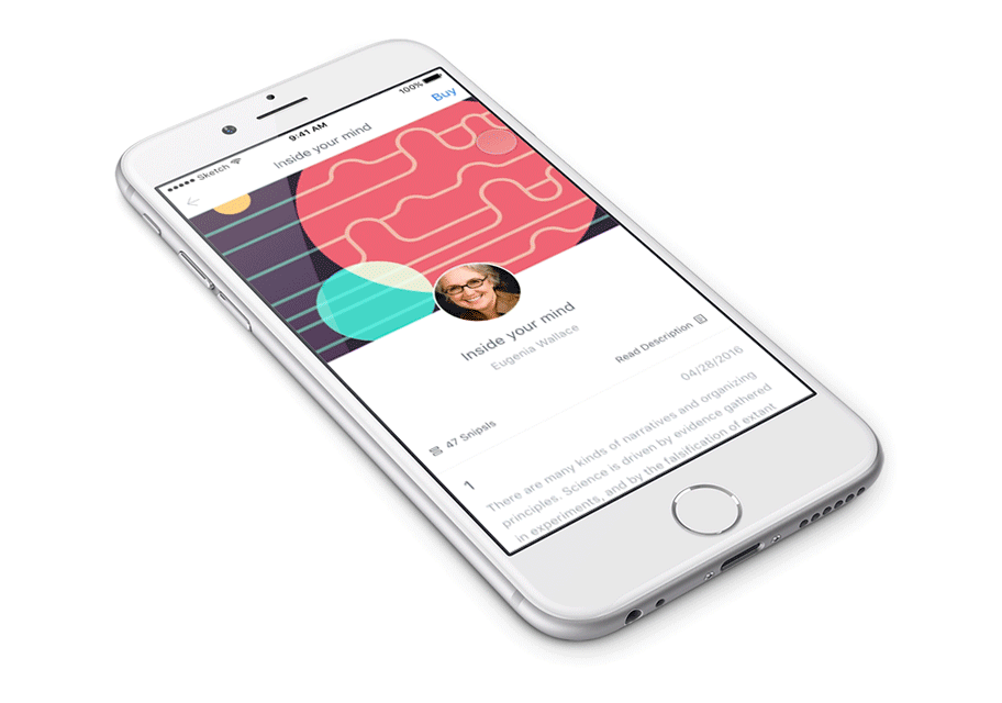
Books
Our Books include all the Snipsls the author has published. To decide which ones to subscribe to, they have a small description of the story and a cover image to illustrate it. You can search for the latest book released, find some highlighted, and filter by genre.
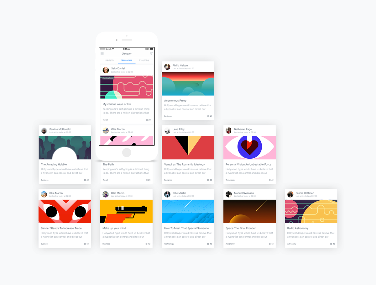
Book Illustrations by Mother Volcano.
The Feed
Think of the Feed as the inside of the book itself. Here you can subscribe to a book, read all the released Snipsls and then interact with the author. If you are enjoying the story you can buy the book before it becomes unavaliable.
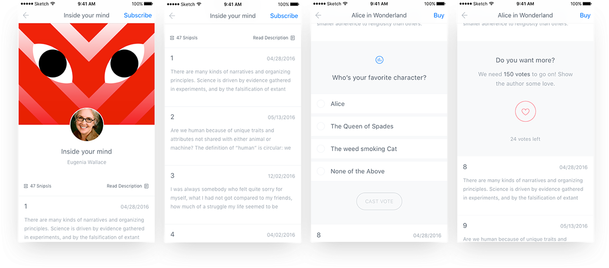
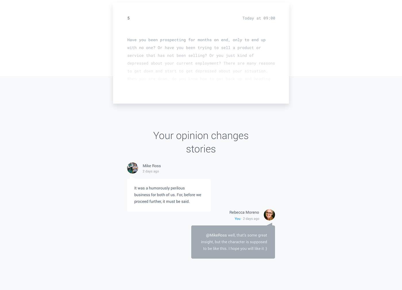
Interacting with the Author
One of the selling points of Snipsl, is the constant interaction between the author and their loyal readers. As the story unfolds, the readers can vote in story driven polls that can influence the outcome of the story, and share their thoughts on the latest chapter, directly to the author.
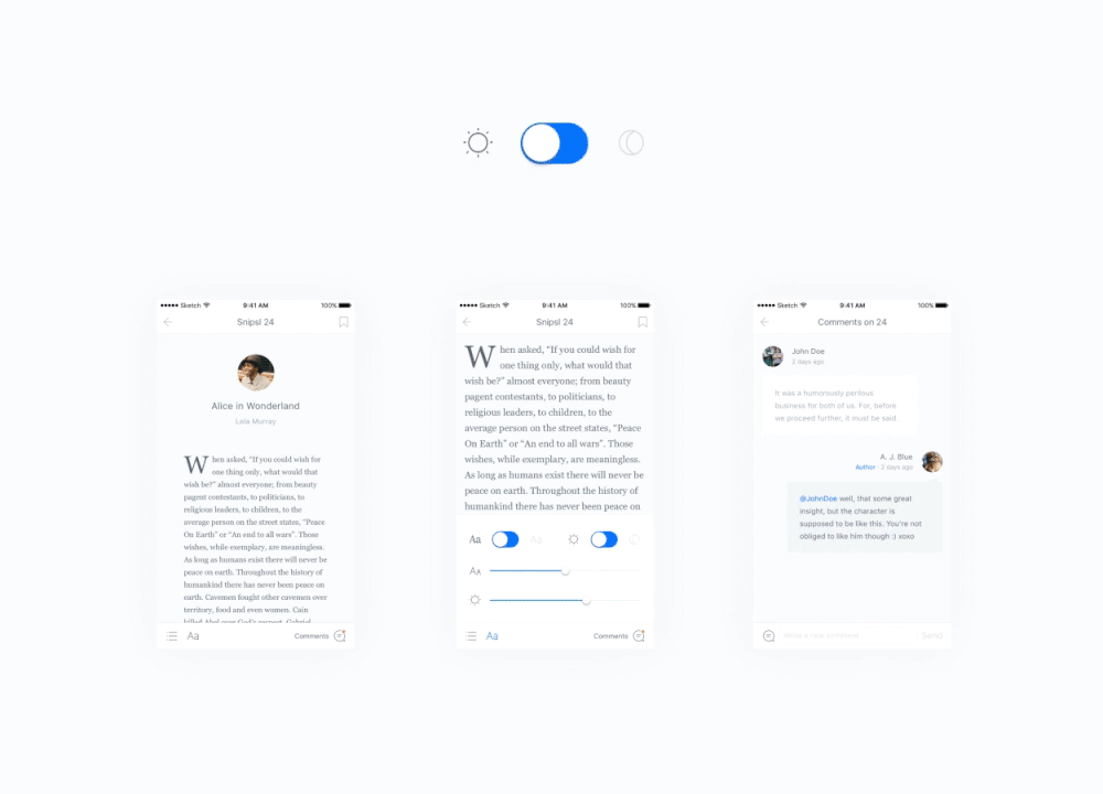
Reading Experience
As the most important section of the app, the reading experience needed to be flawless: a smooth experience that takes nothing away from you enjoying the story. With zero distractions, the user can customize it to match his reading preferences. He can change font size, screen’s luminosity, opt for a non serif font and, most important of all, change the viewing mode from light to dark.
Illustrations
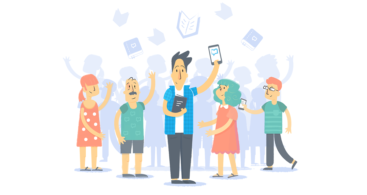
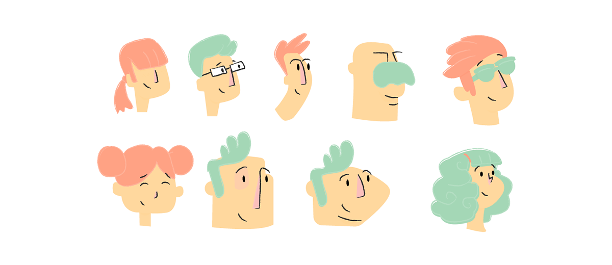
Used primarily as part of the on-boarding experience, the illustrations set the mood for the entire app. With a friendly, simple, yet clear message, the user can fully understand’s Snipsl’s strongest features. As the app aims to bring authors and their faithful readers together, we set out to create a friendly and colourful set of characters that could visually represent the nature of the app.
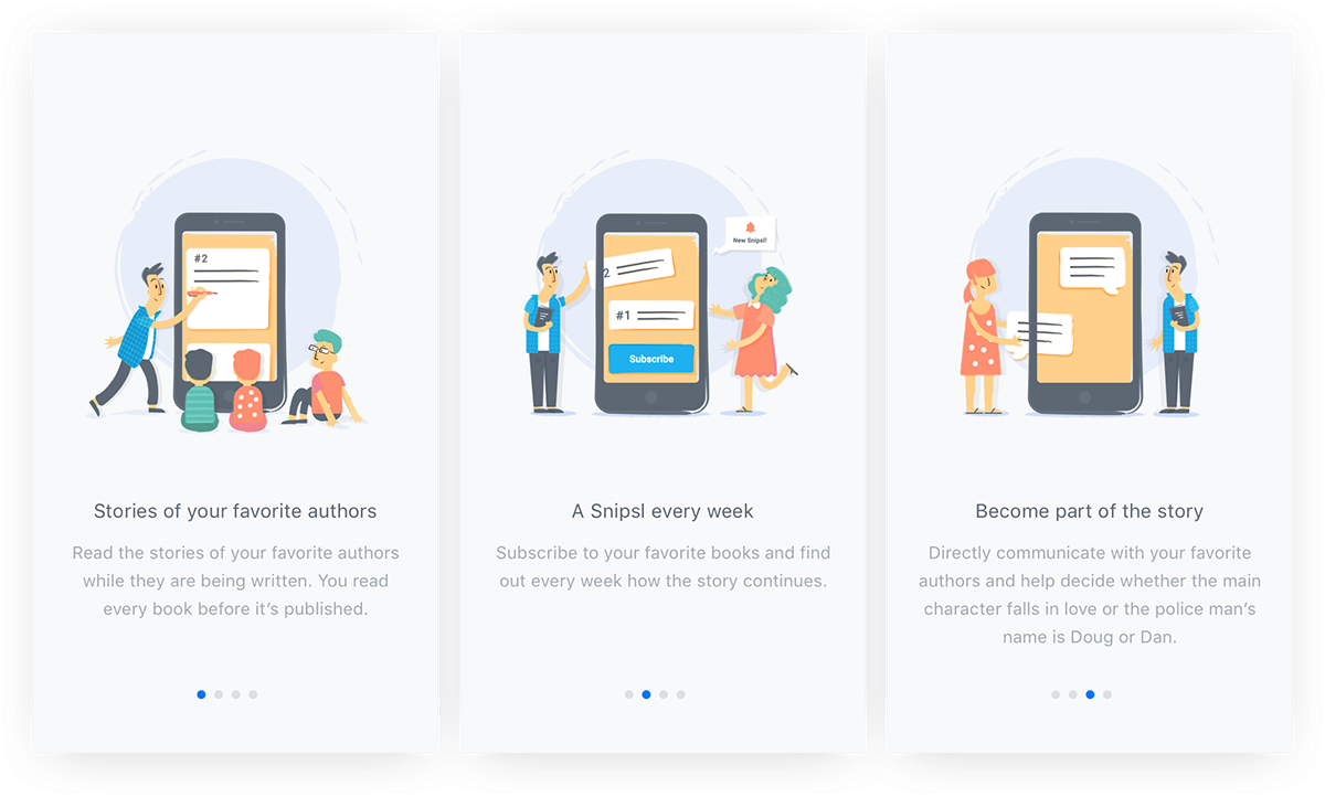
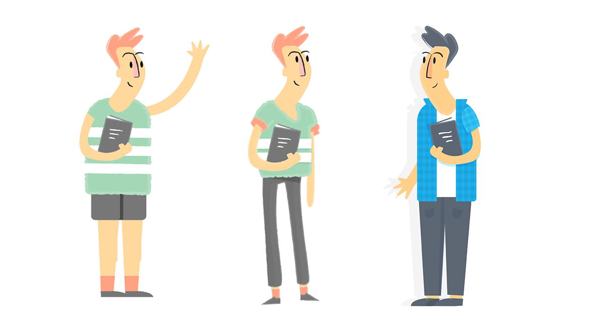
To develop each of these character we had to go though multiple permutations of wardrobe, body style and color to transmit the ideal personality to each of our individual characters. You can see the development process of the “author” character on the illustrations below.
Iconsets
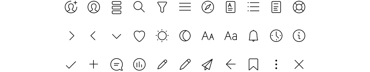
There have been two very distinct set of icons designed for Snipsl. The first, a more standard set of line icons, has the sole purpose of triggering actions that help with all of the app’s navigation.
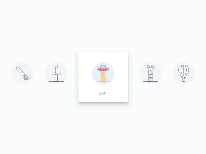
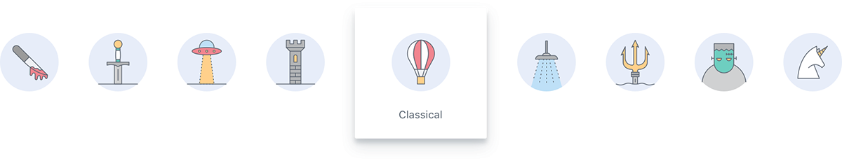
The second, is a set of illustrations that were created to represent each type of book genre in the search filter of the Discovery Section of the app. As the app supports 27 different genres, the greatest challenge was creating a homogenous family of iconographic illustrative elements that allowed for immediate association of each genre. Some of them are straight references to the genre, while others represent specific elements of classic novels that became iconic in our contemporary society.
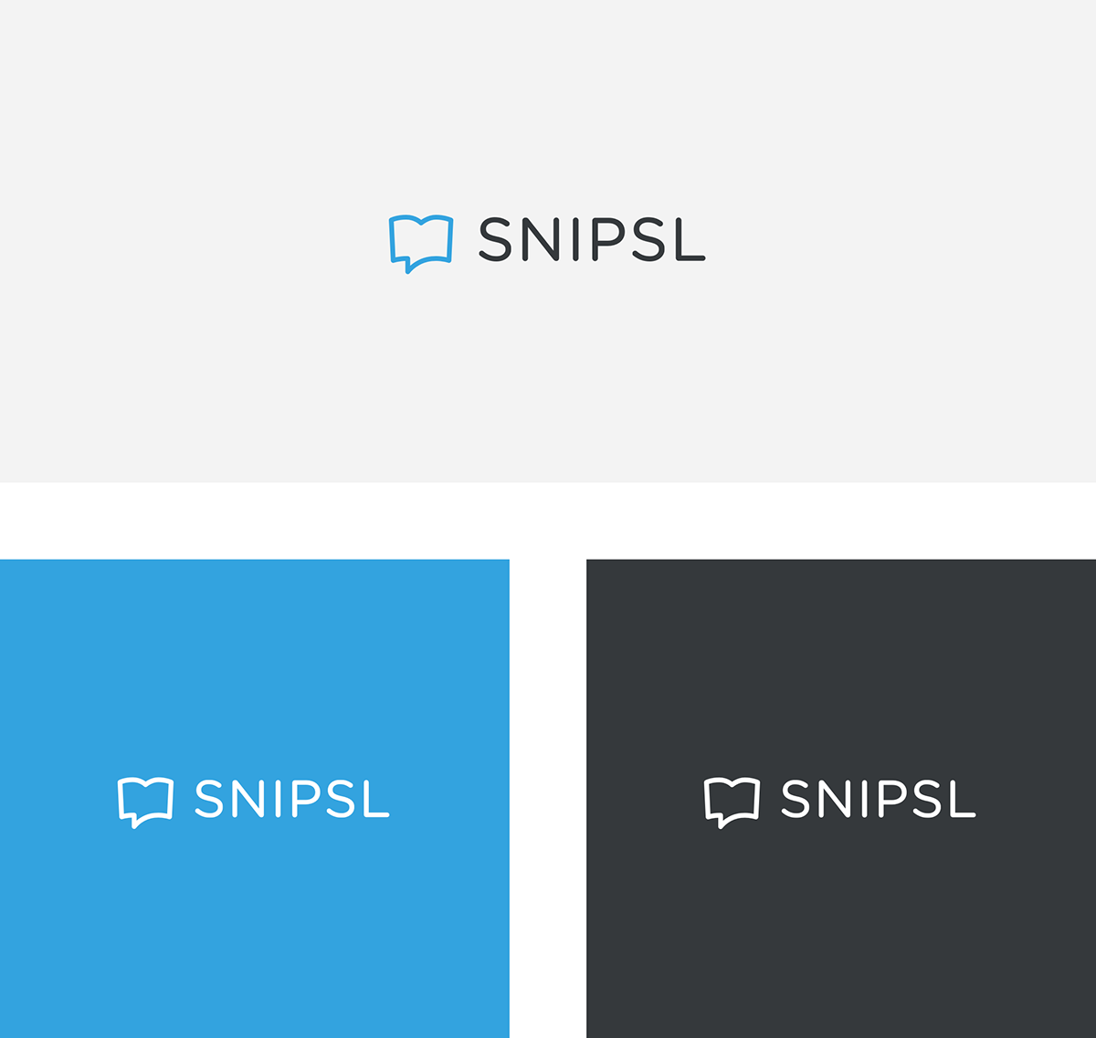
Creating the SNIPSL brand
When creating a brand specifically for an app, you aim to create a visual iconic element whose sole purpose is to stand out with millions of other app icons in the various stores. With this in mind, we also wanted to create a brand that was true to Snipsl’s own identity. That is why we designed an icon that visually represented Snipsl’s main feature: the reader’s voice and opinion to help shape a story as it’s being simultaneously created by the author.
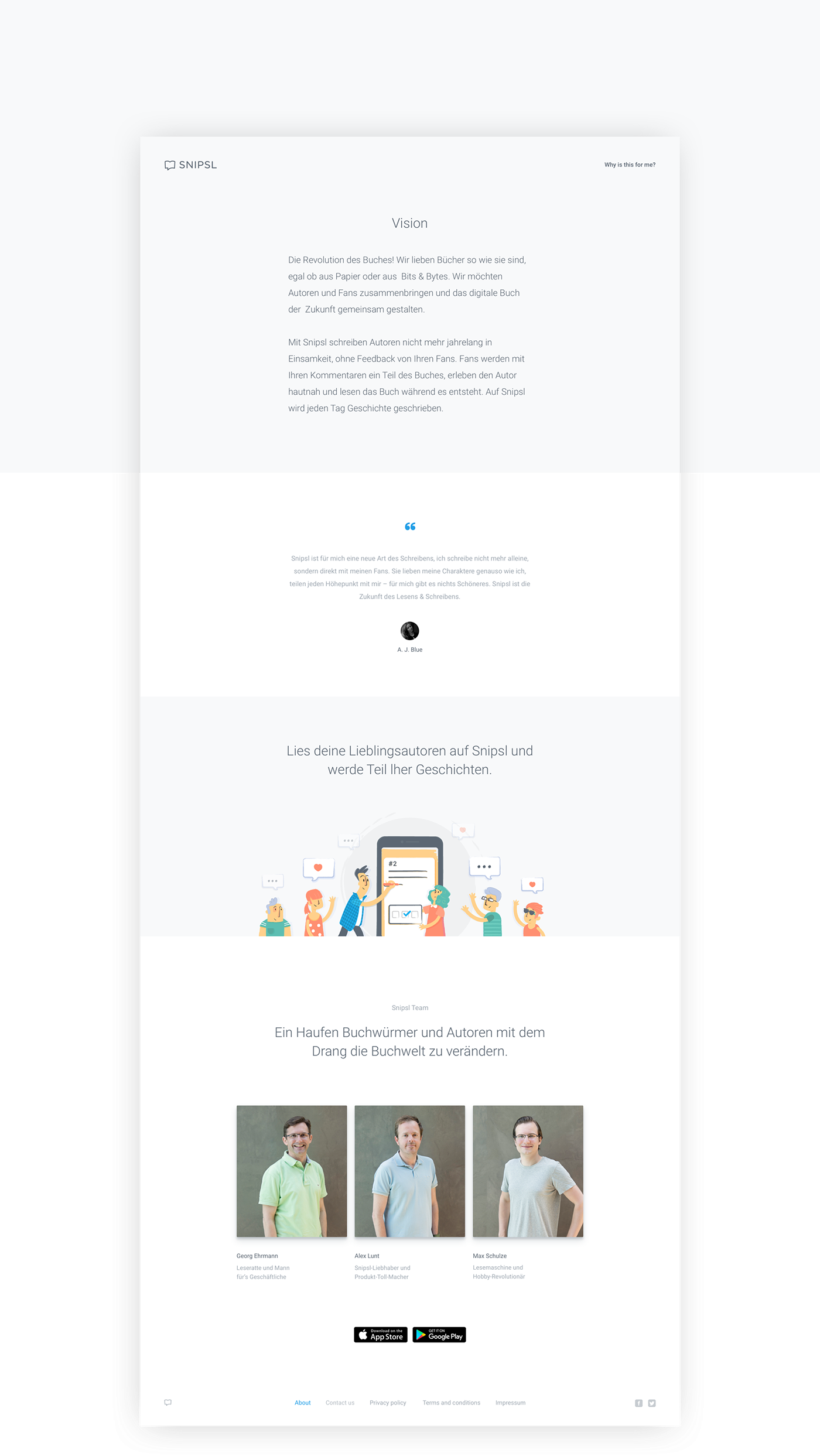
Landing Pages
The Landing Page was the last piece of the puzzle, as it was created as an online brochure of Snips’s core features, capturing the user’s attention and allowing them to download the app. Aesthetically it takes full advantage of the app’s visual elements and uses them to reveal the app’s potential.


Snipsl Authoring App on Behance.
Thank you for watching :)
Visit us on significa.pt or send us an enquiry at hello@significa.pt
Designed by Significa in the heart of Porto.
Visit us on significa.pt or send us an enquiry at hello@significa.pt
Designed by Significa in the heart of Porto.
Special Thanks:


