


Brief
To create a typographic installation of a first person account for a local gallery.
Outcome
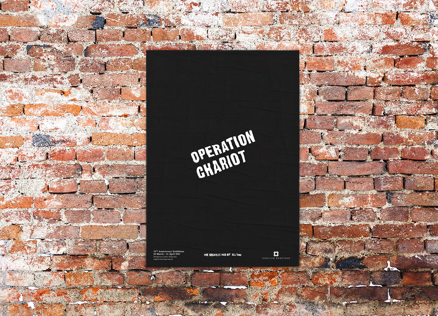
Originating from Falmouth, Operation Chariot was a successful Commando mission in 1942 to destroy a dry dock at St Nazaire, Western France. The purpose of this installation is to celebrate and inform a wider audience of this relatively unheard of WWII raid, even though it is known as the ‘Greatest Raid of all Time’.

As part of the installation, erratic water distorted typography would be projected onto WWII searchlight bases at the mouth of the Fal estuary, which would have been passed by the convoy on their way to their objective nearly 75 years ago.
I felt that a static walk along a wall layout, typical in museums, was an overused medium and undeserving of a mission this significant. Although this layout is necessary, I wanted to use a medium that was much more immersive and disorientating to tell the story.


The raid is told through the eyes of Corran Purdon, a Commando who was onboard HMS Campbeltown as it struck the dock gate. His story is signified by the use of Gothic No.13 a grotesque typeface that was designed in the same year as the raid. A narrator is also included to provide greater context, which is set in a serif typeface from the period.
To demonstrate the progression of the story, I wanted to distort the typography so it would increase in volatility towards the raids epicentre. After researching the subject, I found that manipulated type was typically computerised and very controlled. To do something unique, I used water thereby retaining a maritime link and keeping the distortion as natural as possible.
As well as being water distorted, the type also flits around the screen, dependant on the section of the story being told. Emphasis is placed upon key and not connecting words, so the viewer is unable to read every single word, but its volatile and erratic nature gives you a representation of what the raid would have been like.


To achieve the water distorted effect I positioned a TV, that was linked to my Mac, on my bedroom floor. On top of the screen was a plastic box filled with water, I then shook the box at the right moment when the type was on screen and filmed the result.
Following the viewing of the installation, the audience would receive a copy of a 20 page newspaper to further their understanding of the raid. The use of a newspaper links back to the 1940s, as it would have been the primary source of information for the general public. The logotype is angled at 20º, the same angle that HMS Campbeltown came to rest on the dock gates.


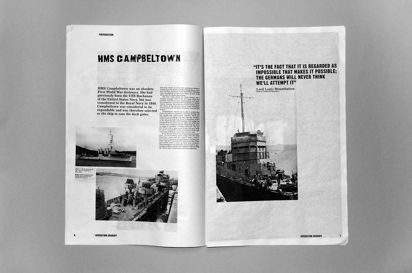


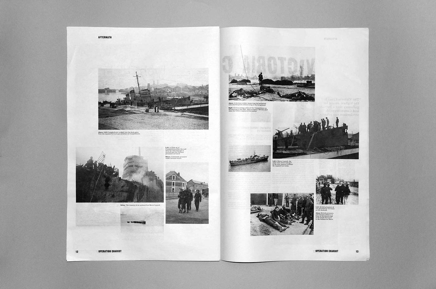
As the installation is purely typographic, the image heavy newspaper aids the viewer in imaging the raid. The inclusion of maps and photographs anchor the expressive typography while the sporadic nature of the layout and water distorted typography links back to the projection.


Thanks


