


Year: 2016
Client: Sareno
Client: Sareno
Fields: Branding, corporate identity
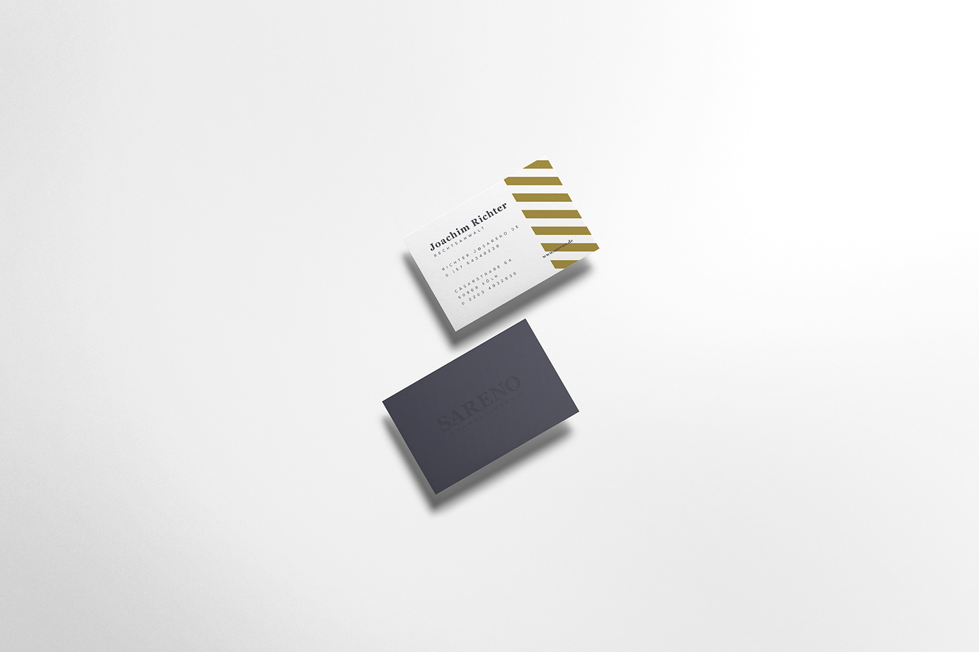
Sareno is a law office based in heart of Cologne, run by two young but experienced lawyers. They assume that the best signature of a lawyer is his suit. They bet on classic elegance adapted to today's aesthetic demand. The same assumption was accompanied to a corporate identity design process of their new brand.
The modern shield-shaped logo, built of diagonal stripes directly refers to the value of the company - to uphold the law and look at things from different sides at the same time. Also, S letter derived from the name of the brand with its modern shape and inner serifs proves its seriousness and power. The logotype thanks to a classic typography is characterized by elegance and dignity, and the tagline by its wide letter-spacing makes it feel modern and progressive.
Full visual identity was based on a minimalistic use of stripes and typography referring to the logo.


A lawyer with his briefcase can fight for more than a hundred men with guns.


