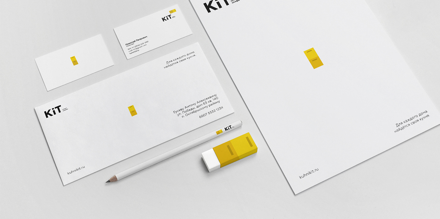
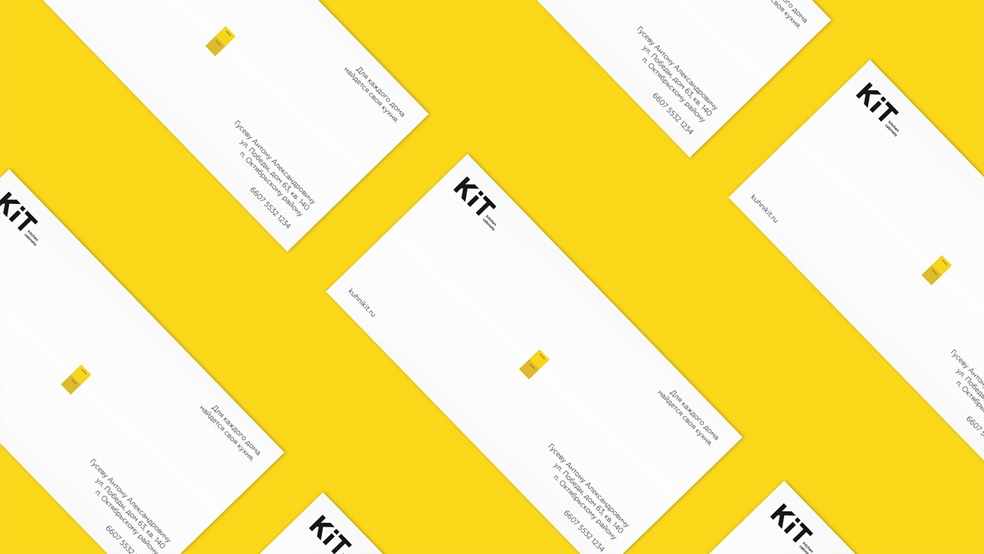
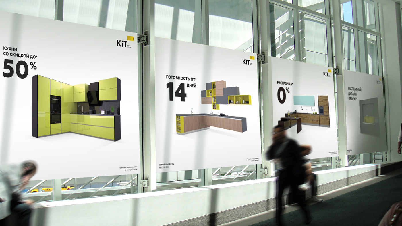
Kit was established 18 years ago, and people already got used to its identity. To save identity
recognizability, we choose to keep the most recognizable parts of the id: color scheme and lowercase "I".

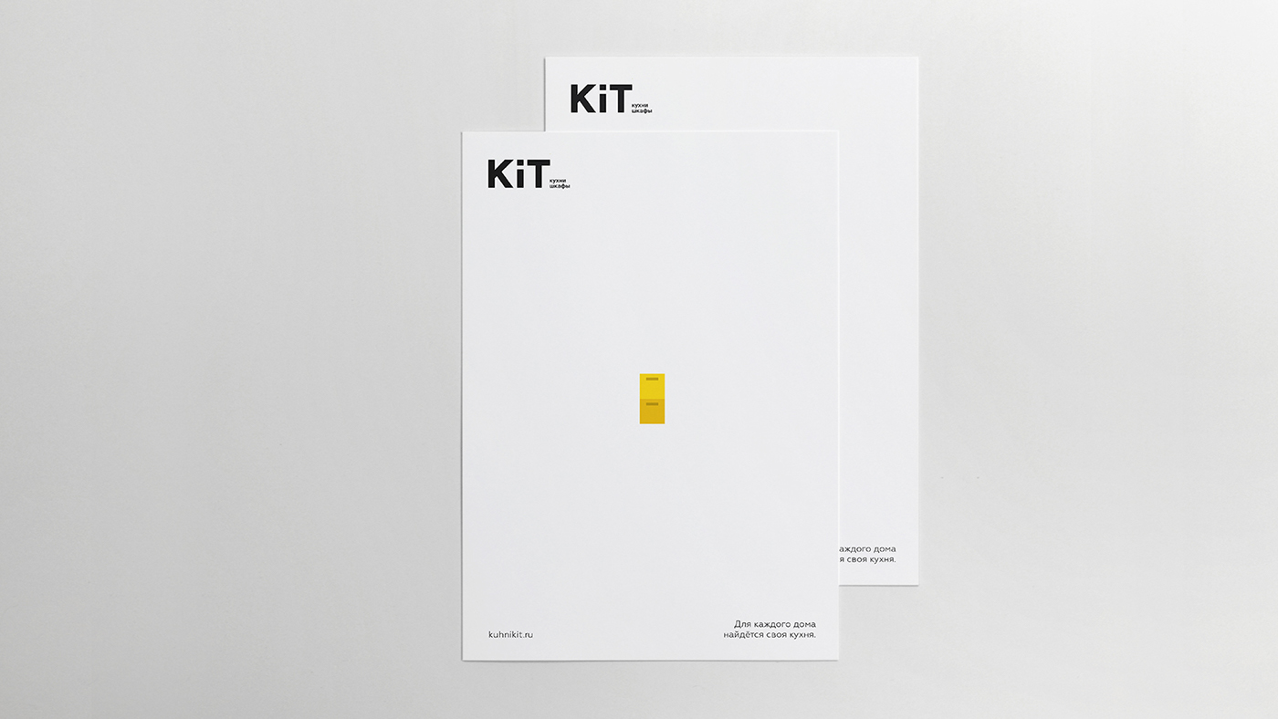
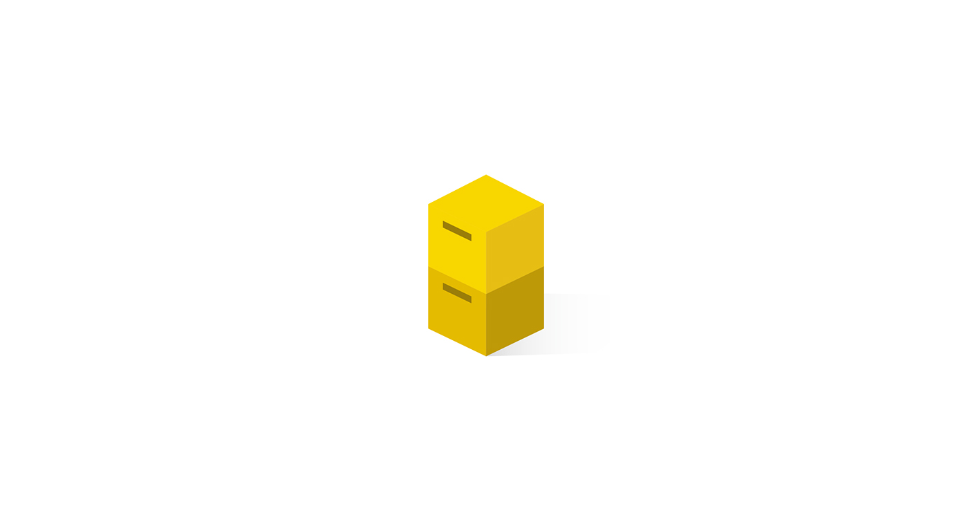
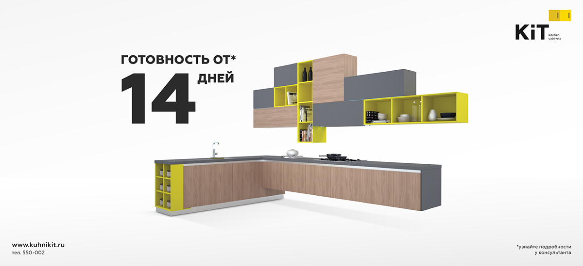
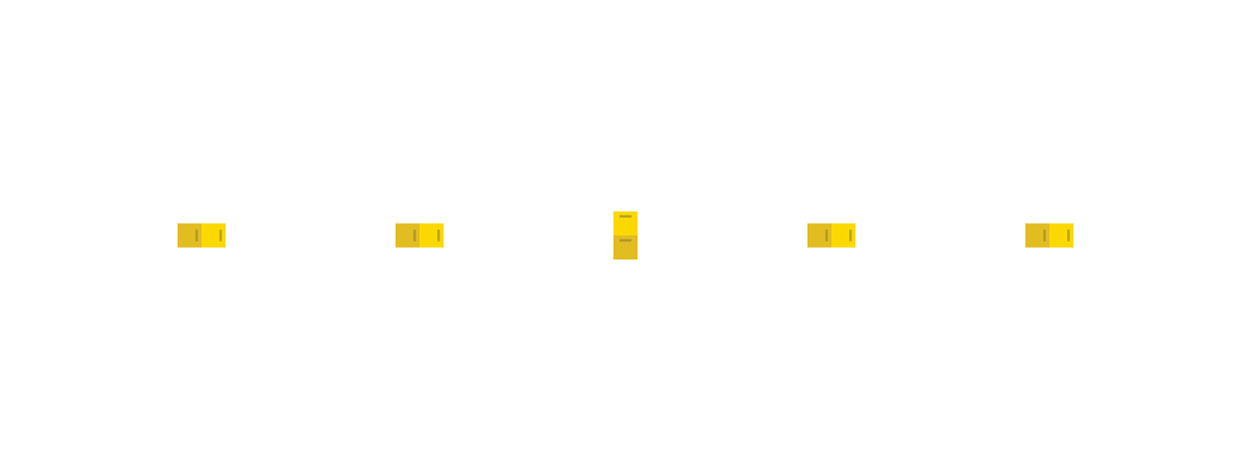
Now logo have an animation. Cabinets become a full-fledged symbol of
brand identity and could be recognized separately from logo.


Now KiT’s identity is simpler, cleaner and more modern with more clear space.