First established in 1905 as a medical school, the National University of Singapore, country’s leading institution of higher learning has ranked consistently as one of the world's top universities. Its academic programmes offer a global approach to education and research with a focus on Asian perspectives and expertise. The Department of Architecture first established in 1958 as part of Singapore Polytechnic, has grown into a full-blown programme at the University of Singapore in 1969. It is also the only architectural programme in Singapore professionally accredited by The Royal Institute of British Architects (RIBA), Board of Architects (BOA) Singapore, and Singapore Institute of Architects (SIA).

Before (above) and After:


Do Not Design was commissioned by National University of Singapore, Department of Architecture to design a new graphic identity to redefine a unified voice and look, reposition and reflect the research-intensive school’s creativity and modular organisation, enthusiasm as well as its mission of ‘Nurturing creative global designers and critical thinkers for the built environment to shape Asia’s future and the world.’
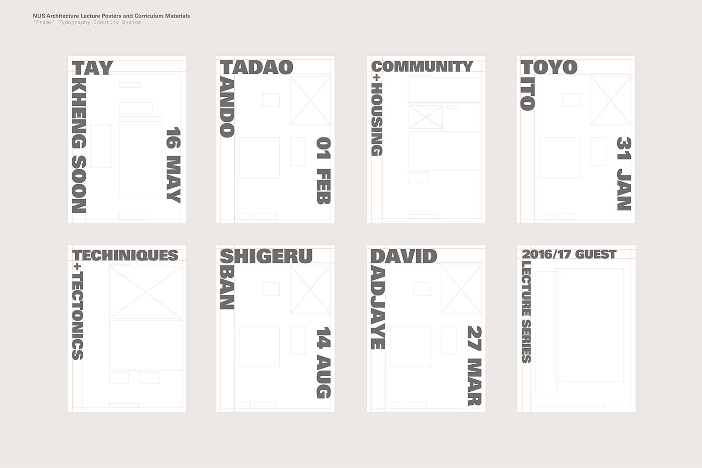
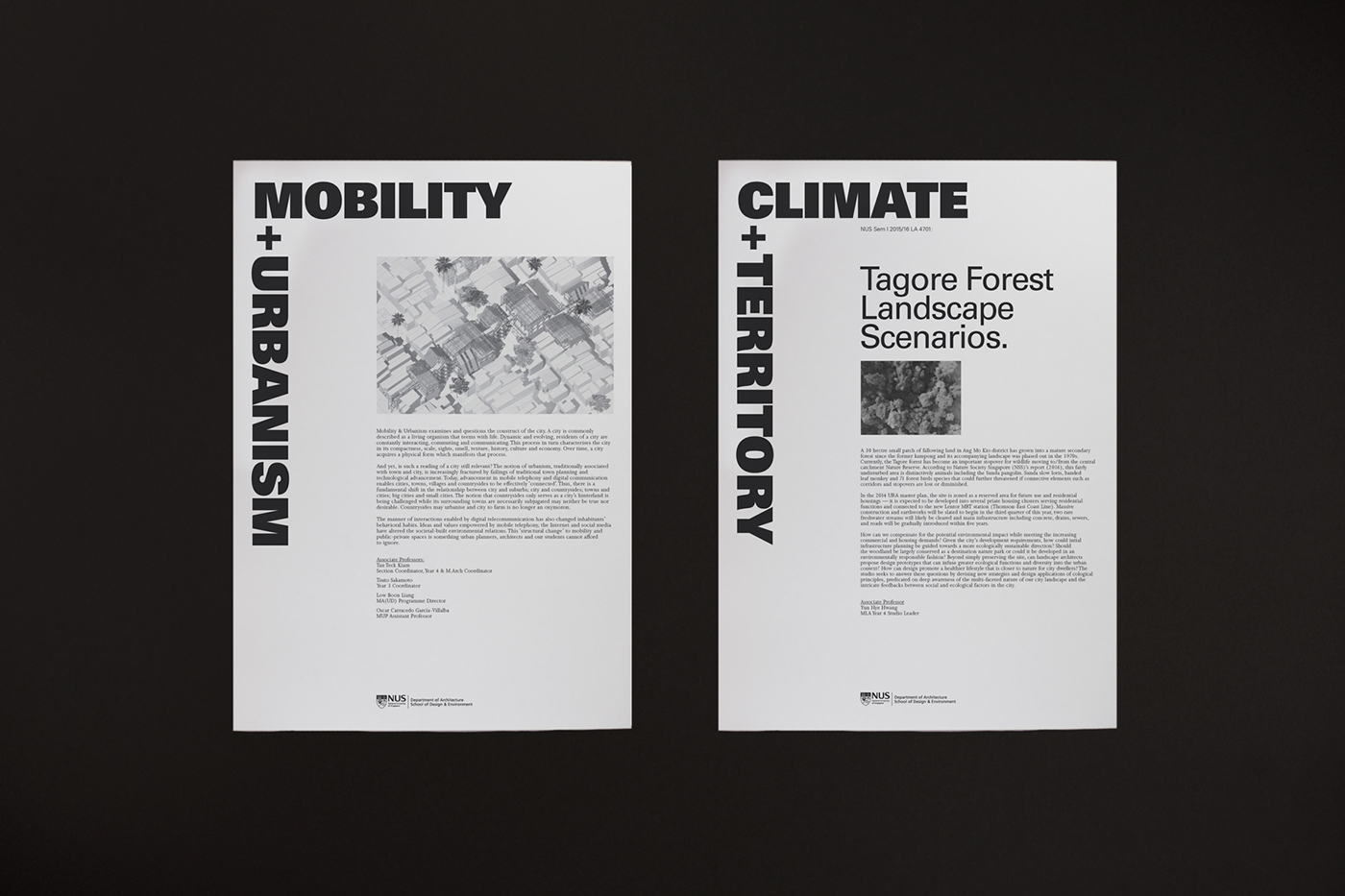
The Department’s previous curriculum materials were inconsistent, cluttered with information, not eye-catching and deemed too easy to ignore. The graphic identity stretched across the school’s communication tools—curriculum posters, studio thesis poster to the day-to-day event materials to inline with the aesthetically pleasing lecture posters that can engage a wider audience—not just for its students but also to broadcast the design of the school’s programme of lectures, symposia, transcript book and yearbook.
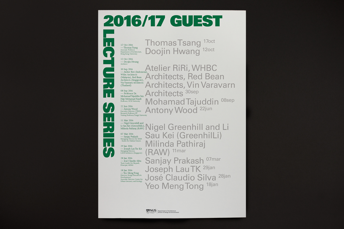
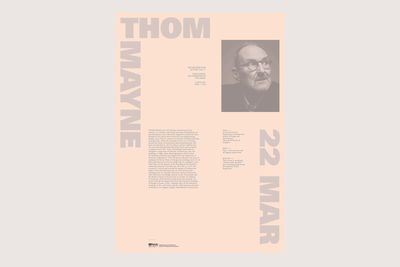
Anchored by ‘framed’ typography; the identity system is derived from the structure of scaffolding on buildings, and thus conveys the idea of education as a foundation. The Architectural/Guest Lecture series posters primarily highlight two key points—name of the architect and the date of the event. A key typeface, Univers, the neo-Grotesque typeface designed by Adrian Frutiger, was used to express confidence and clarity in delivering communication. The new colour palette was also strategically chosen to stand out from the school colours of red and blue, as well as the buildings’ facades that are in yellow and grey. More importantly, the whole system is designed to be straightforward and easy for the in-house staffs and technicians (non-design trained) to work on.