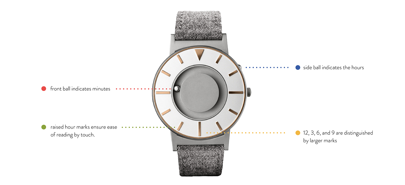
Loop is a watch designed for the blind, but is meant to be worn by everyone. I renamed the product, created a new identity, and designed new packaging. Through extensive research, I found the rebrand goals were to make the brand all-inclusive, playing on the juxtaposition of sophistication and playfulness.
Featured on packagingoftheworld.com on 5.2.16 and on retaildesignblog.net on 5.4.16
http://www.packagingoftheworld.com/2016/05/loop-packaging-identity-student-project.html
http://retaildesignblog.net/2016/05/04/loop-watch-packaging-by-sam-bumbalo/
http://www.packagingoftheworld.com/2016/05/loop-packaging-identity-student-project.html
http://retaildesignblog.net/2016/05/04/loop-watch-packaging-by-sam-bumbalo/
A Revolutionary Product
The problem with a watch designed for the blind was if it is just for the blind, does it help dissolve their disability? Or exploit it? The solution was to create a brand inclusive for everyone, not just the visually impaired.
A New Identity
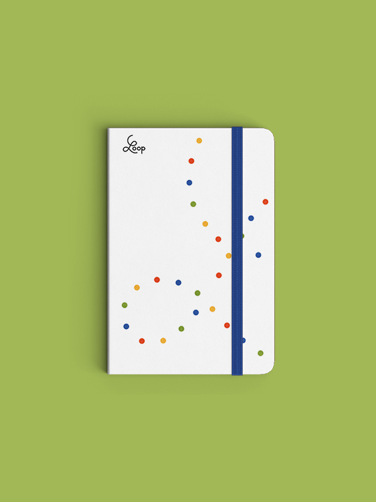
The name was changed to Loop. The name is a metaphor for inclusivity and time; to be inclusive something must go around and include everything, as time is eternal.

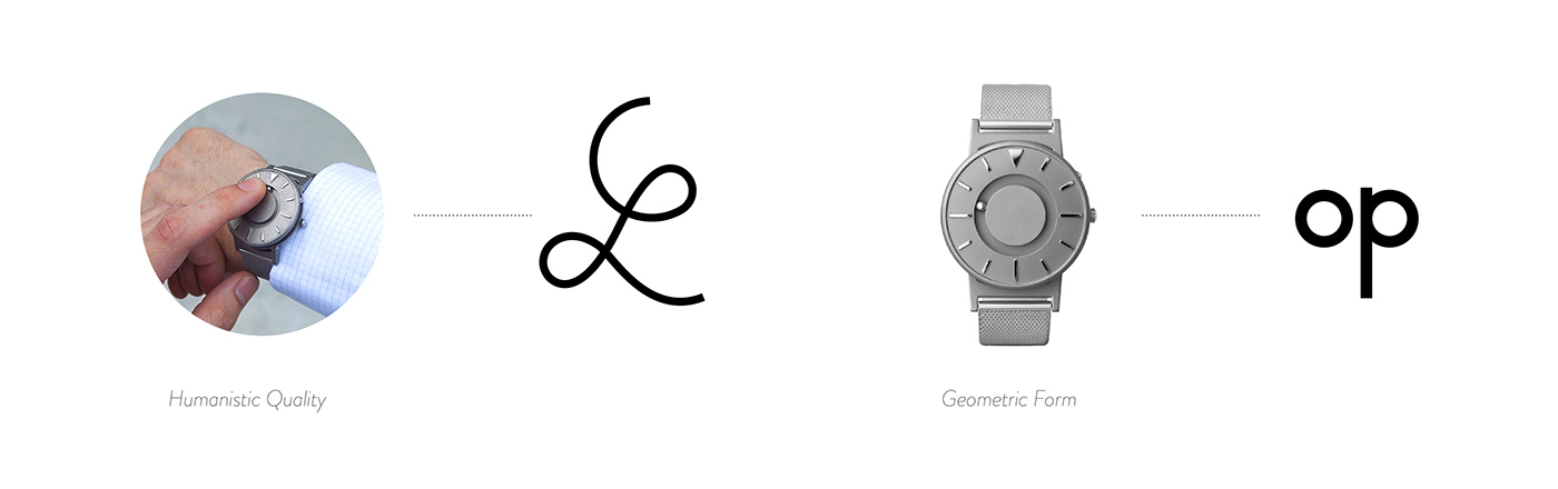
Visual Metaphors
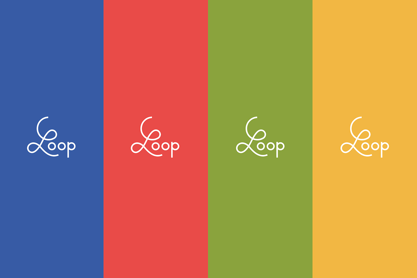
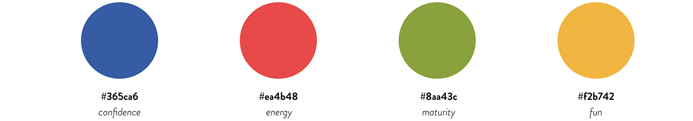
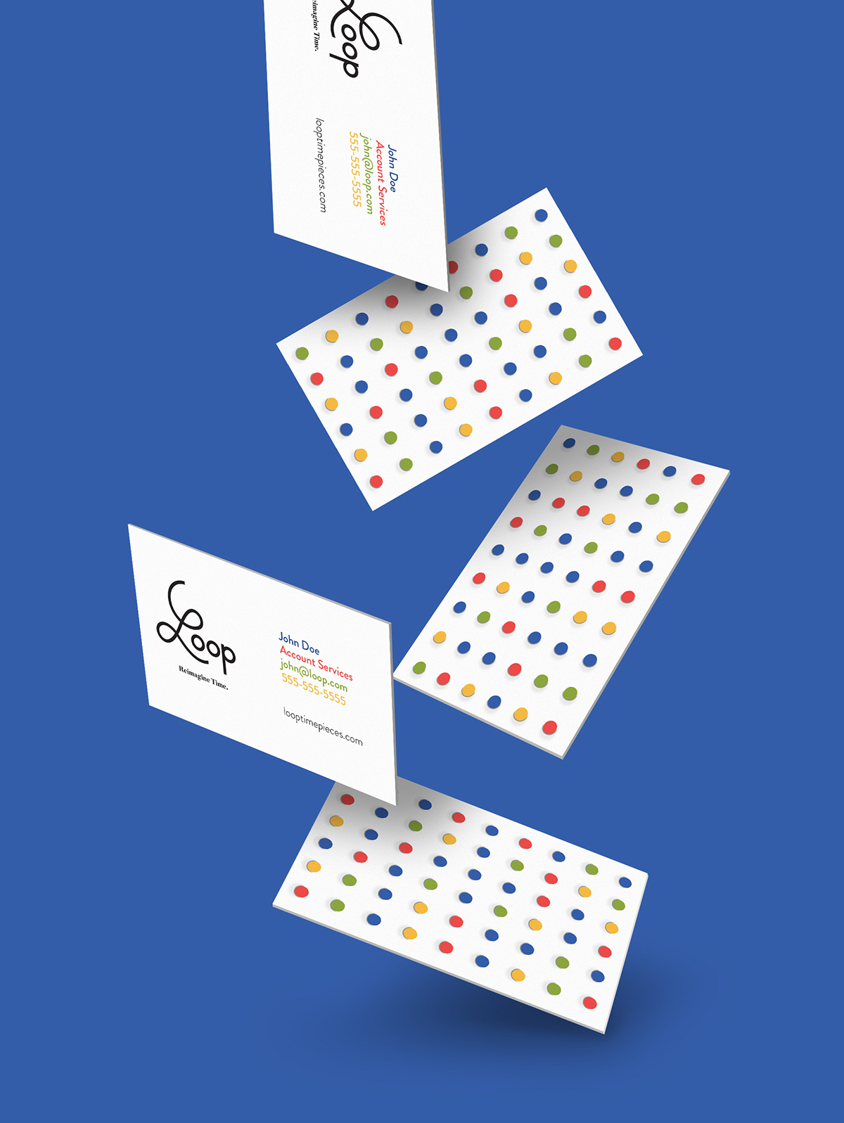
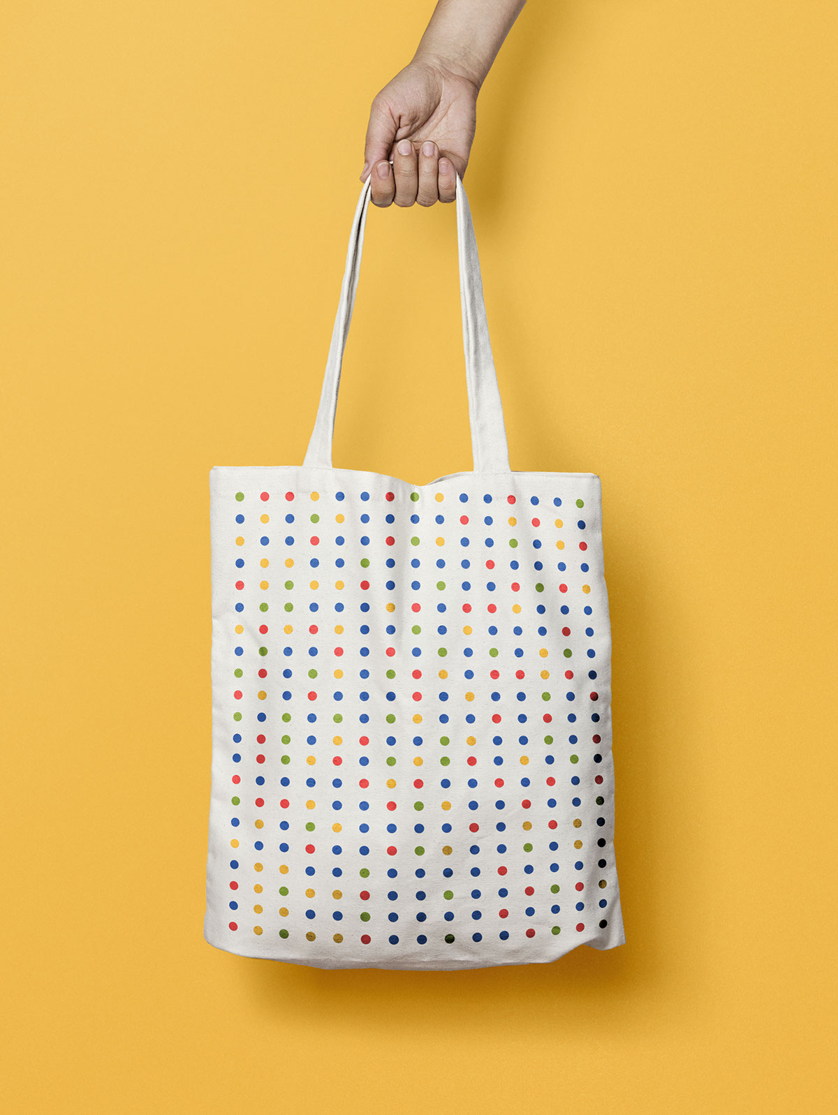
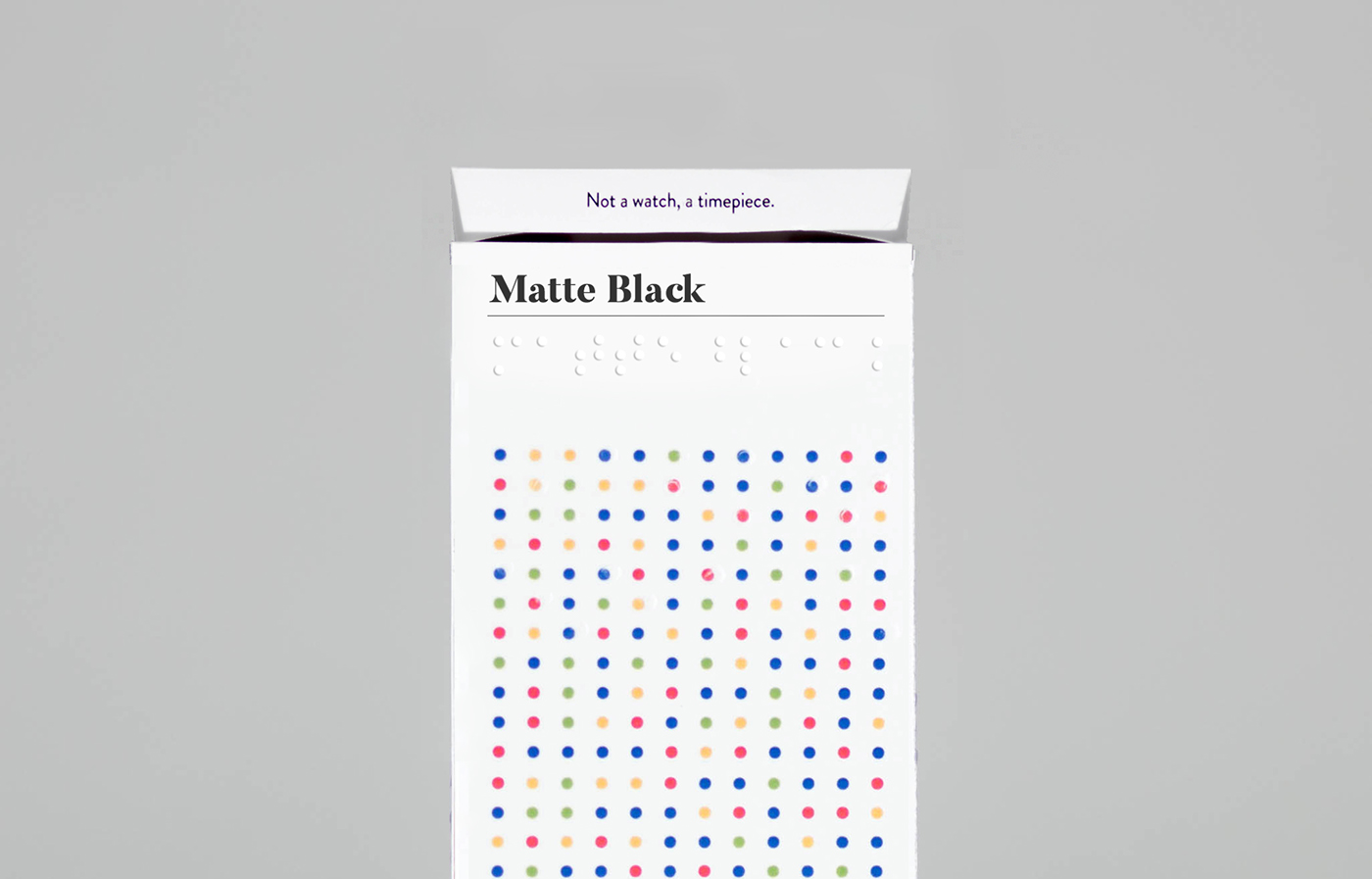
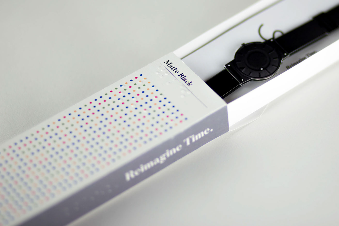
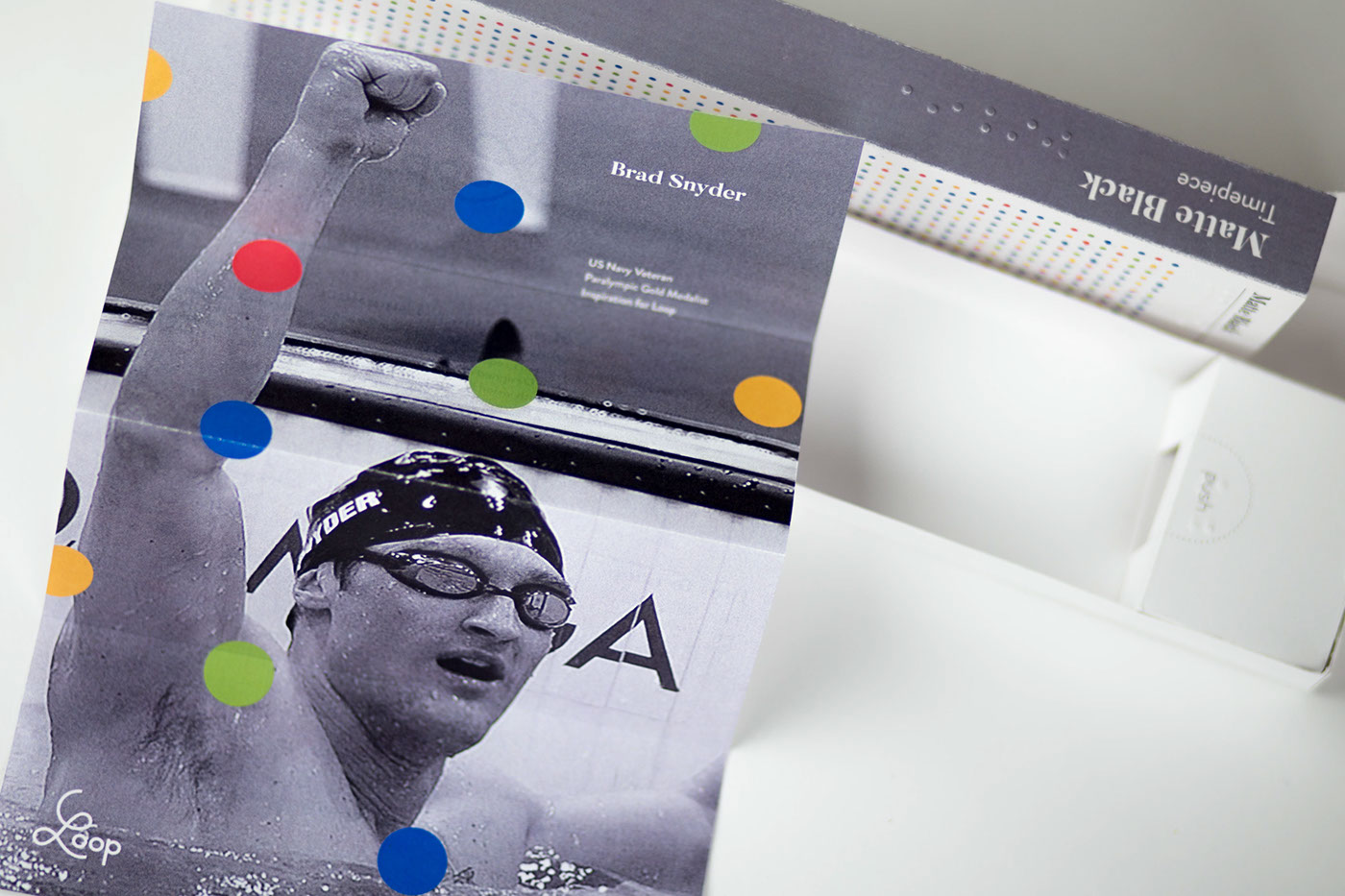
The identity consists of two visual metaphors: Color and Dots: The bright and engaging colors represent the vast range of people and personalities who wear Loop. The repetitive dots pay homage to braille, a system of reading and writing for the visually impaired. Both metaphors are true to the purpose of the product and intentions of a inclusive brand.
The identity consists of two visual metaphors: Color and Dots: The bright and engaging colors represent the vast range of people and personalities who wear Loop. The repetitive dots pay homage to braille, a system of reading and writing for the visually impaired. Both metaphors are true to the purpose of the product and intentions of a inclusive brand.
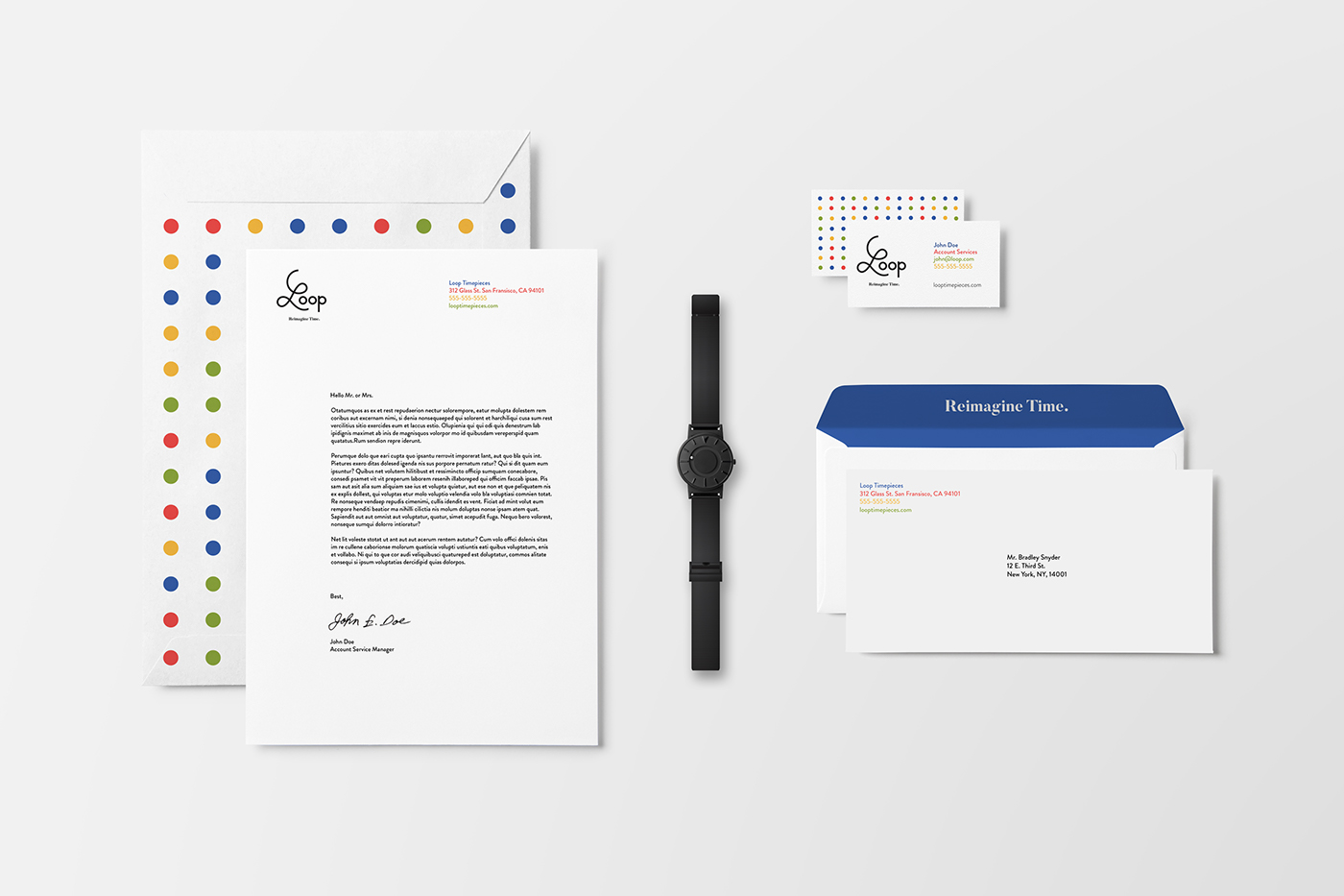
Packaging
Both of the metaphors are included with the packaging of Loop. Braille is printed on the front and side packaging to accommodate the visually impaired.

Note: This is a fictional rebrand for Eone Time, a tactile timepiece company. Timepiece images and copywriting were pulled from their website. Brand Strategy and research was completed with (& shoutout to) Alexander Catanese, Joshua Graef, and Ryan Hammond.


