


Eightyfive
Branding Philosophy of 85 is completed by combination of meanings of the number 8 and 5.
In its formative property, 8 is the number meaning the universe (infinity, circulation) while 5 means "wood, fire, earth, iron and water" in the East which compose the universe.
"Dot" logo which utilized the negative space of number 85 was designed in this meaning.
Square Dots in the upper right mean Digital Dots which are the elements of the digital world while the rest 3 circles mean the elements which compose the real world.
And this embraces the idea of Eightyfive that a single dot (5: Elements, Digital dot, Idea) crates the universe (8:Universe, Atom, Brand).
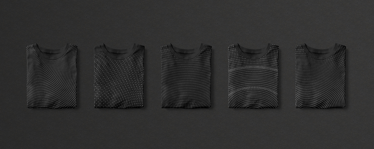
In addition, we replaced 5 elements that compose the universe with the Elements of Creativity (which are gravity, explosiveness, singularity, infinity and flexibility) and, by rendering the nature of the elements into a pattern of countless dots, we led the customer(s) to feel the creativity of Eightyfive in a vast scale.
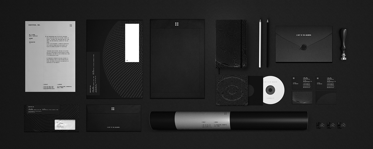
A dot to the Universe™
Our surroundings are filled with invisible dots, which are called in the name 'atoms' or pixels.' Although they sometimes are not to be seen, they are essential elements of the universe.
A dot to the Universe™, a brand of Eightyfive, is a lifestyle brand shop which exactly reflects the brand philosophy of Eightyfive.
"Invisible Dots Pattern" applied to the products is a high-glossy pattern applied to black background, the form of which appears only when it is reflected by light.
By producing 5 products for each category to which designs of only 5 atom patterns are applied, we intend to deliver the creativity of Eightyfive to the products.

