


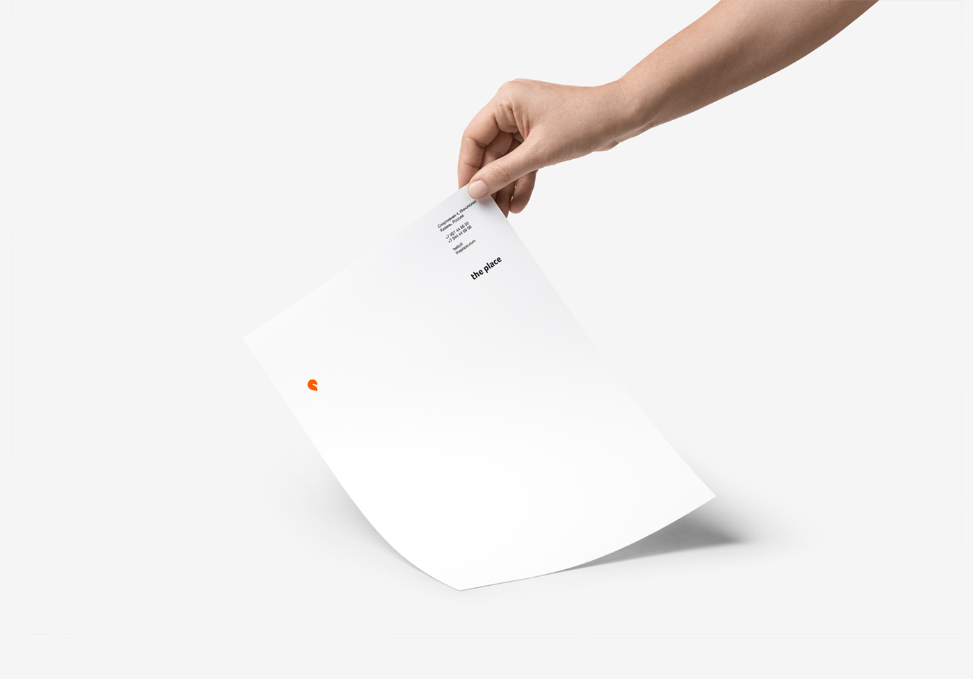
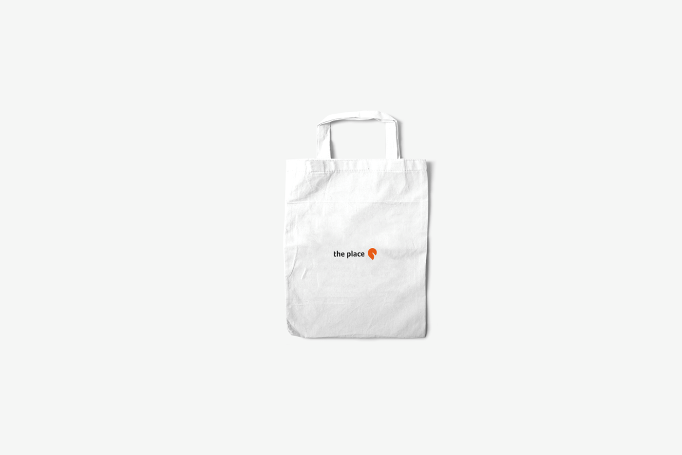
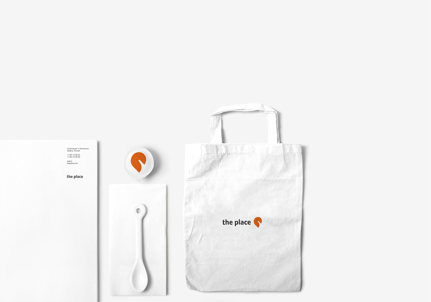
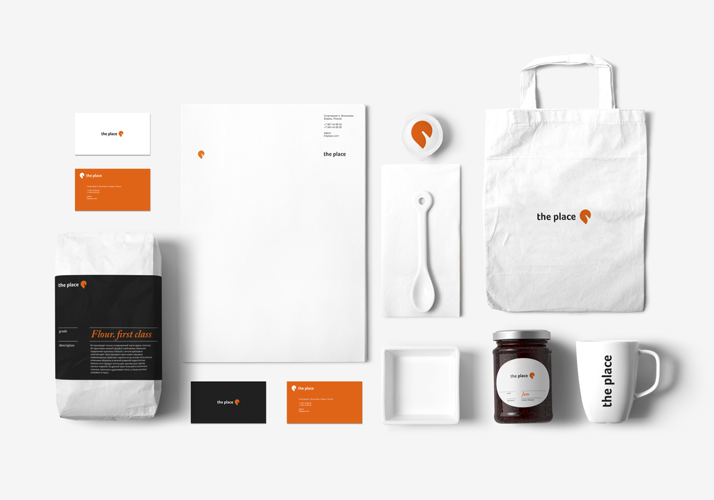
the place
the place is a restaurant in Innopolis. Why is it the place?
Because this is the very place that unites:
- a cafe
- a restaurant
- a coffeehouse
- a bakery
And it's all in one place - in the place.


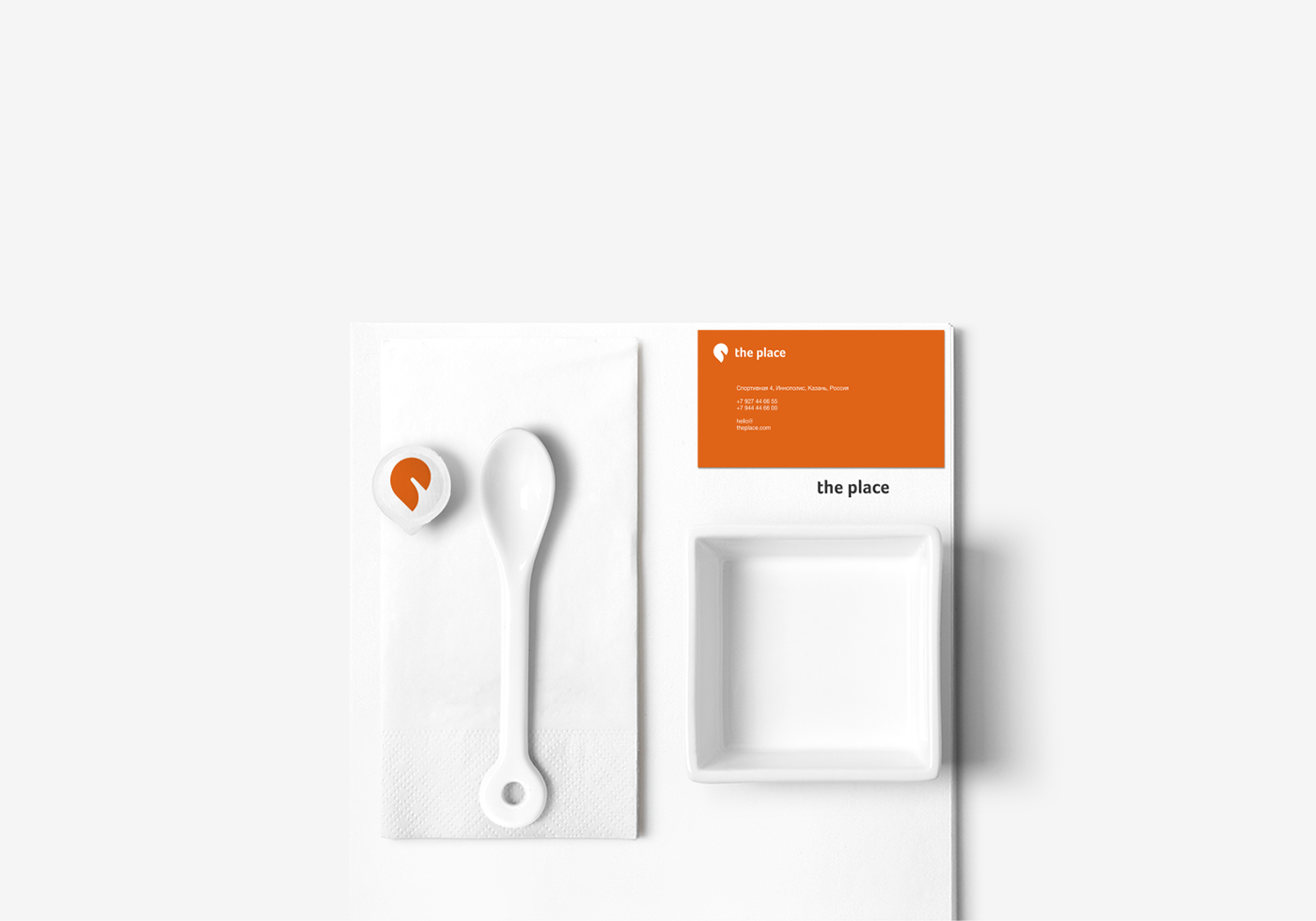
Orange
- A warm color by itself that also represents the brand as friendly,
confident and at the same time without excessive severity, let's say "easy to talk"
- Marketing represents a call to action:
come, buy, subscribe.
- If we consider the human chakra, orange is a sacred color,
it is associated with creativity, fun.
- And such common characteristics as comfort, a little playfulness, determination.


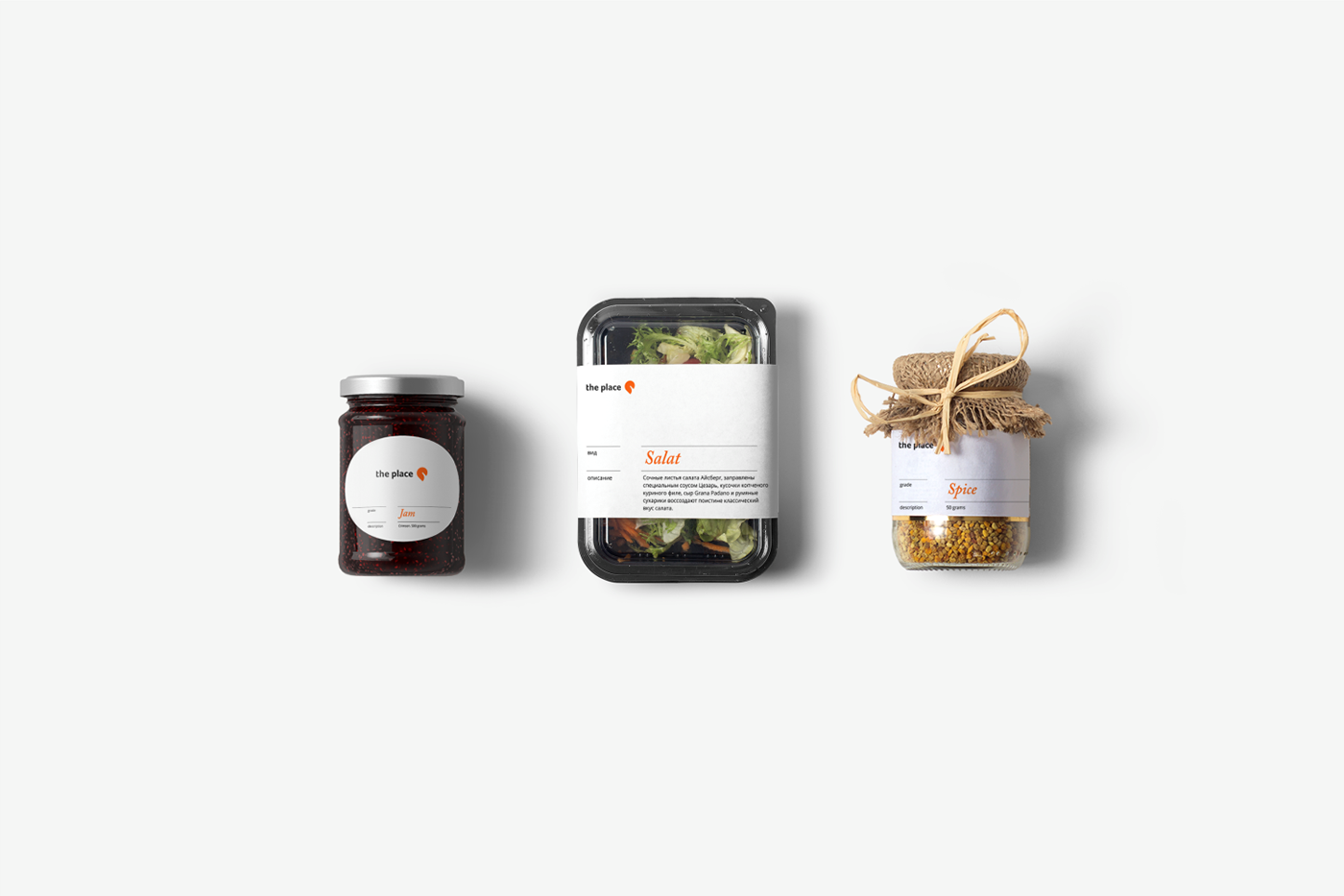
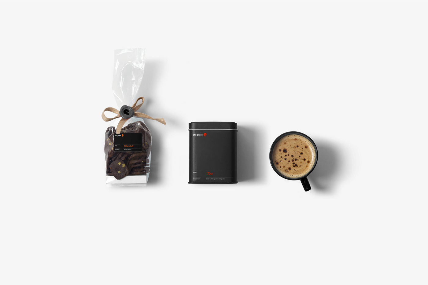


Art direction and design: Radmir Volk
Project Type: Branding, Packaging
Been featured:
- packagingoftheworld.com
- designideas.pics
- braaanding.com
- packageinspiration.com
Project Type: Branding, Packaging
Been featured:
- packagingoftheworld.com
- designideas.pics
- braaanding.com
- packageinspiration.com
Thanks for watching and your appreciation!
facebook / instagram
#designbyradmirvolk
radmirvolk.design
Design by Radmir Volk
© All rights reserved.
facebook / instagram
#designbyradmirvolk
radmirvolk.design
Design by Radmir Volk
© All rights reserved.


