
BIOBO / FRUIT CONCENTRATES FROM THE LAKE CONSTANCE
——
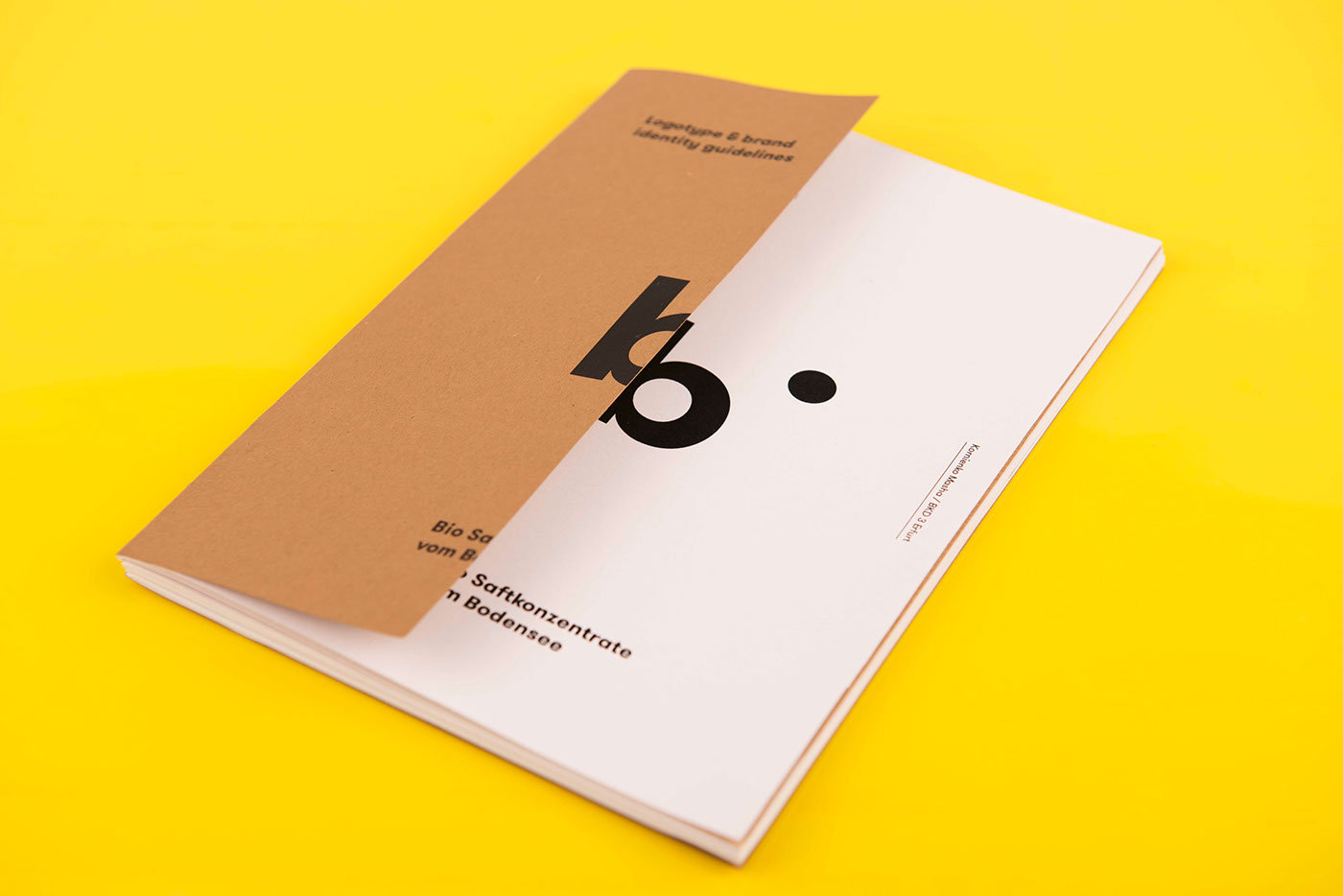
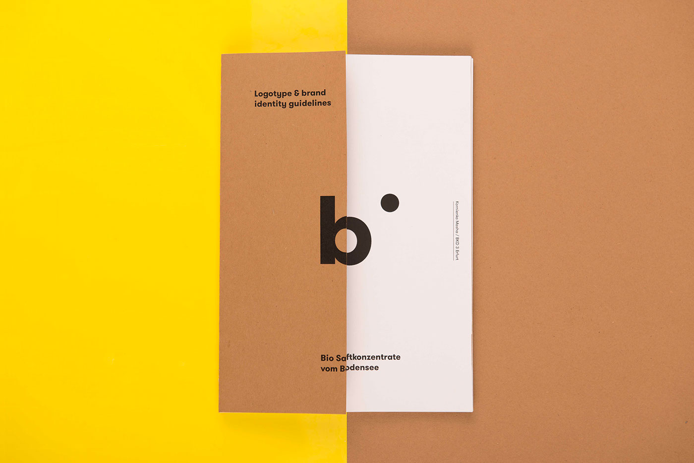
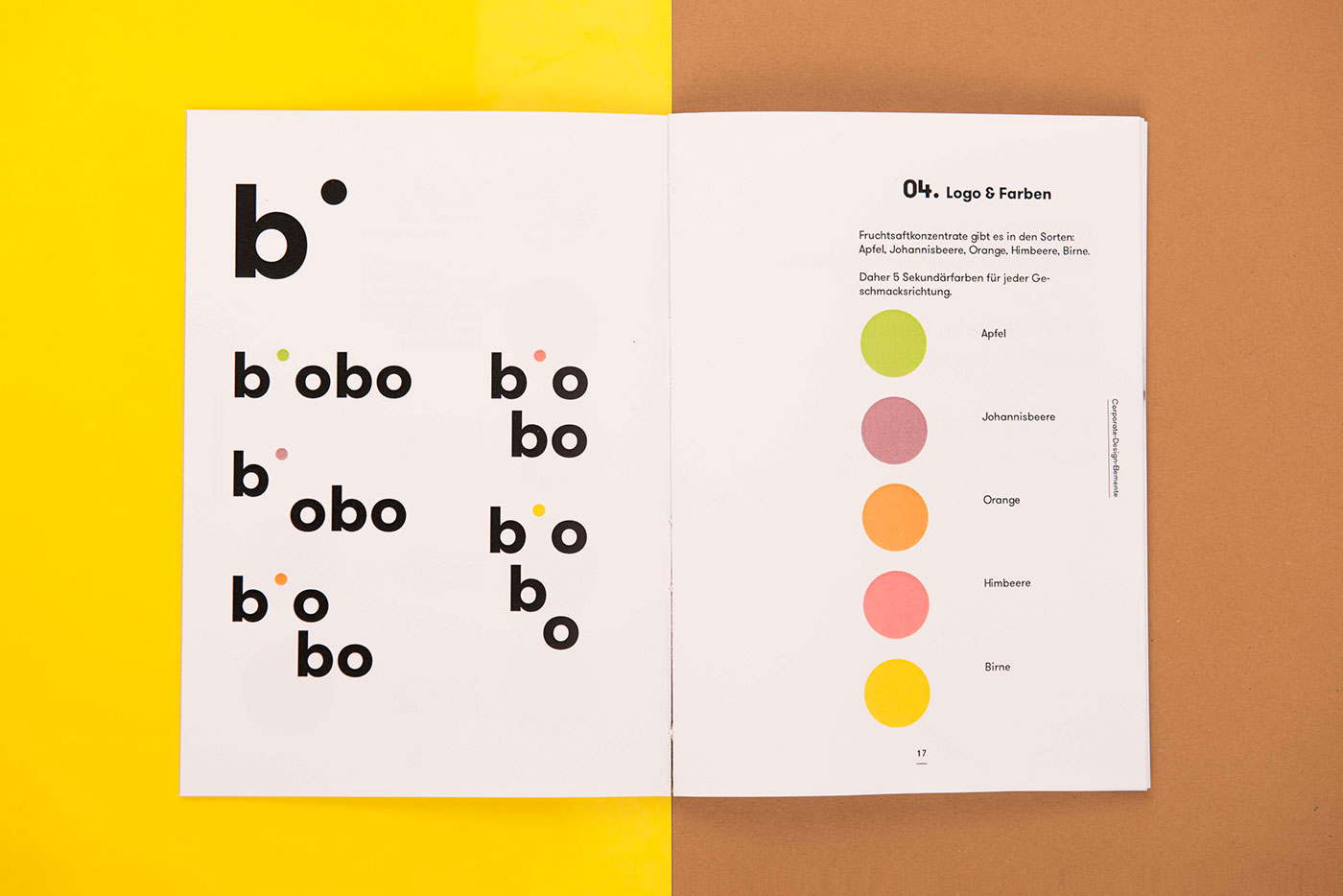
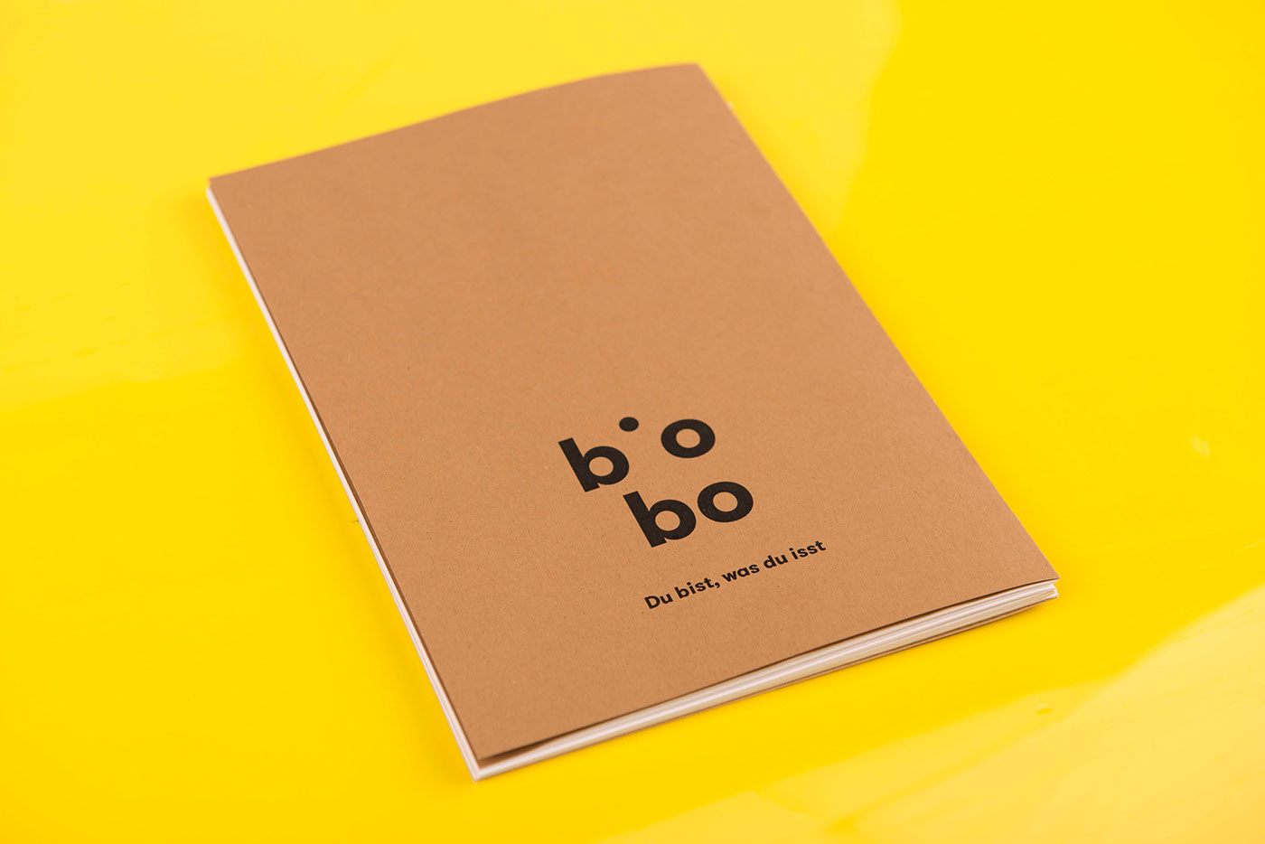
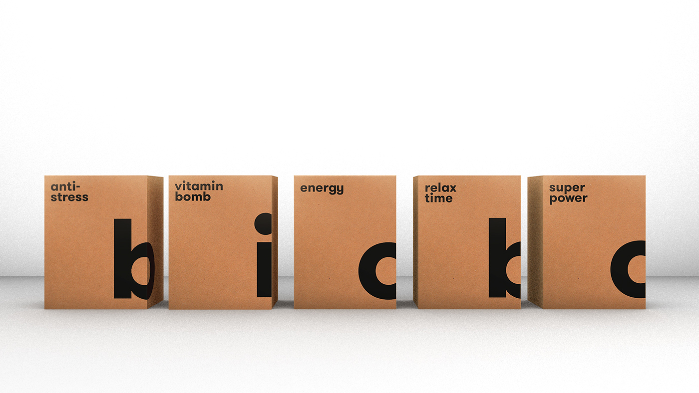
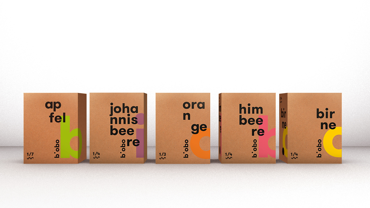
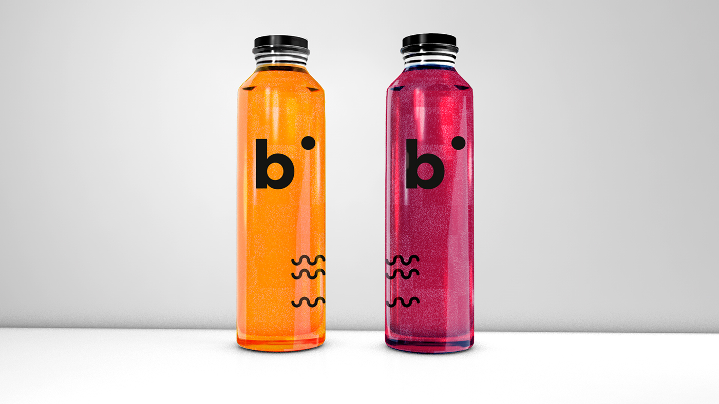
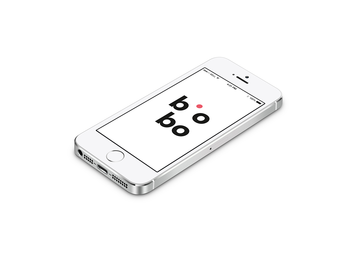
The aim was to make a corporate design manual, a new naming, plus a packaging and digital application for the ‘Ratiodrink AG - bio fruit concentrates from the lake Constance’. “Biobo” was chosen as a new name. It is an abbreviation from the words bio + Bodensee (German for Lake Constance), which means there are only organic fruits from the Lake Constance region inside. The generative logo is multifaceted and changeable, exactly like the variety of flavours of the product. The main parts of the logo is “b + i”, which stands for an organic and natural product. These elements are constant; all another elements of the logo are variable. The point of the “i” also has five variable colours, similarly to the five main flavours of the fruit concentrate.
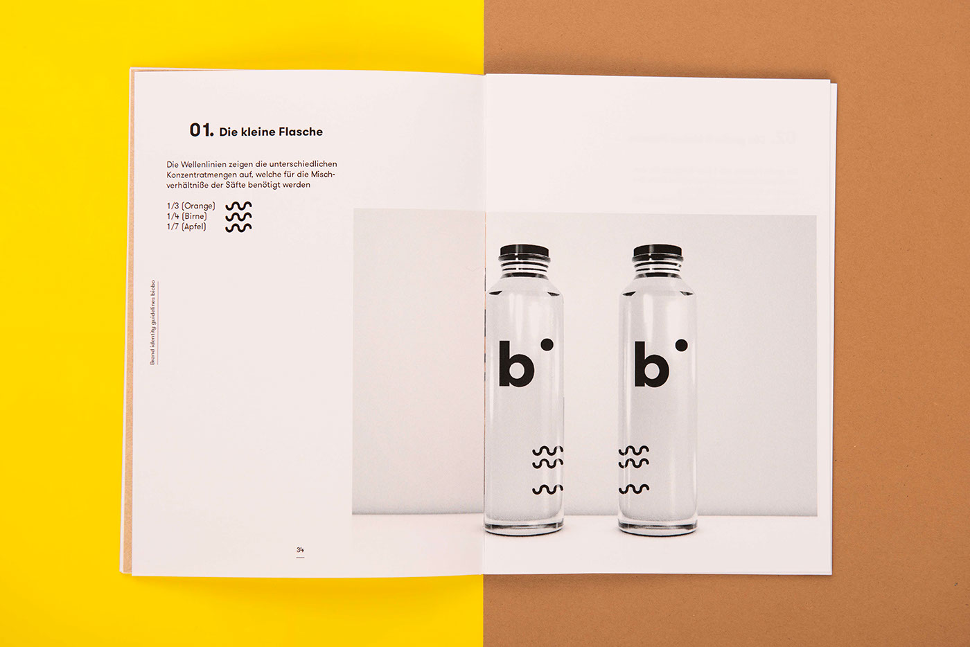
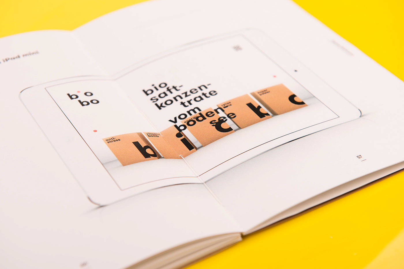
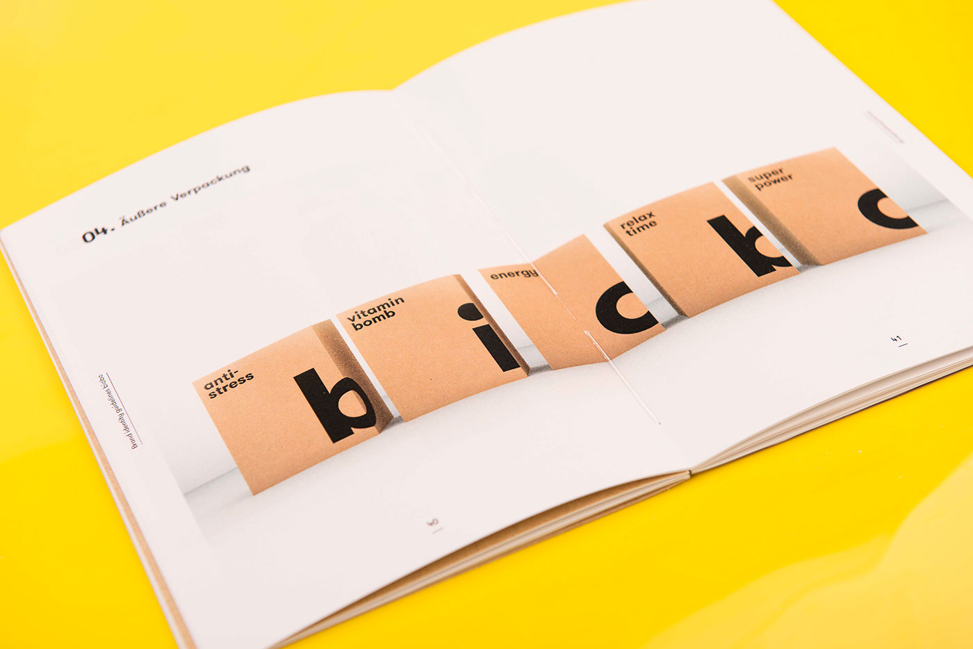
PACKAGING
——

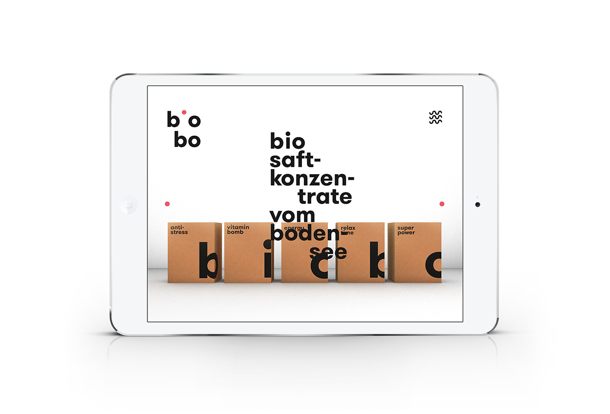
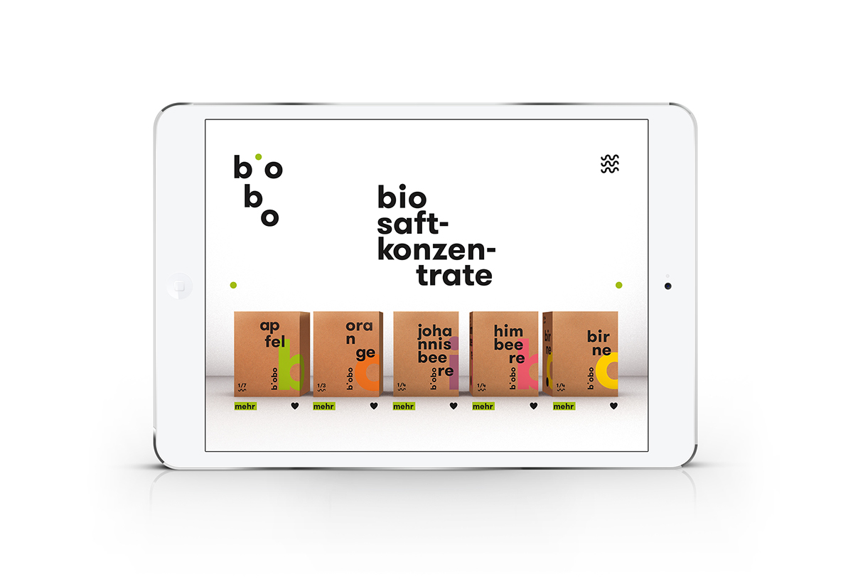
DIGITAL APP
——

THANK YOU FOR WATCHING
—


