
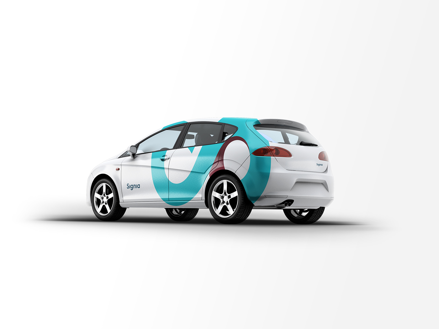
Signia derives its design from infinity and constant revival of the life cycle which both mean reliability and sureness. The sign’s shape is alterated to encompass also a great ‘S’ glyph as well as graduality and adaptiveness which is connected with wide range of products and solutions offered by Signia Group. The sign is very dynamic and brings to mind swiftness of soultion, ‘turning and even humming’ of machinery.
Company’s name derives from sign and sigma. It means significance and draws relation with physical and matematical meaning of the sign. The leading thought was to create outstanding and particular sign that would be easily distinguished and remembered an also to keep high level of alchemical ambiguity merging glyphs for sigma ( Σ, σ, ς ). The sign is mysterous and emphasises maternal role of Signia.


Thank you for watching!


