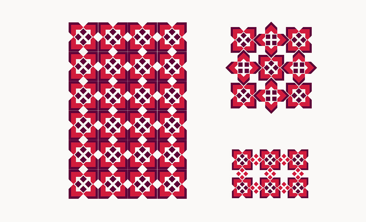
The basic idea of the logo is inspired from the meaning of the company name itself (EZDAN). EZDAN word in the language means the decoration of the place or adorned to be beautiful and wonderful - for example: إزدان البيت بالأزهار–Also it has been connected between the company’s field of work (real estate) and its name, so after research it was clear that one of the architecture details and decoration was Motifs (Zakharf) – which was used to add a beautiful touch to the building –So idea was inspired and some simple geometrical shapes was derived from some Motifs and added to each other to give four Letters E combined together (which is the first letter of the word EZDAN in English) to appear in the final as the logo.The overall idea is a simple geometrical shape that was derived from some Motifs and combined to be reflected on the real estate company logo.