

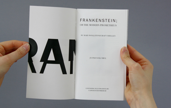
Frankenstein
Hybrid Novel
Hybrid Novel
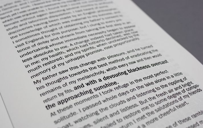
A typographical piece that highlights frankensteins bipolar tendencies by applying the principles of graphology to visualize his Severe mood swings.
One of the main themes of the story of Frankenstein is the protagonist’s tendency towards violent mood swings. At the time the story was set, sometime in the 1700s, little was known about mental health. Nowadays, Victor’s affliction would have most likely been diagnosed as bipolar disorder. By definition, bipolar disorder is a condition in which people go back and forth between periods of a very good or irritable mood and depression. In order to visualise the mood swings of Victor Frankenstein throughout the book, and also the diary-like style that the story is written in, graphology, the study of handwriting is applied to the text.
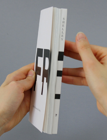
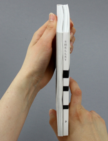
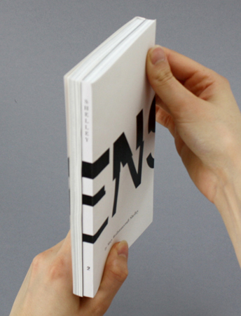
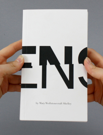
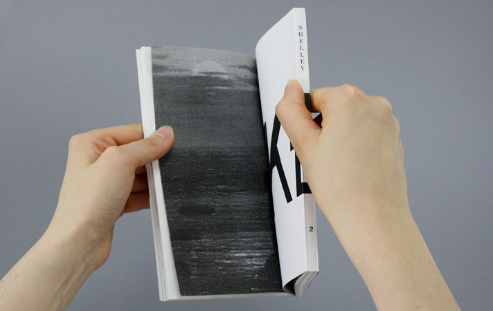
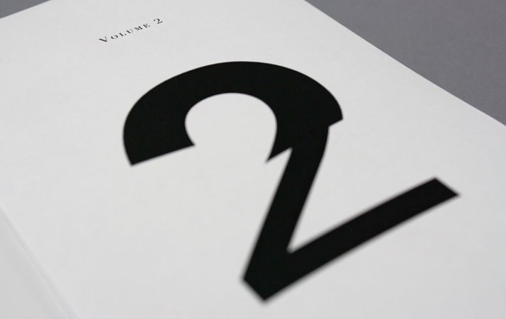
To strengthen the inner conflict theme that the protagonist is going through whilst fighting with his mood swings, the Book is split into two volumes. The actual split is taken from the 2nd edition published in 1821 but instead of having two separate volumes, they are bound together in a dos-a-dos style. This reflects the fact that although Frankensteins moods are extreme, he is still the same person. The title of the book wraps around the whole cover and is Franklin Gothic in 2 weights split in two and then moulded together.
The Book is entirely handmade.
The title 'Frankenstein' on the cover wrapped around the book in a dos-a-dos style.
The layout and sizing of the book spreads are based on the original 2nd edition published in 1821. This makes the book slightly taller in relation to width (110mm x 188mm), which compliments the binding style, making it easier to handle while reading.
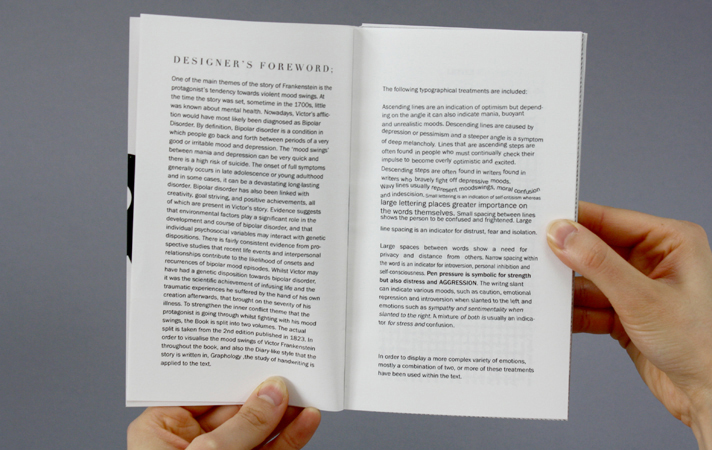
My foreword explaing the typographic treatments I used throughout the book.
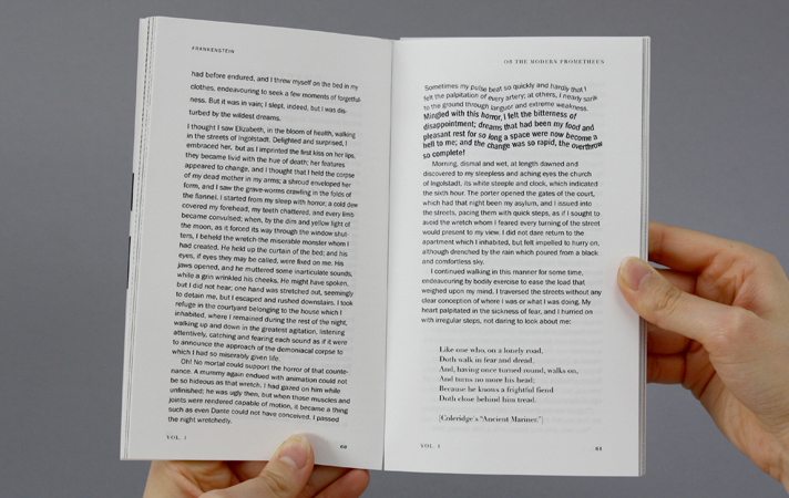
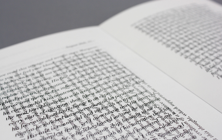
Sample spread.
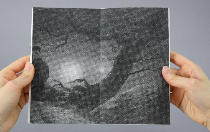
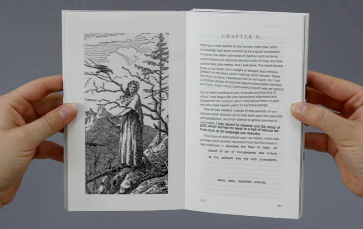
One of the Illustrations by Caspar David Friedrich.
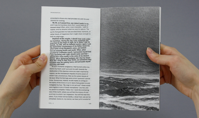
The images used throughout the book are by Caspar-David Friedrich. They add an erie feel to the story and are chosen to suit the storyline of the book. A halftone pattern is applied to make them more distorted, as well as compensating for difference in dpi.
Throughout the book, most images are split over front and back, creating a sense of foreboding. There is also a repeat of images showing 2 people. They are used in relation to the text, as well as the overall meaning of the story.
Throughout the book, most images are split over front and back, creating a sense of foreboding. There is also a repeat of images showing 2 people. They are used in relation to the text, as well as the overall meaning of the story.
The image ‘Two Men at Moonrise’ (above) is split over the two volumes, with the first half at the end of volume one and the second half at the beginning of volume two.


The letters written by Walton at the beginning and the end of the book are horizontally and vertically overlayed, as in the Victorian era, letters were written in this way to save on postage. Being as the letters were all very long, this is both practical and a visually exciting treatment. This only applies to the frame story letters, as the letters in Frankenstein’s narritive are part of his story and are therefore his own interpretation.