Eurovision visualisation
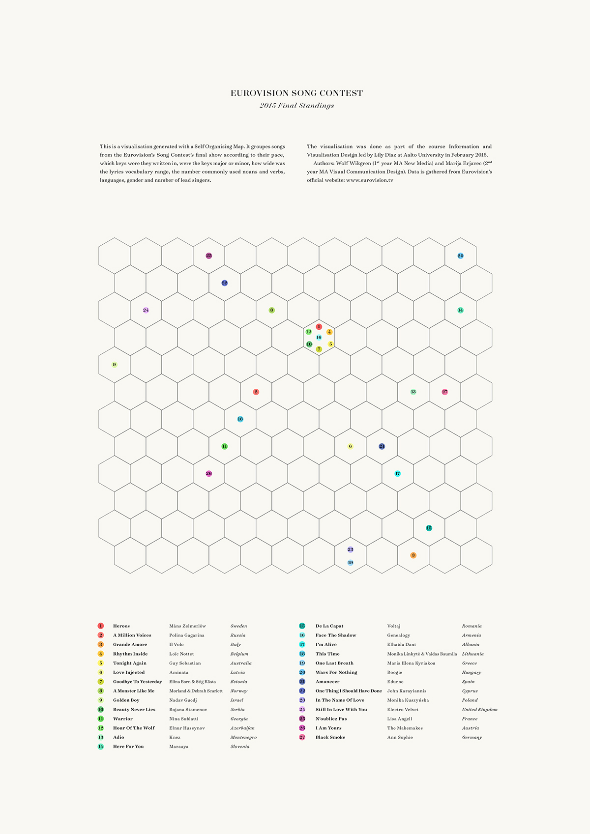
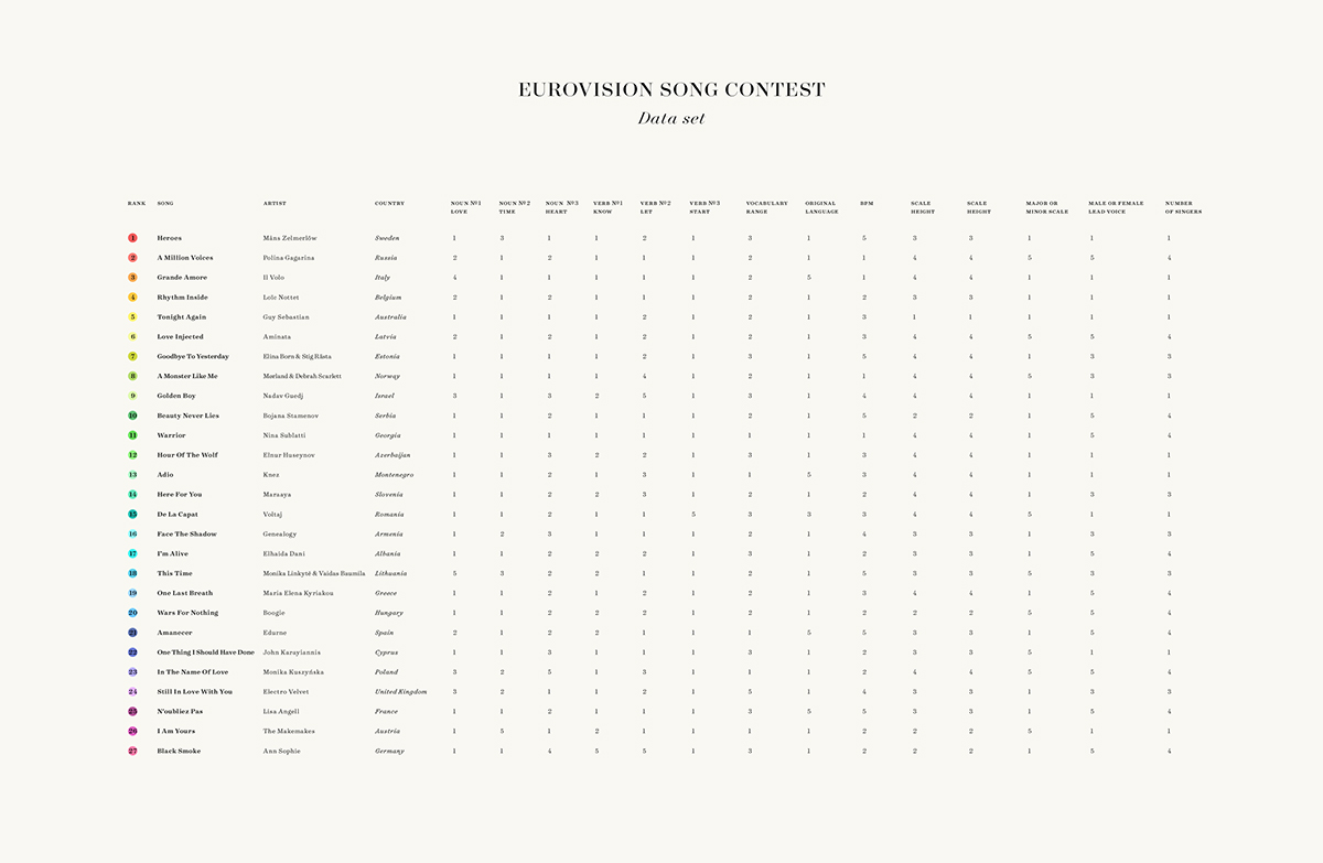
This is a visualisation generated with a Self Organising Map. It groups songs from the Eurovision’s Song Contest’s final show according to their pace, which keys were they written in, were the keys major or minor, how wide was the lyrics vocabulary range, the number commonly used nouns and verbs, languages, gender and number of lead singers.
Below is a Sankey diagram of the voting process of the Eurovision Song Contest Finals held in Stockholm in year 2015. The size of the stream correlates with the number of points given. Austria and Germany did not receive any points. Data is gathered from Eurovision’s official website.
I made the visualisation with Wolf Wikgren as part of the course Information and Visualisation Design led by Lily Diaz at Aalto University.
February 2016. Information design. Data visualisation. Data art.