


Brief
Create a new identity for the whisky brand Whyte & Mackay that targets a younger demographic of drinker.

The abbreviated name is a much bolder statement compared to the previous logotype. Its shadow form links to Glasgows ship building industry as well as its stylish heritage. The typeface used is Akzidenz Grotesk, which is similar in form to the company’s first logotype.
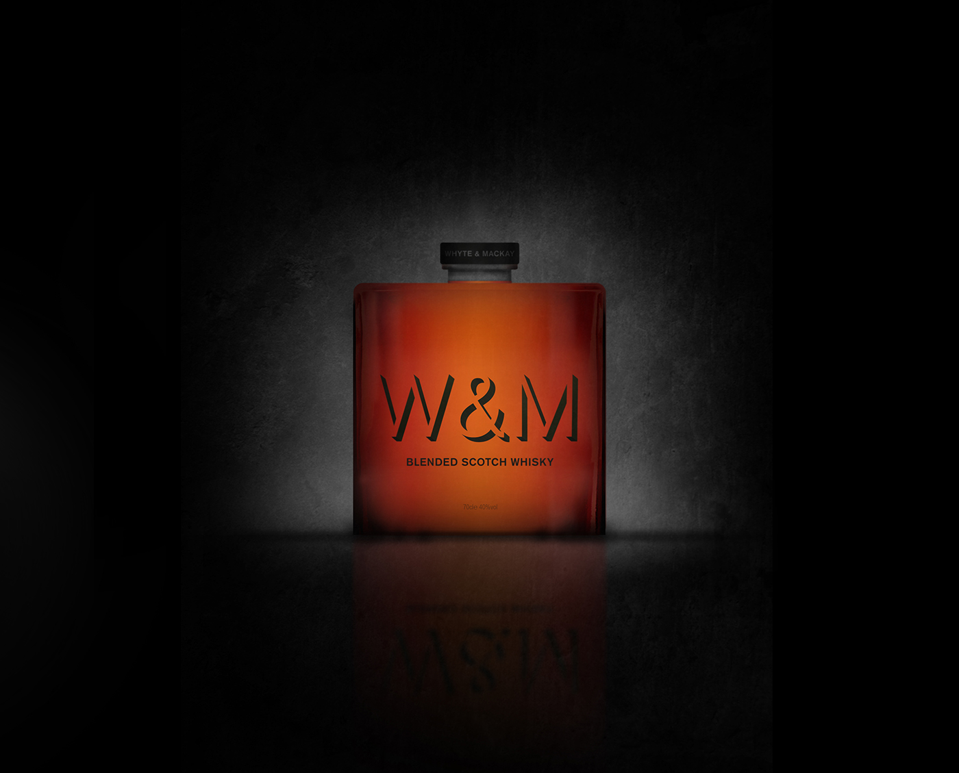

W&M use the process of triple maturation to create their whisky. This distinctive method is represented by the unique shape of the bottle; its cylindrical barrel like form contrast the generic tall and thin bottles common in the industry.
The red and black colours of the McGregor Clan, the founders of the brand, are integrated into the design by using the red tone of the whisky and the black typography. The logotype is screenprinted onto the bottle, reducing the number of processes, thereby making it more environmentally friendly.

To further the idea of individuality, each poster produced would be original as the three letters would be positioned and scaled by an algorithm. This bold and distinctive style avoids the stereotypes of alcohol posters, which are typically lifestyle and bottle orientated.

Thanks


