Twelve Ounce
An unlimited coffee subscription for the coffee lover.
This case study was originally published on www.cortes.us, please redirect there for a better viewing experience.
My Role
I was responsible for designing the entire iOS app, Rails website for internal use, as well as creating Illustrations that went into the website, app, and marketing mediums. I also helped create the overall brand image for the company and helped in the design of their marketing site. Here is some insight into the work that I created and how I came up with the solutions that I did.
When
August 2014 - July 2015
Technique
Illustration, Branding, iOS Design, Web Design, Art Direction

What is Twelve Ounce?
The idea of 12oz is to bring an unlimited coffee subscription to those that love coffee for one low, monthly price. 12oz partners with local coffee shops to allow users to use their simple app to pay at coffee shops. Coffee shops take down a 4 digit code at the time of order, and 12oz reimburses the coffee shop fully each month.
Beginnings
Where I Came In
After recently being hired by a firm back in 2014 in Nashville, Tennessee called Vrasa owned by Jordan Halvorsen, he immediately brought me on to be the lead designer of his new startup idea, 12oz. Jordan was the Product Lead for 12oz so I did all of the design work and we would discuss what we felt was working and what wasn’t. This was usually every two weeks or so. All they had so far were some initial branding and some basic wireframes (shown below).

My Initial Thoughts
Being someone who had recently moved to Nashville and was starting to explore the coffee scene of the city, I was ecstatic to hear about this idea. The idea of saving money, having access to the coffee shops I wanted, and being able get any drink I wanted while paying with my phone (was before Apple Pay) was an incredible thought.
Naturally as a designer I started to think about what problems would be faced with an app like this. Speed and Funtionality, to order fast and easy. Aesthetic, we all know how coffee culture loves it’s aesthetic. And Personality, not the easiest thing to do with an app focused on coffee ordering. There were of course a few other smaller issues to think about, but these felt the most important.
Research
Like any of my UI/UX projects, I always start with research so that i can understand things like target market, use cases, competition, and objectives. This allows me to better comprehend the project and what the best approach to certain aspects of the product is.
Competition
After recently being hired by a firm back in 2014 in Nashville, Tennessee called Vrasa owned by Jordan Halvorsen, he immediately brought me on to be the lead designer of his new startup idea, 12oz. Jordan was the Product Lead for 12oz so I did all of the design work and we would discuss what we felt was working and what wasn’t. This was usually every two weeks or so. All they had so far were some initial branding and some basic wireframes (shown below).
After recently being hired by a firm back in 2014 in Nashville, Tennessee called Vrasa owned by Jordan Halvorsen, he immediately brought me on to be the lead designer of his new startup idea, 12oz. Jordan was the Product Lead for 12oz so I did all of the design work and we would discuss what we felt was working and what wasn’t. This was usually every two weeks or so. All they had so far were some initial branding and some basic wireframes (shown below).
Market
Although 12oz would be based in Nashville at first, limiting our market to only the type of people in Nashville would inhibit 12oz in the long run. At first I felt the need to focus on consumers between the ages of 18–30 but when I found out we would have to change our price model to be higher, a lot of the people I asked in this age group said they wouldn’t pay the $70 a month for the base price subscription. This makes sense because a lot of this market was still in college or just out of college and things like student loans and bills were much more important to pay.
Although 12oz would be based in Nashville at first, limiting our market to only the type of people in Nashville would inhibit 12oz in the long run. At first I felt the need to focus on consumers between the ages of 18–30 but when I found out we would have to change our price model to be higher, a lot of the people I asked in this age group said they wouldn’t pay the $70 a month for the base price subscription. This makes sense because a lot of this market was still in college or just out of college and things like student loans and bills were much more important to pay.
Because of the feedback received from asking people in this age group, I decided to shift the main focus to early adopters in the 30–45 age group. This would target those that usually choose to do one of the following throughout their day: grabbing coffee in the morning before a long work day, meeting someone for business at a coffee shop and having the ability to buy them a coffee, working long days at coffee shops and wanting a few coffees throughout the day, catching up on work with a coffee after hours, along with other possibilities that I feel fit the age group best. Of course, there are going to be consumers outside of this initial target, and I believe the situations can definitely be applied to others, including students or younger/older coffee lovers.
Coffee Shops
Knowing coffee shops was a big part of the project because of the nature of our app. Making things simple for coffee shops was just as important as making things simple for consumers. Knowing the needs of coffee shops and being able to create a company that would help and grow shops we believed in was an important part of the 12oz culture. We had 3 main points that were brought up to coffee shops to show how our product could help their local businesses.
Knowing coffee shops was a big part of the project because of the nature of our app. Making things simple for coffee shops was just as important as making things simple for consumers. Knowing the needs of coffee shops and being able to create a company that would help and grow shops we believed in was an important part of the 12oz culture. We had 3 main points that were brought up to coffee shops to show how our product could help their local businesses.
1. The idea of unlimited coffee would make customers stay longer. Staying longer would then lead to things such as ordering food, inviting friends, coffee exploration, and build customer trust.
2. 12oz created new customers. Users of 12oz that did not initially know of certain coffee shops were introduced to exploring new places knowing they would be able to grab a fresh cup of coffee there.
3. The technology gave them leverage over competition.
Moodboards
A great product always starts with great inspiration!
Going back to design, with the wireframes I had I wanted to get a feel for how I wanted the app to look now that I had the general UX laid out. (These were chosen before iPhone 6 in 2014, keep that in mind.) I wanted to use a bit more color than I am used to and I really enjoyed the color scheme of the bottom left picture as you will see throughout the app.

Early Iterations
Note: I usually start with sketching wireframes after moodboards, but I was given specific directions to use their original wireframes and start building without recreating my own wireframes.
I went through and designed the existing wireframe views and along the way realized screens that needed to be added and functionality that needed to be built upon. I changed screens and added others accordingly that were necessary for user flow. At first I was going to have a few different colors for success buttons and cancel buttons (see below) but felt the colors all clashed with each other.
Instead, I stuck with an orange for CTAs and a blue or dark grey for secondary buttons and info displaying (below). This felt a lot less distracting, cleaner, and more straightforward for users.

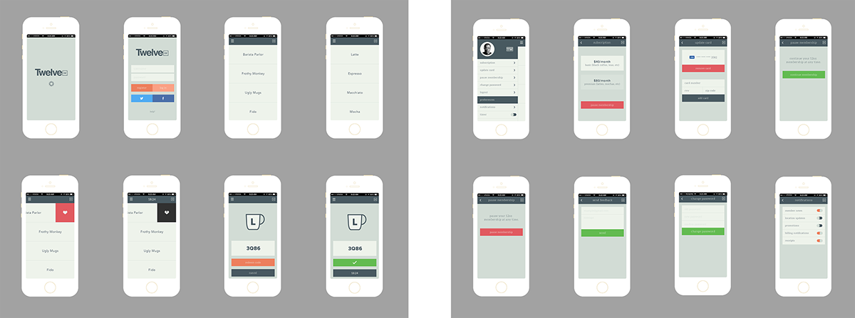
After finalizing the 1.0 ready to ship version for the beta, I went through and designed around 20 different lettering illustrations to be applied to the redeem screen. The decision to do this came with the idea of rewarding users for each time they redeem a coffee. At first, the idea was to have a different illustration based on the type of coffee the user would order, but this lead to the issue that if someone had a favorite coffee, they would only be limited to one or a few different illustrations. So came the decision to randomize the illustrations no matter what coffee the user ordered to provide an exciting “reward” experience for users. See all the screens in order below for version 1.0.

Beta & Feedback
We launched a private beta to 100 users in Nashville in order to see what we could refine before going public.There were a few issues we received after the beta in terms of UX and although I cannot show every problem for privacy reasons, I’d like to highlight one I had to fix before launch (the other two shown on left are being fixed in version 2.0). On the redeem screen there was no way for the barista to see the type of drink the user ordered when writing down the redeem code, which is a crucial part of our established workflow. Because the barista has to take down a code at redeem, knowing the price of the transaction they wrote down served as a way for the shop to track finances. Sometimes users would forget exactly what coffee they had pressed if they are having small talk or something so it was a highly requested feature from both beta testers and coffee shops. My solution can be seen on the right (before the user presses redeem, still leaving room for illustrations).

Icon
Creating the icon for the app was a super fun part of this project. I already had it set in my mind to create a coffee cup for the icon, the problem was choosing a style. I went through a few early iterations of a face on coffee icon but all of them felt too weak or too plain (see below).

Of course I didn’t want to have a distracting icon, but I also wanted to create something inviting that users would want to open and also give that small design detail to the app. I ended up creating a top view of a coffee cup and it felt perfect. Where do coffee drinkers look at their coffee from? The top. It only made sense. After I created the icon, something still felt a little off so I added shadows for depth and a little bit more realism while still maintaining the characteristic illustration style that I love. I tried a few colors for the background but ended up deciding on a light grey (see below).

Rails Website
More for internal use, the Rails website I designed lets coffee shops keep track of the transactions that have come through with the 12oz app and stay on top of how much 12oz owes them. On the other hand, it also allows for the 12oz team to also stay on top of what they owe coffee shops. Coffee names and prices can also be changed and are directly fed into the app without any need for users to update. Pretty great huh?
For the design of this site I decided to go with a side menu that allowed easy access to all parts of the site and was also able to use the rest of the screen real estate to portray data and tables and still incorporate some gorgeous typography all tied together with a minimal gold, grey, and white color palette.
Obviously I cannot show actual data in this case but I’d like to show a few of the final screen designs with some placeholder data.
Obviously I cannot show actual data in this case but I’d like to show a few of the final screen designs with some placeholder data.

Collateral
In addition to Interface and Experience Design, I also created a vast amount of collateral for the brand such as posters, illustrations, stickers, billboards, and marketing tools. Here are some of the works I created. Captions for each in order:
1. 8 of Almost 50 Illustrations Used for Marketing, Website, and Collateral
2. Left: Promotional Stickers, Right: Stickers to Put in Windows of Supporting Shops
3. Launch Posters to Hang in Coffee Shops to Raise Awareness
2. Left: Promotional Stickers, Right: Stickers to Put in Windows of Supporting Shops
3. Launch Posters to Hang in Coffee Shops to Raise Awareness

Marketing Website
I decided to leave the marketing website for last because I had the least involvement in this part of the project. The rest of the project that you read above I was the 95% of it but this part Jordan Halvorsen took care of. I did some revisions of the site and some advising but the majority of the design was Jordan through use of my illustrations and color choices I showed above. You can see the site live here.
Launch
The launch for version 1.0 went really well! People were in love with the application and the entire culture and brand behind 12oz. The app was featured in The Tennessean (read here!) on the day after release and we were also featured on Product Hunt (see here!). We had an overwhelming amount of consistent sign ups for the first few weeks and were able to get a ton of feedback that we filtered through as features for 2.0 or changes that needed to be immediate.
I’m always open to take on new freelance work and talk about hiring opportunities, feel free to email me at hi@cortes.us if you’d like to get in touch!


