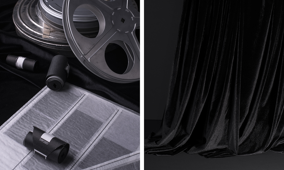


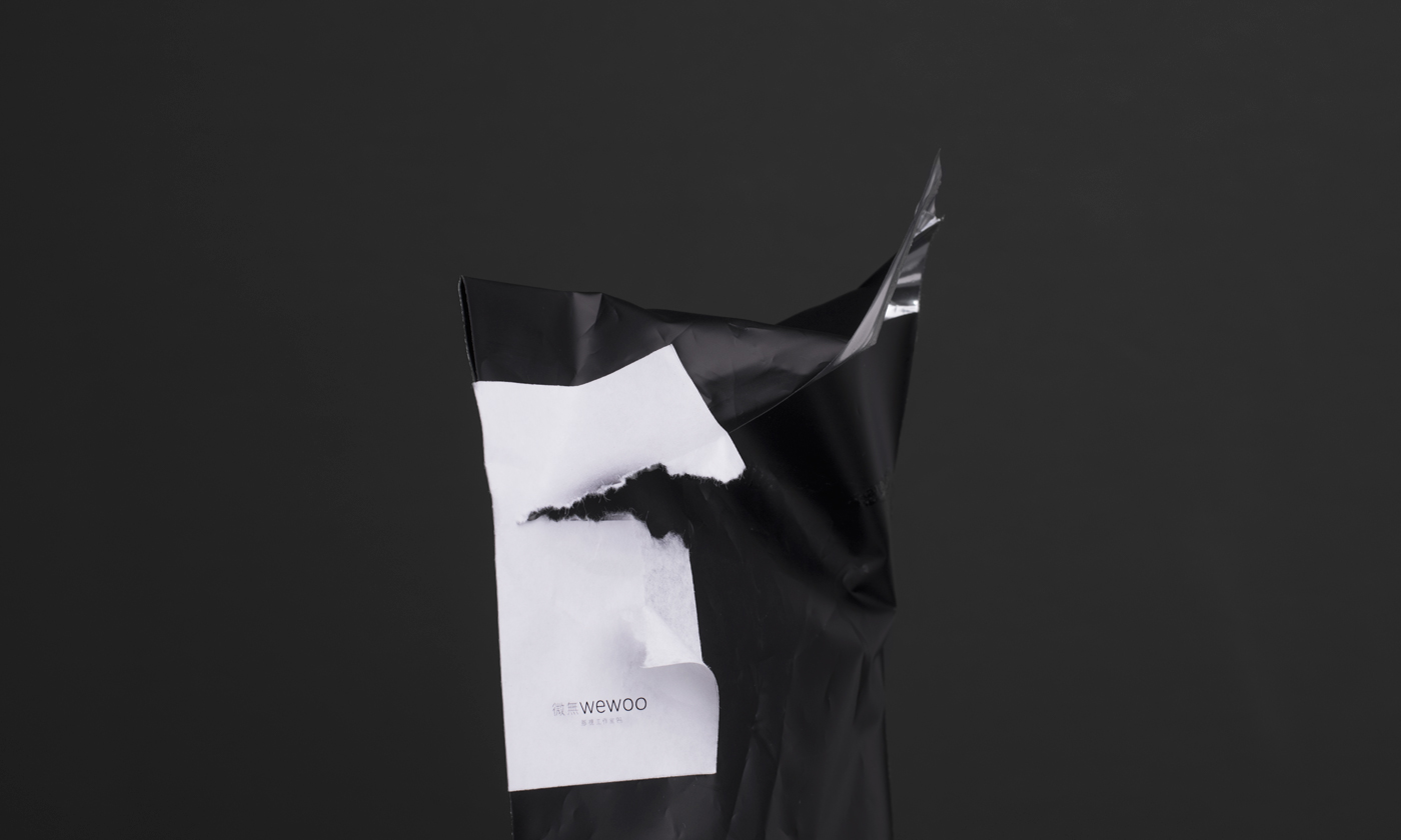
Wewoo
Industry / Location:
Film Production Studio / China
Scope of Work:
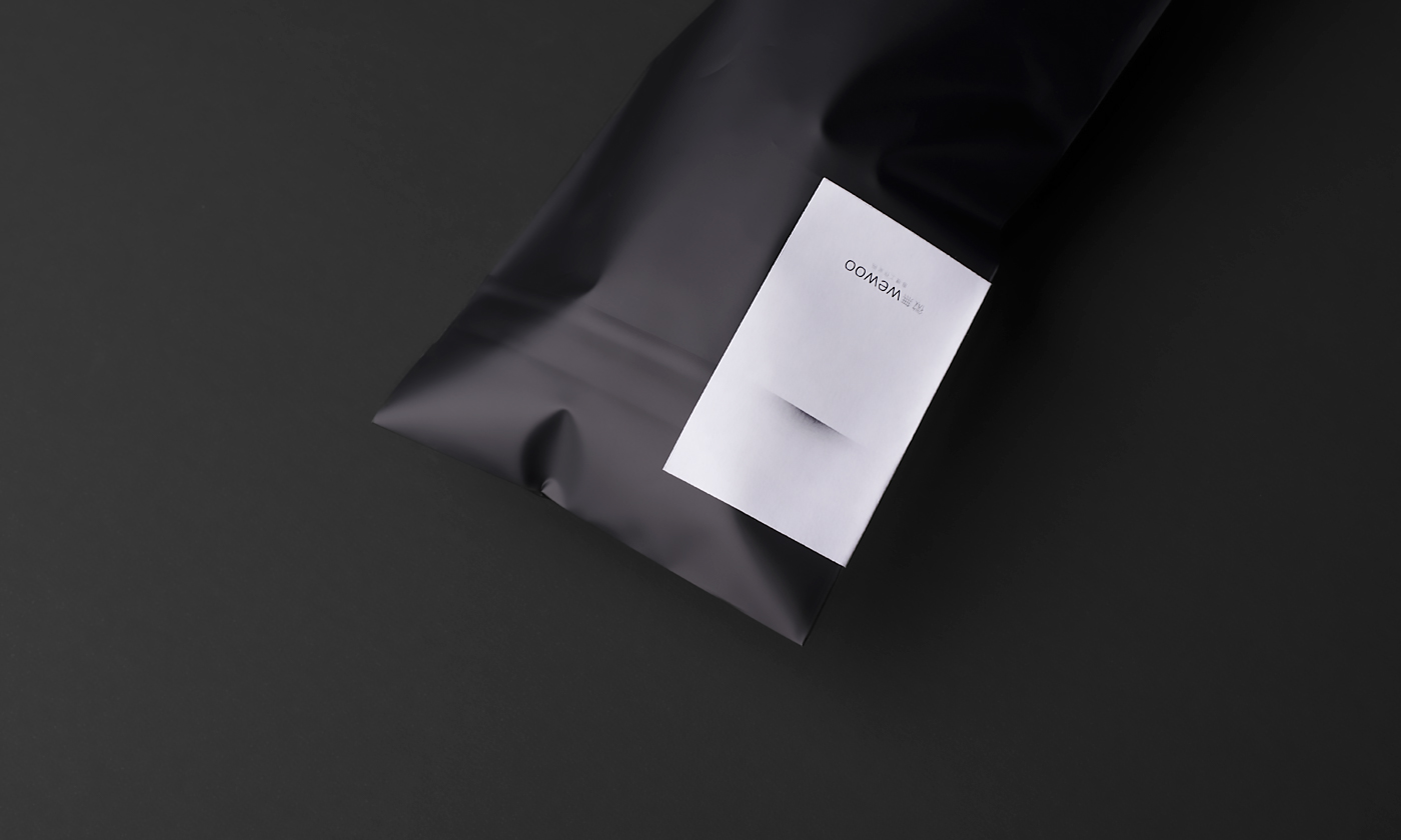
Visual identity / Print design & management
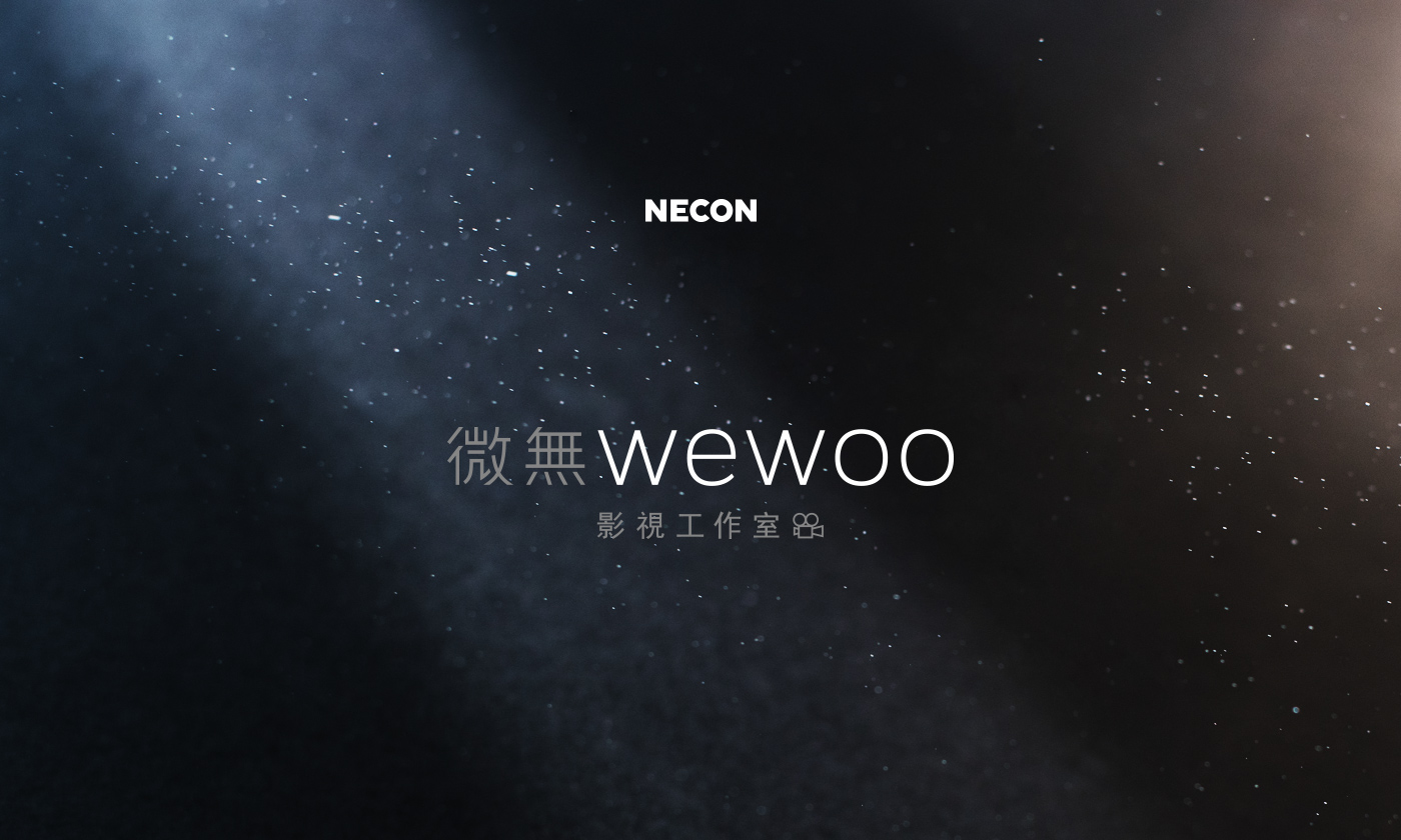
The brand name - Wewoo - is formed out of two Chinese words: ‘light and darkness’, and ‘divine’. The duality rendered out of Wewoo's approach to the subject of video art.

The concept
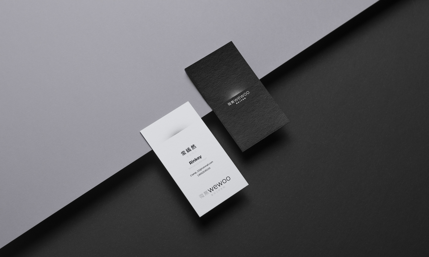
A delicate light ‘halo’ breaking over the horizon becomes the main brand visual representing both the subject and the predicate of Wewoo.
The resulting work is a visual identity which elegantly epitomizes Wewoo’s three tenets – showing care and thought, following the philosophy of yin and yang, and demonstrating dedication commonly associated with the photosensitive gelatin-silver film photographic process.

Execution
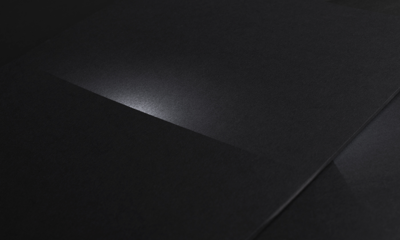
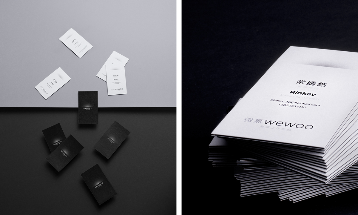
Elegance and sophistication is achieved through minimalistic design and clear layouts. A very soft brand visual - ‘light halo’ - sits above Wewoo name as is gently highlighting the delicate Wewoo wordmark. Balance in lighting to bring out only the important details.
Both the Wewoo name and the design perfectly reflect on Wewoo’s main slogan: ‘Being everywhere like a faint light.’ The idea behind this message is to not be so bright as to blind, but be visible enough to light the way.