
Packaging Cretan rusks
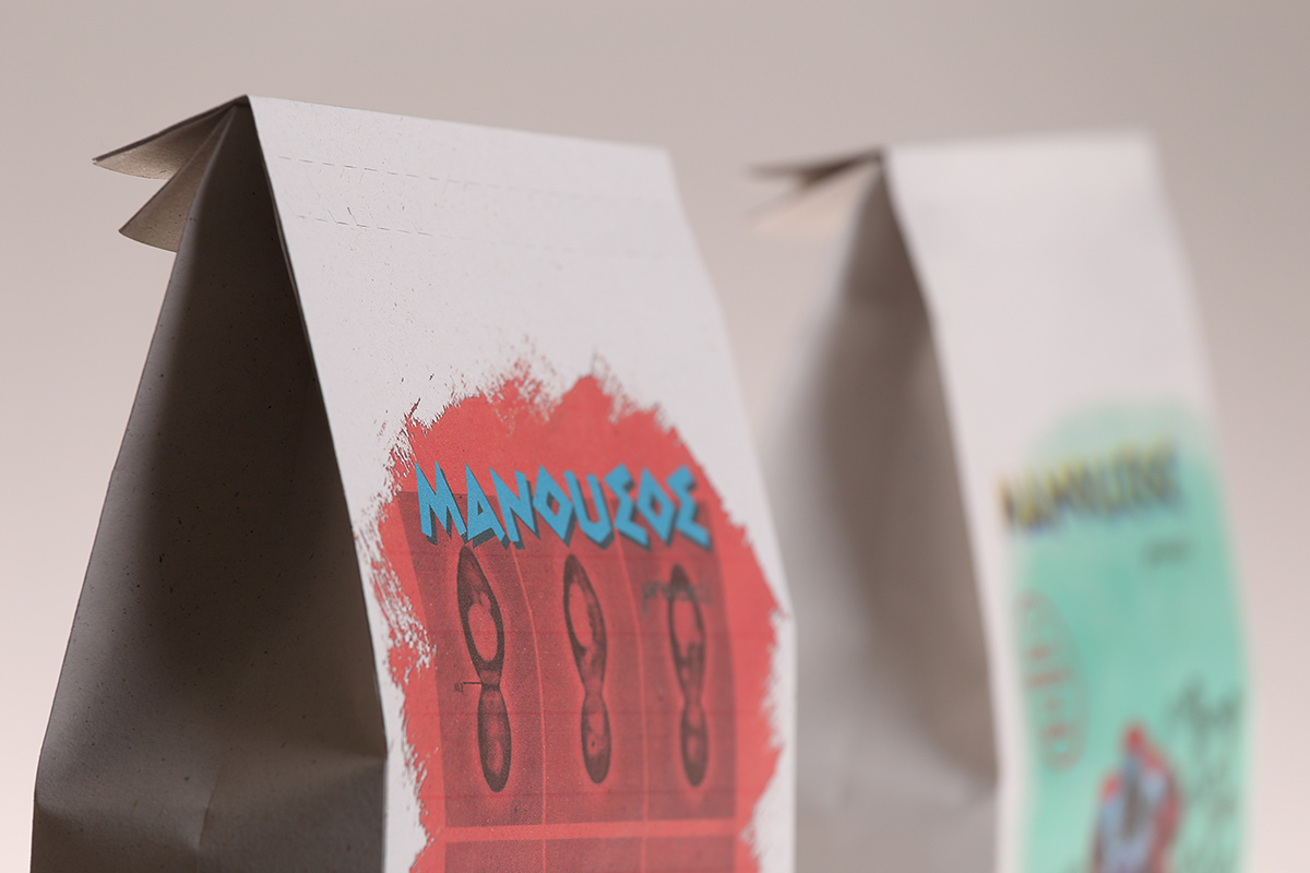
Packaging design for three different types of crisp bread (Cretan bread rusks) of the company Manoussos.

The brief was to redesign the packaging of a favourite product (in this case, Cretan bread rusks). Two conditions of the brief were a. not to alter the logo of the product brand (Manoussos), and b. to retain all of the text on the original packaging. The third condition was to communicate three words through the packaging design (in this case, “film noir”, “Chemistry” and “antithesis”).


The graphics on the front of the crisp bread packets directly reference the composition, colour palette and lettering of classic film noir posters. However, diagrams and photographs from Chemistry text books have been incorporated in the place of film scenes and actor shots. The packaging paper simulates pulp fiction.

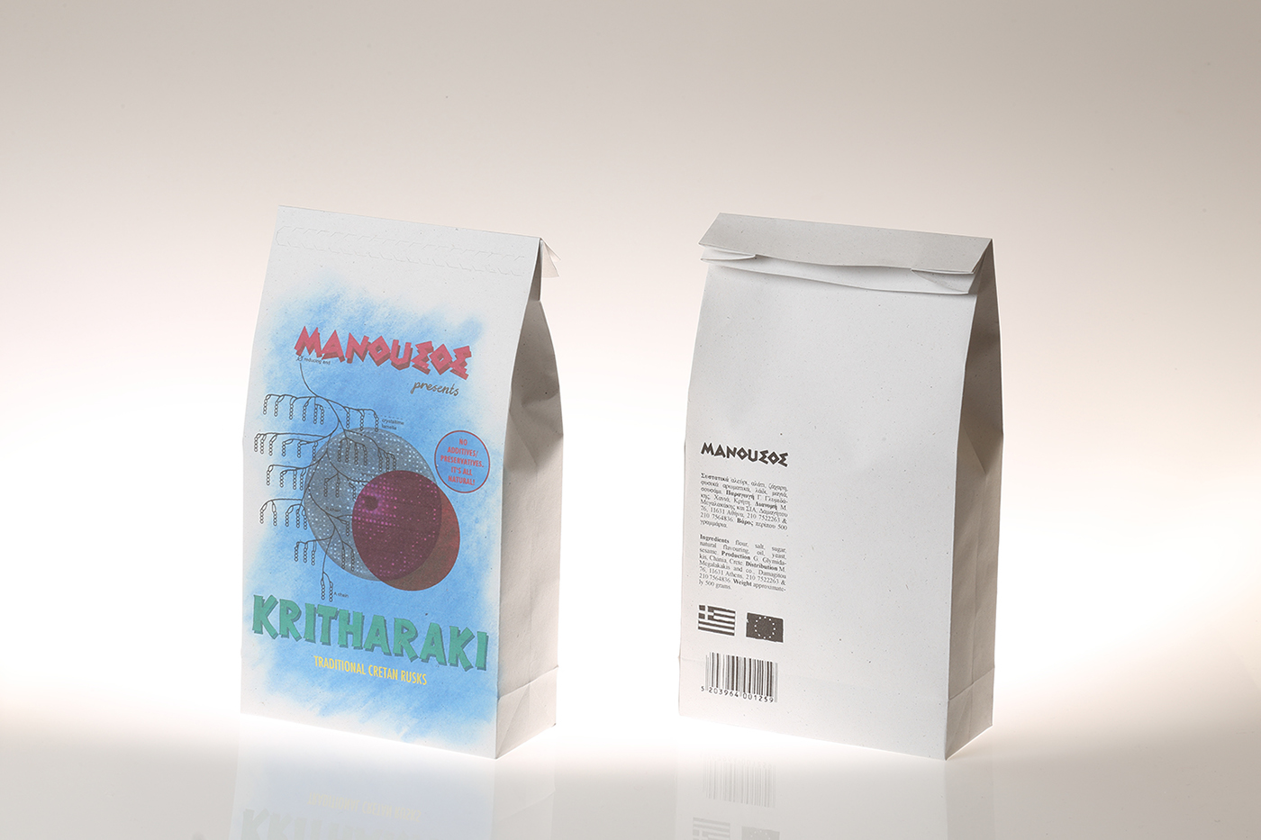
The design of the back of the packets contrasts that of the front, in that it includes only text (and symbols). The text is set in Times New Roman (as opposed to the elaborate typefaces of the front). The design of the back is printed entirely in black monochrome and is restricted to a corner, rather than occupying the entire surface.
supervision: Vasilis Marmatakis, Vakalo Art & Design College
photography: Thodoris Fragkos [http://www.thodorisfragkos.com]


