


—
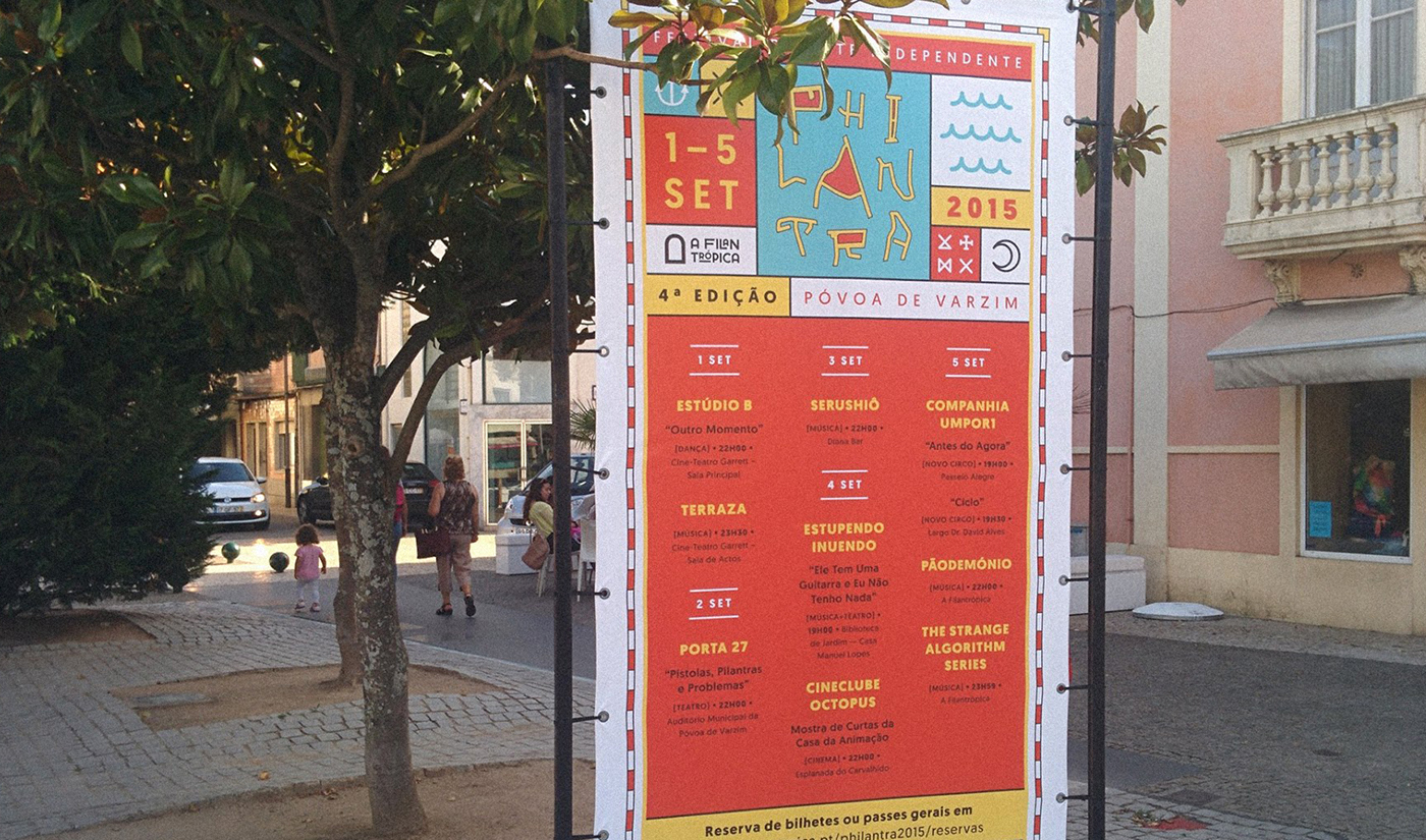
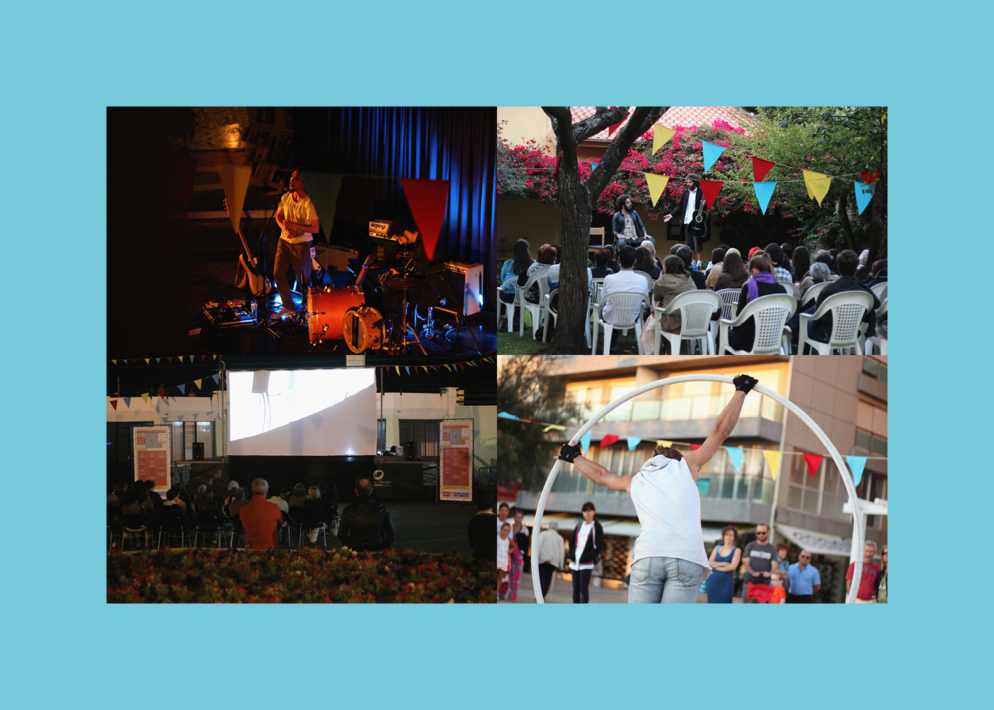
Philantra is an Independent Art Festival held in Póvoa de Varzim (Portugal), annually produced by A Filantrópica – Cultural Cooperative in early September. The main aim of this festival is to support and highlight emerging artistic projects from different fields, such as music, dance, theater and circus; offering to its community a diverse, artistic and aesthetically demanding program, with affordable events and shows for all ages and audiences.
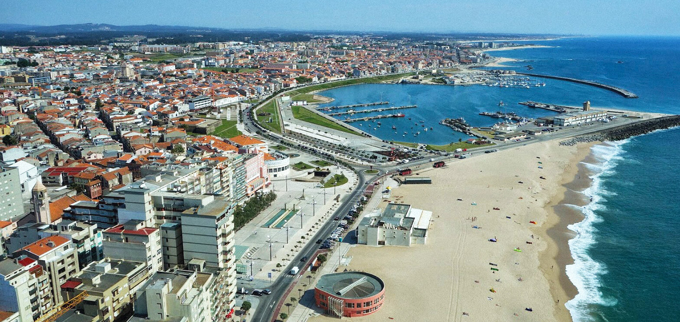
In 2015, for its 4th edition, Philantra presented a more inclusive and broader proposal, with a clear idea about how, during the first days of September, inhabit the city of Póvoa de Varzim. Suggesting an artistically rich, bold and multifaceted itinerary through several city sites, both conventional and alternative, Philantra has stated itself as a landscape transformer phenomenon.
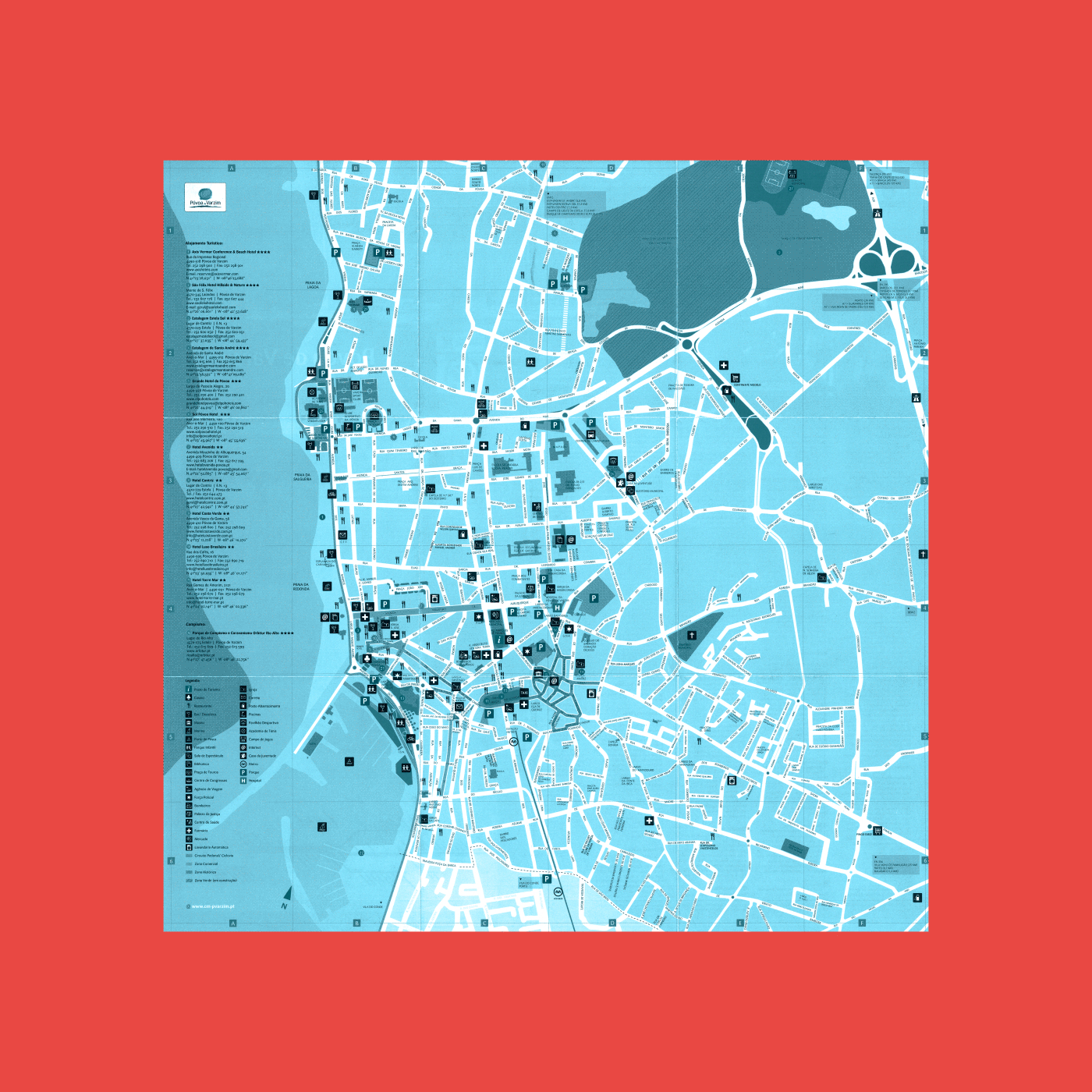
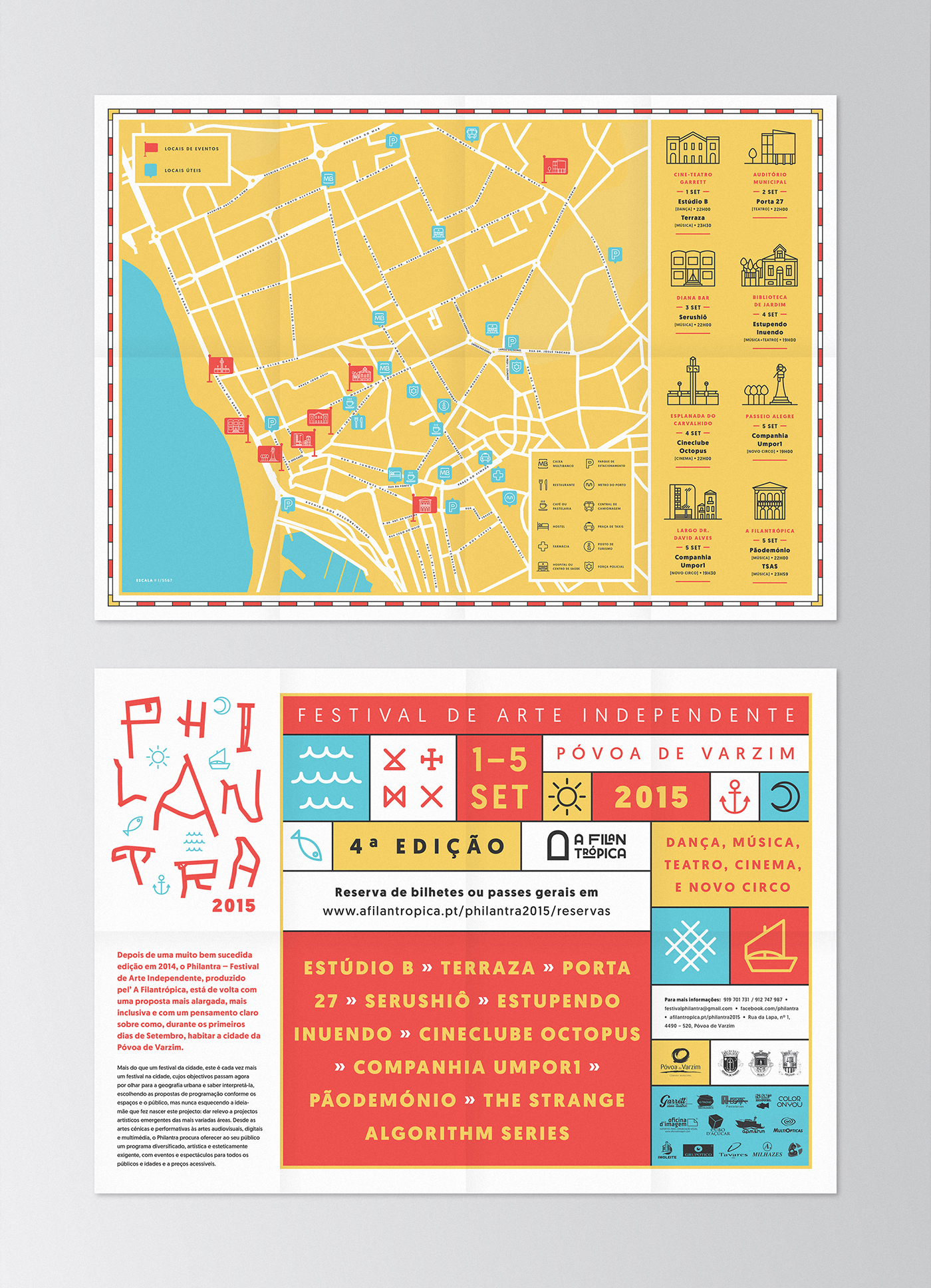
We’ve developed the identity of its 4th edition, including all the communication supports, both digital and printing. Taking into account the motto of the festival for this edition: inhabit the city of Póvoa de Varzim, offering the public an artistic and cultural route through the town; we worked around the idea of the map, especially this city map, looking at its urban geography and trying to reinterpret it. We get inspired by old and contemporary maps, but also by the typical elements, symbols and colors that best represent this city, its culture and traditions; in order to create an identity that not only shines the goal of the festival but also highlights the most striking and unique features of its birthplace.
—
Lettering
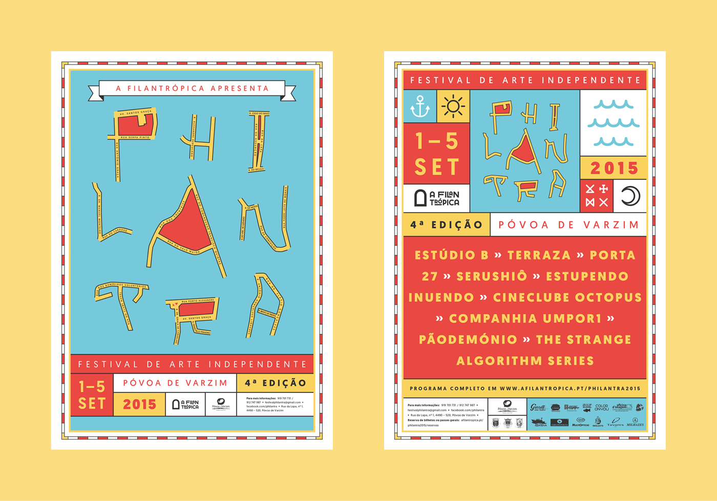
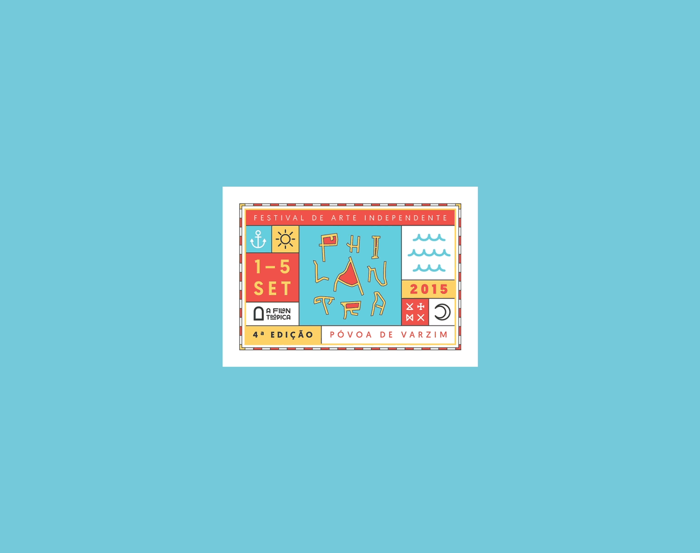
All the letters that compose the word PHILANTRA were found in the city map and drawn directly from different streets of Póvoa de Varzim, having been later reordered but keeping the original ratio between them.

—
Inspiration
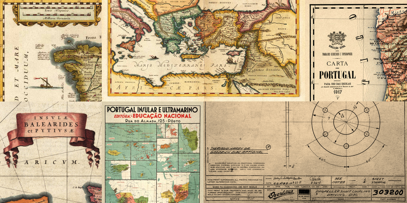
Inspiration
We get inspired by some basic elements and characteristics seen in maps, especially the older ones, and technical drawings. The decorative frame of the posters and other supports was based in the border commonly used in old maps as a scale indicator and its embellished ribbons were reeinterpretated and simplified to showcase some headlines. Also the title blocks used in technical drawings, usually drawn at the bottom of the paper, were the main inspiration to create the graphic compositions of the posters and other itens, using modular blocks.
—
Posters & Outdoor
—
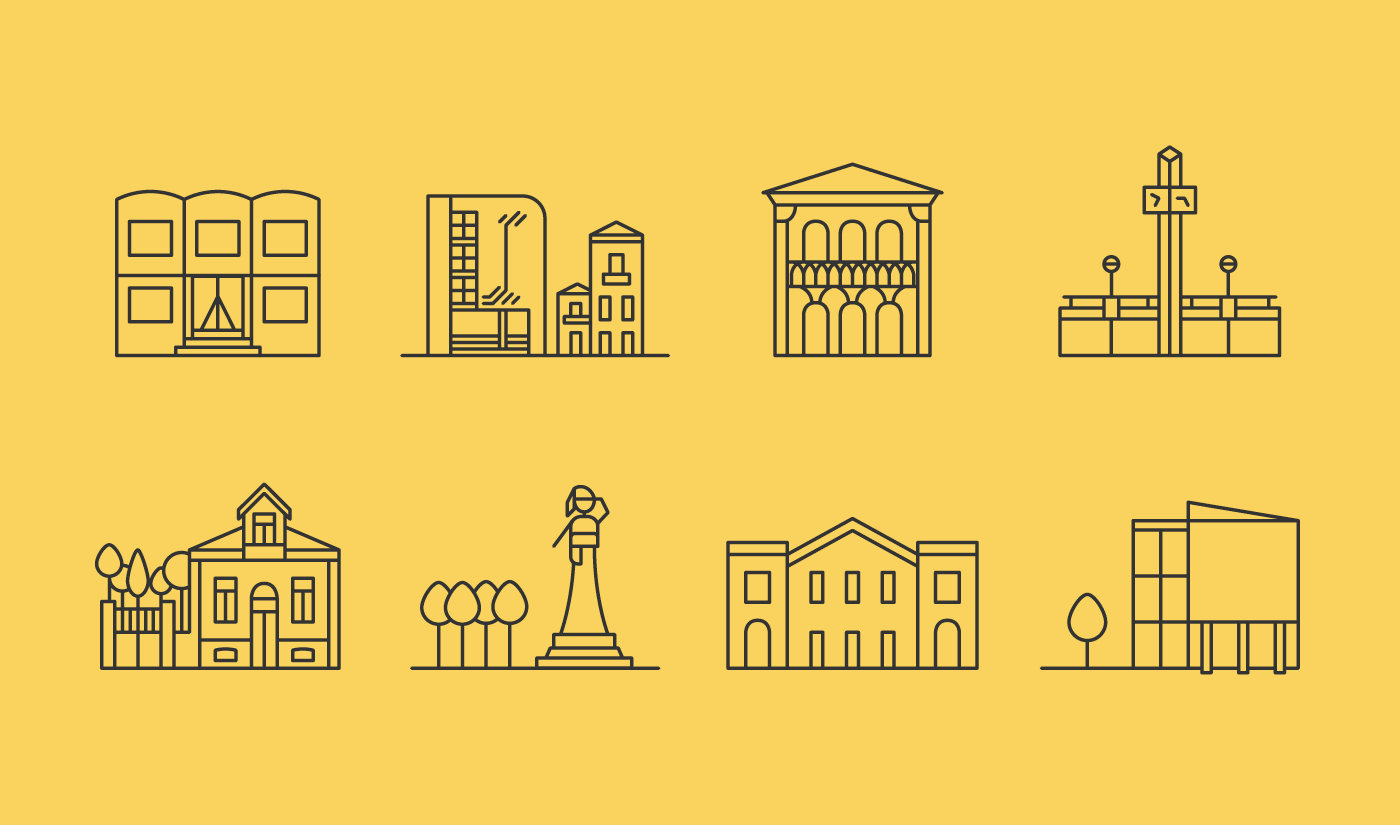
Iconography
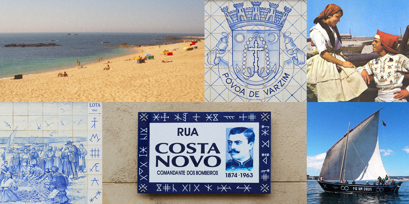
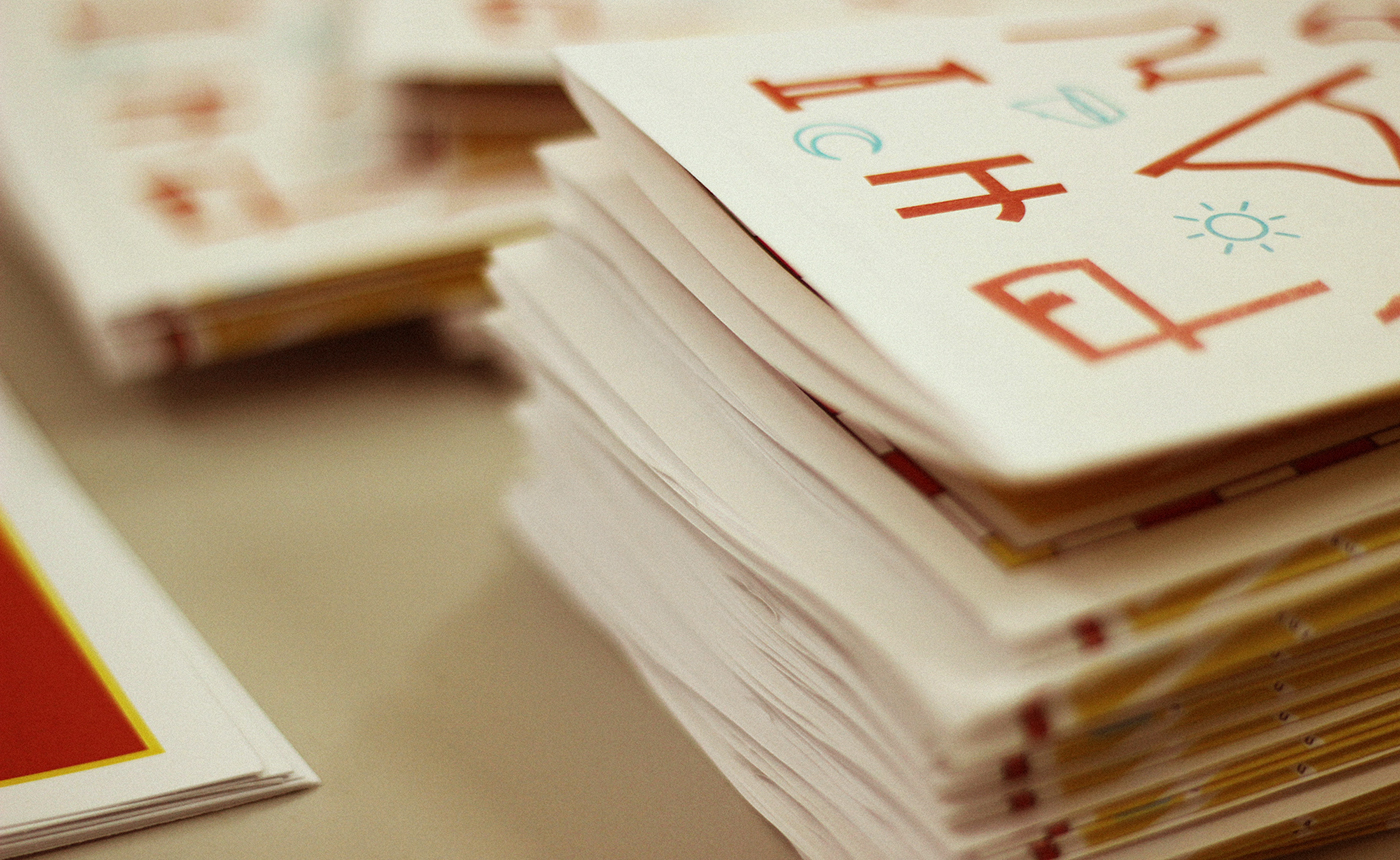
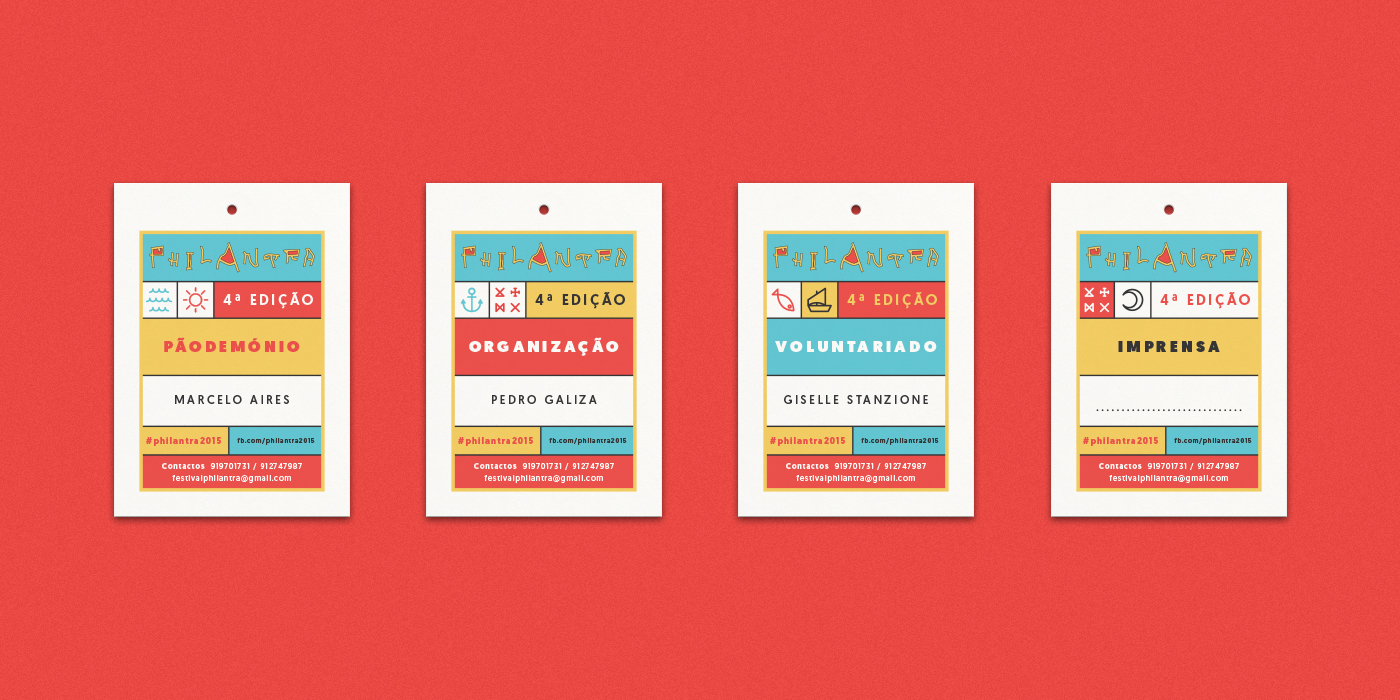
In order to create a close proximity to the city of Póvoa de Varzim, we drawn a serie of icons that illustrate the best known features and symbols of this coastal and fishery town. For example, the sun, anchor and moon are symbols of the city that can be found in its coat of arms, and the acronyms, called "Siglas Poveiras", were left by the Vikings about 1000 years ago, have been used by the fishermen as a visual language and today can be found in many places of the town, being applied in almost every types of surface and support.
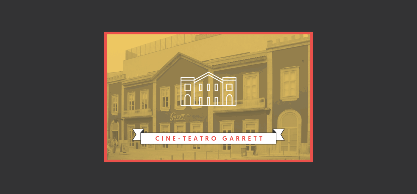
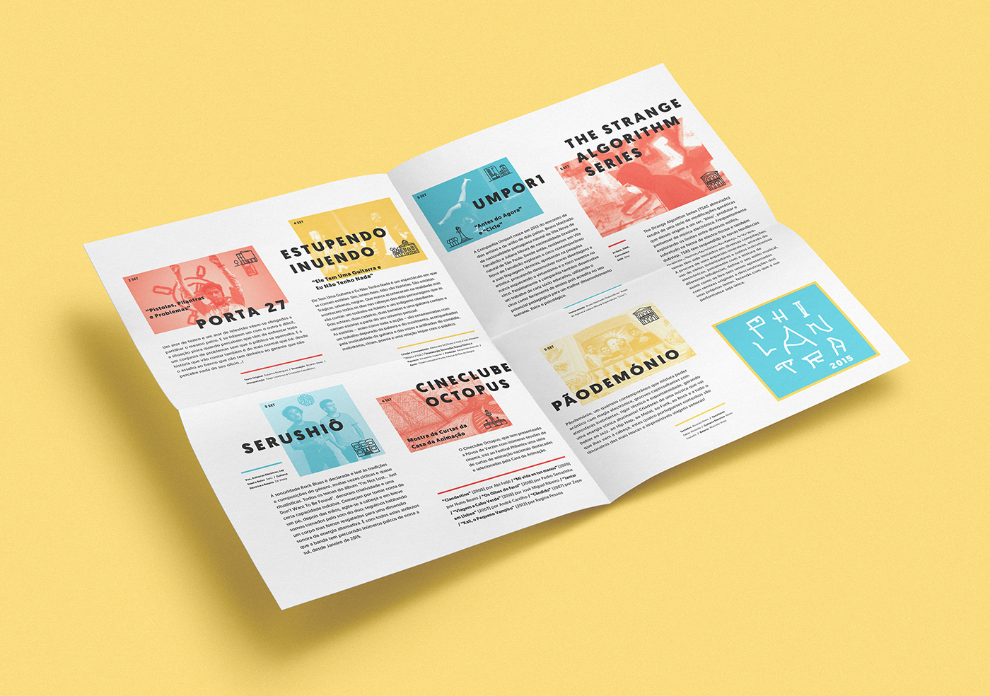
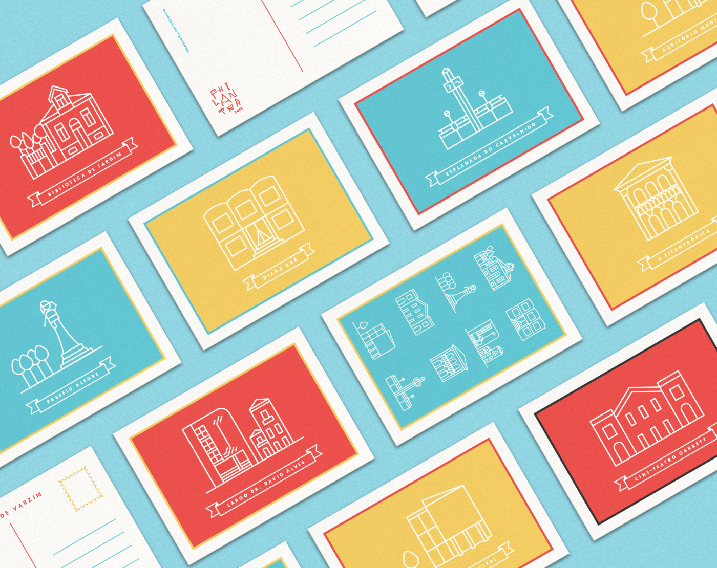
We also created a set of building icons to represent each place of the artistic and cultural route of Philantra, based on its main formal and arquitectonic characteristics. Those icons were then used in the festival events' map and other promotional materials, as well as in some merchandising itens.


—
Event Map & Artists' Fold Out
—
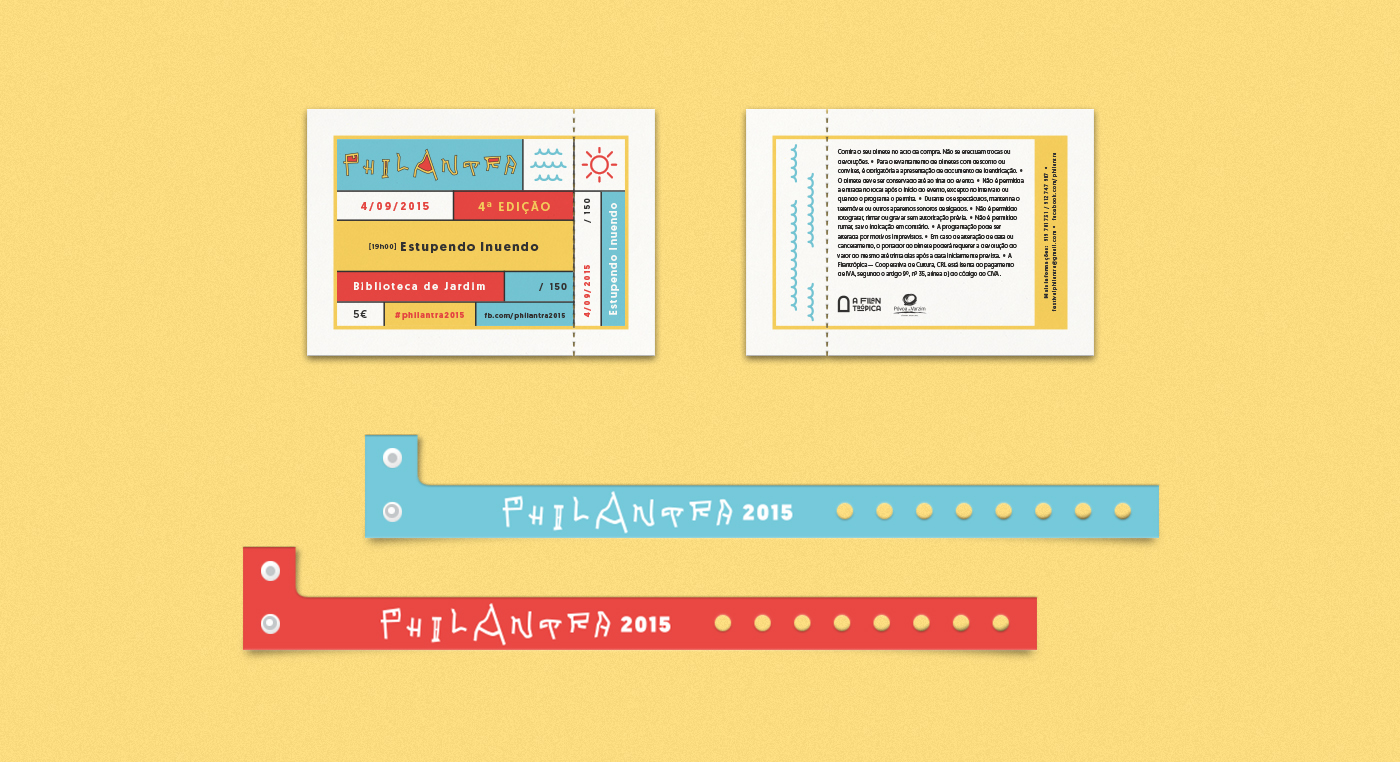
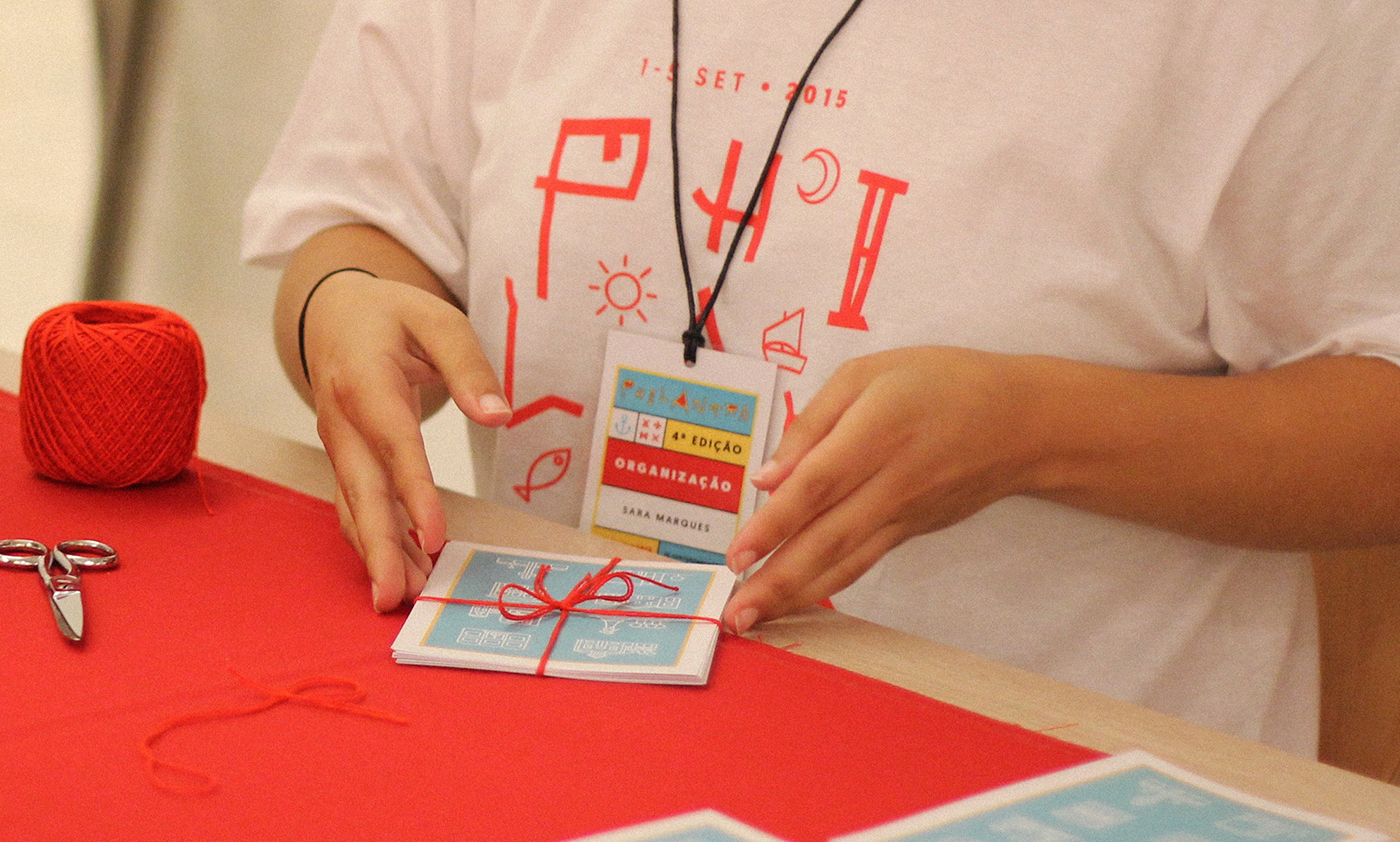
Event Stationery & Merchandising
Event Stationery & Merchandising


Year: 2015
Client: Philantra Festival
Client: Philantra Festival
Creative Direction: Snack Studio
Graphic Design: Adriana Leites
Icon Design: Adriana Leites & Nuno Leites
Event Photography: Nuno Leites
All rights of the other photos belong to the respective owners.


