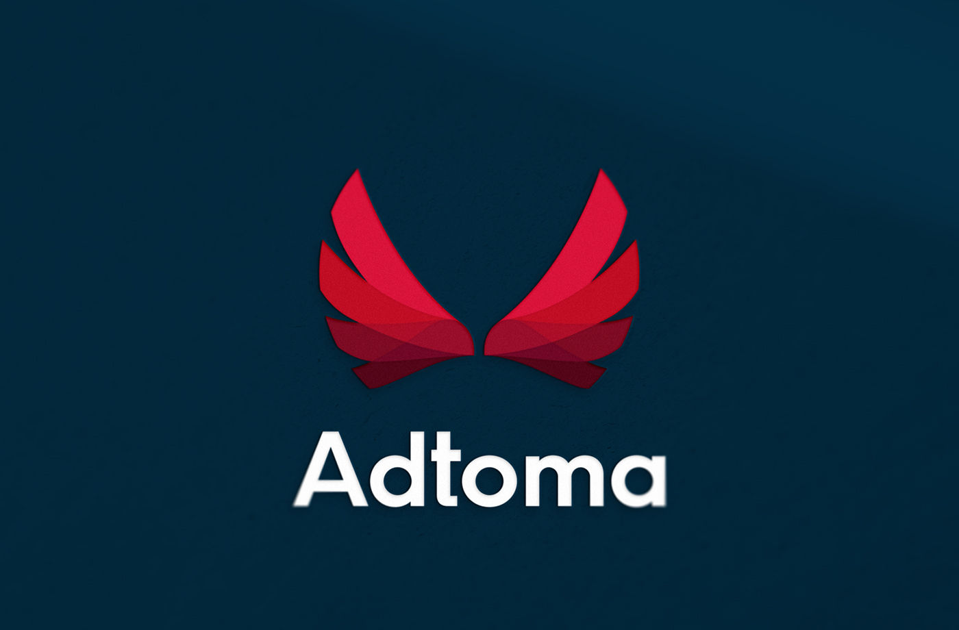
Adtoma derives its shape from eagle wings. In new sign, which is built on circle, wings has become more vertical to better fill space and maintain sign's distinctness while scaling to small sizes. Wing-like elements are finished in abrupt manner, to evoke circle shape. Wings are more friendly, they don’t look dominant neither imperial.
Colours, with slight difference of hue give effect of gradient transition and even of transparency and convexity. Logo is lighter than old one, more virtual and resembles digital entities that cannot be measured. lineament of wings is dynamic. It resembles hunting eagle but also, to soften the logo expression it resembles hands in protecting entanglement as well as lotus flower.


Thank You for watching!


