

BRANDING -
LOAD DIAL
- Brand Logo & Identity Design
- Stationary Design
- Re-branding
- Stationary Design
- Re-branding
-----------------------------------------------------------------------------------------------------------------------------------------------------------
----------------THE DEAL
To create a Brand Logo for Load Dial, an app that aspires to be the 'Uber for Packaging and Logistics' in the transportation industry.
As an investor in this startup venture, the client felt the need to completely rebrand the existing logo and identity. The brand name, Load Dial had the simplicity of communicating the idea behind the startup. As the story goes, it was also inspired by an existing well known services and utilities app in India called Just Dial.
Now now...Dial is a universal word.

THE DOPE
The brand name, while simple was challenging in itself from a visual standpoint. The client was clear on one aspect. Avoid Boxes. At least not in the way that would be the standard, visual bore.
We researched and sketched out multiple design ideas trying to avoid the use of boxes yet always coming back to it. I mean, when you talk about parcels or packaging - what comes to your mind?
The irony is Hilarious right?

During one of these ideating sessions, simplifying the name led us to a couple of design pointers. The core idea of this brand was it's location based search in the app. While Load symbolised weight > depicting weight in this context meant packages or boxes; Dial indicated the ease of finding or calling the service. How could we show Dial, visually?
Why not signal waves? An app uses the same signal waves for tracking and communication, doesn't it? And how best to represent a map location but the well known marker pin?
This was a Eureka moment, minus the shower scene, I tell you.
Using the marker pin as our core base, we worked on visually incorporating our other elements within it. Now how do you show a package box when the brief was clear to avoid it? You stack 'em up and take an angle of them that reveals the letter 'L', smack in the center! The signal waves complete the other angle to form the letter 'D'.
That's just dope, isn't it.
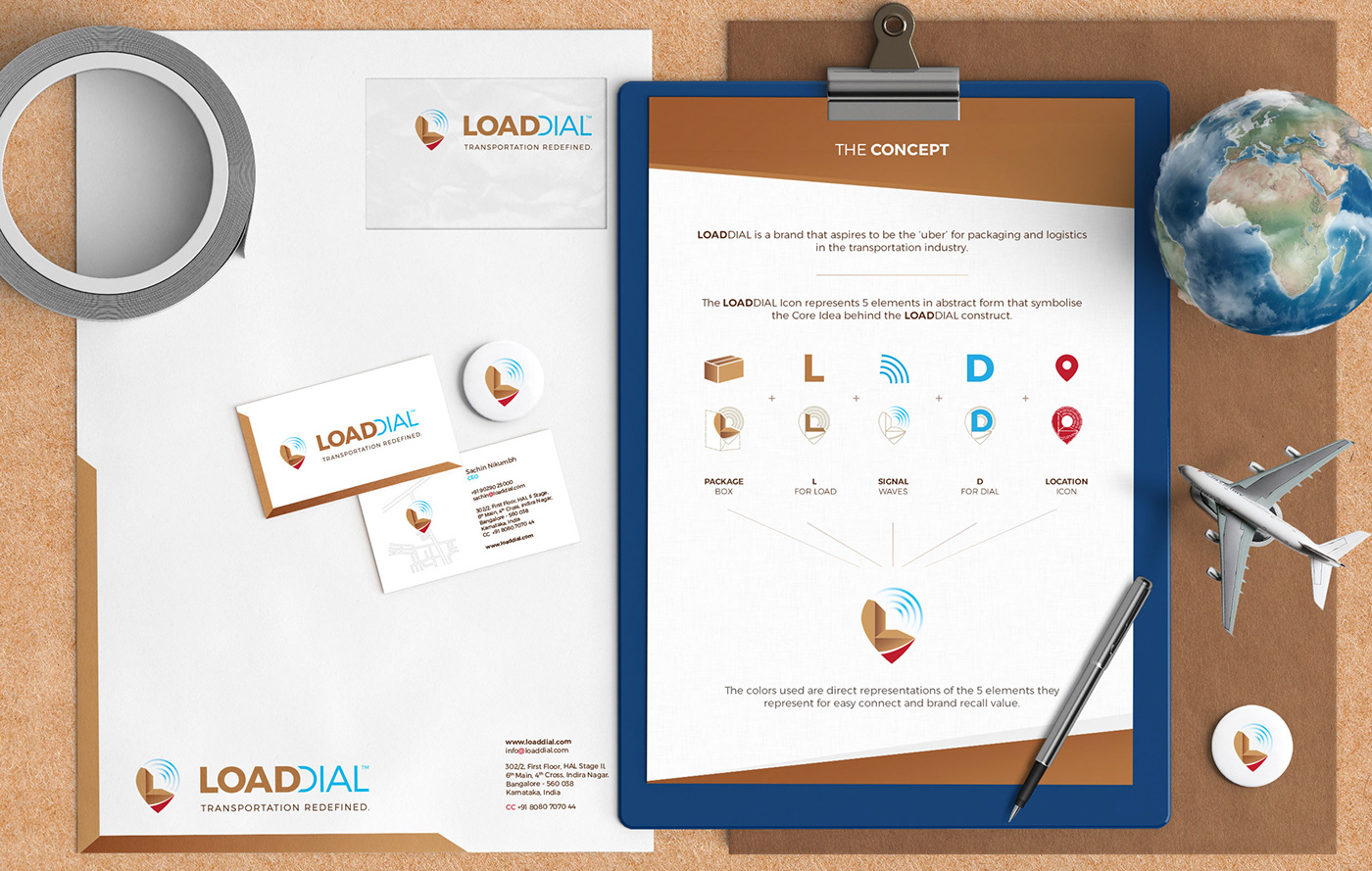
The sans serif typeface is a combination of 2 styles. Bold to represent Load and Light to represent Signal waves aka Dial.
This is further represented in the Brand Name where the Double D has been maintained by showcasing the 'D' in Dial as signal waves and the 'D' in Load to represent weight.
The Tag line was shortened to Transportation Redefined, as that is the intent of the brand.
We replicated the design theme along the rest of the brand's identity like using the marker pin on actual locations of the Indian offices on business cards, thereby allowing it to fit perfectly with the ethos of the brand.
And we still got to use the Box!


