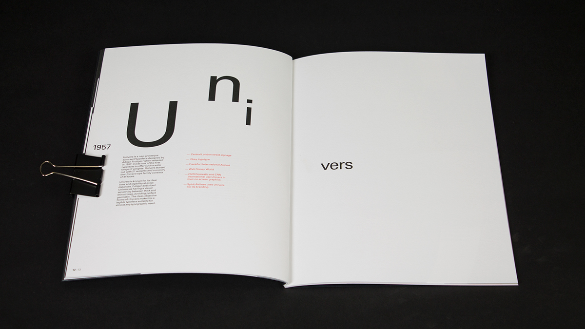
This is a publication about one of the greatest typeface designer Adrian Frutiger that passed away last year, it was made to celebrate his life work. I wanted people to see typography through his eyes, that's why I decided to focus on the inner shapes of the letterforms, something Frutiger himself was more concerned about. That's probably why his typefaces are considered to be the most legible.