Successor of the former “Casa dos Operários Poveiros” (House of the Povoan Workers), social purposes institution founded in the 20s by publicist Baptista de Lima in the coastal town of Póvoa de Varzim, “A Filantrópica” was born in July 16, 1935 as a social and philanthropic institution, keeping the previous headquarter in the old building of Montepio, now over 150 years. Having been primary school, library, space for gatherings and socializing, and even consumption cooperative, in 1987 it was established as a cultural cooperative, and after almost 30 years of its restructuring, continues its journey as a cultural institution, having been printed to its action, in the last years, a new dynamic.
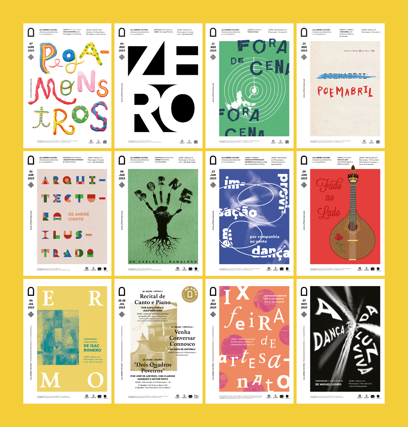
In 2015, year in which “A Filantrópica” celebrated its 80th anniversary, we were invited to develop its new visual identity, which opened a new chapter in its history. This new chapter included the promotion of the cultural landscape in the municipality of Póvoa de Varzim, scheduling a regular cultural program that favored the emerging creation, as well as a varied educational offer in many artistic areas, positioning the cooperative as a bold and innovative cultural center, an axis of creation and dissemination of the latest artistic trends.
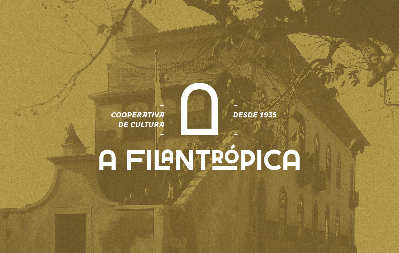
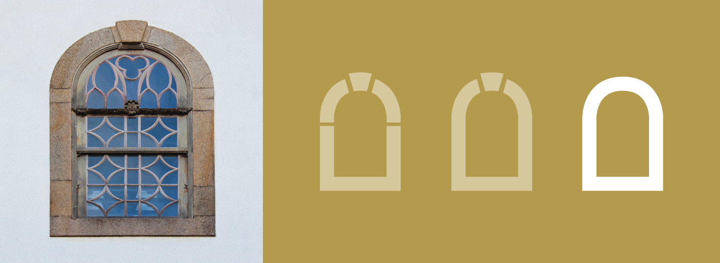
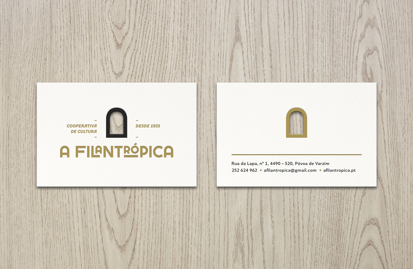
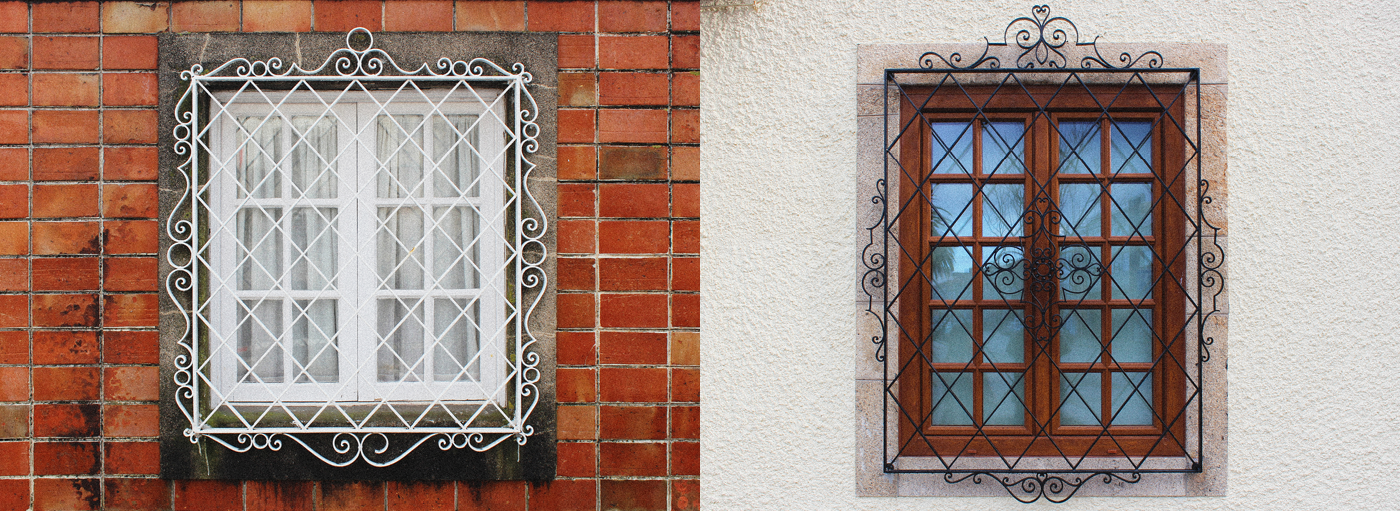
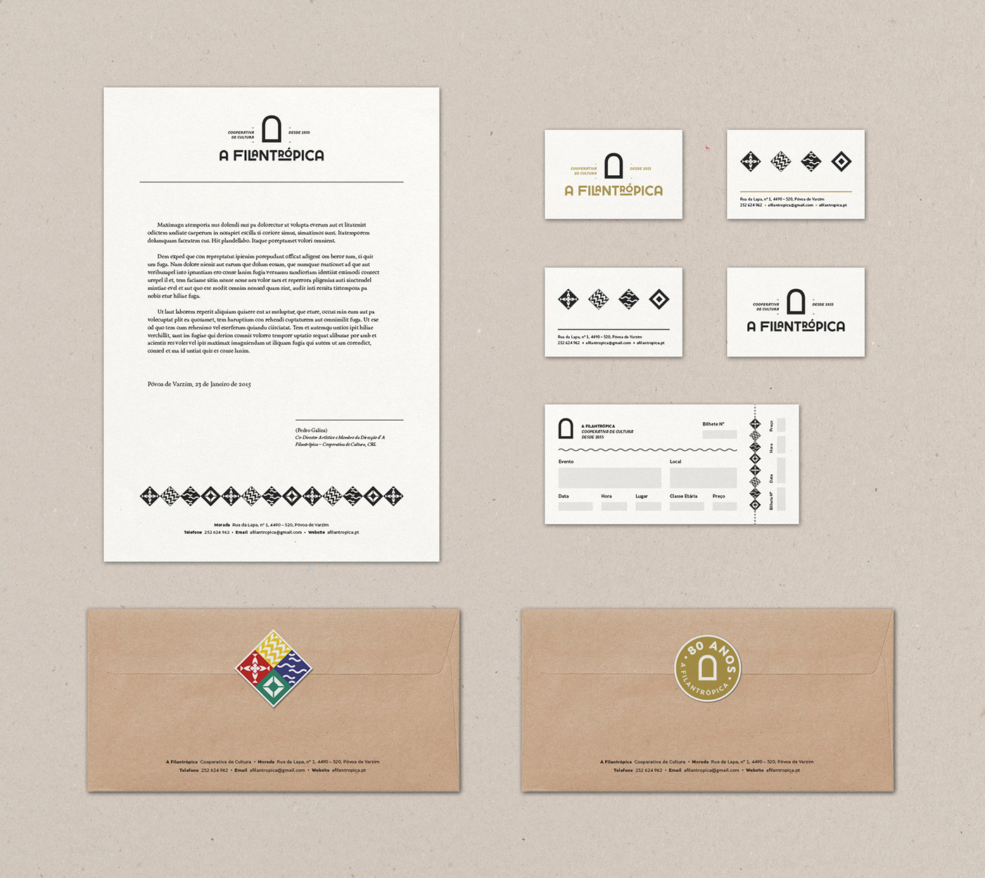
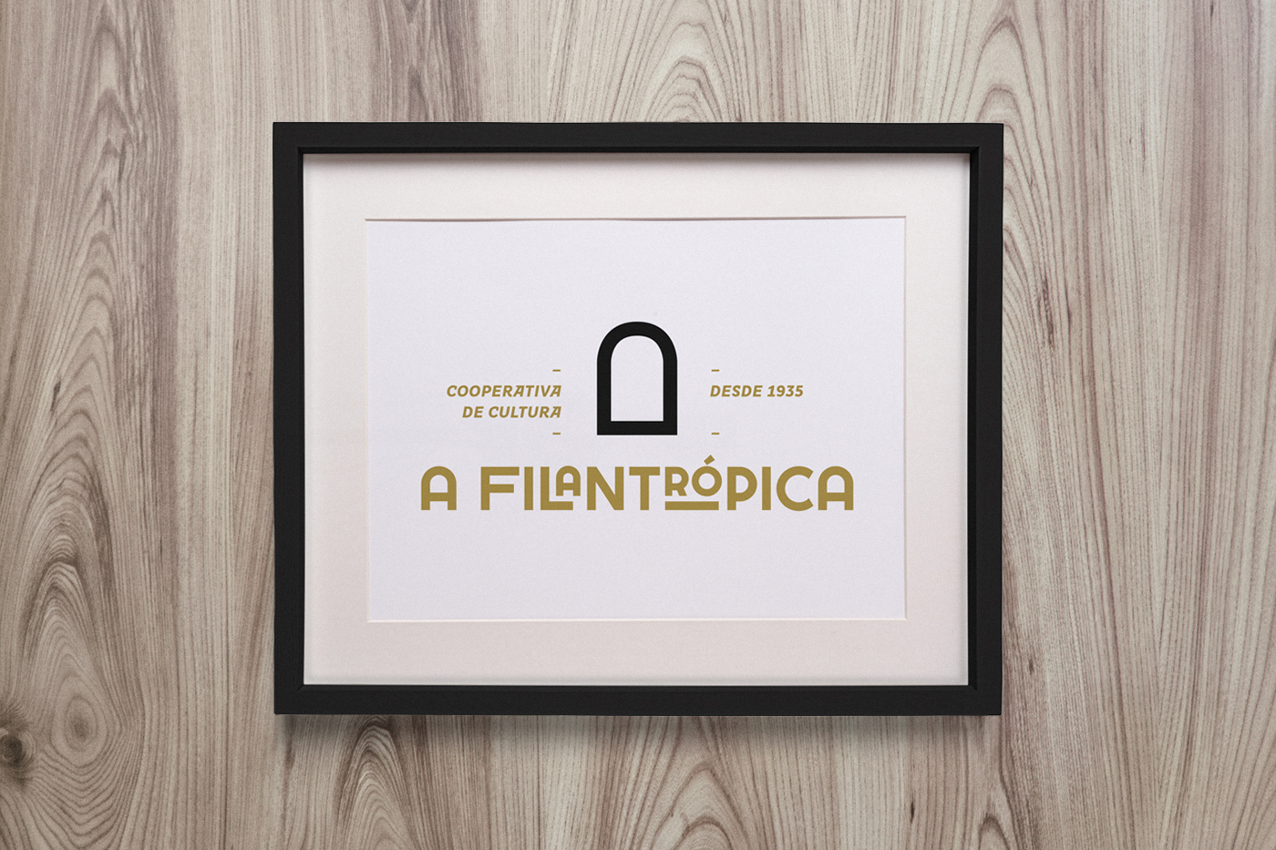
With all that in mind and avoiding the cliché symbol of the people holding hands predominant in the previous approaches to the logo, we embarked in a deep research to the archives of “A Filantrópica” and its city, aiming to know about its history and context, and we also went to the streets to capture its surrounding environment. After all the hard work, here are the results we're happy to present to you. The logo we proposed includes a simple mark based on the arched windows of the centenary building facade, which is a very distinctive architectural element of this building and one of the few that resisted to the successive restoration works. It’s a welcoming open window ready to talk about art and culture with whoever wants to join the conversation. The color chosen to paint this window was the gold to honor the 80 years of the cultural cooperative but also inspired by Art Deco, an influential visual arts style that began flourishing by the same time of its foundation.
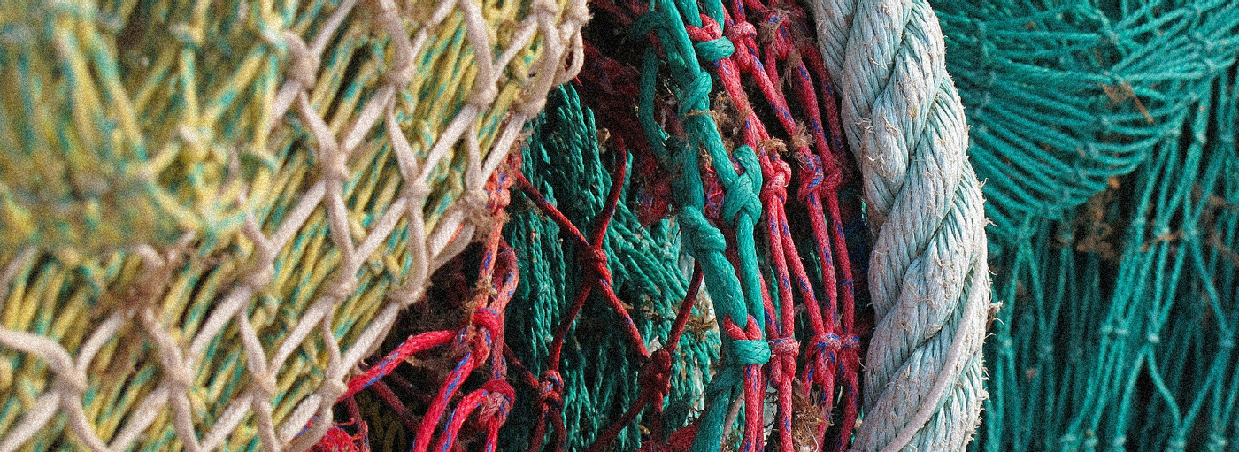
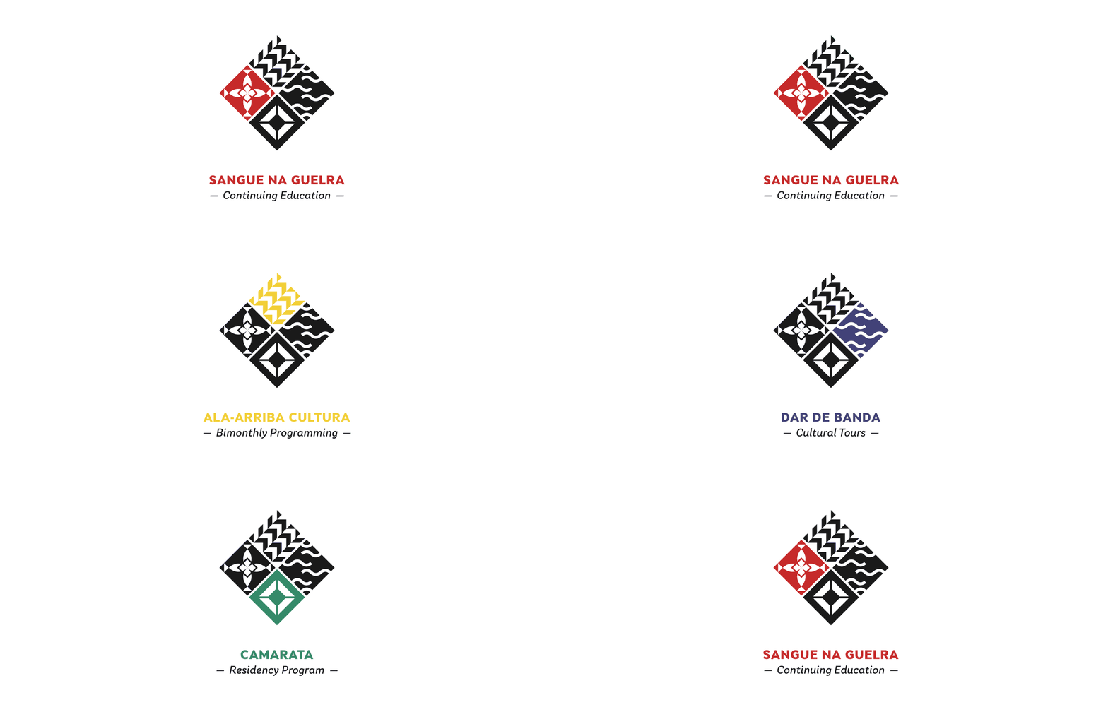
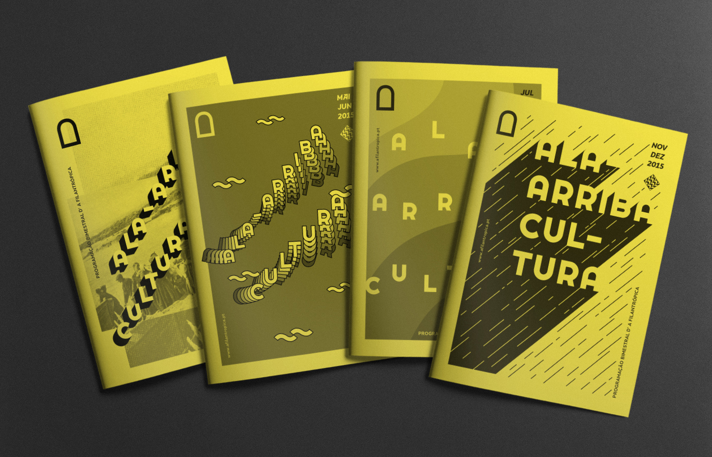
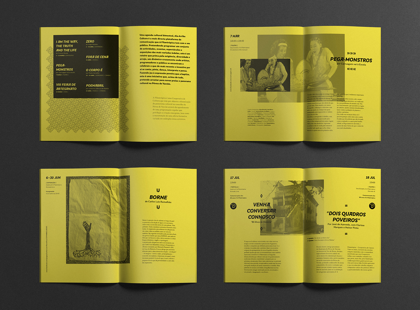
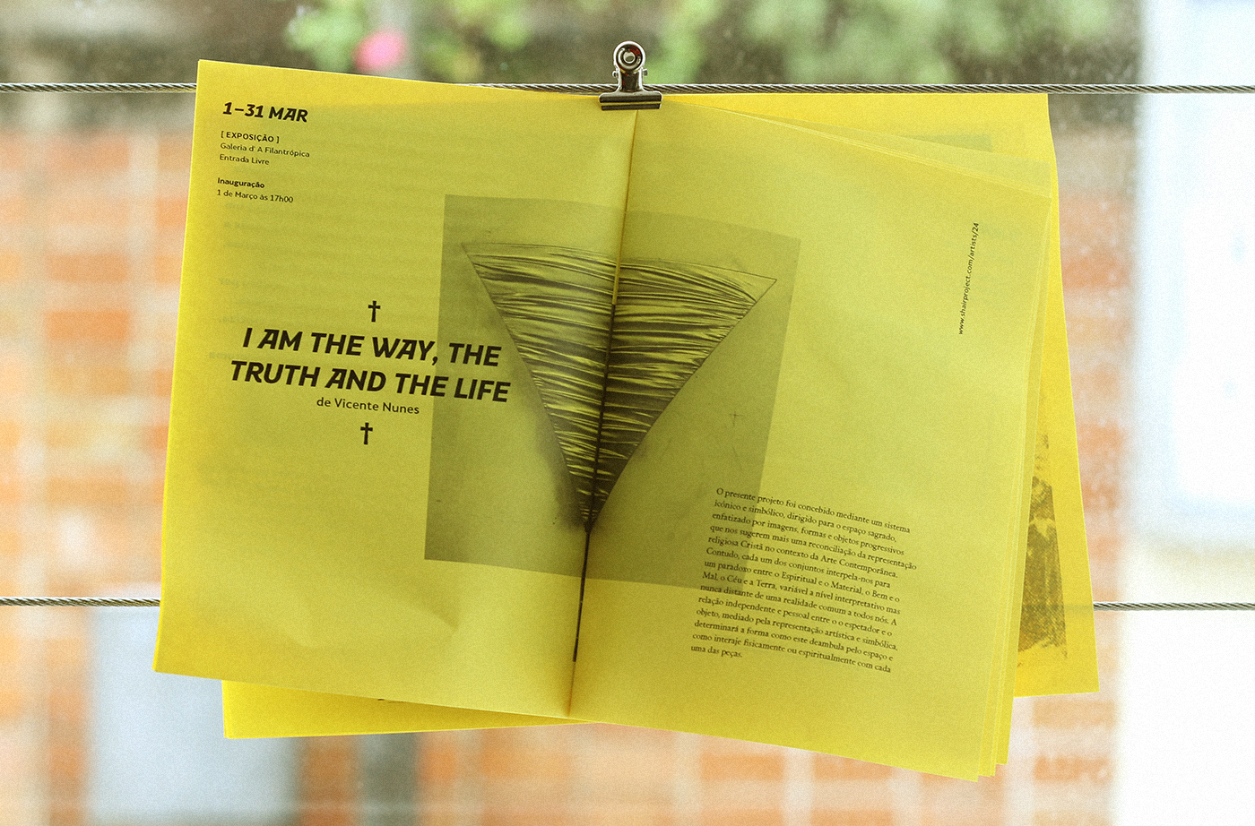
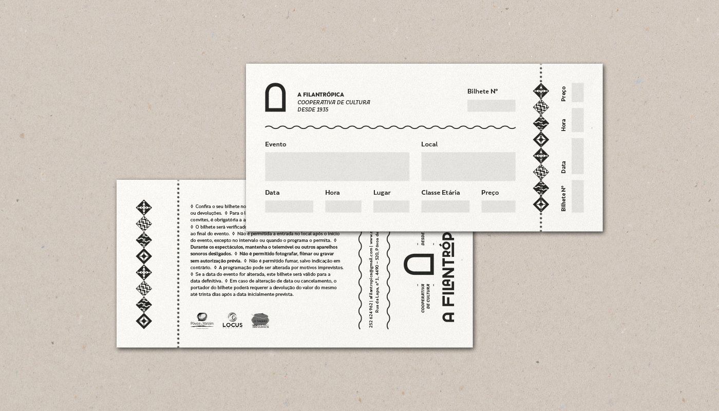
Apart from the logo, We also created four symbols to identify the four different departments of “A Filantrópica”: “Sangue na Guelra” (Continuing Education), “Ala-Arriba Cultura” (Bimonthly Programming), “Dar de Banda” (Cultural Tours) and “Camarata” (Residency Program). All of them have a strong bond to the popular culture of Póvoa de Varzim, being their names based in popular expressions, and some of them related to the fishery, one of the main and older activities of the town. Each distinctive squared symbol was inspired by the many tiles that live in most facades of the neighborhood and created using an oblique quadrangular grid based in the fishing net and other architectural elements. Also there is a different color associated to each symbol, that conveys the spirit of each one. Red, yellow, blue and green: all of them are related to the city of Póvoa de Varzim and its culture, being used by traditional and popular festivities.
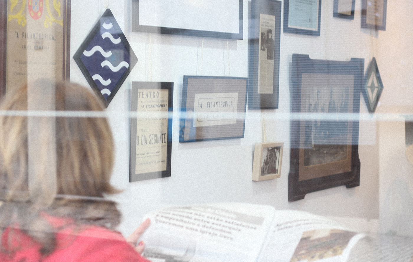
Some of the past logos of "A Filantrópica" we found in its archives







Year: 2015
Client: A Filantrópica
Creative Direction: Snack Studio
Graphic Design: Adriana Leites
Animation: Nuno Leites
Photography: Nuno Leites

