Here's the whole graphic design work I've done for the semesters of fall 2015 to spring 2016.
Intro to Graphic Design Class
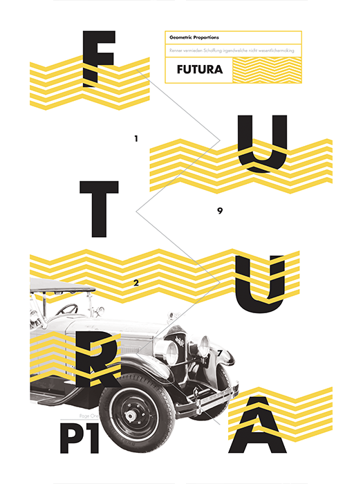
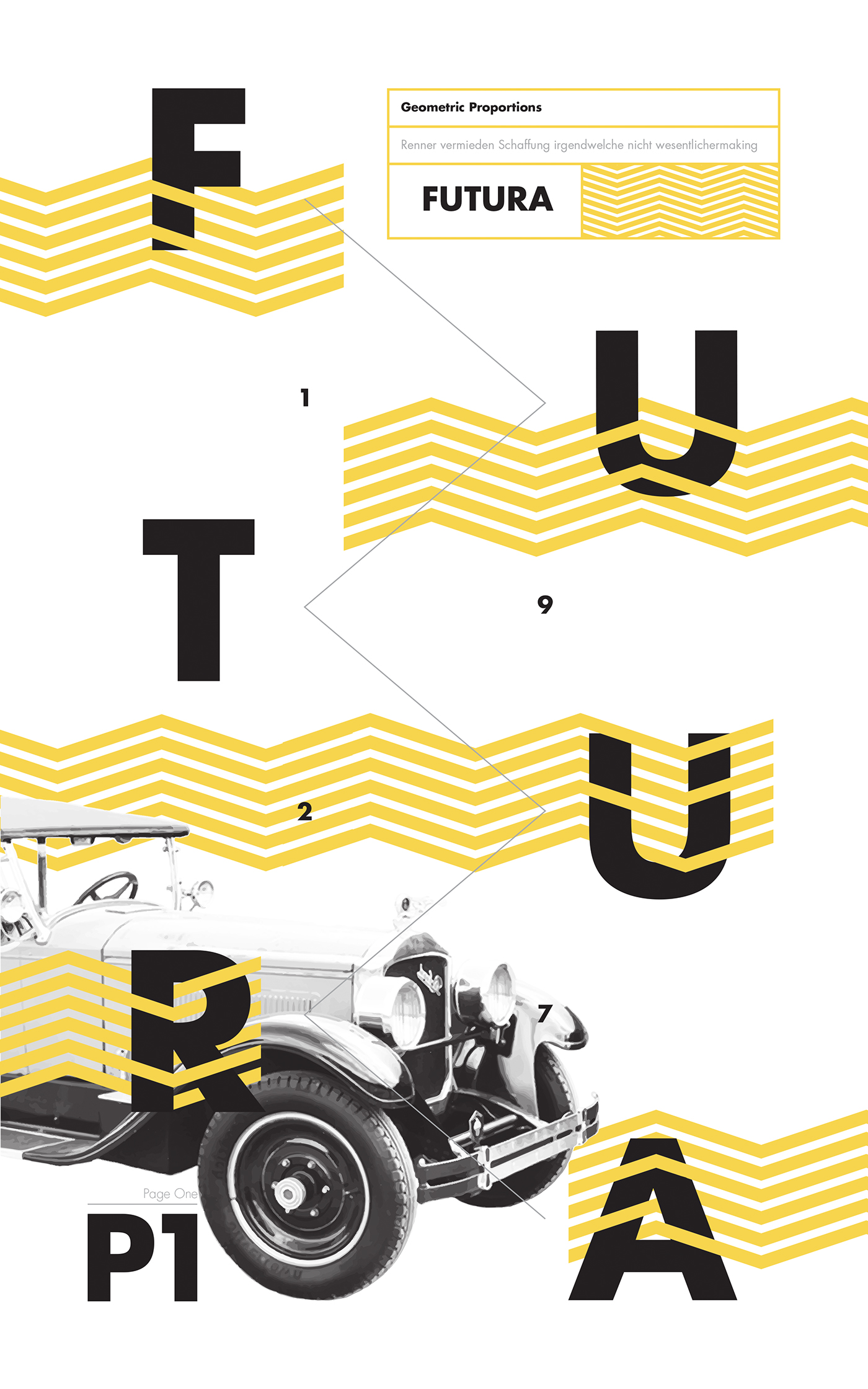
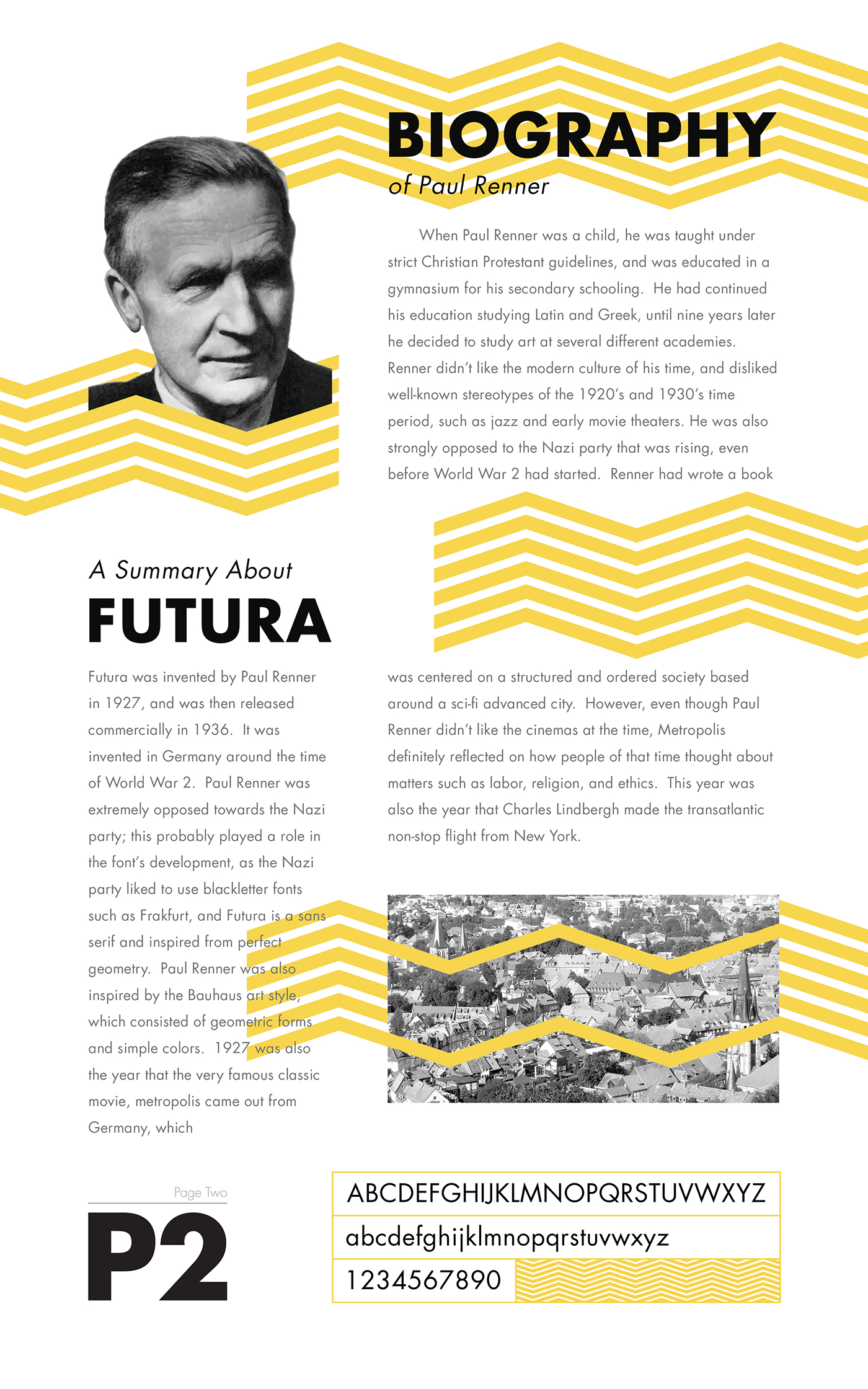
Futura Typeface Poster (Regional ADDY Award Gold)
The goal of this project was to highlight a famous typographer and show the history on the back, and showcase their typeface on the front of the poster. I chose to showcase Futura, and chose this typeface due to its completely geometric forms. I based the design off of the geometric forms of popular 1920's architecture and design.
Front
Back

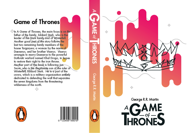
Game of Thrones Book Redesign
The goal I had in mind for this project was to convey a different perspective on how the books are viewed. My hypothesis was that more younger people are attracted to the TV show rather than the books. So by making the book covers more modern and colorful, it would grab a younger audiences' attention, therefore increasing book sales to a wider audience than there were previously. I chose what I thought to be very iconic figures in each book to be displayed to make each cover look unique, however, styling everything very similarly to make it look like a consistent piece.


Typography Class
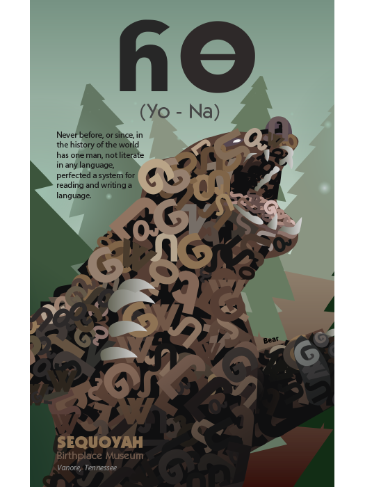
Cherokee Type Poster
The goal of this project was to create a poster design entirely made of a cherokee letter typeface we made as a class. Most all of the shading was done with letters made by me and our class, and some gradients for shadows. The entire poster was created in Adobe Illustrator.

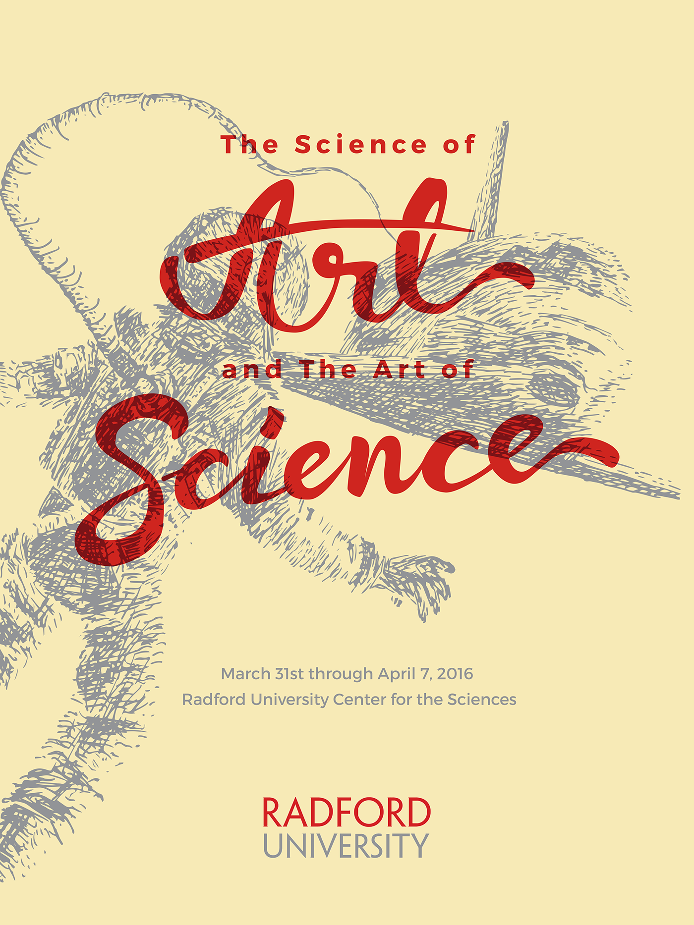
The Art of Science and the Science of Art
The goal of this project was to create a poster design for the Science of Art and the Art of Science event going on in Radford University. I created a hand-drawn pen and ink drawing of an astronaught overlooking his space shuttle to which his oxygen is attached to. I created the entire poster using the official Radford University brand colors. I also hand-drew the Art and Science handlettering to show the creative side of the event, and I used Montserrat, a very geometric sans serif typeface to show the scientific side of the event.

The Art of Science and the Science of Art (2)
Another poster I created for the same event, but with a more minimalistic/modern approach. I chose to emphasize on this poster that scientific theories are based upon the most current and up-to-date information, so I wanted to reflect that in a modern, up-to-date design.


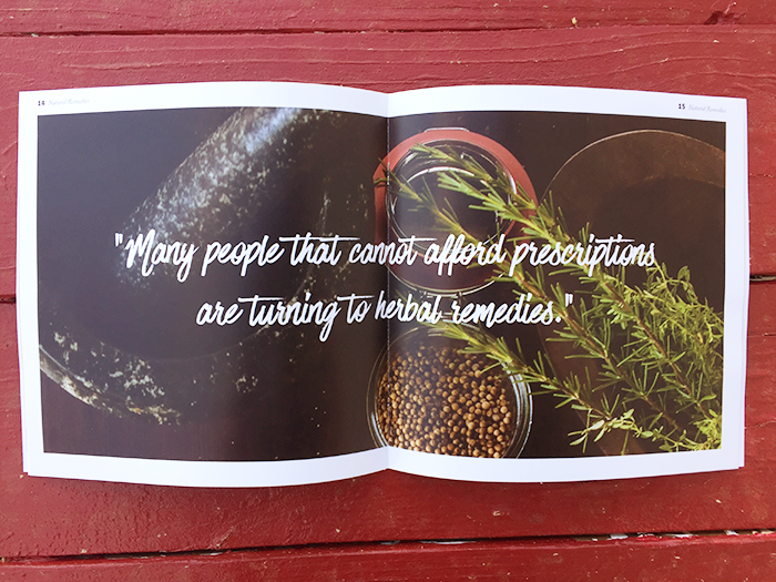
Natural Remedies Interest Book
For this project, we had to create a booklet of a topic of our choice that we found interesting, and use advanced typographic techniques to create a layout for the booklet. I chose the topic of using natural herbs and roots to solve ailments, instead of using expensive and questionable prescriptions.


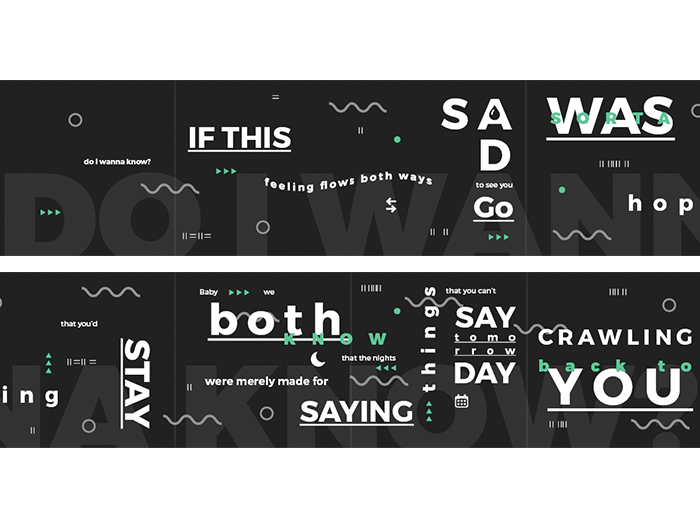
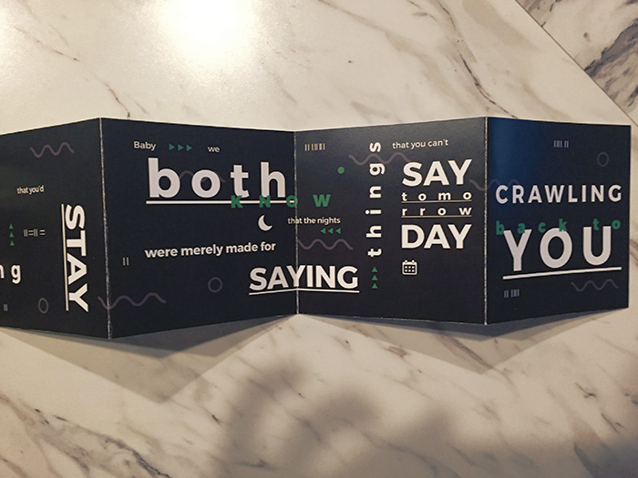
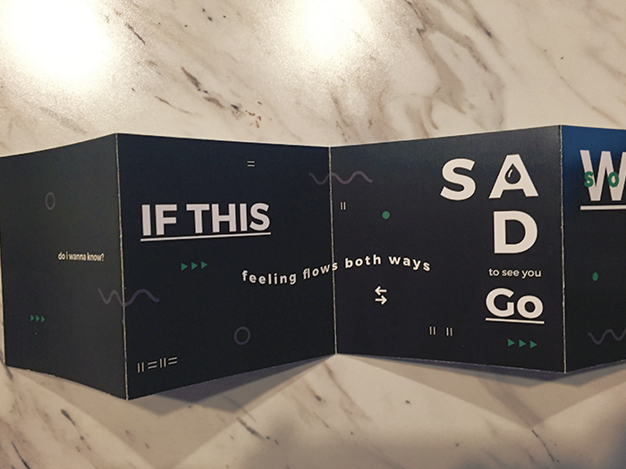
Expressive Song/Quote Accordian Booklet
For this project, we had to create an accordian-fold booklet and illustrate the words in an visually expressive way to convey however someone is speaking/singing. I chose to illustrate a popular Arctic Monkey's song, "Do I Wanna Know?". I thought that with their branding they have, a minimalistic with a modern appeal, and with a few throwback themes mixed in would be the best execution for this particular band. I wanted to challenge how the reader sees the piece, by having the reader follow the green "play" or "fast forward" icon, similarly seen on tape recorders. The waves in the background represent the "AM" waves you'd see on their album cover; keeping to a similar branding as the band.

Graphic Design Production Techniques Class
Kid-Friendly Cereal Mascot Design
For this project, we had to come up with the name of a cereal, and invent a mascot that would get the kids' attention in hopes they would want to buy the cereal. I chose to make up a cotton candy cereal called "Katch", and to illustrate the name, I made "Cotton" the cat catching the bowl of cereal, ready to take a bite with his spoon. This entire project was made solely in illustrator using gradients, shapes, and the pen tool. The mascot design was sketched with pencil and paper and scanned into illustrator.

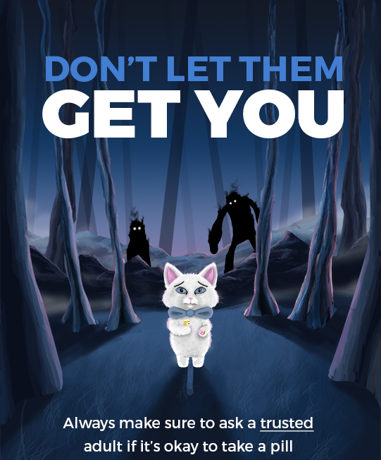
PSA Poster Digital Painting
For this project, we had to do a PSA poster to which we advise children to make a good choice and/or influence them away from the bad choices. For my project, I decided to do mine on the subject of kids taking prescription pills without the supervision of an adult. To me, it's important that kids don't fall victim to taking too much of a prescription, or the wrong prescription, and to make sure kids know who to talk to if they need to take one.