JOANA RAINHA
BRANDING
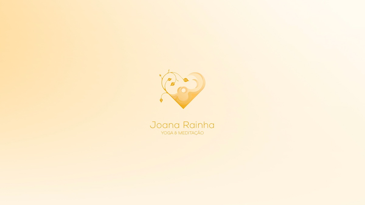
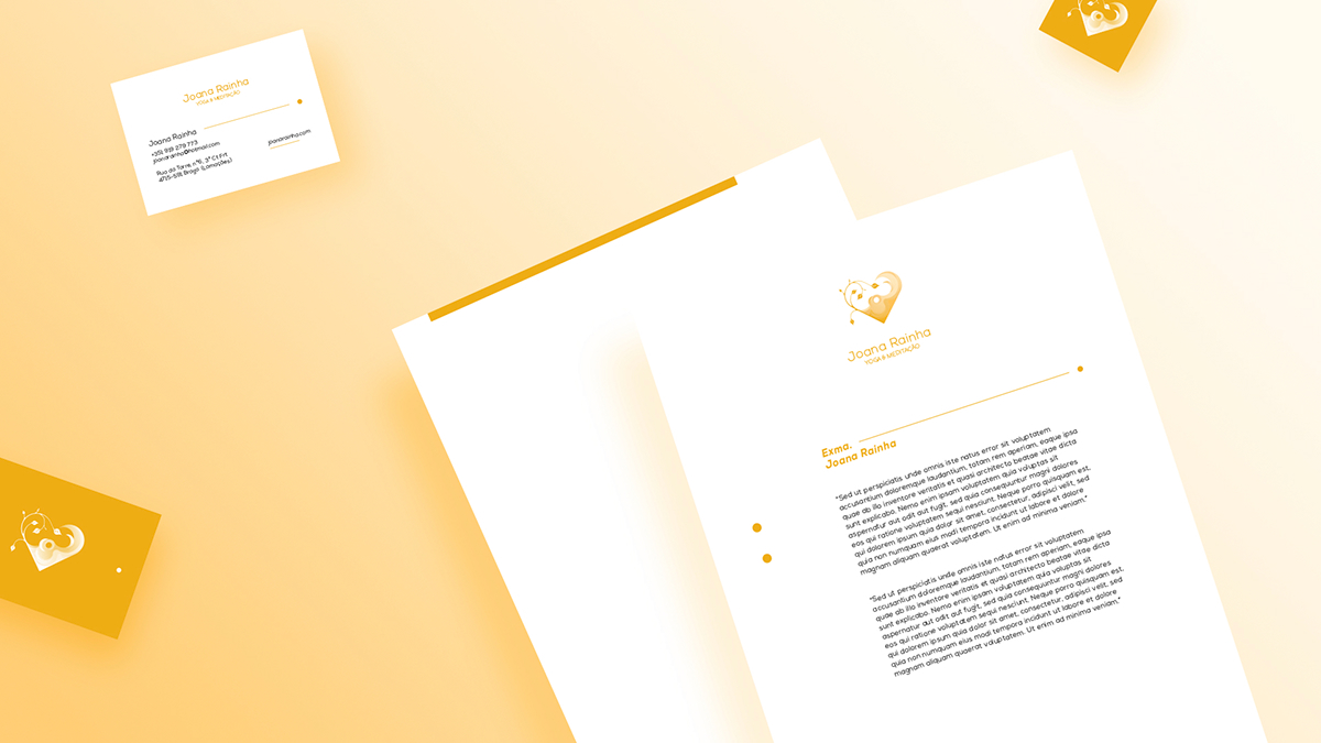
Using a circular shape and the yellow color as reference, we built a simple logo. We created it
with the function of transmitting light and calm. The brand was crafted around two elements,
a Bodhi tree and heart.
We deconstructed the tree and created a composition using a leaf. The heart, as the main element,
embraces the leaves and make up the symbol of the brand.