
Concept
Cocktail recipes all start out as science experiments before striking that perfect balance - the winning formula. For this new cocktail bar identity I decided to work with this comparison in mind as it had great potential for a quirky, minimal aesthetic to create the luxury feel the bar wanted.
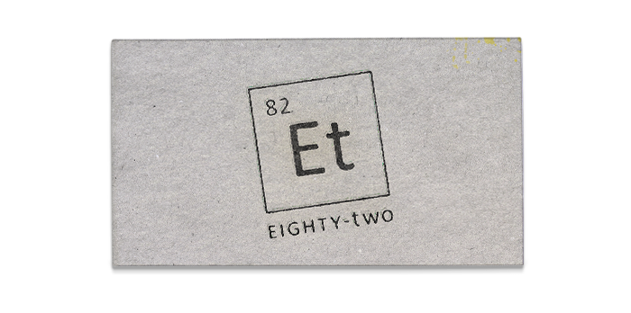
With a little experimenting myself, I discovered an interesting comparison whilst designing the logo: the initials Et match the chemical symbol for a group of compounds called Ethanes. This group contains the compound Ethanol, or as we know it more commonly, Alcohol.
Coupling this discovery with the initials for Eighty-Two, I decided a twist on the classic periodic table would be the perfect way to represent this bar with Et forming the initials of Eighty-Two. I decided to change the TWO to lowercase so it makes it clearer for the audience de-code the initials.
Periodic Menu & Cocktail Stickers

The Periodic Menu is the brands centre-piece, every element is replaced with a cocktail that customers can collect in the form of stickers.
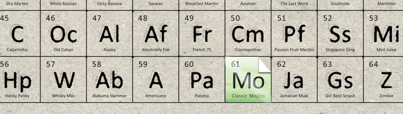
By purchasing specific cocktails, customers will be gifted a Cocktail Card which contains a sticker to pop on their menu as a neat collectible and incentive for repeat business.
Cocktail Cards & Opening Night Invitation
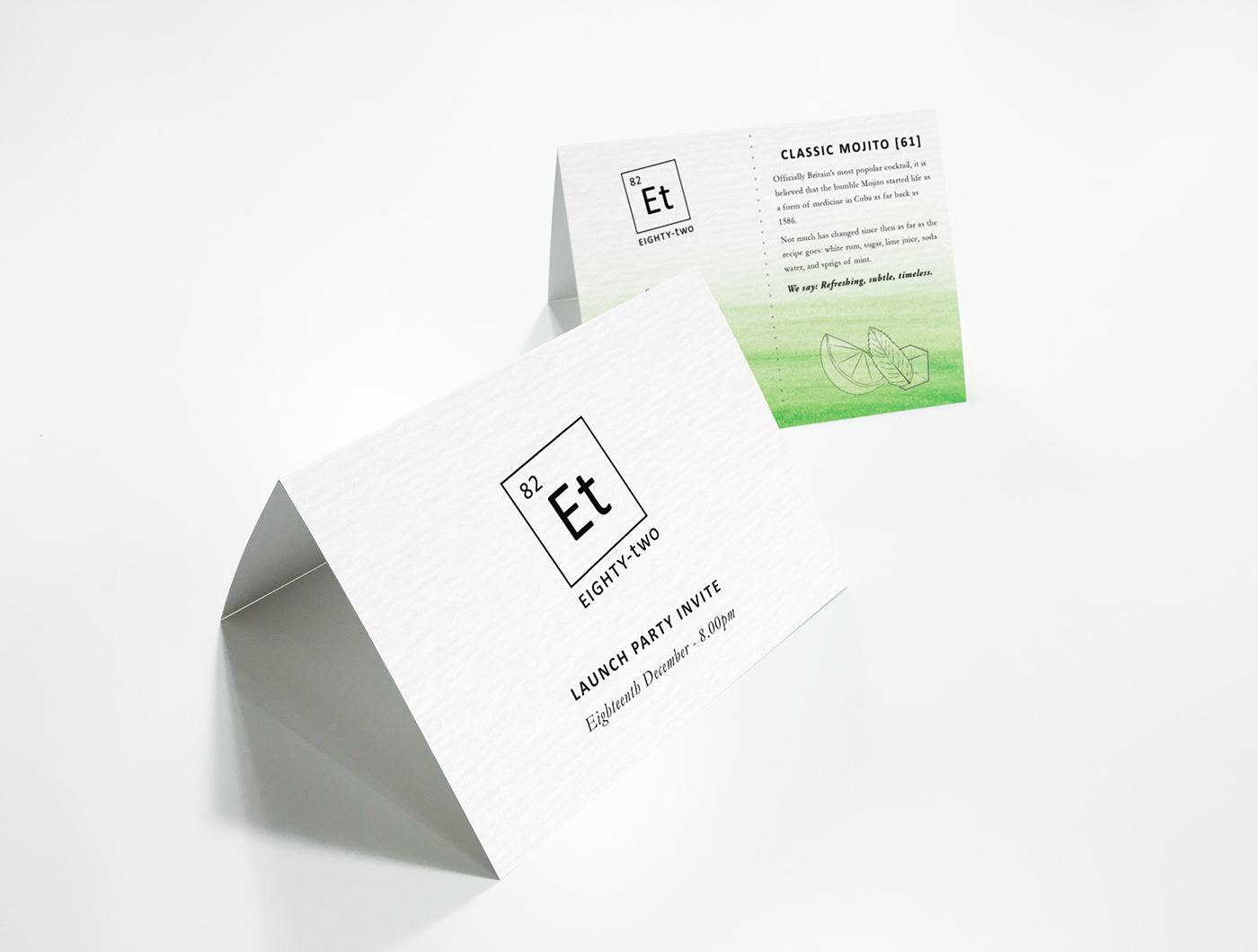
Invitation with perforated Cocktail Card and entry ticket. The illustrated ingredients combine with a colour scheme that relate to the evening's featured cocktail (Cocktail of the Week) - in this case, the Classic Mojito.
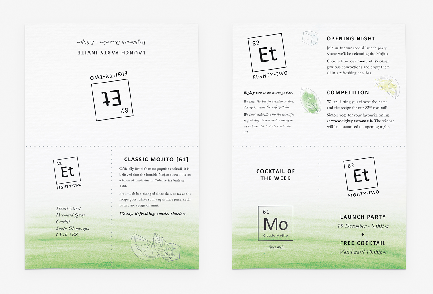
The full invite (double sided) showing the detachable Cocktail Card with sticker and drinks voucher. Thin washes of watercolour form the colour scheme for the brand as it's an elegant way to represent the mixing of alcohol with fruit/herbs, something most cocktail recipes consist of.
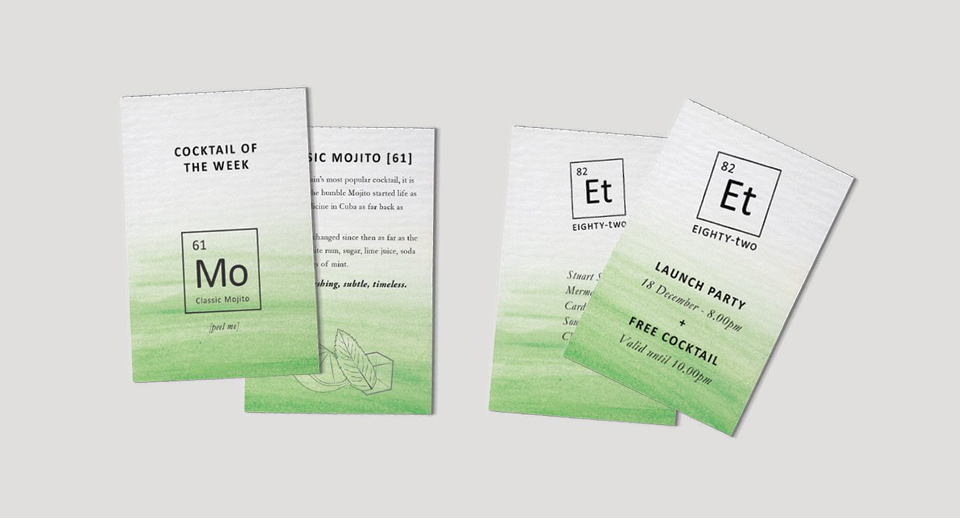
Double sided Cocktail Card (left) and ticket/drinks voucher once detached from invite. The Cocktail Card features a basic cocktail recipe and sticker on the reverse to be used with the Periodic Menu.
Branded Material
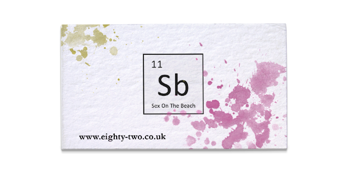
Each business card uses a colour scheme relating to a specific cocktail which is teased with small traces of paint in a chaotic colourful mess. I wanted this to show the experimentation and dedication of perfecting a cocktail recipe.
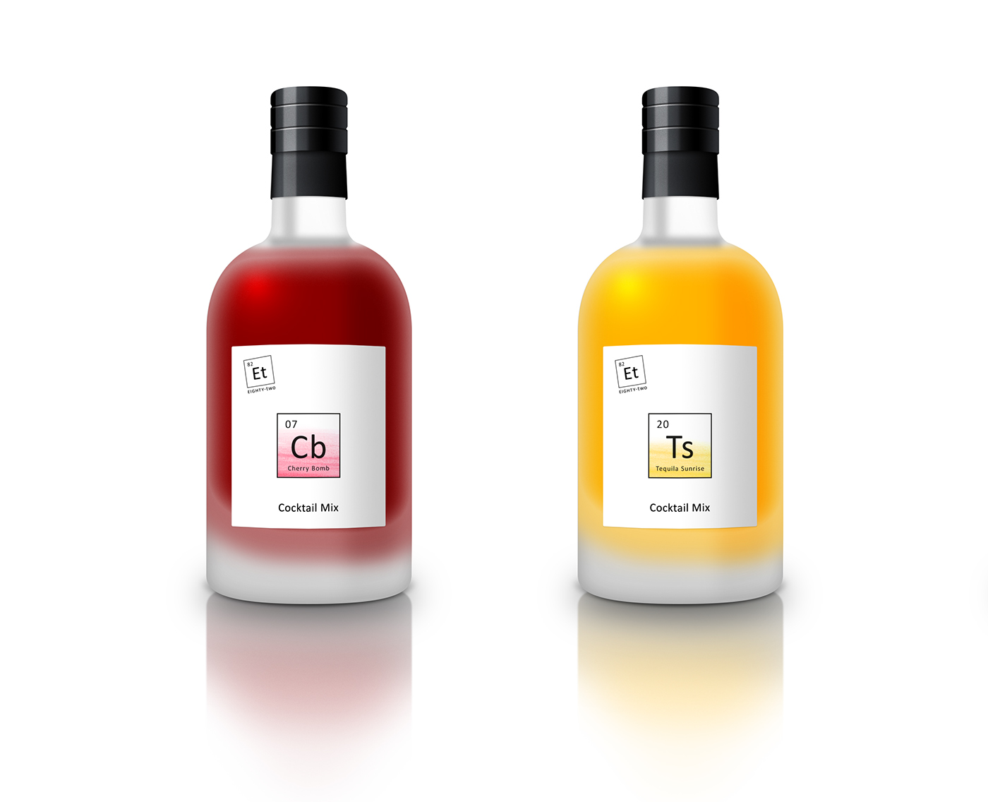
I created these bottle labels to show how the brand could function outside of the bar environment. The colour intensity on the labels is an innovative way to show the level of alcohol content. The bright colourful labels represent a relatively weak strength and the clearer whiter labels are for the more boozy stronger cocktails.


