
Inspiration

Branded Stationery
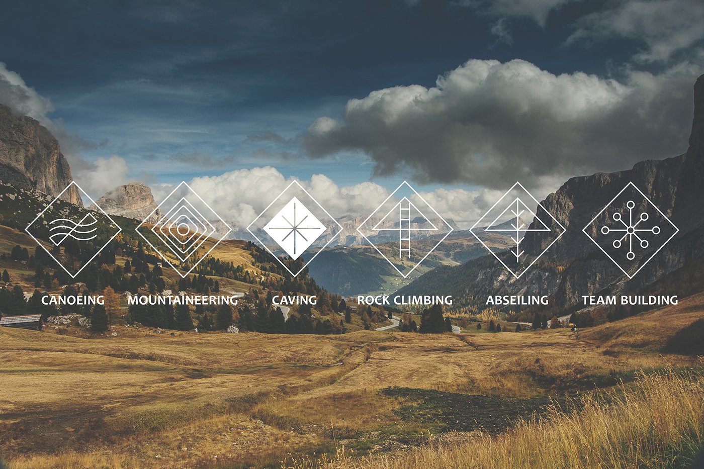
The purpose of this icon set is to identify activity types and can be applied as way-finding signs and online symbols. They are inspired by native american culture to create a timeless and authentic experience. I wanted them to look like they could have been carved in stone centuries ago.

An added application for the icons is an embroidered 'badge of honour' for participants to show off their achievements or skill level. Each star represents a rank for the activity with four stars being professional standard. This an attractive feature for the competitive adventurers (bragging rights) and for the less experienced (an indicator of their weaknesses).
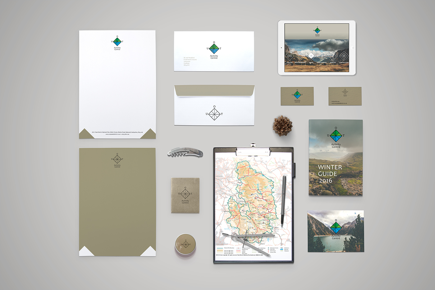
The final stationery set combines use of the simplified logo and display logo coupled with the main brand 'stone' colour.


