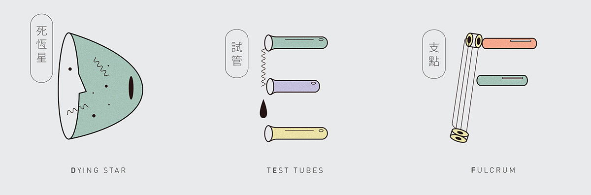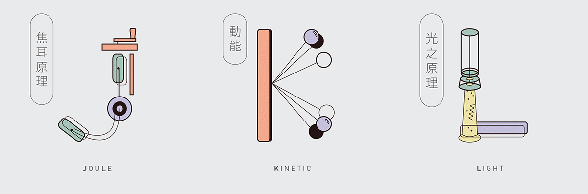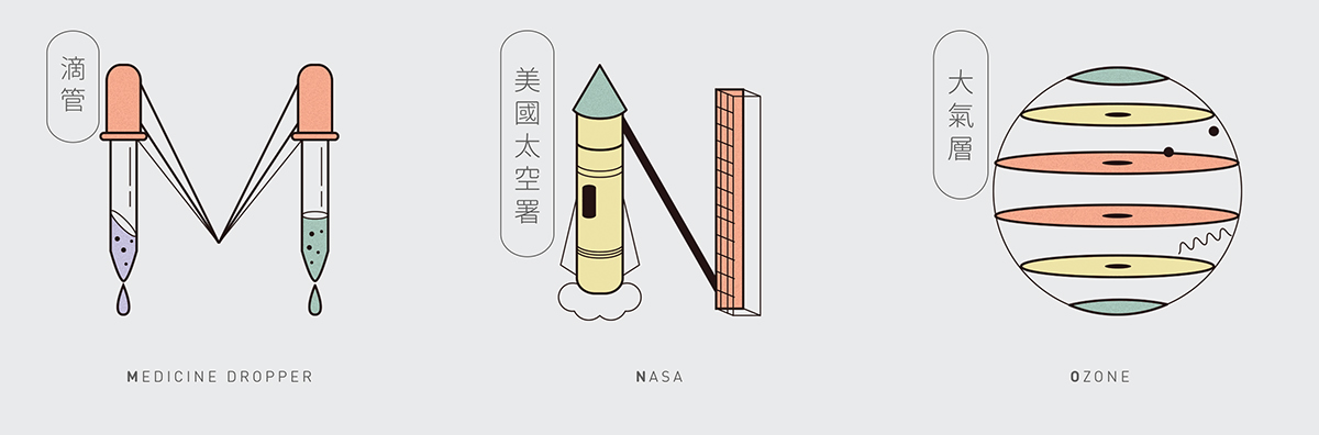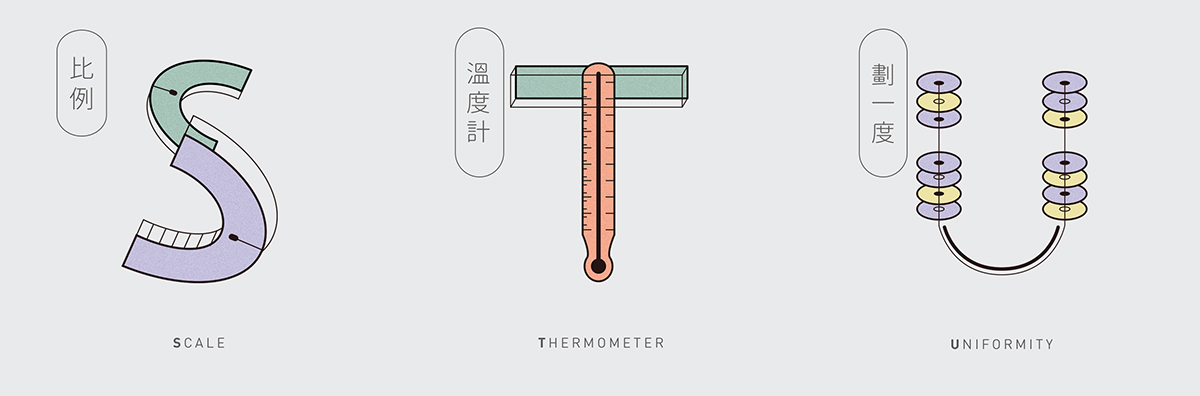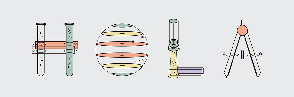
The brief of the design was to create series of alphabets by interpreting them with a theme. Apparently, I chose 'science' as my subject matter in this typography project. The process was quite promising as designers are normally strange to the scientific realm.
Technically, each alphabet must represent a science-related term or object. But there were still exceptions when I beat my brain out and I still couldn't think of the word to represent with. For example, 'Gycroscope' and 'Yunnel‘ were self-created ( so, yeah, do not try to ask me why google can't define it XD )
In short, I have learnt some new words throughout the process but most importantly, I have discovered a new way for me to do illustrations and apply it in design. I hope you would like the outcome like I do :D
In short, I have learnt some new words throughout the process but most importantly, I have discovered a new way for me to do illustrations and apply it in design. I hope you would like the outcome like I do :D