WE HAVE LOFTY GOALS
we want Chinatown to appeal to the new generation of Chinese travellers and expats, while remaining a place where those who have shaped it can feel their sense of home. It will be a place that reflects the mix of tradition and modernism that makes cities like Shanghai, Beijing, Tokyo and Seoul some of the most exciting places in the world for people to live in and visit.
OUR LONG-TERM VISION
A place where those at home proudly amaze those who visit.
OUR MISSION
Changing the perception of Chinatown and creating the number one East Asian area in the West.
OUR CORE VALUES
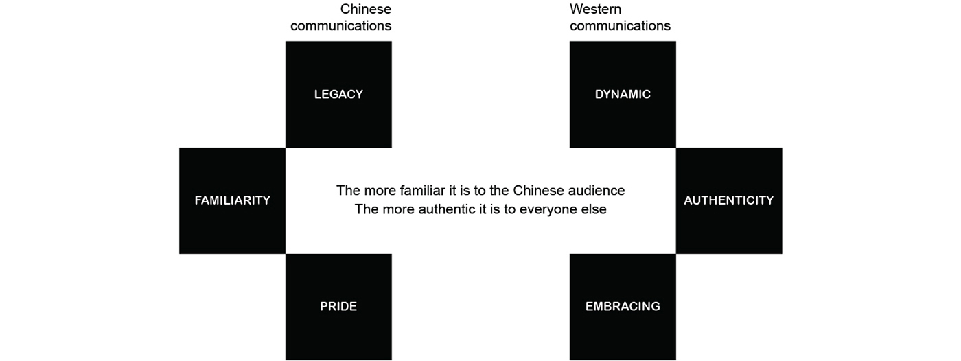
Chinese communications: LEGACY | FAMILIARITY | PRIDE
Western communications: DYNAMIC | AUTHENTICITY | EMBRACING
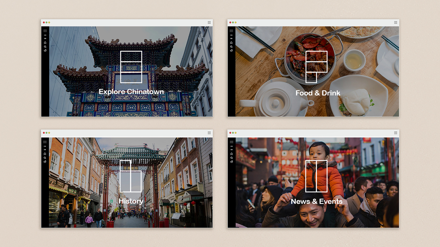
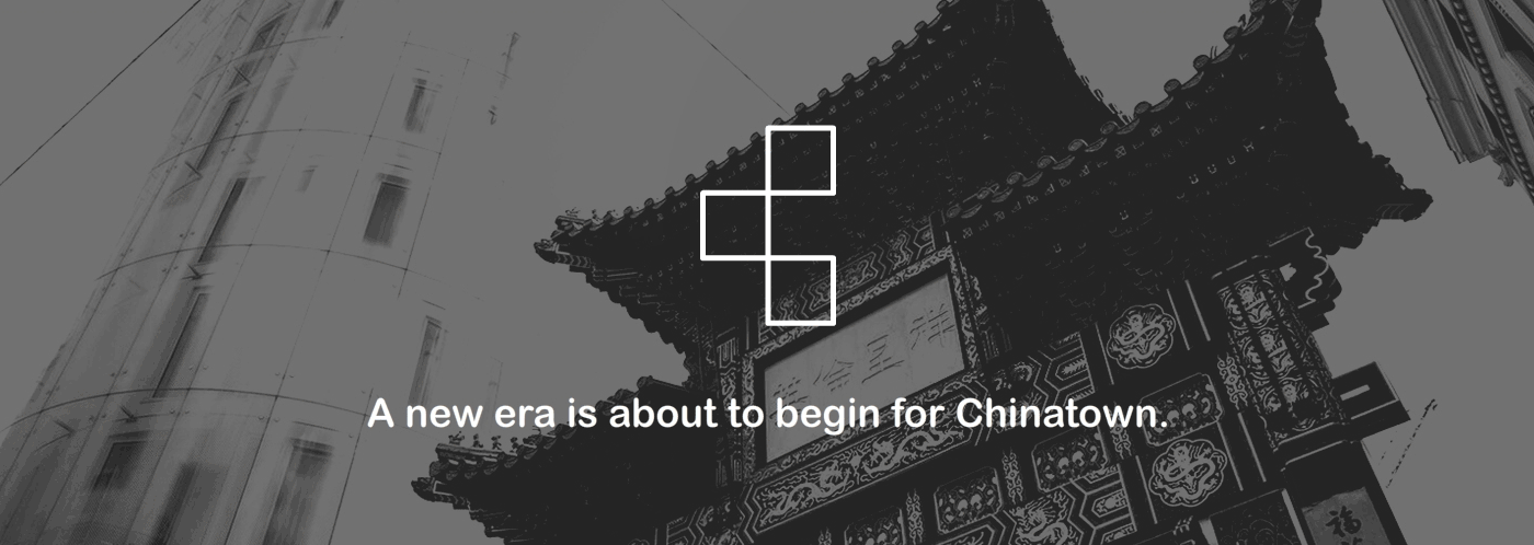
EVOKE MEMORIES AND INSPIRE DISCOVERY
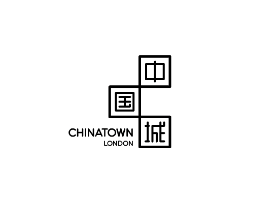
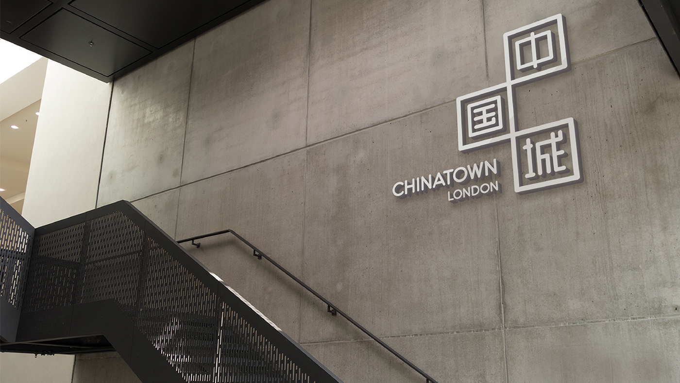
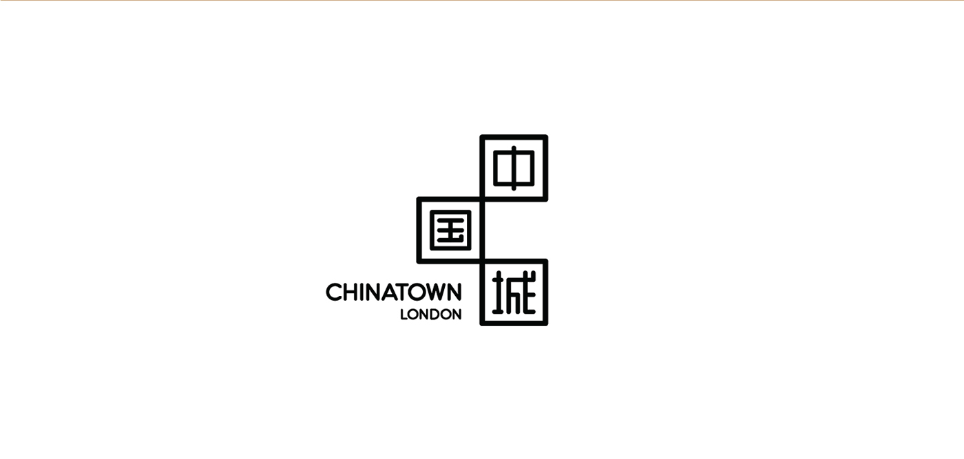
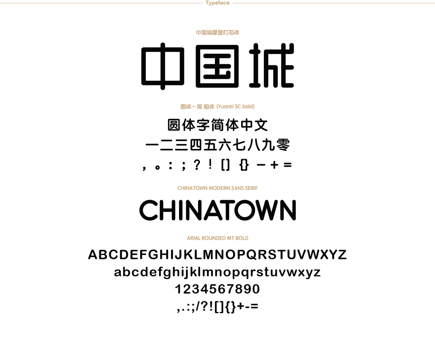
Our logo is going to be like China - modern, but with traditional elements included.
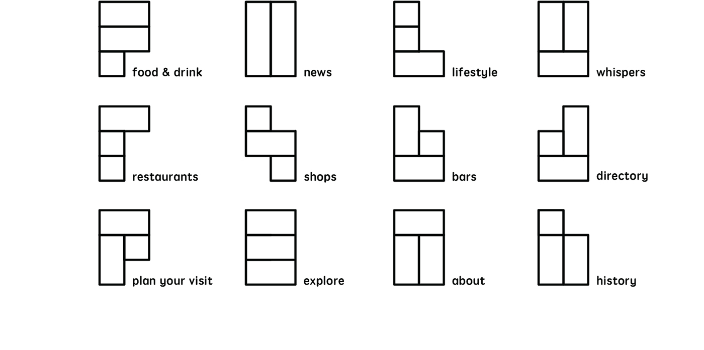
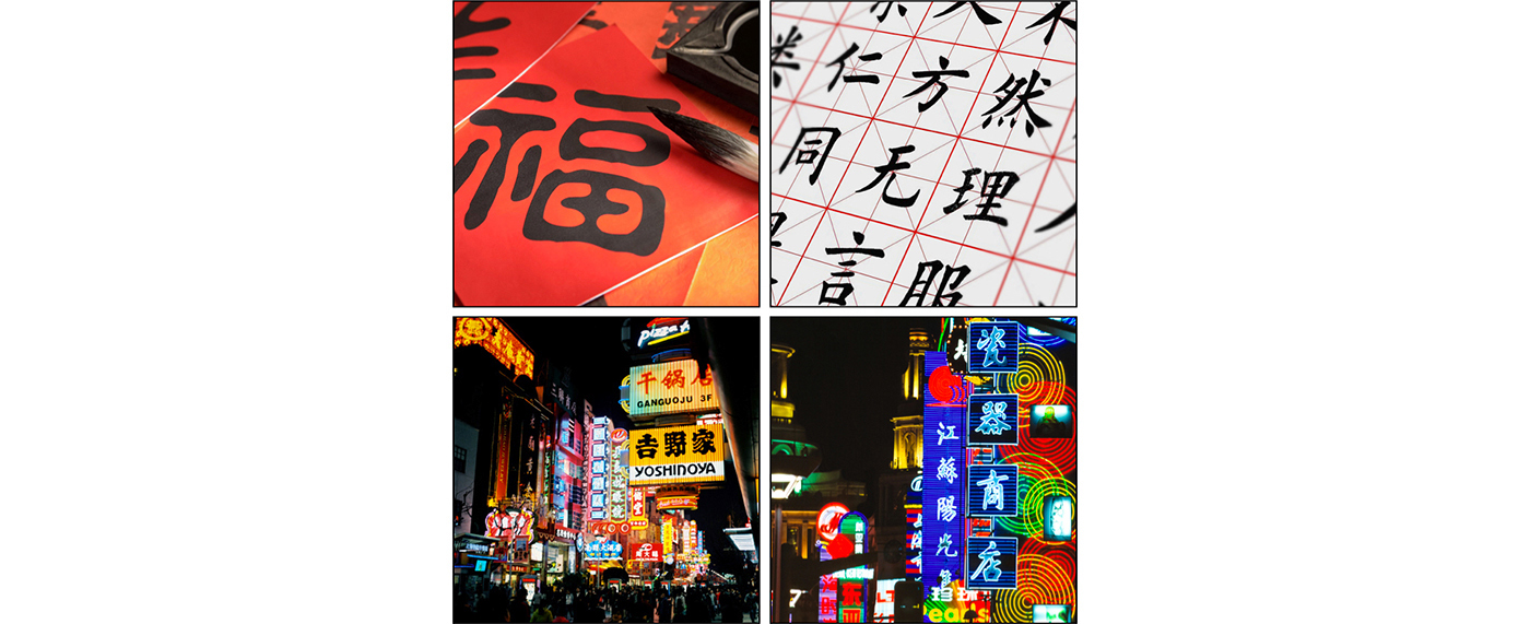
The inspiration for our logo comes from Chinese characters and the dynamic street signs. Traditionally, Chinese characters are always written out, and are always written in a square. Even in today's modern environment, they are displayed in squares. Square can be seen as a container of Chinese culture and has iconic potential.
The form of the dynamic street signs reflects the prosperity of modern china and also showcases the rhythm of Chinatown. The lights, neon signs, and things happening around this area make Chinatown London special.
The brand values of legacy, pride, and familiarity will be reflected by the use of Chinese characters.
We will be dynamic, embracing and authentic through the use of modern elements - typeface like neon light; squares like street signs; movement like the way how signs overlap and form together on all those busiest streets like Shanghai, Hongkong.
In simplified Chinese characters, 'Chinatown' is written with three characters
'中 zhong(middle) 国 guo(country) 城 cheng(town)'
The base of our logo takes its form from the 'C' in Chinatown.
If we pixelate the capital 'C', we get three squares.
The pixel then form the square signs that Chinese characters are written in...
creating our logo.
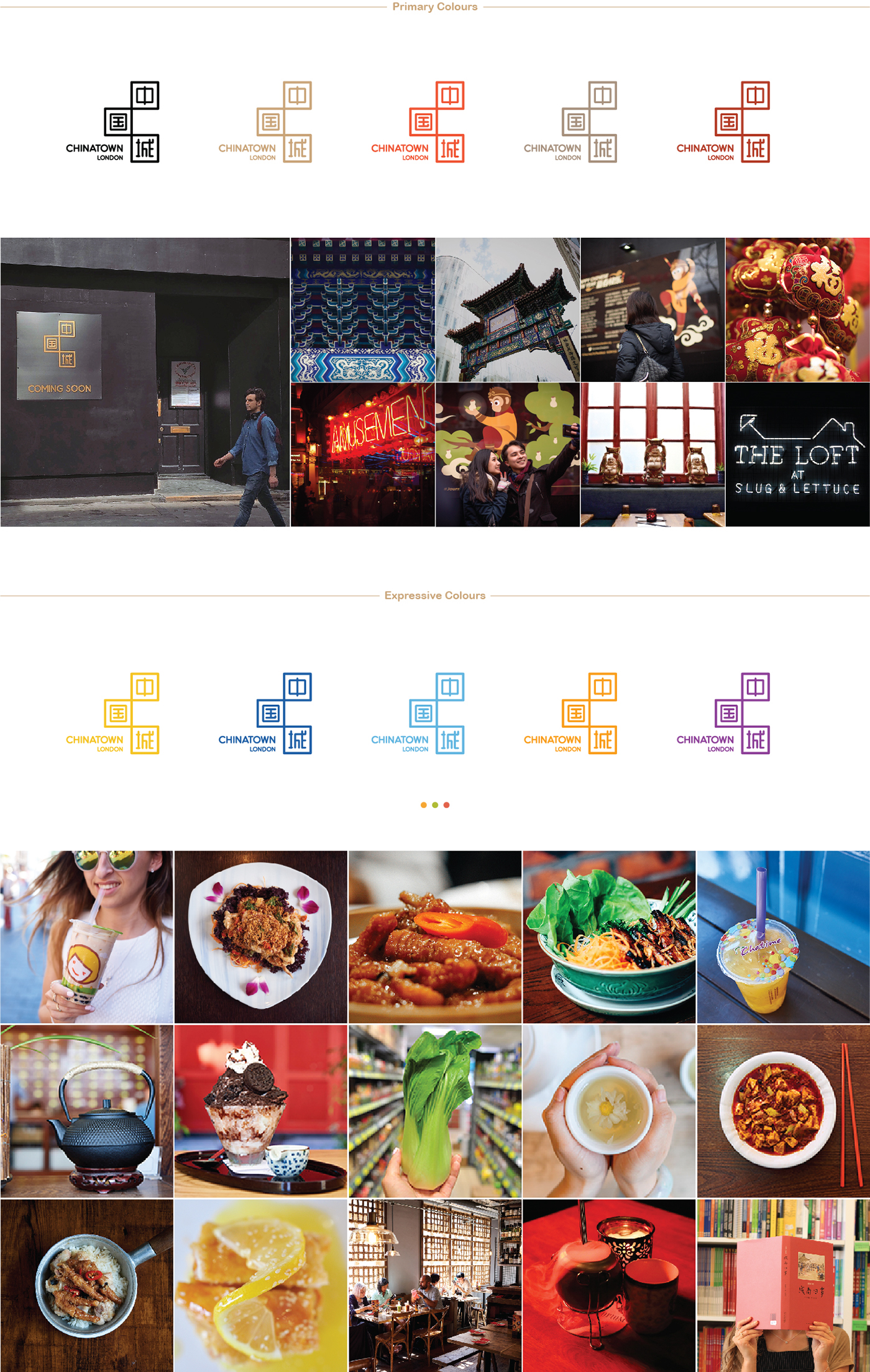
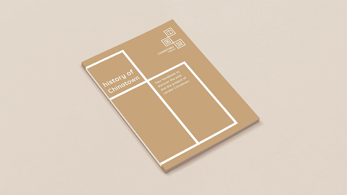
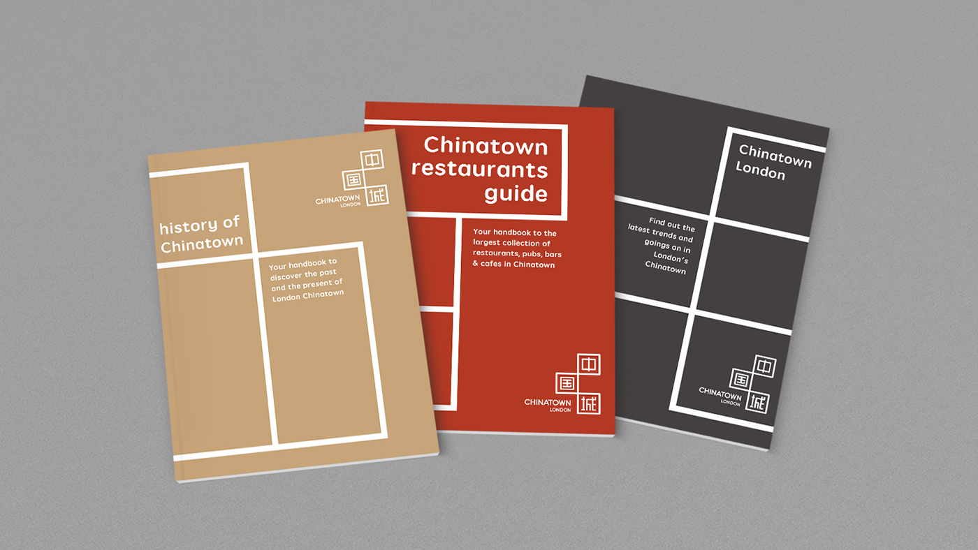
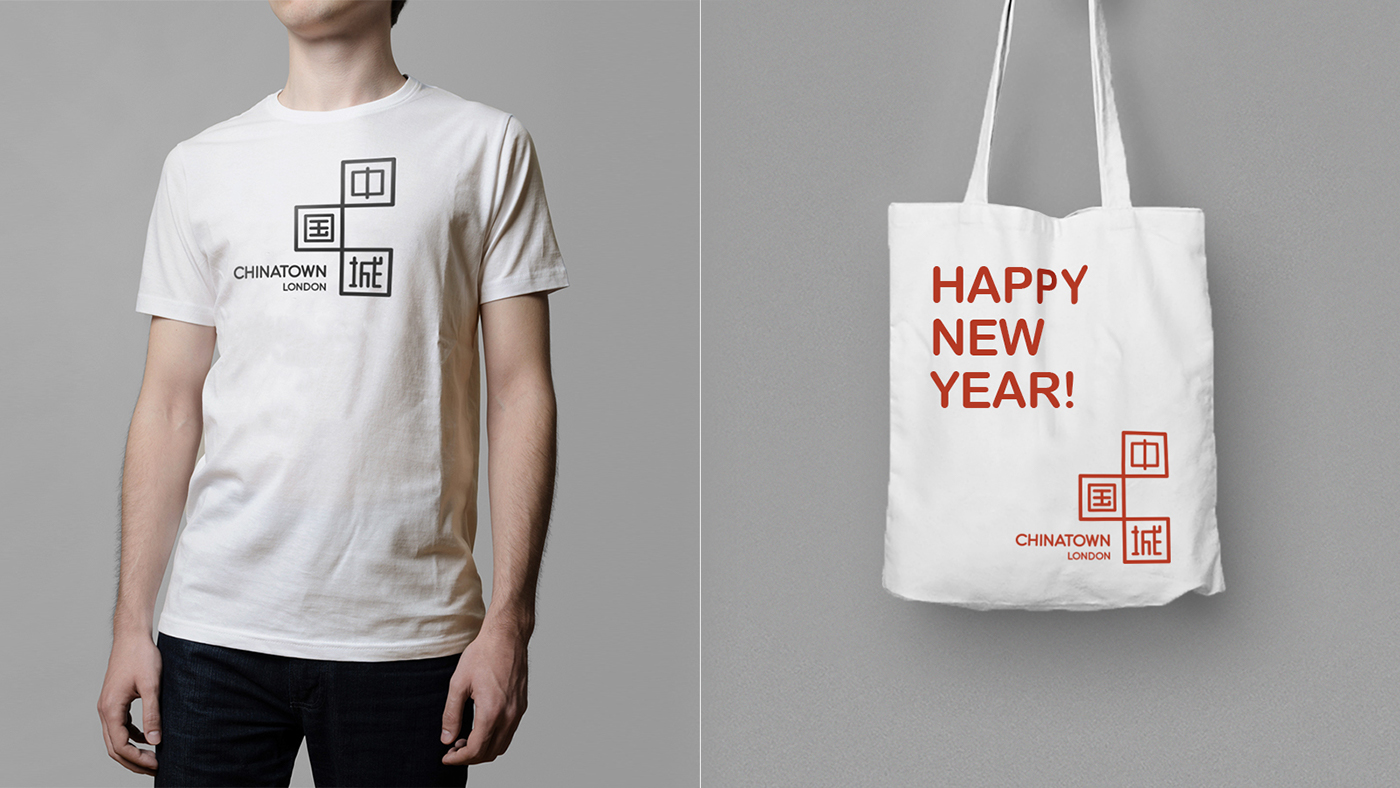
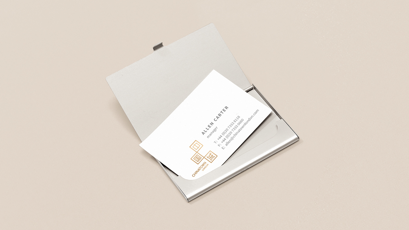
Our primary colours are chosen for their meaning in Chinese culture. Gold traditionally represents quality and prosperity, and is used in decoration. Red represents luck, or is considered lucky. Dark red and bright red, gold and brown grey, they embody Chinatown's brand values through both Chinese and western communication.
There are no limits on expressive colours.
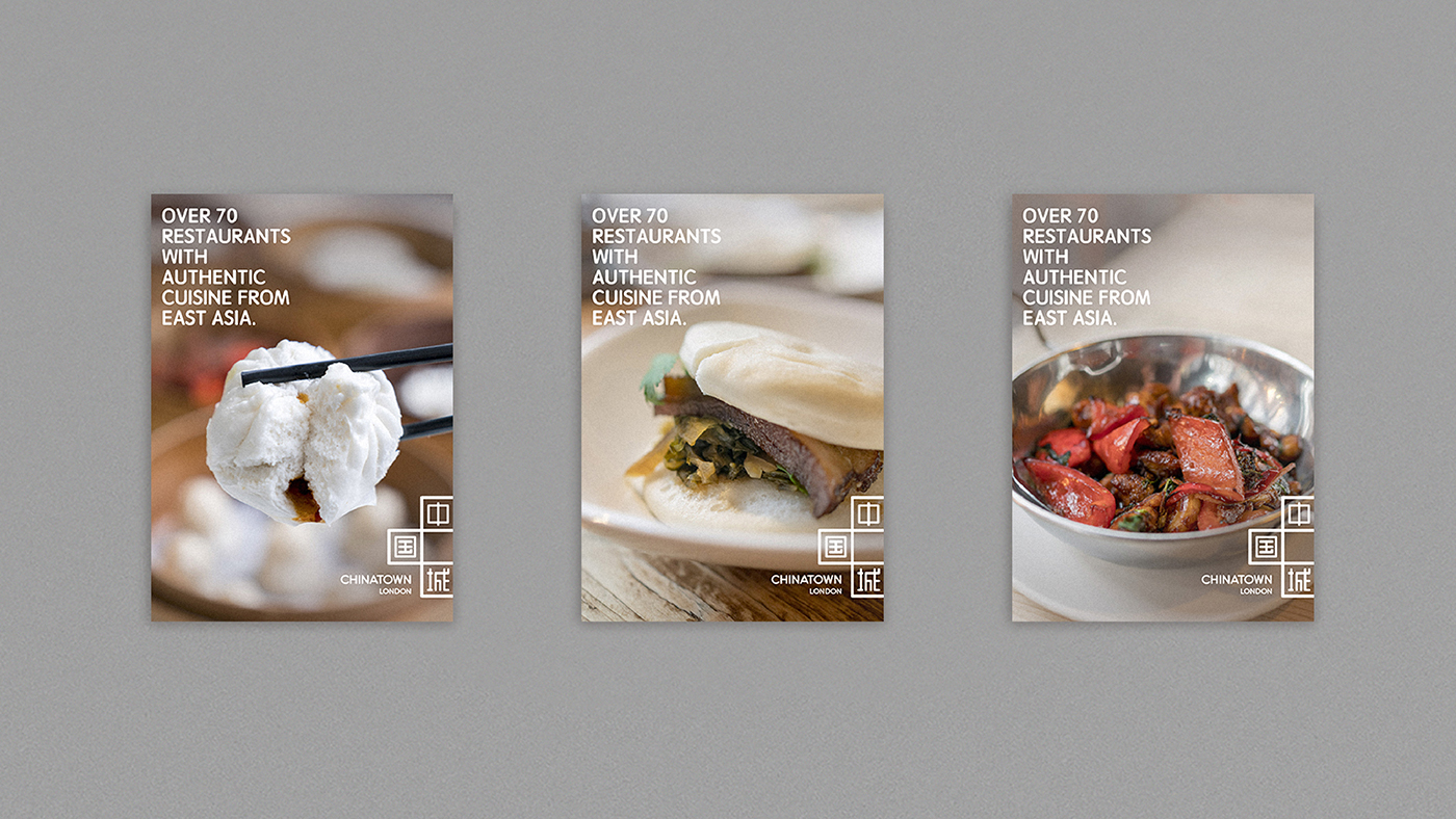
These colours can be from the store/restaurant/product/story we are promoting.