

I love football, and I always have, but I was born into an era in which a new shirt was released every year, a shirt slightly more expensive than the year before. Is it worth buying the new shirt of your favourite team?
I wanted to take ten clubs from around Europe with different histories and identities, and see if I could design them all a set of three football kits for the 2016-17 season - home, away and alternate - which are not only stylish, which not only feel different from previous years, but embody the club and the community.
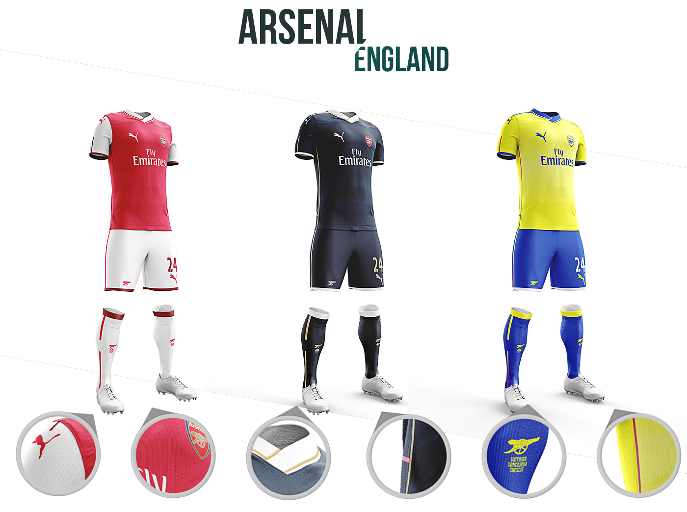
Though the classic Arsenal motto "Victoria Concordia Crescit" (Victory through harmony) is the perfect way to describe the Wengerball style that has graced North London over the last two decades, a more recent slogan from the club, "Tradition with vision" perhaps sums up the team's brand.
With this set of Arsenal shirts, I wanted to create something that felt fresh from recent seasons but harked back to some of the club's greatest triumphs. All three shirts feature twelve subtle hoops, which represent a record twelve times that Arsenal have lifted the FA Cup, for example.
The redcurrant trim on the home shirt is reminiscent of the club's original colours, and both the stripe down the socks and hoop on the lower back of the Arsenal kits is designed to mirror the 2004 Invincibles' home shirt. I wanted to keep the white of the home kit only on the sleeves, and avoid white on the shoulders, as the classic Arsenal shirts of the the 1930s onwards did.
After two yellow/gold away kits with lots of navy trim, I went for a brighter shade for the alternate this time - again in reference to 2004's away kit - and used mostly royal blue as trim, in reference to the 1971 FA Cup-winning shirt. The away shirt is influenced by the French national side's of a few years back - a country that has produced many an Arsenal legend - and eschews any light blue or red to give this shirt a more unique feel.


As the motto claims, Barcelona are "more than just a club", and in just the last ten years they've racked up much more history and myth around the Nou Camp than most clubs do in a century. But with so much legend to choose from, where do you begin in creating something new for a club like Barca?
Giving that home shirt a brand new spin must be one of the hardest jobs in design, but with my attempt, I looked back to the Barca kits of the late 1990's, and re-introduced the darker shorts to the home shirt as it hadn't been done in a while. The red/blue stripes are back to a vertical position and in reference the first ever Barca home shirt, the red appears on the right for a change. There is subtle gold trim either side of the middle red and blue sections to emphasise this; the first Barca shirt was simply split into two, rather than striped. I liked the horizontal stripes of last year though, and wanted to continue the theme with hooped socks.
I wanted the away kit to feel rich, familiar but new, and to allude to Barca's style of football. I decided to add a marble texture, which hopefully ticks all the boxes; it looks unique for a football shirt and fluid as the tiki-taka we associate with Messi and co. The alternate strip is Netherlands orange, a tribute to club legend Johan Cruyff who died in 2016, and features horizontal red and blue bands across the chest, just like the very first Barcelona away kit did. Both also have striped socks for cohesion, are adorned with the Catalan flag, and have five footballs (taken from the club crest) on the shoulders, to represent the number of European Cups won by the club.


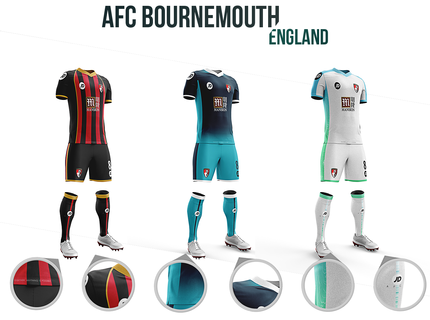
Branding Bournemouth's second season in top flight football is a whole different ball game to reinventing Barcelona's wheel. Just a few short years ago, the club were facing a financial cliff's edge, and it took rookie boss Eddie Howe to drag a club full of unpaid loanees back from -17 points to beat relegation.
To even be competing in the Premier League is achievement enough, but to have stayed there is something else. I wanted to create a set of kits that affirmed what people already associated with AFC Bournemouth, give them a platform to build an identity on for the next few years, and design something that the fans would like: something stylish, striking and with plenty of heart, not unlike Bournemouth's journey itself.
I wanted the home kit to reflect the kit that had got Bournemouth to the Premier League, as I loved the gold touches and black arms. The only other club in the league with an extensively black and red kit, Manchester United, use white as a third colour on their home strip, so to use gold not only sets the Cherries apart but gives them a regalness that neighbours Southampton don't really have with their red and white kit. The away kit was designed to build upon the blue fade of the past two seasons - where many fans of bigger clubs would just have started to notice Bournemouth - only this kit was designed to be bolder and brighter.
White tends to be a regular alternate strip, but given that the first two kits had played safe, I wanted to create something more ambitious with the third. A popular green/black away kit of yesteryear was the inspiration for the green, and again I chose a fade for coherence. A contour map of the town adorns the third strip to root the club to its whereabouts, and all three kits have the unofficial motto of the club, "Together, anything is possible" emblazoned on the base of the shirt.


From the smallest ground in the Premier League to the biggest: Manchester United are the most successful team in England, one of the most recognisable visually in Europe and one of the most supported clubs in the world.
But when I think of classic United kits, the vintage-style, Munich Air Disaster Anniversary kit of 2008 is the one that comes to mind. United often have black and white lining their shirts, but I wanted to go with something a little subtler, something like the Bayern Munich 2015-16 home shirt. The collar is a huge reference to the 1999 treble-winning shirt, but other than that, it would perhaps be the most minimal kit United would have had in years.
United tend to go with either royal blue, white or black for an away kit. I didn't want to deviate too far from tradition; Sir Alex Ferguson deemed their last grey kit unlucky after five games and the yellow/green change strip of the 1990s is still viewed as a monstrousity by some fans. I did however want to include yellow and green on the away, the colours of the original Newton Heath which later became United. The kit features 20 hoops - one for every top flight league title - and the hoops in turn are inspired by a navy away kit from the early 2000s.
For the third kit, I wanted to eschew tradition slightly: what about combining blue and black? I went for a much more modern colour scheme than the old-school away kit, and created a low poly pattern to represent the passing football that Manchester United became known for under Fergie; a style many would like to return next season, regardless of who the manager might be.


Real is Spanish for "Royal", a title that was okayed by King Alfonso XIII, the King of the Spain, in 1920. The club are more than just the Kings of European football by title though, as ten European Cups and 32 Spanish league titles proves. They're the most valuable team in world sport. They have more history to mine than anyone else in the sport.
My inspiration for the home kit came from a few sources. The gold lining represents the regal image of the club, and the subtle inclusion of a Spanish flag at the top of the shorts is lifted straight from the first ever home shirt. A star with an "X" inside represents La Decima (the ten European Cups) and the sides of the kit are adorned with a comic book-esque halftone pattern to represent the glory years of the 1950s.
Where the home kit remembers the '50s though, the away kit pays tribute to the Galactico era; a starry night-style pattern represents the galaxy of stars who flocked to the club in the late 1990s, changing the game forever. Of course it's purple - regal enough for a king - though I wanted a darker, meaner finish to this kit, hence the fade to black. The third choice kit also pays homage to a royal past with its gold colour, but features the other colours of the Spanish flag: in fact, the Spanish flag is faintly visible across the chest. The circular pattern mirrors the badge.
I wanted to do something with the third kit that hasn't been done by Real of late, and something that would counter the Catalan flag that seems to always sneak into Barca designs: easier said than done though when both flags are similar in colour, so I hope this is distinct enough.


The traditional superpowers of Italian football - Juventus, Internazionale and Milan - all sit in the North. That gives AS Roma the perfect opportunity to stand out from the others; they are situated in one of the most beautiful cities in Europe and have plenty of history to explore with their kits, not to mention beautiful colours.
The home shirt is fairly standard in colour for a Roma shirt. The curved line across the body diagonally though is intended to represent the Colosseum, arguably the city's most famous attraction. The lines on either side of the collar extending to the sleeves are a throwback to 2000-01's shirt, the last in which Roma lifted Serie A, and the fades either side of the neck refer back to the title before that, 1982-83, in which Roma wore collars.
The away shirt though has more obscure references. Nicknamed "I Lupi" (The Wolves), the colouring is inspired by the Stark house from HBO's Game of Thrones - which carry the direwolf as their symbol - the fiery red touches juxtaposing the cold grey, just as fire and ice does in the show; with such a departure though, I kept the Roman flag down the shorts. The change strip is a standard black, but perhaps controversially features blue - though not too similar to rivals Lazio - horizontally across the badge to represent the river Tiber.


With loveable managers, a passionate yellow wall of noise, beautiful football and players like Marco Reus, Schalke's bitter rivals Borussia Dortmund have caught the eyes and won the hearts of English football fans in the past few years. Schalke though have a surprisingly rich history in German football for those who don't know; they're the one of the most supported sports teams in the world, despite all of their league titles coming before the 1960s.
The goal with Schalke was to take a team already watched by 60,000 fans weekly and build on the brand. The home shirt features a brighter blue than previous to match the vibrant hue of their neighbours. There's a subtle fade on the home shirt which gives a more stylish tint to the shirt, and the striped socks are in reference to those worn by the 2011 German Cup winners. All three shirts feature a faint German flag fading from the bottom of the Adidas stripes.
The away shirt is a traditional black in many ways, but the green is brighter than before. The illustrated tree that adorns the shirt is not only a reference to the Gelsenkirchen Coat of Arms, but to new beginnings and development of young players. For the third strip, I chose to break from the tradition of the first two; the red and yellow are a throwback to the colours worn by Westfalia Schalke, set up by students, but the yellow is golder than Dortmund ever wear.

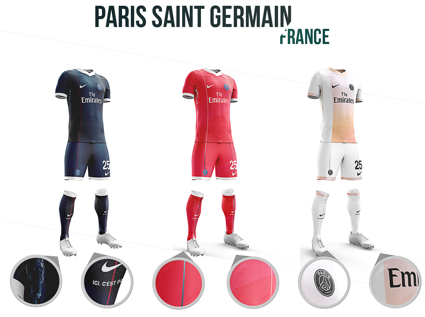
The newest member of Europe's top table and one of France's youngest clubs, Paris Saint Germain have got wealth, star players and above all, style. The famous blue and red stripes that run centrally through their home shirts were designed in the early 1970s when the club was formed, and attempts to deviate from this design over the years have largely proved unpopular.
So naturally, I wanted to try to deviate slightly without causing too much of an issue. The deep blue is typically Parisian, and red stripes line either side of the main body of the kit, running all the way down to the socks. Where Real Madrid have a starry night under their arms, I created a nebulous watercolour pattern down the sides of the PSG kit; it represents the "Galactico" nature of modern PSG, though it feels artier, which is typical not only of the club but the city. There are six dots striping the pattern too - one for each top-flight league title - which ends in a point. Upside down, this is intended to vaguely resemble the Eiffel Tower.
The bright red of the away kit is a deliberate break from the typical white away kit, but still feels like PSG, counteracting the dark home kit. With the third strip, I wanted to create something white but fresh and stylish, so went with a rose gold-style fade across the kit, something that perhaps the fashion capital of France could appreciate. The socks are all emblazoned with "Ici C'est Paris".


The old lady of Italian football, Juventus are synonomous with so many things. "Juventus" is derived from the Latin for "Youth" - fitting when you consider the number of young players the club still continue to develop even to this day - and many see Juve as an icon of Italy.
With such esteem comes the importance to represent it all in three kits. The club's original pink colour is strongly used in this shirt, along with gold to represent the team's glories; the subtle fade down the stripes of pink to gold was done to show the past bleeding into the future, hinting at the theme of youth development. The white V around the neck is there to hark back to 1985's kit, when Juve first won the European Cup.
The grandeur of pink and gold are typically Juventus but with the change strips, I wanted to create something far more understated. The ice blue of the away draws influence from Turin's snowy conditions, and an icy texture is even applied to the body of the kit. The pink alternate shirt is far more vibrant than many of Juventus's pink kits, but I wanted to add the subtlest of stripes to the shirt - a reference to the home - along with a gentle colour fade to make it seem as classy as it is bright. Both change strips have light Italian flags fading down the Adidas stripes too.


A European superpower with five European Cups, Bayern Munich have a clear identity as a football club, yet their shirts vary so much from year to year that they barely look like they belong to the same team sometimes. To an extent, I wanted to include some of the most exciting features of some of Bayern's nicest kits, but I also wanted to build on the brand and create something that had never been tried for the club's home shirt.
That's where the idea for red and black came in. Bayern sometimes go dark on home kits, regularly on away kits, and on the European stage it's not too much of a clash with any other goliaths, given that AC Milan haven't competed in the Champions League for a few seasons. I chose a curved edge for this colour scheme to hopefully inject a little classiness, and added a single stripe down the middle to reference the stripey shirts Bayern have worn in the past. The Bavarian flag is visible still though: blue features between the white Adidas stripes.
The space grey away kit is also very un-Bayern but was intended to feel like it was a throwback, even if it isn't; it features a Spirograph-style pattern that resembles the pattern on the Bavarian flag (and incidentally, the Allianz Arena's exterior). The alternate shirt is similarly subtle, something I felt Bayern's white shirts sometimes lack in favour of embellishing trim. The downwards chevron has two meanings; firstly the implication of Bayern being one of the most southern-based teams in German football, the other being a "V", the Roman numeral for "five".
Despite approacing Bayern's kits with more of a subversive approach than a traditional one though, all three kits are influenced by German national shirts.


