

XE is one of the most popular currency apps out there. As a frequent user, I found the core experience of the app quite unusual. The priority and the mental model of the app’s many features seemed to have become lost in the process of being made, nor did it seem to embrace modern and convenient native mobile patterns.
I set myself a goal to plot out the key useful features in the XE product, and determine the best way for them to fit together in a relatable and contextual sense. If a feature did not add any real value to the app, was it worth keeping?
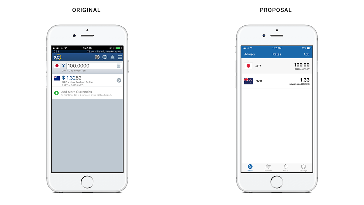
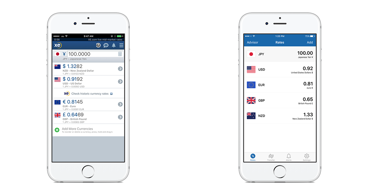
After reviewing the original design, I realized that besides rate conversion, only 4 other features were truly worthwhile; charts, rate alert, rate advisor, and money transfer. Market analysis and currency profiles were discarded.
Market analysis was a feed of the latest currency market news. However, the likelihood of people looking up news from a currency app is quite slim. As for currency profile, there wasn’t an immediate obvious need for this, as finding out information about a particular currency seems like a one-time action, and it might just be easier and quicker to look it up online.


A few key changes that were made:
— A tab bar was put in place with the main tasks for easy access; rate conversion, money transfer, alerts
and settings. In my experience the draw paradigm in the previous design did more harm than good as it contained quite a lot of unnecessary nuance.
— The chart tool was moved to be accessible at all times from the keyboard.
— Rate advisor became part of the “Rates” tab. It shared more DNA with the function of converting currency, for it reverses the equation of the conversion and figures out the mid market rate between a currency pair.


