{ Mar to Sept 2015 }
Housing.com is India's fastest growing online real estate portal with a vision to transform the entire housing eco-system. The brand stands for boundless optimism & possibilities and challenges the slippery notion and perception of the real estate world.
As a part of the brand team at Housing, I had the opportunity to work on and lead some of the projects and initiatives. From developing a luxury product; campaign design and events to refining the brand guidelines and introducing a pinch of humour at the work place, the experience allowed me to change roles repeatedly. This presentation is a visual scroll through some of the undertakings at Housing.com.
Note: The projects have been modified for this presentation.
___________________________________________
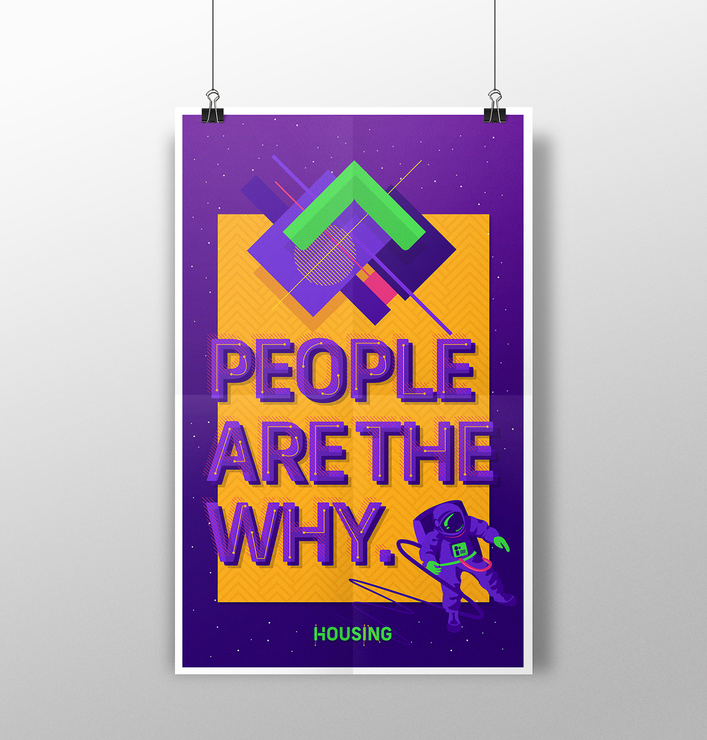
People are the why, Look Up is the how
A brand expression that I hold on to even today. It’s a value that stuck with me and inspired
me to create this piece in my initial few days after joining the team.
___________________________________________
#HelloFlatmates #TogetherIsBetter
An online campaign designed to introduce the new Flatmates App by Housing. The aim here was to capture moments that celebrated the essence of sharing a place. The copy (with help from Animal) pokes fun at the contrasting personalities that strangely live in harmony.
The format was designed to visually resemble a polaroid print to resonate with the 'memory guarding nostalgic fridge-magnet'-
target audience.

___________________________________________
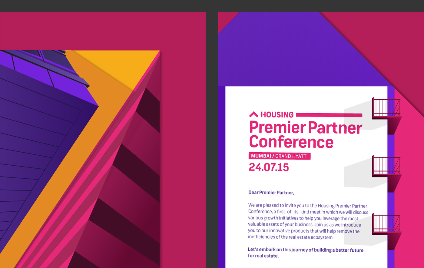
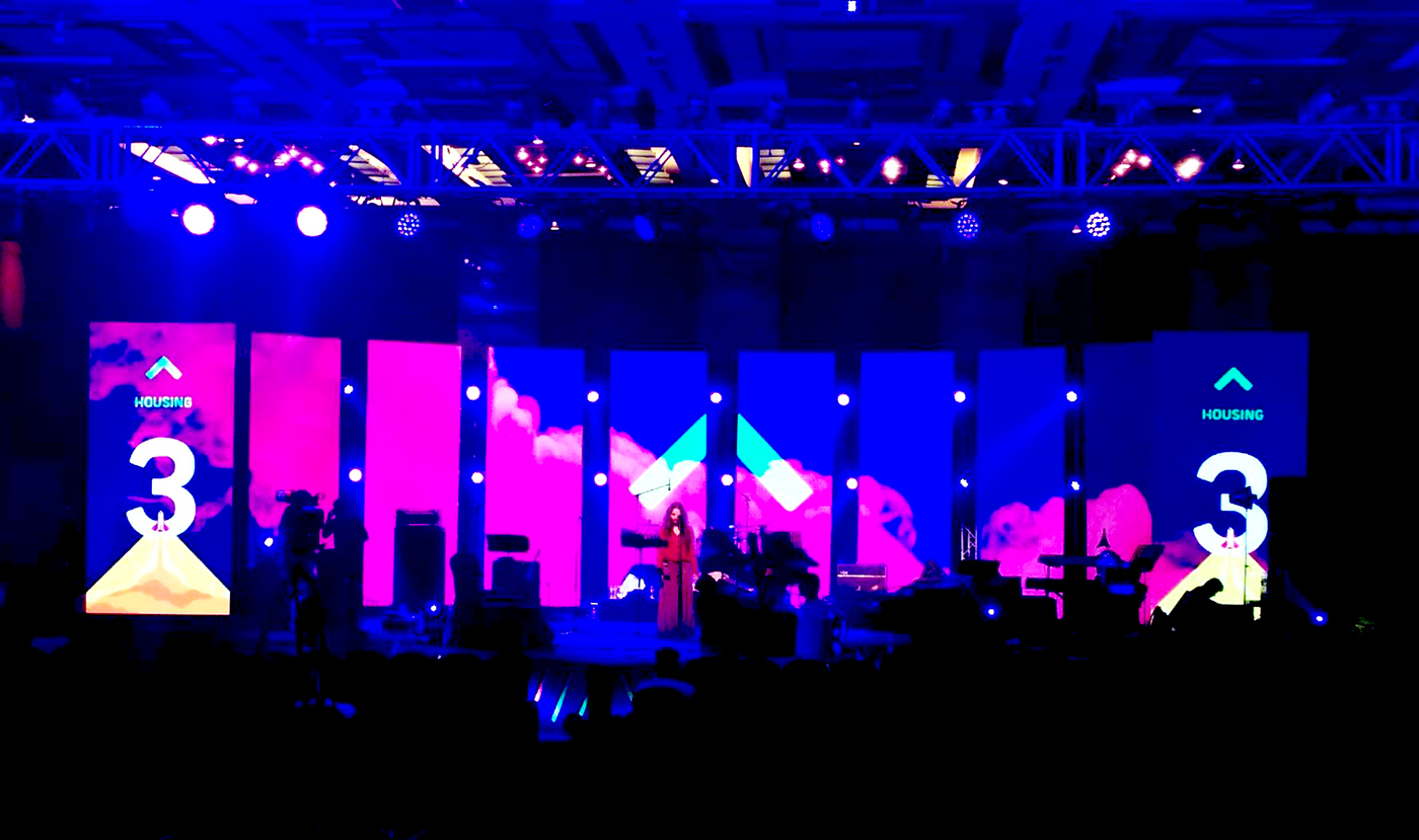
Housing Premiere Partner Conference
Designed and developed the visual language for HPPC, an event hosted by Housing aimed at
collaborating with the leading real-estate developers of the country. With Print designer/ advisor Dhruvi Tolia

Showing stage 1 and 2 of the visual langugae development. Detailed stage 2 illustrations
executed beautifully by Gaurav Rukhana and Utkarsh Raut.
HPPC Invite Prototype :

Product Brochure :


___________________________________________
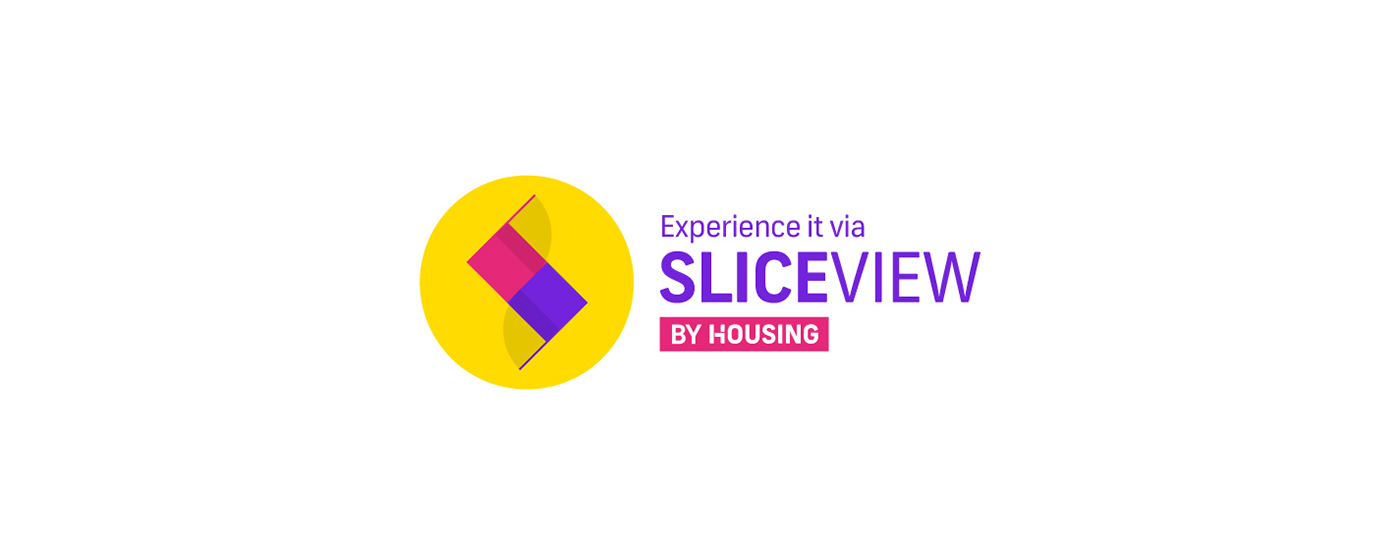
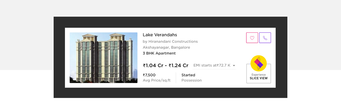
Slice View visual identity
Housing introduced a unique feature which enables the user to literally ‘slice’ through a 3D model of building and explore floors, apartments and even the rooms before buying a property. The identity needed to be bright and vibrant like the brand. The inspiration came from an architectural floor plan. The curve overlay signifying open doors and also forming a memorable ’s’.

___________________________________________
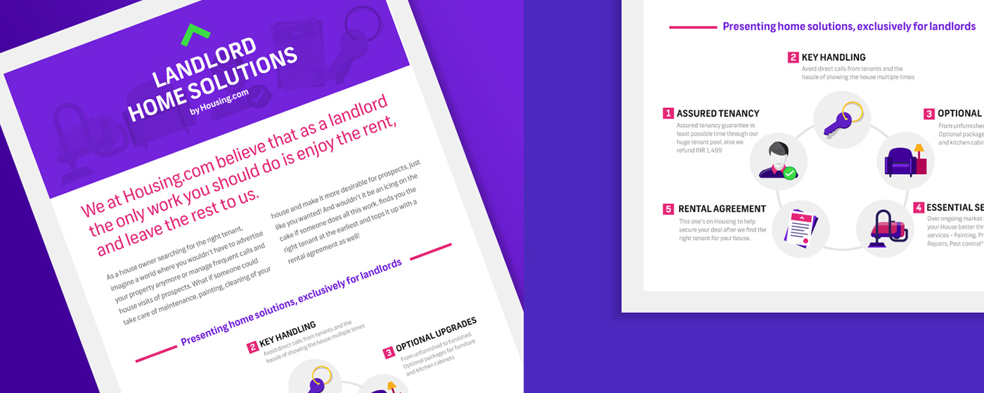
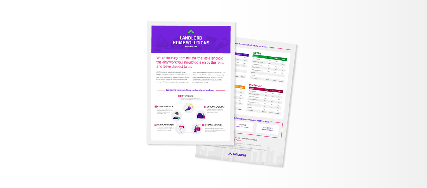
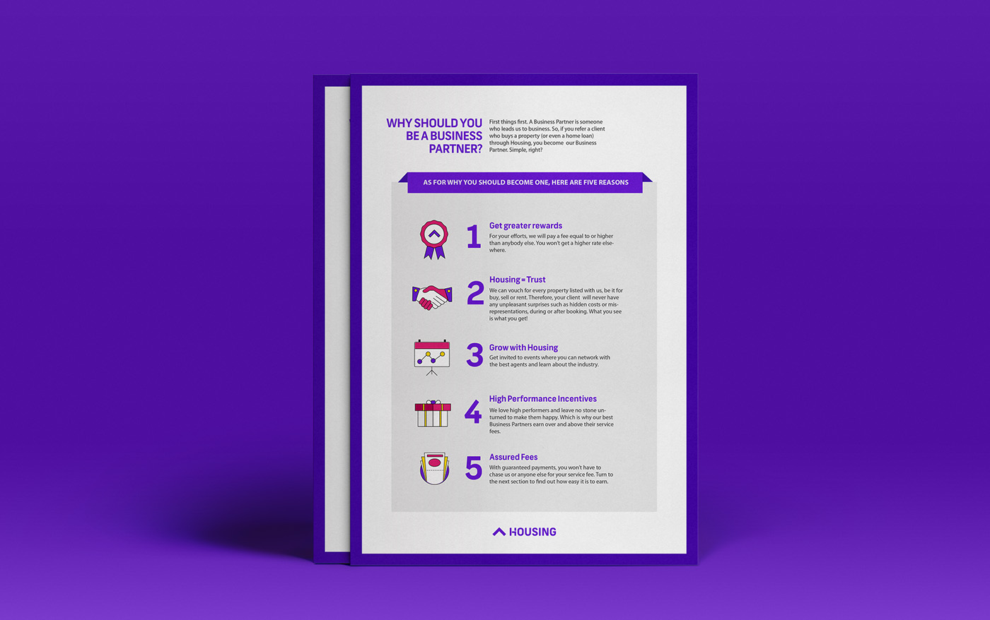
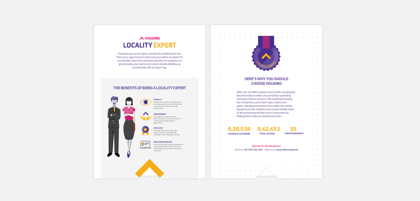
Product marketing material for Brokers and landlords
This print communication set was to be shared at broker events as well as hand delivered to selected landlords informing them about the types of services available at Housing. The communication needed to be structured simple and clean with little visual clutter for easy comprehension. Executed with Dhruvi.
___________________________________________
Fab50
A real-estate event equivalent to a fashion sale, showcasing the country’s top 50 developers. Two visual formats were finalised for the print campaign. Note: Images have been changed for the purpose of this presentation.

___________________________________________
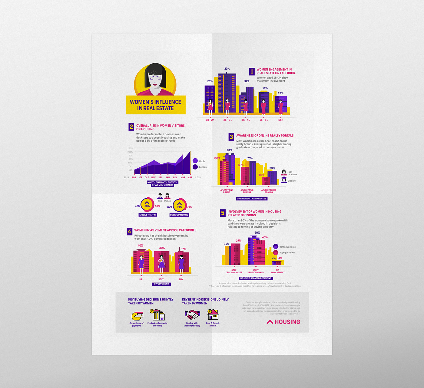
Blog story : The Women in Real-Estate
The housing Blog site was starting to become a crucial sales tool. There was a need to define the content strategy aimed at providing interesting/ useful insights into the world of real-estate.
The user insights and research team at Housing tracked the influence of women in real-estate in India. This was an interesting insight into the behaviour and patterns with respect to women in this otherwise male dominated space. The goal here was to represent data in multiple formats for digital and print channels for maximum reach.

___________________________________________

___________________________________________
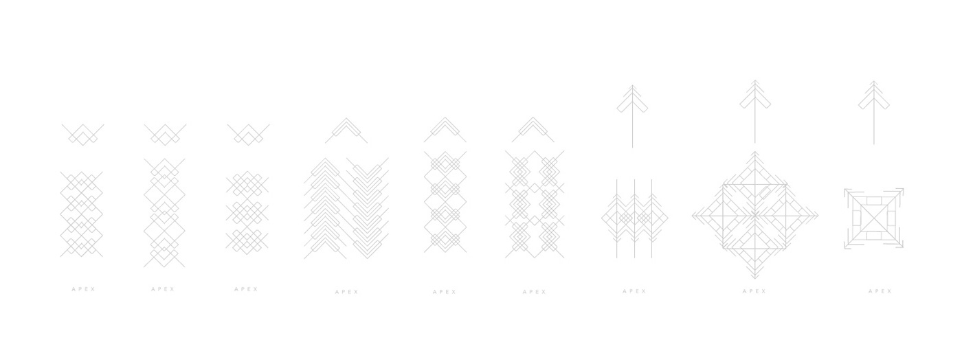
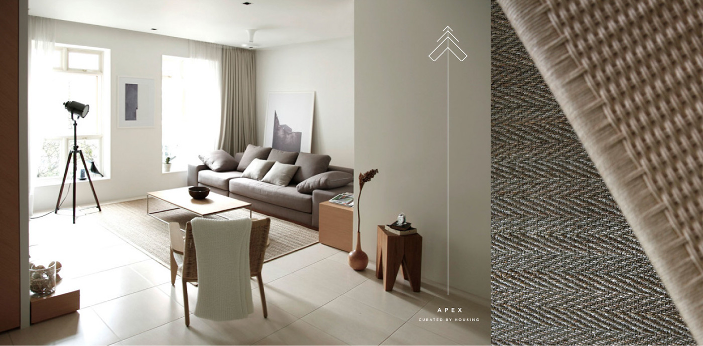
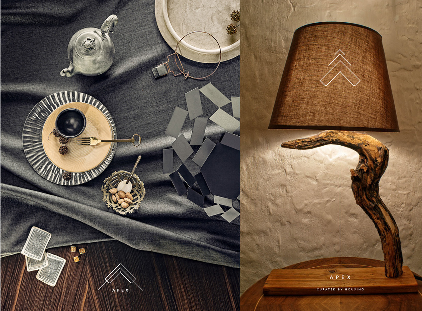
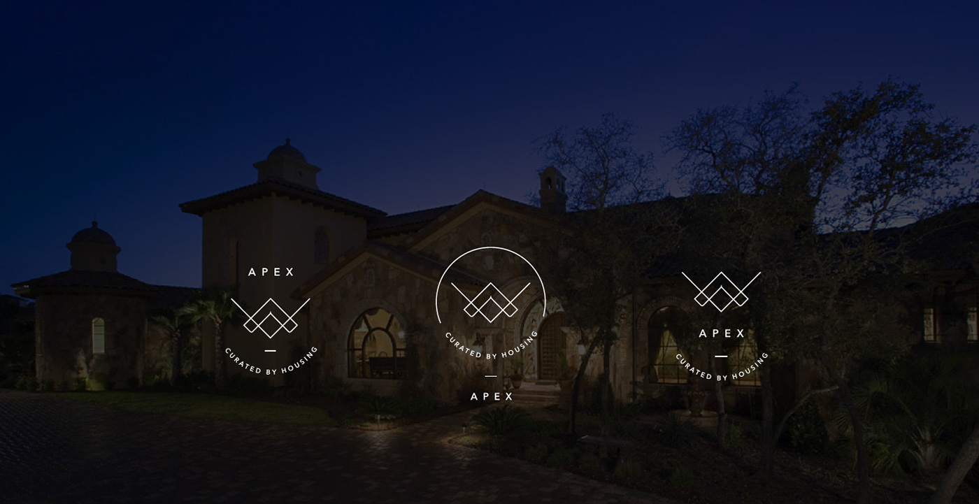
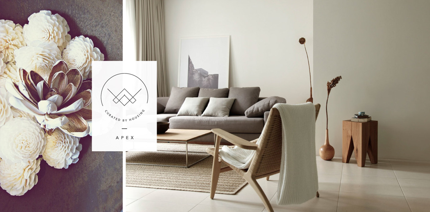
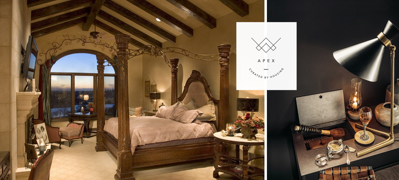
Apex - Curated by Housing
The luxury product was planned to be launched in late 2015. The brand was to carry the ‘Housing DNA’ yet be set apart in its experience. The Housing mark was also to be considered in the identity for recall value. Positioned as a sister brand in the uber luxury space catering to the affluent few. I got the opportunity to lead this one - from naming and positioning to visual language and experience of the brand, everything was done in-house. Mentored by Anirudh Luthra - Head of Luxury Businesses at Housing.
Note: All the visuals below are conceptual and show the early stages of identity exploration. The project is still developing. I do not own the rights to any photographs in the section below. They are for representtion only.


___________________________________________
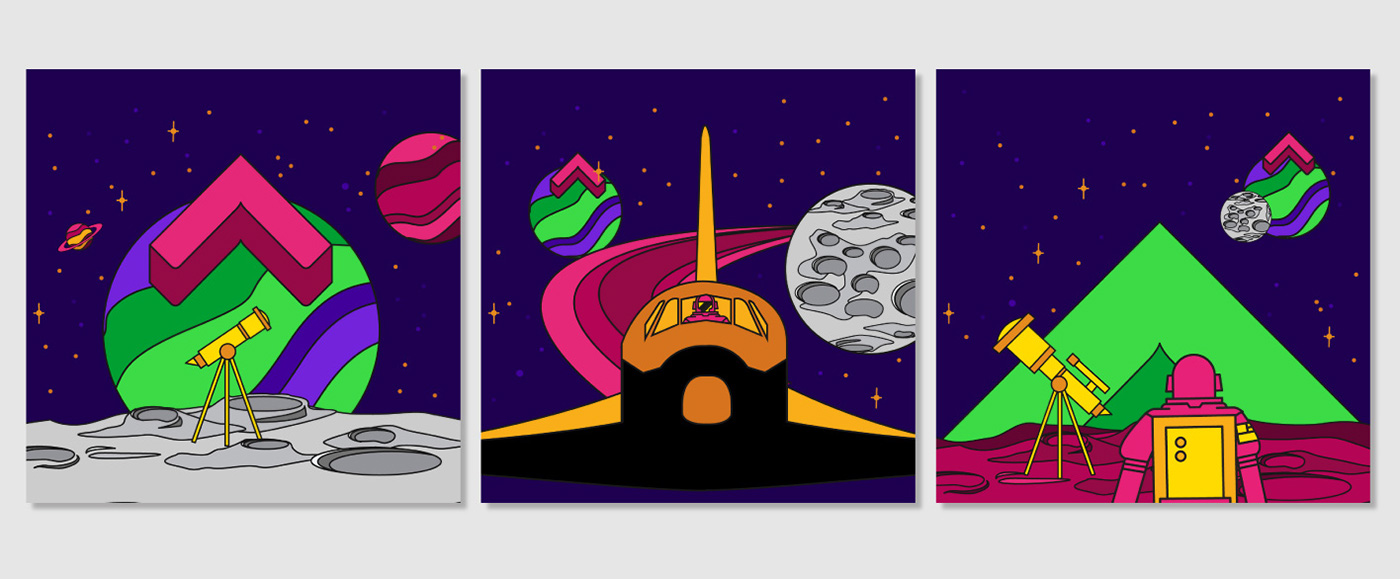
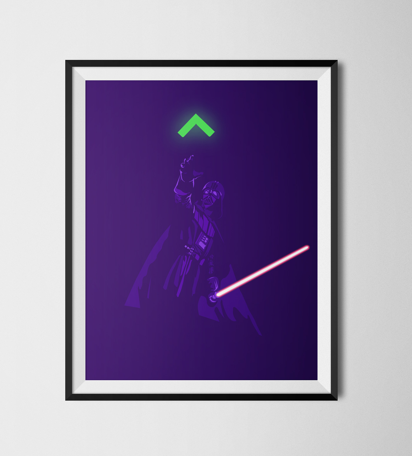
LookUp Humour
As the team got larger, occasional goofing around became necessary as a way to get our creative juices flowing.
As the team got larger, occasional goofing around became necessary as a way to get our creative juices flowing.