Data Visualizations
Completed in 2010
During my Fall 2010 semester at UC Berkeley, I took Stat 133 - Computing with Data, a class that focused on the R programming language. The following are various projects and assignments I completed in the class.
Digital
Created using R, Wordle
During my Fall 2010 semester at UC Berkeley, I took Stat 133 - Computing with Data, a class that focused on the R programming language. The following are various projects and assignments I completed in the class.

Number of words and average words per sentence of presidential State of the Union Addresses. Note the general trends, outliers, and recent trends in both graphs.

Word cloud created using wordle.net showing Obama's most commonly used State of the Union words.

Word cloud created using wordle.net showing Bush's most commonly used State of the Union words. Compare with the previous image.
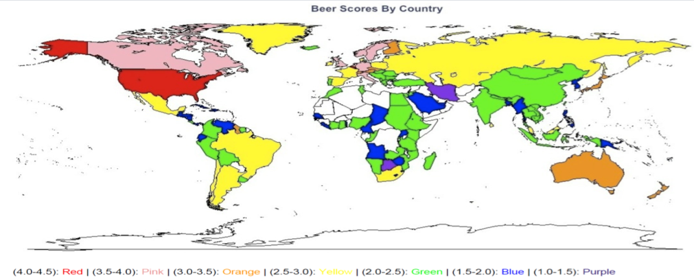
Visualization of beer ratings on a scale of 0 to 5 using data from RateBeer.com. Note that the data is likely biased as the majority of RateBeer.com users are American.
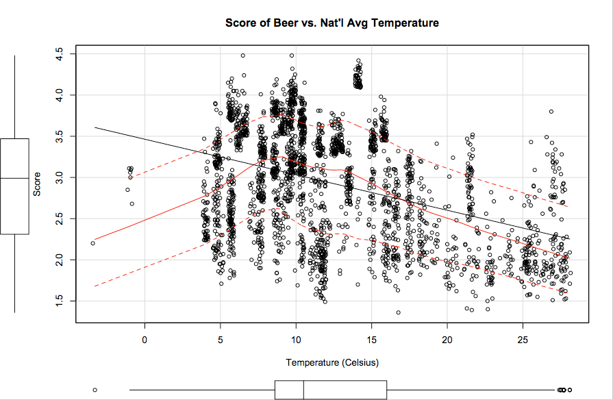
Graph of beer score versus temperature based on data from RateBeer.com. Ideal national average temperature for highest beer ratings appears to be approximately 7-8 degrees Celsius.
