

For my Portfolio & Branding class, we were required to create a brand for ourselves. This included creating a logo, collaterals (calling cards, letter heads, resumes), a website and a demo reel. So let me introduce myself.


So I decided to not use my name for my brand and instead call myself "Outland Creative".
But why?
What does Outland even mean?

I chose the name “Outland Creative’ to represent me because the word ‘outland’, which means a distant land, prompts the audience to think out something outdorsy and something that is related to nature and adventure. I wanted my audience to think that I am a very hands-on person and that I derive my inspiration from travelling and nature.

I wanted my color palette to have a natural and organic feel to it so I took a photo of a sunset and eyedropped the colors to get my brand's color palette.


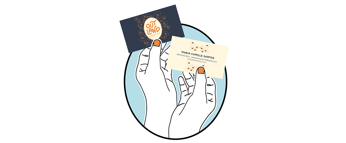
I wanted the design of my business card to reflect the kind of work I like to do while at the same time show people my personality.

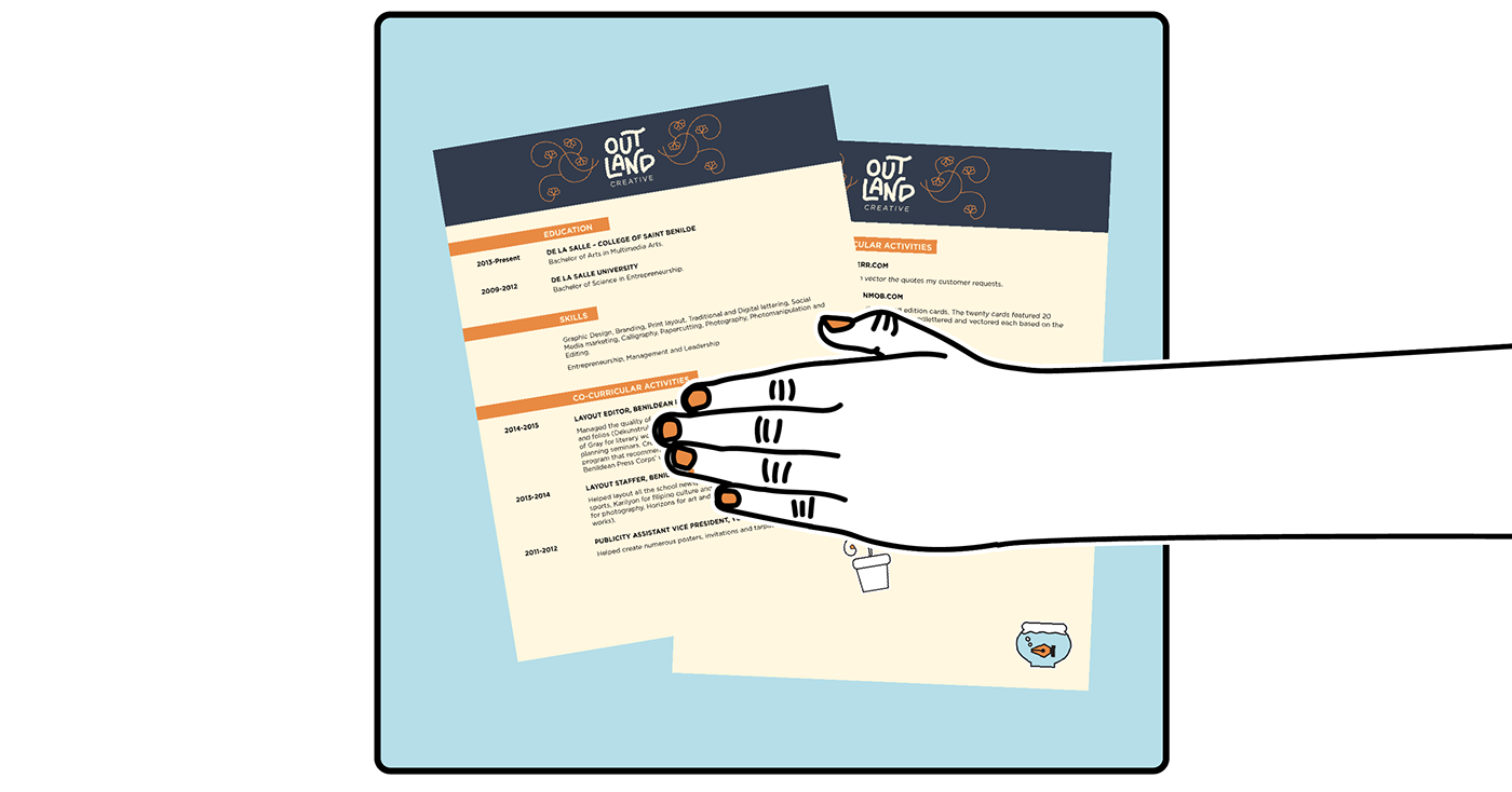
For my letterhead, I used the same flower and vine vectors for the header of my letters and added two vector illustrations at the footer of the letter. The two vectors represent my two strengths as an artist. The fishbowl represents my love for vector art (the fish is in the shape of the pen tool) and the paintbrush plant represents how I like to merge traditional art with digital art.


I wanted the layout of my resume to be simple, organized and easy to read. So like my letter head, I used my logo with the vine and flower vector as a header infront of a navy blue header to distinguish it from my letter head.
You may download my PDF Resume here

I used the same graphic of my logo as my calling card for my PDF portfolio to not only give it a variation from my letterhead and Resume but to be able to make the most of the space on the front cover. When printed it will be the size of a 1/4 letter sized bond paper.
You may download my PDF Portfolio here


I wanted my website's design to be both simple, so the design does not overwhelm my portfolio entries and at the same time stay consistent with the overall look of my brand.


Since my brand revolves around "hand-on" and organic elements I made sure to shoot my works in areas that feature nature. I also made sure that my hands are the only part of my body that is seen to reflect the vectors I used for my website where in my hands, which I vectored, are holding my collaterals.


