
Existing symbol.
_FONT SONERA
Corporate Typeface
I designed a corporate typeface and a logotype for Danish telephone company Telia Sonera. In May 2011 the new identity was launched and the logotype is a version of Helvetica with some flavours from the old Telia-logotype. Very inconsequent in the stroke and relations between letters. We had to design a typeface, that suits the symbol and can work as a logotype, either just written or optimized for the name, and as an identity for headlines. The typeface is original work.
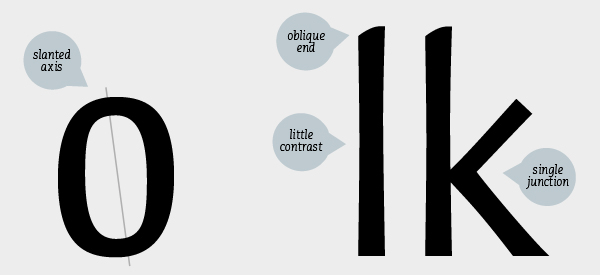
We had to adjust the typeface to existing symbol and make it compatible with it. Symbol consists of strokes of varying widths and round organic shape. That was the main point in designing typeface - to make organic letters that will conect to the symbol. Also make them more squared at the same time due to shape of the symbol.
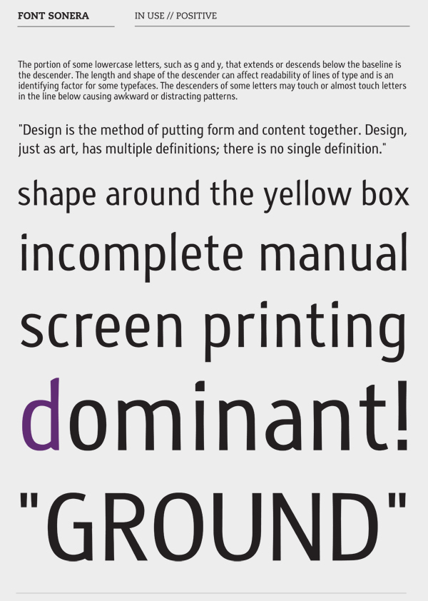
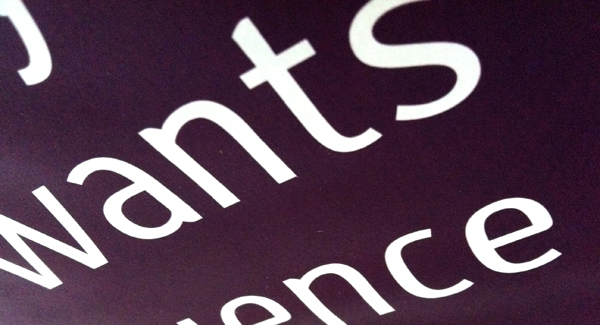
Font Sonera is sans serif typeface. Due to organic effect stroke has two widths - it is wider at both vertical ends. Letters are asimetrical. E-bar is horizontal, stress is slightly slanted, letters are narrow. Lower case letters in the ascender have ronuded and oblique end, rounded ending are with small contrast (wedge).
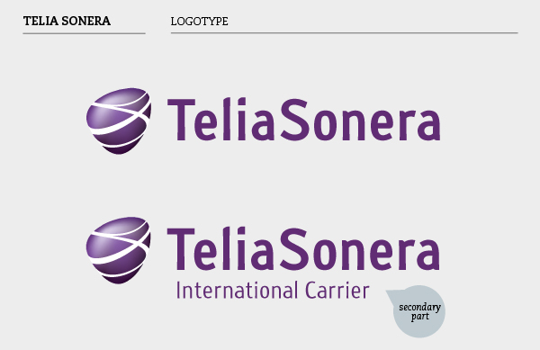
Typeface in bold version for main logotype and in regular version for secondary part.


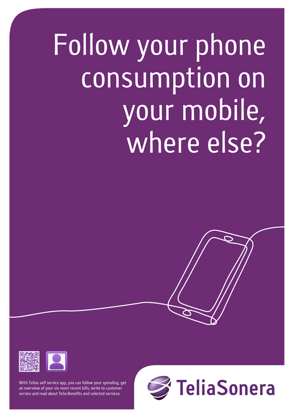
Posters for Telia Sonera are made in their existing style and colors. They are clean and pointing out corporate typeface. It can be used in big and in small size as well.


Sanja Radakovic
Designskolen Kolding 2012

