Typographic Circle Supplement
D&AD Student Awards Brief
D&AD Student Awards Brief
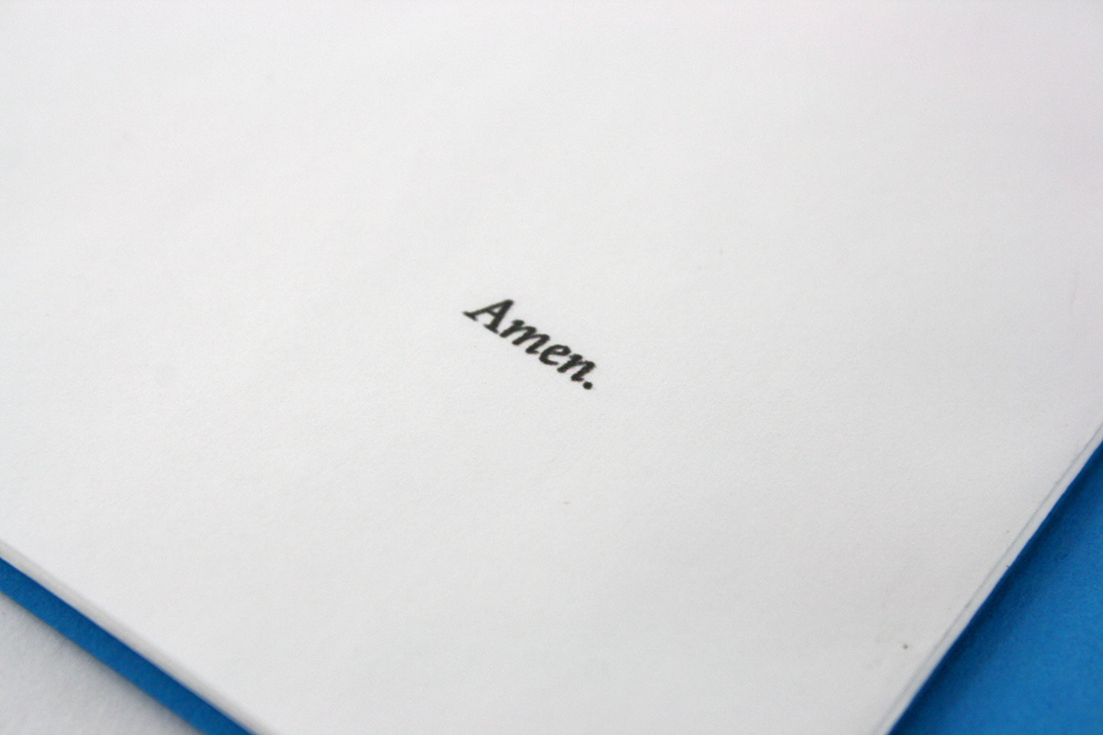
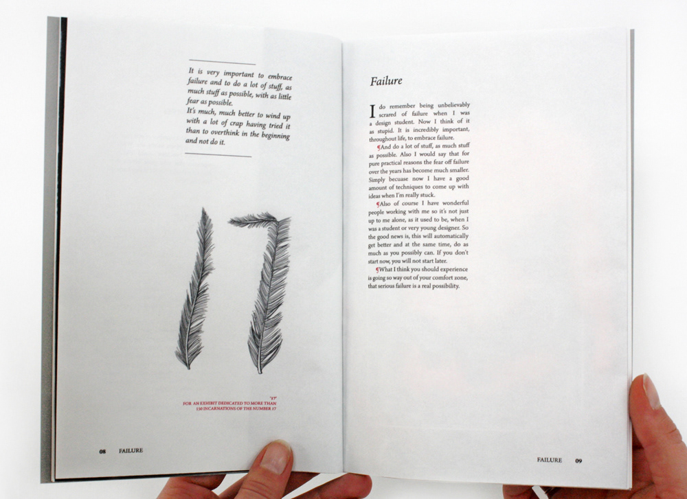
The concept is a Bible theme to visualize the idea of the Designers/ Writers that have given talks for the Typographic Circle being Icons. The content consists of the three designer’s individual 10 commandments and is written in the first person to mimic the Gospels contained in the Bible.
The Typeface throughout is Arno Pro, a serif typeface to reproduce the look of Bible text. Whereas Imagery is used in more of a loose way to give the supplements a contemporary feel. Pilcrow marks are used to indicate new paragraphs as can be found in some Bibles. To add a contemporary feel, the pilcrow marks are in colour, as opposed to standard black.
Dimensions:
140mm x 210mm
Paper:
Offenbach 40gsm
Cover:
Colourplan 135gsm
Style:
French Fold

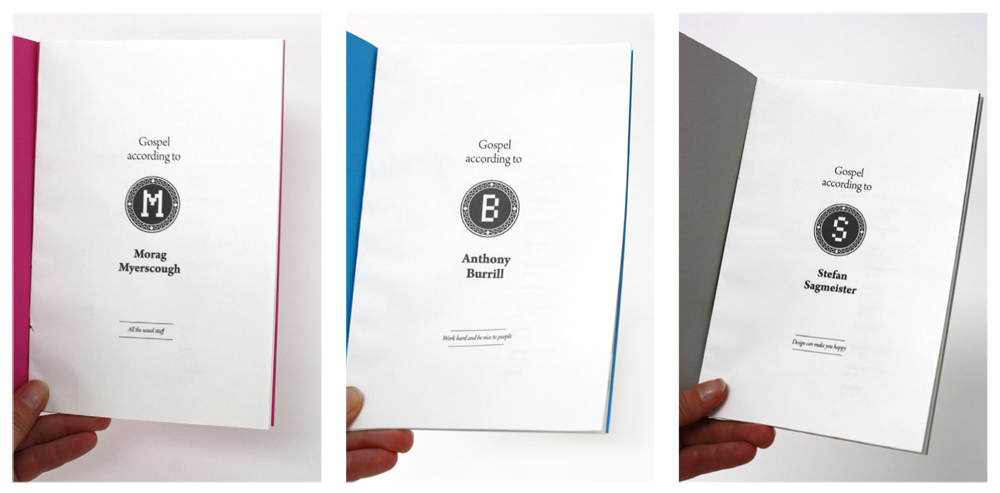
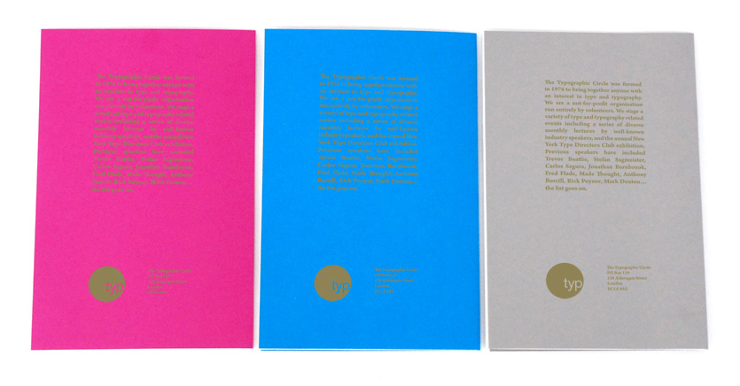

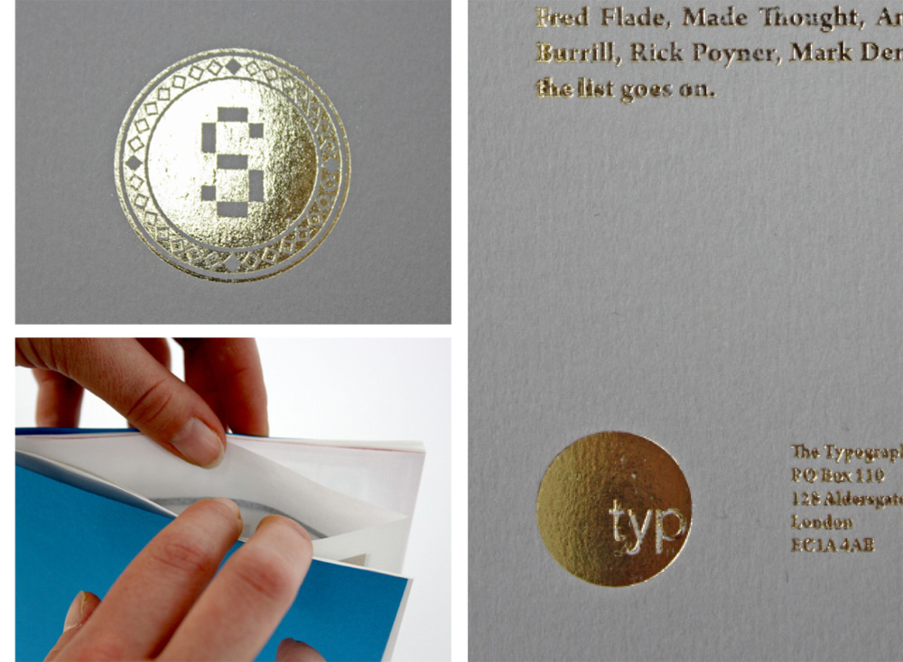
The cover stock is colourplan for a fresh take on the subject but goldfoiling has been added for the authentic Bible look. The Logo is a mixture of ornamental shapes and modern pixels, each one customised according to the surname of the designer featured. The back also uses goldfoiling text summarising general information about the Typographic Circle and featuring their logo.
The paper stock chosen is Offenbach Bible paper to support the general concept. Throughout the three supplements, frenchfolding is used as the paper stock is only 40gsm and double sided printing would make text illegible.
The paper stock chosen is Offenbach Bible paper to support the general concept. Throughout the three supplements, frenchfolding is used as the paper stock is only 40gsm and double sided printing would make text illegible.