
This was my debut / experimental project in graphic design for print, where I could put my lettering skills into action and on the test. A friend of mine, knowing my love to lettering, doodling and all things visual, asked me to create wedding invitations for her.
She introduced the color pallette of the wedding to me - peach and pale green; and the theme of the wedding - music. My goal was to develop the concept of music and incorporate it in the invitations in a way that conveys the overall feeling and theme of the wedding: lots of flowers, spring, rustic, vintage...

There were some other variants of the letters and the play of ornaments at the beginning. Each of them with their own character: the bolder ones and the more elegant ones.
Some sketches

The very early vision
Then there was a round of iterations with the flowers... Initially I would've loved to paint them in watercolor, but...this was not the time for that yet.

Here I used an image from an open source. But in the end, it didn't match the pallette, and the overall feeling.
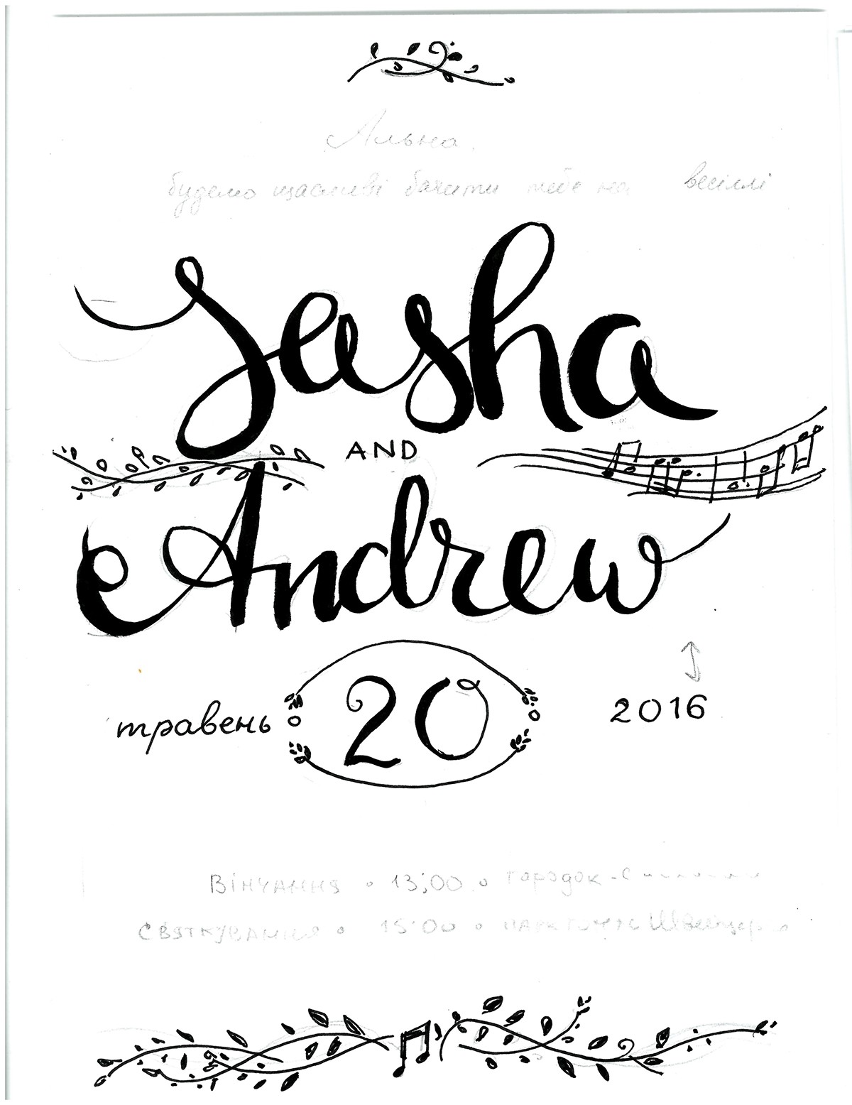
So, using the music notes as the leading concept, and a more prolonged way of displaying the letters, we agreed on this final design.
My friend created the envelopes from true old 'rustic' music sheets bought on a local book market here in Kiev, and they matched perfectly with the colors and the feeling of the invitations.
We had several paper colors for the invitations - snow white, pale cream and
ivory. The pale cream looked best together with the envelopes. The vibrancy of the fresh colors on the invitations, contrasted perfectly with the burnt-out music sheets, brought together by the creamy palette.


The final 'packaging', with the peach, green and cream lace ribbons was done by my friend as well :)
And I had the pleasure of working on this kind of art.


And...this was us going through the pile, putting the names of the guests on the invitations and sealing the whole deal!

