59th Photographic Society
Identity, Branding, Graphic Design, Publication Design | May – Oct 2014
Identity, Branding, Graphic Design, Publication Design | May – Oct 2014
Collaborated with Yanny Chow
Design Theme
This is an identity project for The Hong Kong Polytechnic University 59th Photographic Society (2014–2015). The theme of the year is ReFrame, by including the watercolour splashes to create a refreshing and relaxing atmosphere, lower the distance between photography and everyday life.
Design Theme
This is an identity project for The Hong Kong Polytechnic University 59th Photographic Society (2014–2015). The theme of the year is ReFrame, by including the watercolour splashes to create a refreshing and relaxing atmosphere, lower the distance between photography and everyday life.
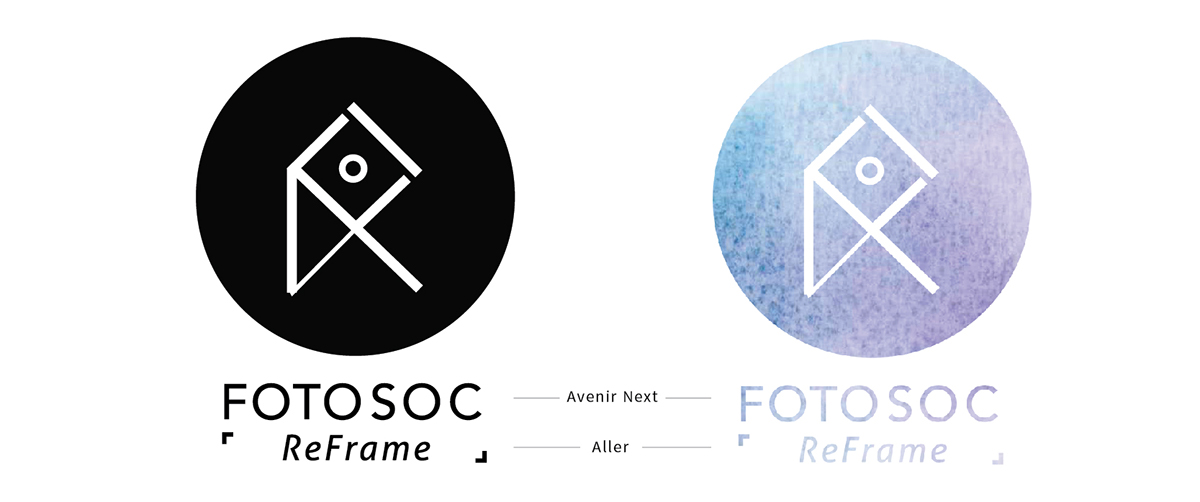
Design Concept | logo
The logo was inspired by the structure and shape of tangram, symbolising the action of reframing. Also, the circle at the centre symbolises the camera lens. The whole logo also represent the overlapping "R" and "F", the short form of ReFrame.
Design Concept | name card
Continuing the visual style of watercolour splashes, the name card was designed based on the structure of film photography, as of 14 committee members connected into a complete roll of film, to create flying colours.
Continuing the visual style of watercolour splashes, the name card was designed based on the structure of film photography, as of 14 committee members connected into a complete roll of film, to create flying colours.


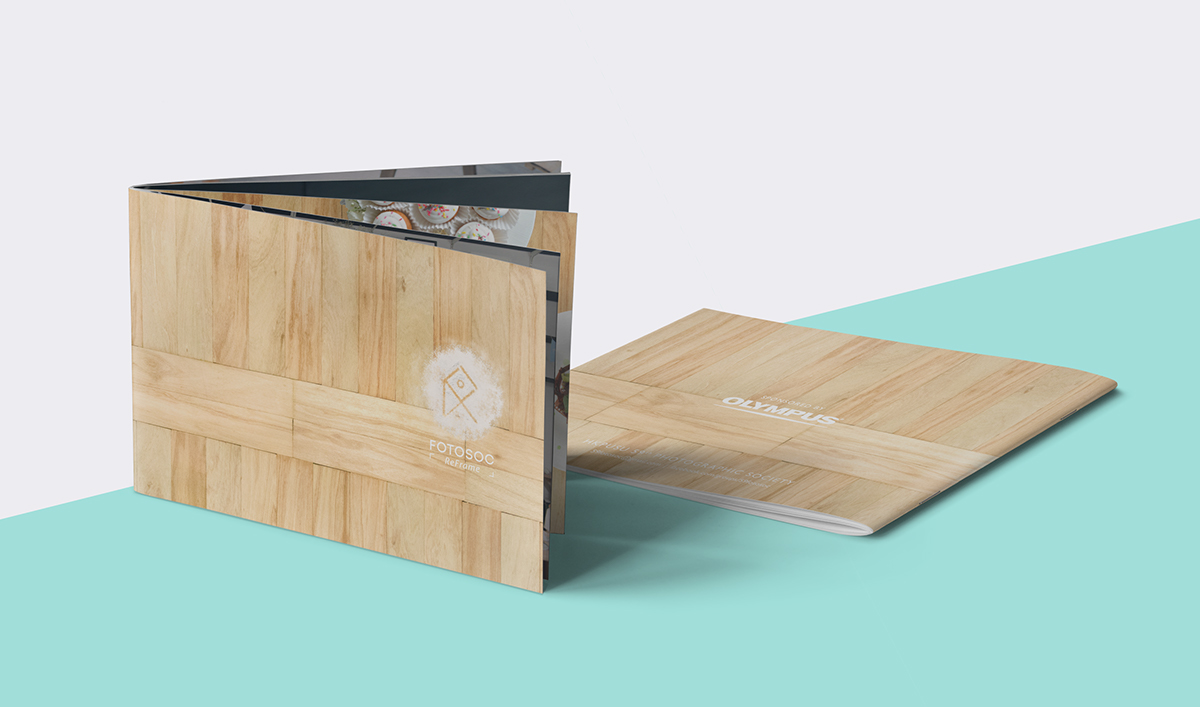
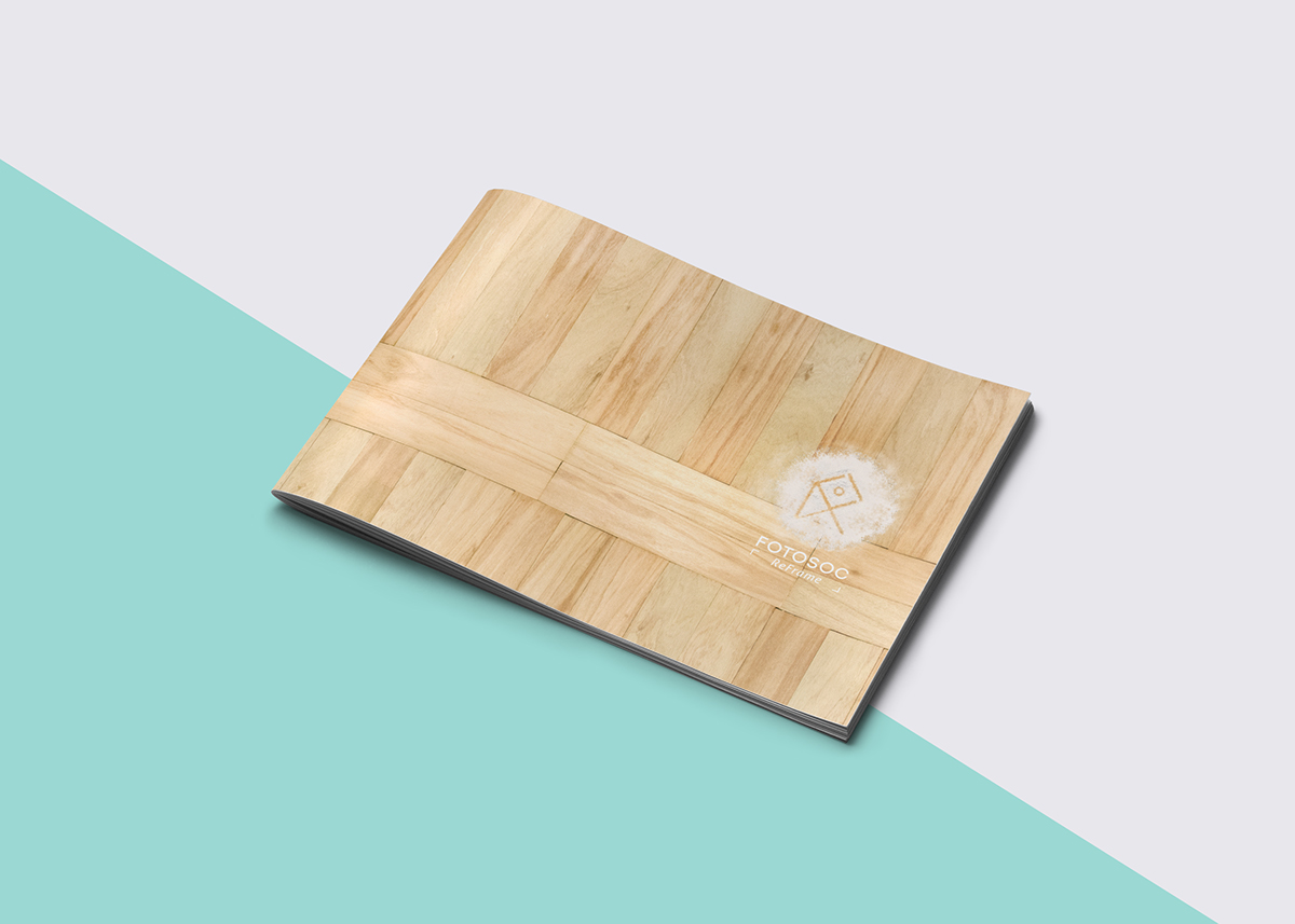
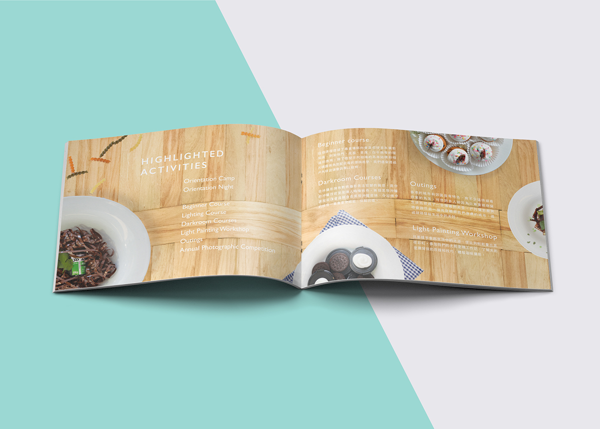
Design Concept | society booklet
Food was chosen as the theme to connect between photography and everyday life since it is easier to approach, as well as essential in everyday life. The theme of booklet is cook book, readers can expereince the imaginative linkage between photographic elements and food styling in the booklet, as well as reading the introduction of the committee members. More refreshing style was used in order to create a new perspective for viewing photography.
Food was chosen as the theme to connect between photography and everyday life since it is easier to approach, as well as essential in everyday life. The theme of booklet is cook book, readers can expereince the imaginative linkage between photographic elements and food styling in the booklet, as well as reading the introduction of the committee members. More refreshing style was used in order to create a new perspective for viewing photography.


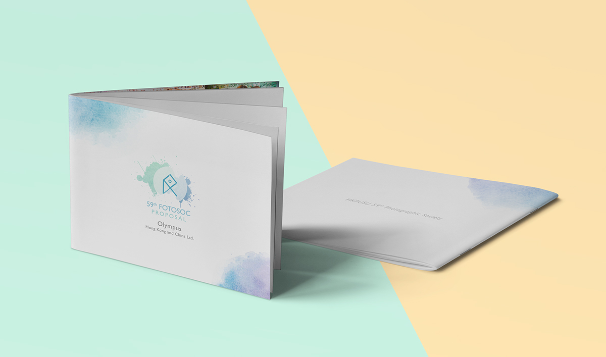
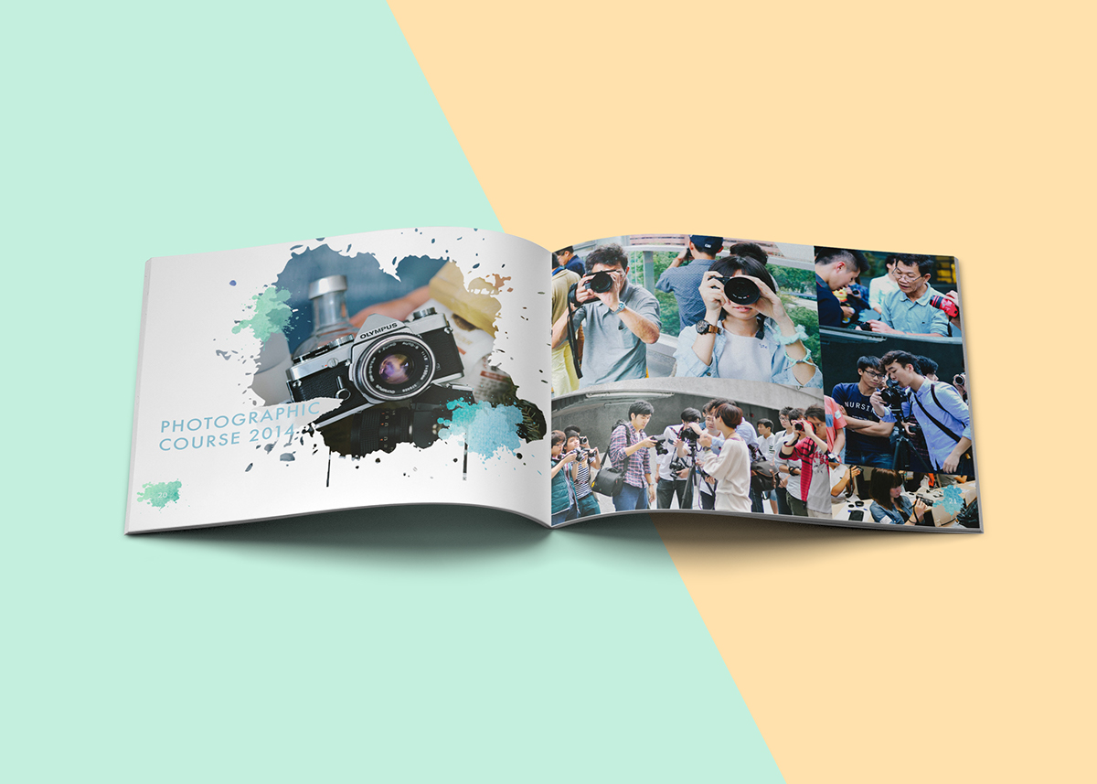
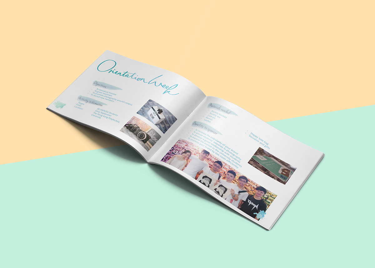
Design Concept | sponsor booklet
Sponsor booklets designed for proposing potential sponsoring possibilities to different sponsors. It acts as a proposal in a more relax and itneractive way.