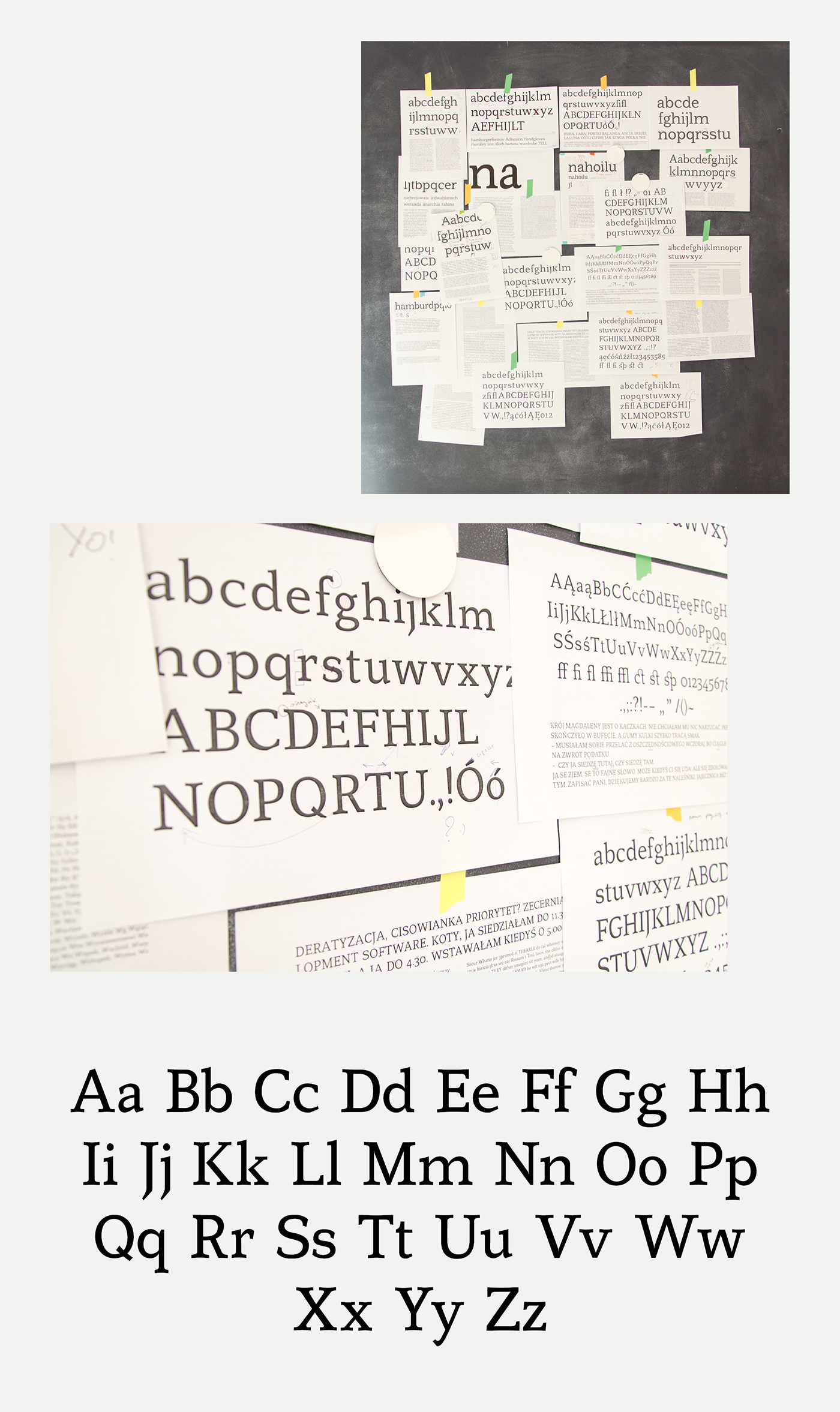
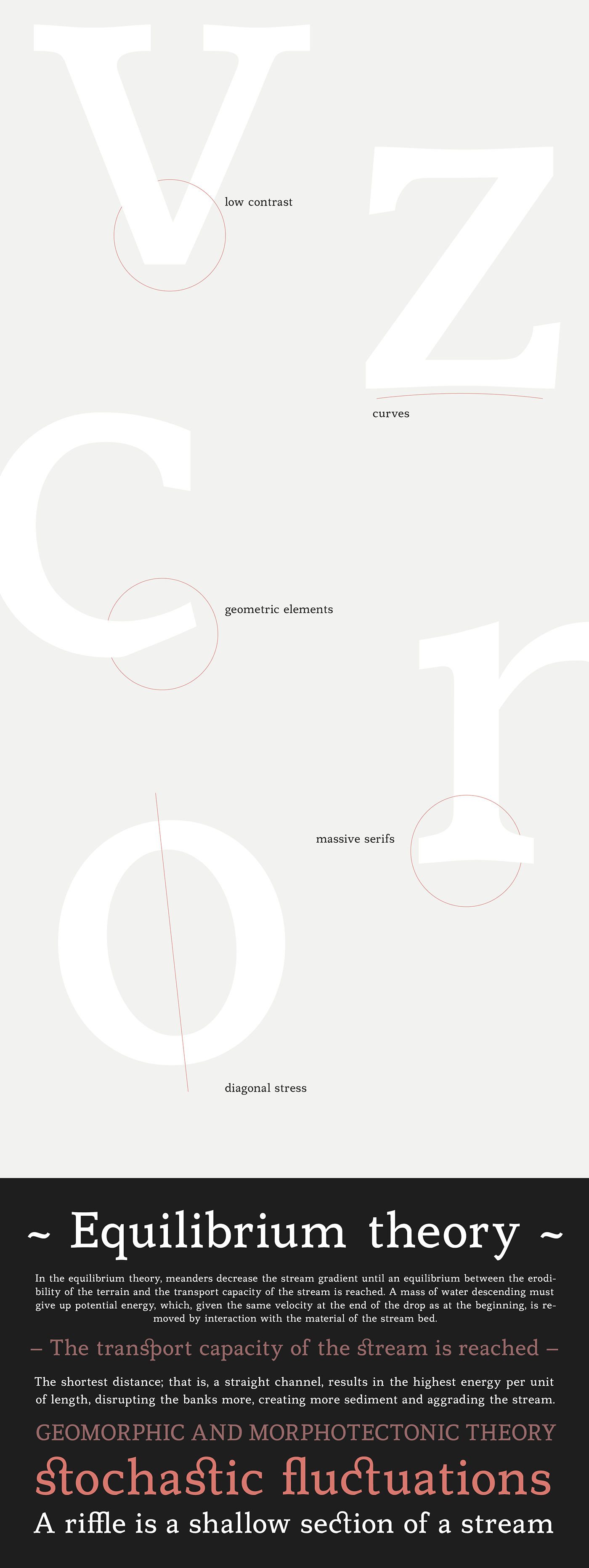
Meander is my first attempt at designing a typeface. The premise was to create a typeface which would work in typesetting larger portions of text. Massive serifs had a positive impact on the stability of the font, and the increased x height and the large width of the symbols, make it easily readable in small size. The shape of the letters comprises classic features, deriving from calligraphy, with modern geometric cuts.