From rigid to flexible.
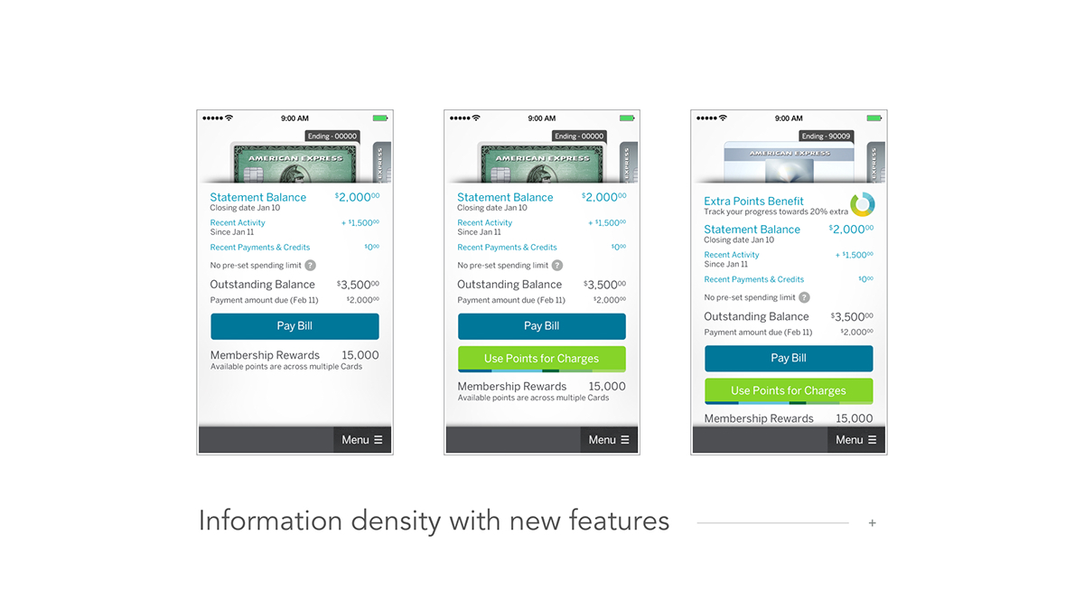
The previous Amex Mobile made it easy to check your balance, but buried many sought after membership-focused features.
Over time, the app's primary screen became crowded with competing features, with an under utilized menu in an unconventional place. Users liked the one screen experience, but tended not to access other valuable areas, like Membership Rewards. A new approach was needed.


A new app. A new platform.
Before the roll out of any significant new features could be contemplated, the overall user experience and technical architecture of the product needed to be streamlined and simplified around core user needs.
After extensive exploration and sketching, the architecture emerged around 4 primary tabs: Billing, Activity, Rewards, and Offers.


UX / UI
The team and I started with a wide range of sketching to generate new ideas about how the app could be organized and function.


We worked with the engineering team continuously to bring the new design to life. It became easy to navigate using well-known UI patterns, native to iOS and Android.

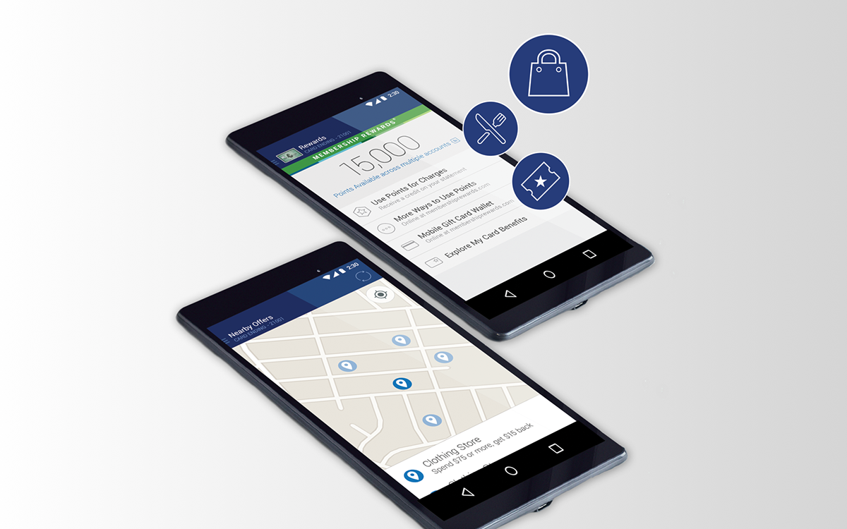
The new, more flexible structure enables new features to be developed that enhance these sections over time, allowing for continuous improvement with each release.


Featured in the Apple App Store
With the release of the redesign update, the app was featured in the App Store, and listed in the Best New Apps category. With an increasingly frequent regular cadence of new releases, the app continues to get strong reviews.


