
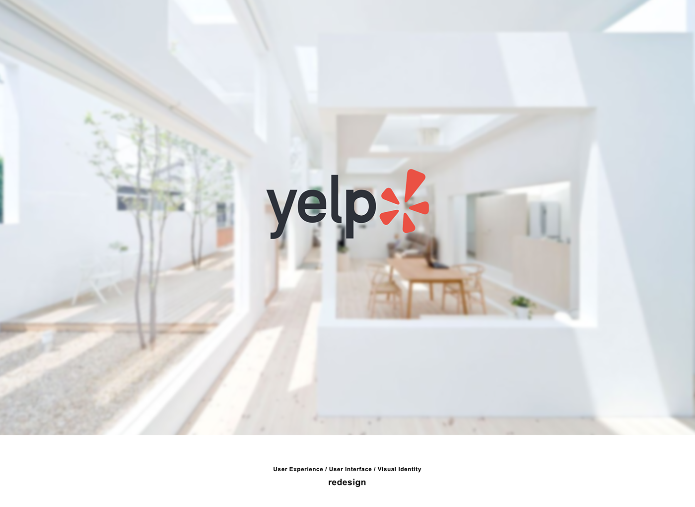

It is a side project. The main purpose is to redesign yelp iOS application. By redesigning the user flow, interface structure, visual looking, we would like improve the existing yelp user’s experience. Team Members included Liyi and me. Big company does not take risk. We want our design is realistic, which is possible to be implemented and meeting the design principles for a industrial product. It might not be super creative. But it must be reasonable. That is the biggest challenge we think.

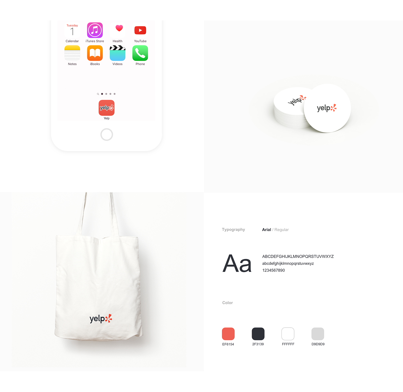
we started to brainstorm the new visual identity. According to the our friends’ impression of Yelp, “Friendly” and “Energy” were the keywords of the Yelp brand. Therefore, we would like to keep those words as a guideline, also, “modern” was new word we added to the existing branding guideline. As a result, we came out the new logo and color palette.

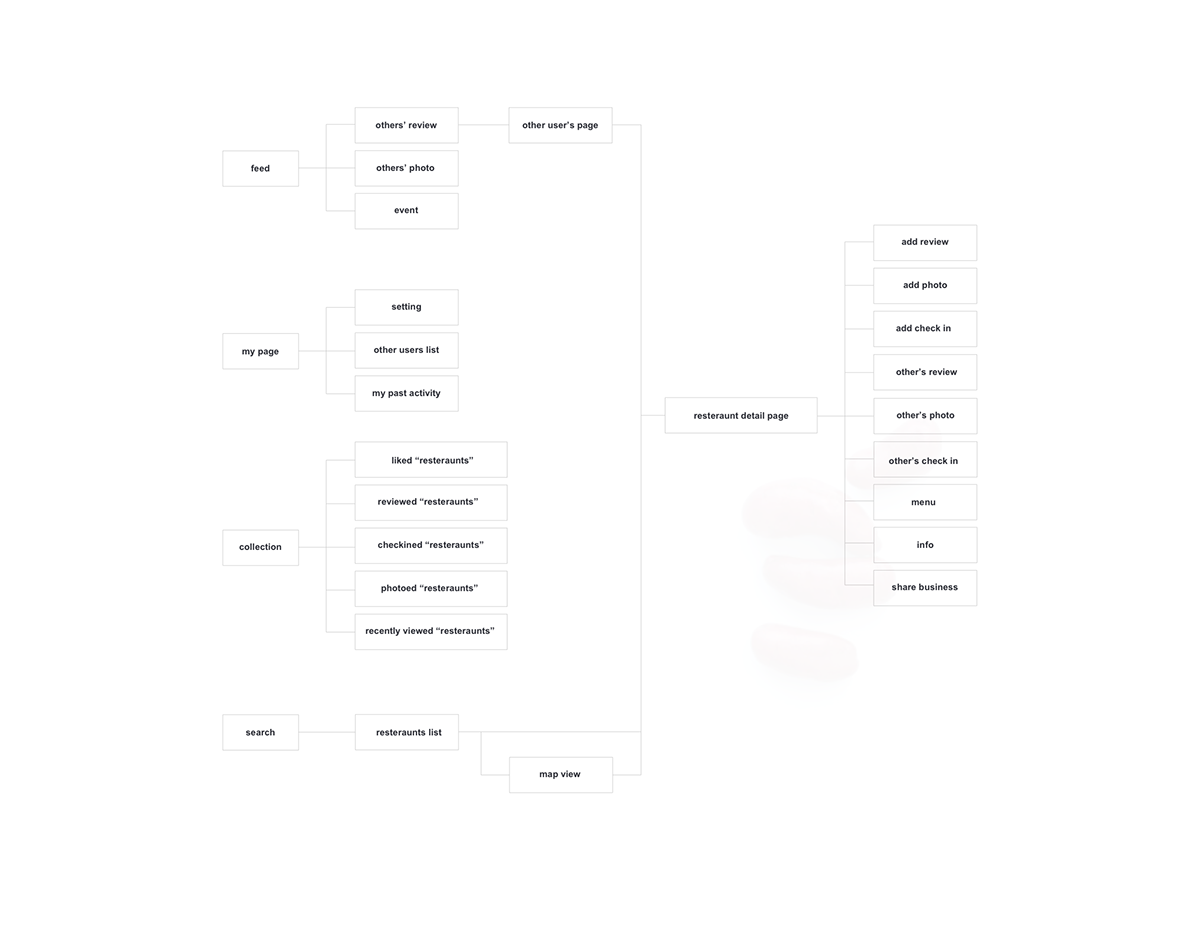
At the first stage, we analyzed the current user flow of Yelp application. Then we found out some big problems.
1. “Nearby” and “Search” are almost sharing the same flow.
2. In “Action” flow, after the user chooses an action option, she has to search the restaurant again, just like “Search” tab.
2. In “Action” flow, after the user chooses an action option, she has to search the restaurant again, just like “Search” tab.
With the consideration of the problem we found at the first stage, we conducted the first round user interview to figure out how user felt about current features and flow. And then we found out “search” was the feature user used most often. And the “action” tab did not encourage users to add a review or photo successfully. https://www.youtube.com/watch?v=7bouMvu5QnA
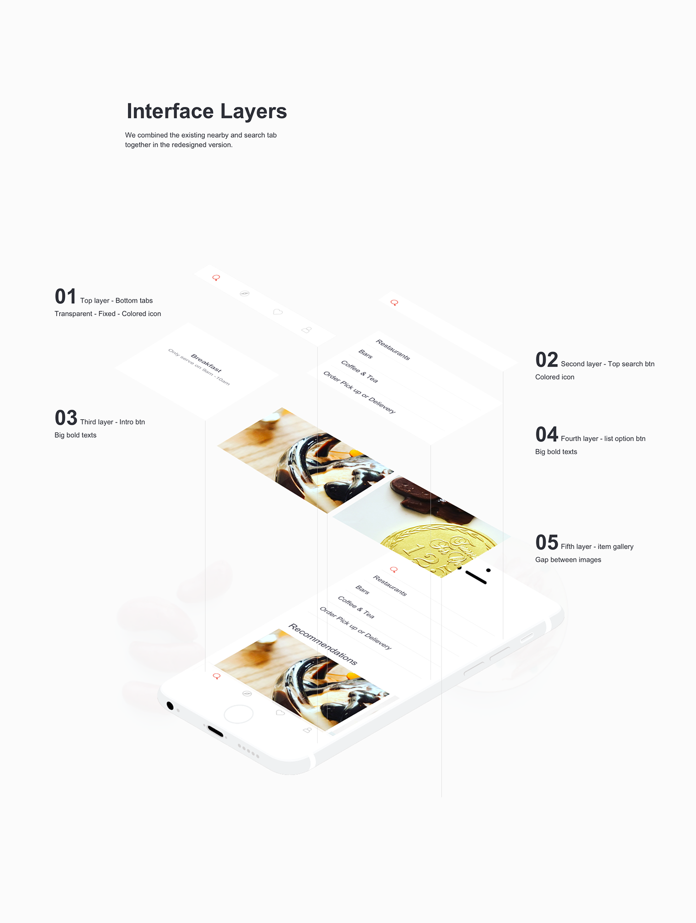
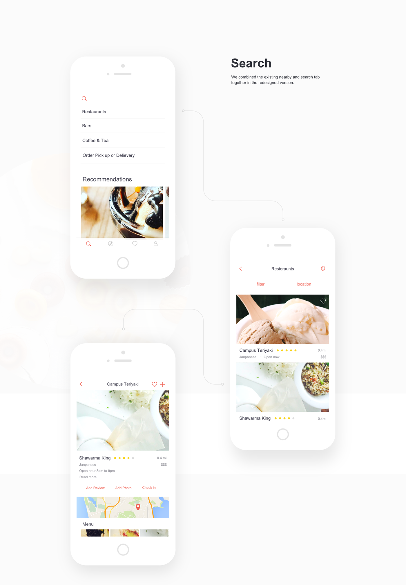
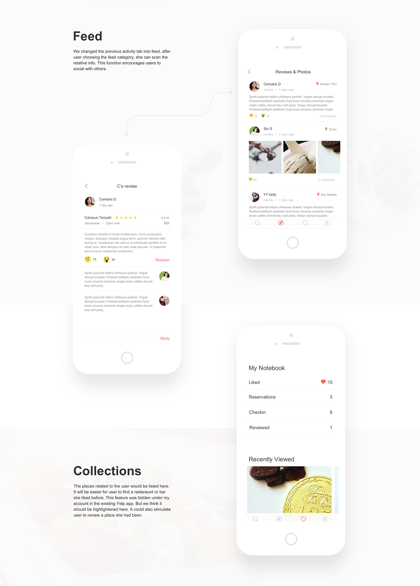
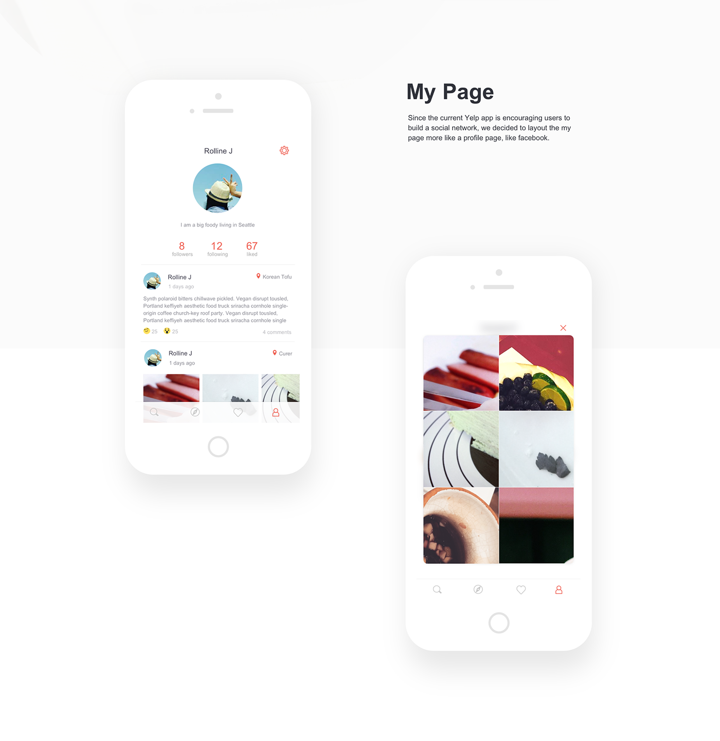
Based on the feedbacks we gained from the analysis and first round interview, we brainstormed how to improve the current user flow. The we came out the redesigned flow. We came out 4 main features - search, feed, collection and my page. Basically, we merged previous “nearby” and “search” into one flow. And the “action” was deleted. Instead, the collection feature could store the places related to the user, which was supposed to encourage the user to add an action.

After finishing the paper prototype, we conducted the second round user test to figure out whether the flow made sense. We asked the user the perform the tasks which are to search a restaurant called Adam, to find information at my feed page, to find a restaurant bookmarked, to check my personal page. Overall, the user felt the four feature are pretty clear. But she did not like the information to be “folded” through a button on restaurant page. https://www.youtube.com/watch?v=kmqgB0muxr

Since the feedbacks we gained were mostly positive, we dived into wireframe design immediately. At the stage, we started to consider the design consistency. Also, since the main purpose of this prototype was for user testing, we decided the user tasks at first, which were to find a user in your following list, to find an event you liked it and attend it, to find a restaurant. The last task included using the filter to check which one was opening now, using the map view to check the location, and sharing the restaurant to a friend. After we decided on the three tasks, it was easy for us to decide which screen we would like to make. Eventually, We made 17 screens in total.

Now we conducted the third round user test to see whether there was some usability issue and also test whether the user flow made sense. The three tasks were a find in your following list, to find an event you liked it and attend it, to find a restaurant. The user gave some valuable feedbacks. The unclear tabs at the home screen did not indicate the features successfully. Feed and collection look very similar, it was hard for her to tell the difference at the first sight. For the my page feature, the timeline look like a little bit redundant.
https://www.youtube.com/watch?v=v-fMypmpoKY