

Adobe Document Cloud is a modern way to manage documents at home, in the office and across devices. It addresses the waste and inefficiency associated with document processes. Whether it’s school permission slips, health insurance forms or complex enterprise document workflows, Adobe is transforming how people and businesses get work done. At the heart of Document Cloud is the all-new Adobe Acrobat DC.
A Design-led Approach
Acrobat DC is a significant leap from the previous versions of Acrobat. At the risk of alienating some of our users who dislike ‘change’, we followed a design-led approach to build something that in the long run would become a powerful and easy tool for beginners and pro-users alike. What was also different from the past was that the entire organization embraced user centered design as the core around which our product had to be developed.
The Process
The XD (Experience Design) team started with a vision of modularizing the complex application that was Acrobat. Given its wide range of users in the world, we felt that it was important to be able to design a product that would be modular and customizable for different use cases. Using design methods of sketching, prototyping and user validation, and working together with other facets of our organization like engineering, marketing and product management, we arrived at a tool centric approach.

Digital Transformation
One of our core design principles is to revolutionize paper processes across industries. How do we help our users convert paper to digital? Replace ink with e-signatures? Digitally send and track documents?
One of our core design principles is to revolutionize paper processes across industries. How do we help our users convert paper to digital? Replace ink with e-signatures? Digitally send and track documents?
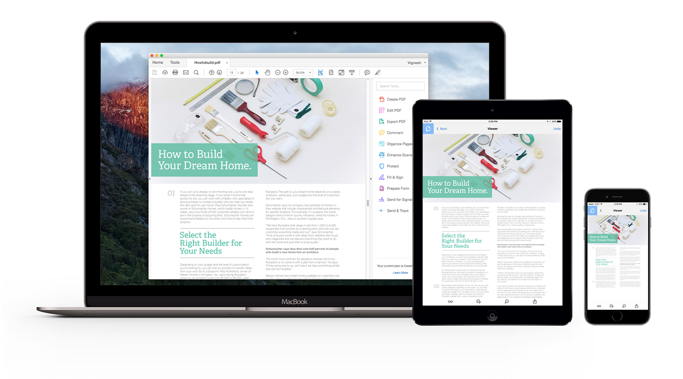
Cross Platform
To meet the expectations of our modern day users, we had to ensure a seamless cross platform experience. With a consistent experience model, the Document Cloud allows you easy access to your files across any device and increases productivity on the go with a touch friendly, and intuitive interface.
To meet the expectations of our modern day users, we had to ensure a seamless cross platform experience. With a consistent experience model, the Document Cloud allows you easy access to your files across any device and increases productivity on the go with a touch friendly, and intuitive interface.
Visual Upgrade
With the Document Cloud project, the XD team worked on simplifying the visual patterns to arrive at a modern UI. One with a color palette that is lively yet professional, and a lightweight interface that is inviting to use.
With the Document Cloud project, the XD team worked on simplifying the visual patterns to arrive at a modern UI. One with a color palette that is lively yet professional, and a lightweight interface that is inviting to use.

A closer to look at the UI framework

Home View
All your files in one place. The Home view is meant to be a central location to access all your files whether they locally stored or in the Document Cloud or even Dropbox.
All your files in one place. The Home view is meant to be a central location to access all your files whether they locally stored or in the Document Cloud or even Dropbox.
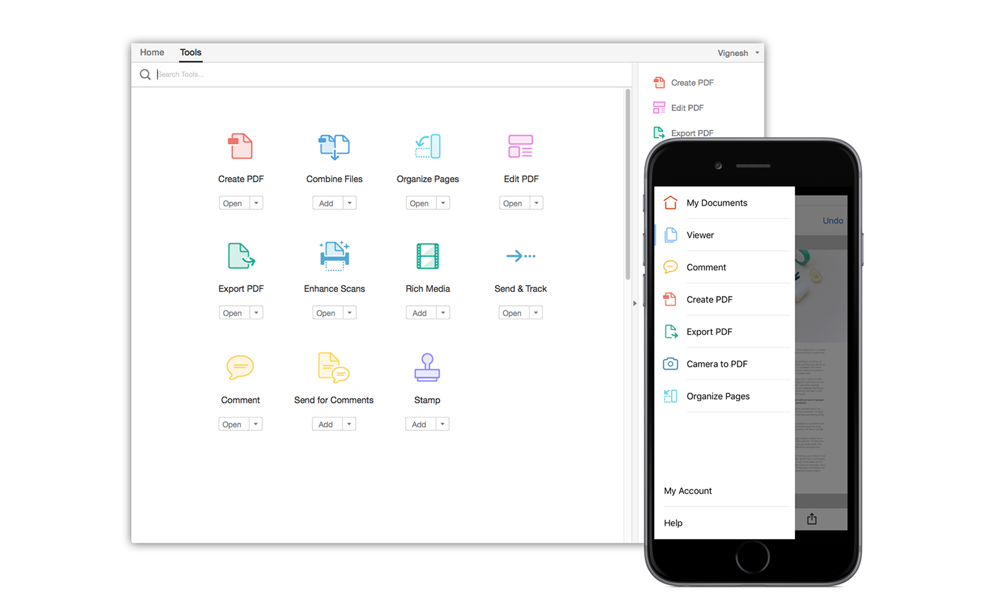
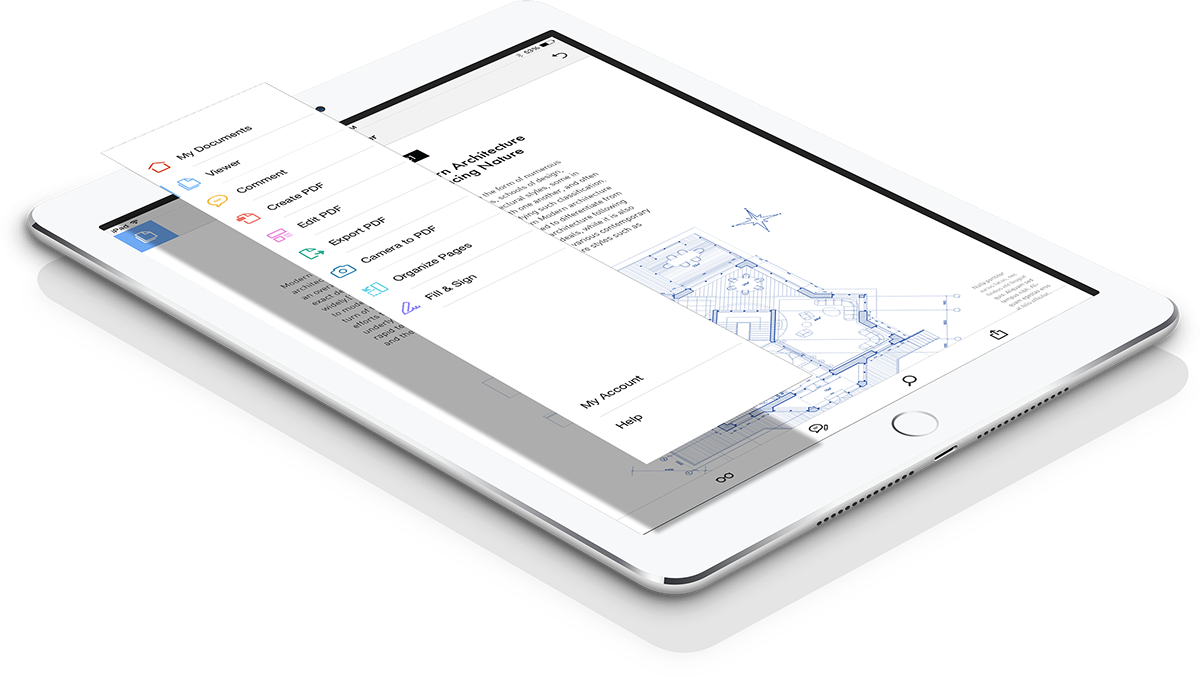
Tools Center
An easy way to search and access all the tools in Acrobat DC. Catering to a diverse user group was always going to be a challenge. One solution that helps the user is the ability to customize the right sidebar to contains tools that they frequently use. This sidebar is easily accessible from the document view.
An easy way to search and access all the tools in Acrobat DC. Catering to a diverse user group was always going to be a challenge. One solution that helps the user is the ability to customize the right sidebar to contains tools that they frequently use. This sidebar is easily accessible from the document view.

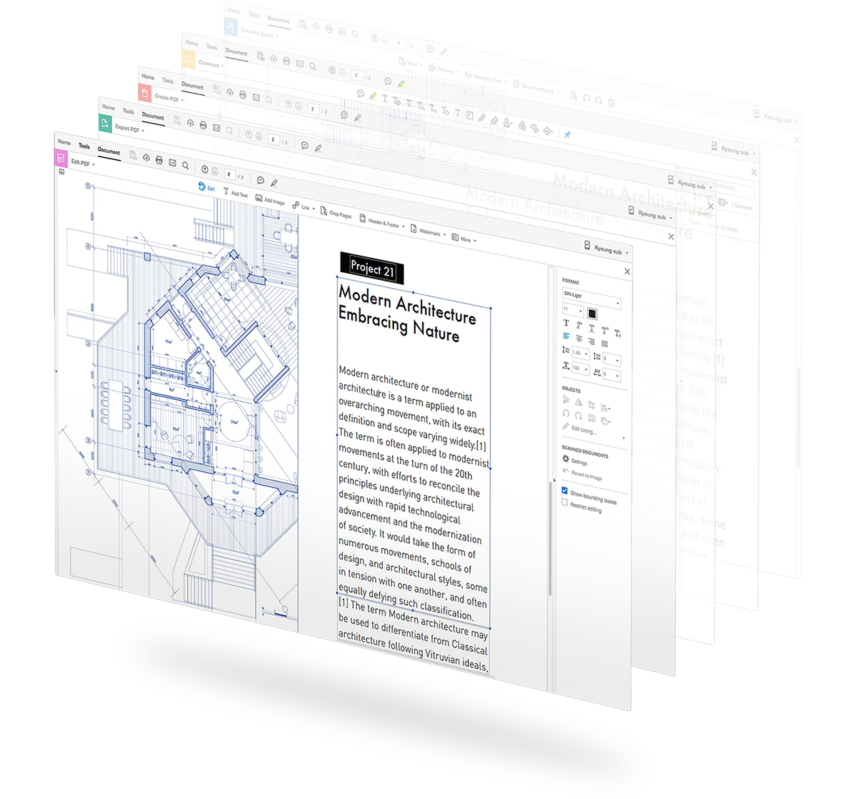
Document View
The most frequently visited 'view' of Acrobat, the Document View, needed to be simplified as much as possible. While hiding a significant portion of power tools, we still provide a way for the same power users to customize and add shortcuts to their favorite tools either on the top toolbar or in the customizable right sidebar. Additionally, with Acrobat DC we re-introduced after many years the ability to have multiple tabs open in the same window which was a delight to many of our pro users.
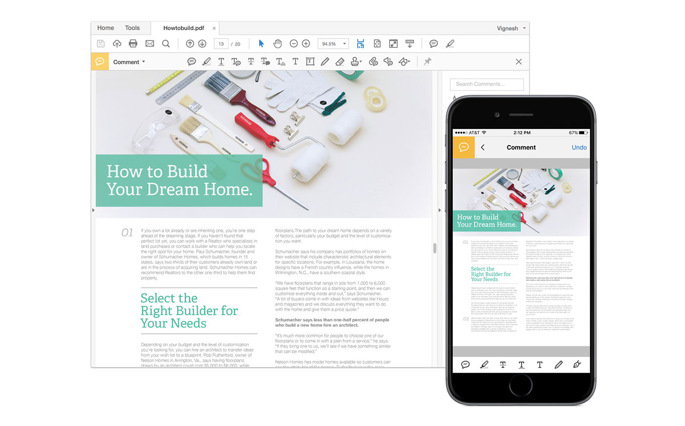
Tools Subview
One of the major changes to the UI framework this release was the introduction of focused subviews for tools. Take for instance the Comment tool. It takes the user to a focused mode with the Commenting features taking over a secondary toolbar and the sidebar. This provides a simple structure to get a task done while hiding away much of the noise and features that are not relevant to a user trying to add comments to a document.