PROGRESSIVE DIRECTION
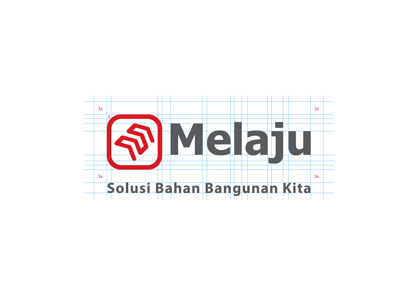
MELAJU logo is formed with a minimalist and modern contemporary impression from the combination of arrows in symbol 'M' (target ) to the upper right ( forward / progressive / increasing) . Using composition of the letter on the logotype complete the impression of MELAJU committed to reach both from the top-bottom market with flexible services . The combination of primary colors (red and gray) make an impression of brave , strong, and nationalism spirit of PT. Maju Anugerah Jaya Unggul.
M (Mekanisme / Mechanism), EL (Elohim/Tuhan; atas berkat & anugerah Tuhan / by God's Grace),
A (Akal Budi / Intelligence), J (Jujur / Honest), U (Usaha / Effort)
A (Akal Budi / Intelligence), J (Jujur / Honest), U (Usaha / Effort)
Brand Design Concept
aksen, berani, komitmen, kontemporer, minimalis, progresif, nasionalisme
aksen, berani, komitmen, kontemporer, minimalis, progresif, nasionalisme
accent, brave, commitment, contemporary, minimalist, progressive, nationalism
Target Market
By Occupancy: Retailer, B2C, B2B, Grosir, Toko Material, Kontraktor, Developer
By Occupancy: Retailer, B2C, B2B, Grosir, Toko Material, Kontraktor, Developer
By Gender: Pria & Wanita
By Age: Segala Umur (meliputi umur 25 ke atas)


Thank You
M| thooneyns@gmail.com


