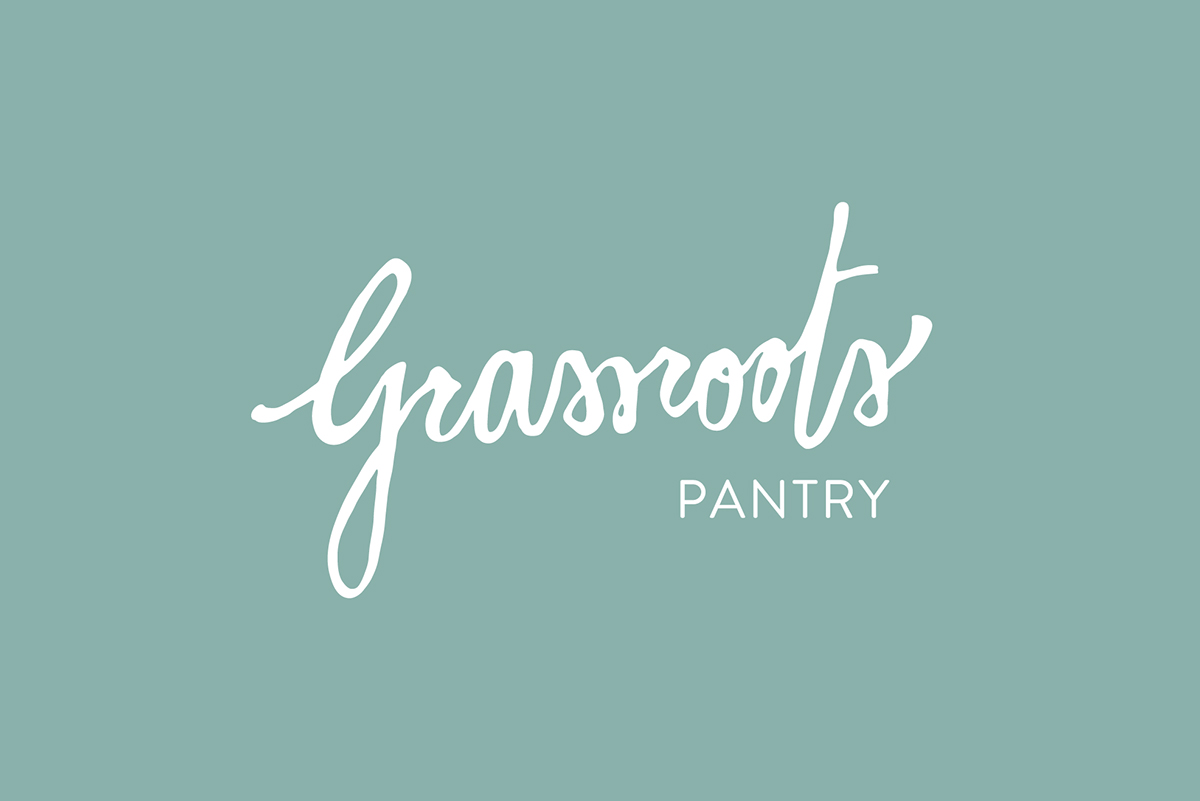
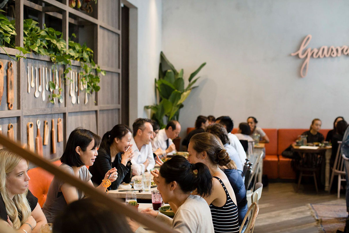
The main concept for the rebranding of Grassroots Pantry aims to evoke a more hip and sophisticated image compared with the previous one, to reflect the restaurant’s new location and revamped interior.
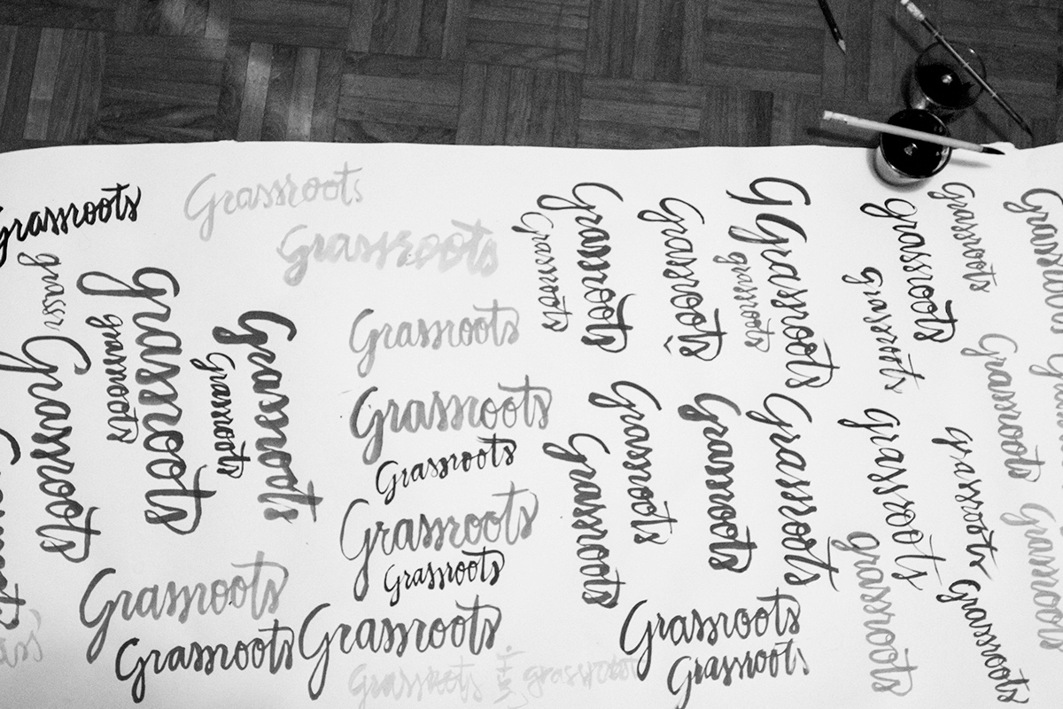
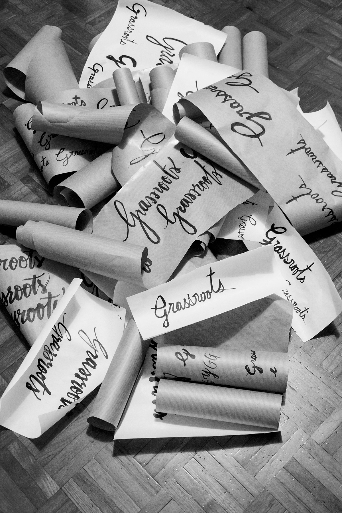
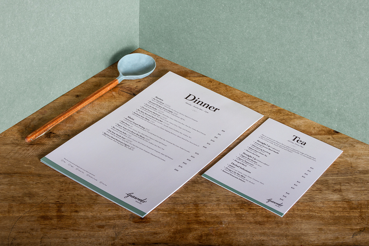
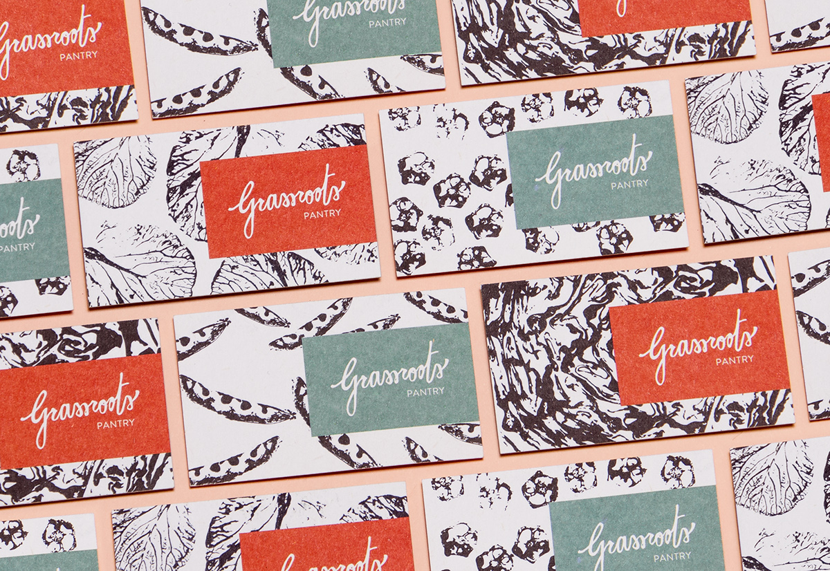
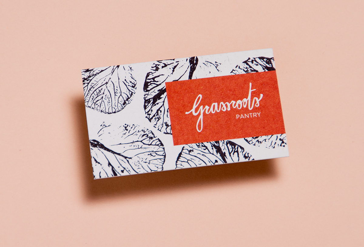
The idea in designing the logotype was to convey an organic and naive feel. I opted to explore a casual handwriting, that references irregularities and proportions in children’s handwriting such as long ascendants and descendants and uneven letterforms. The idea was also to reference calligraphy-based signs in Hong Kong by using brush lettering and Chinese ink.
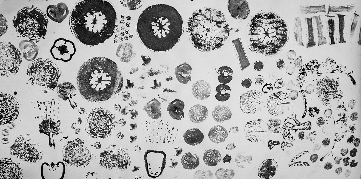
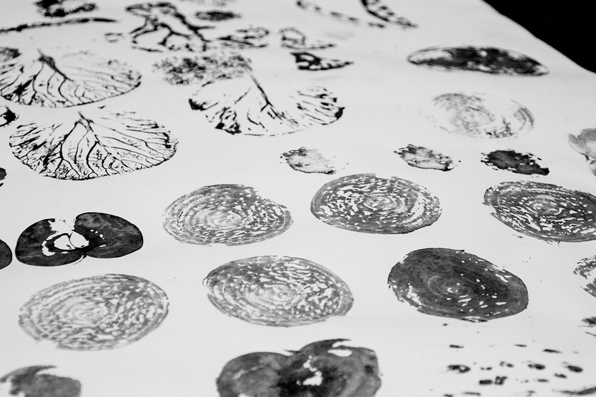
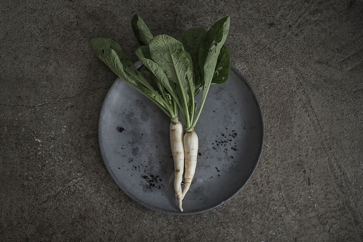
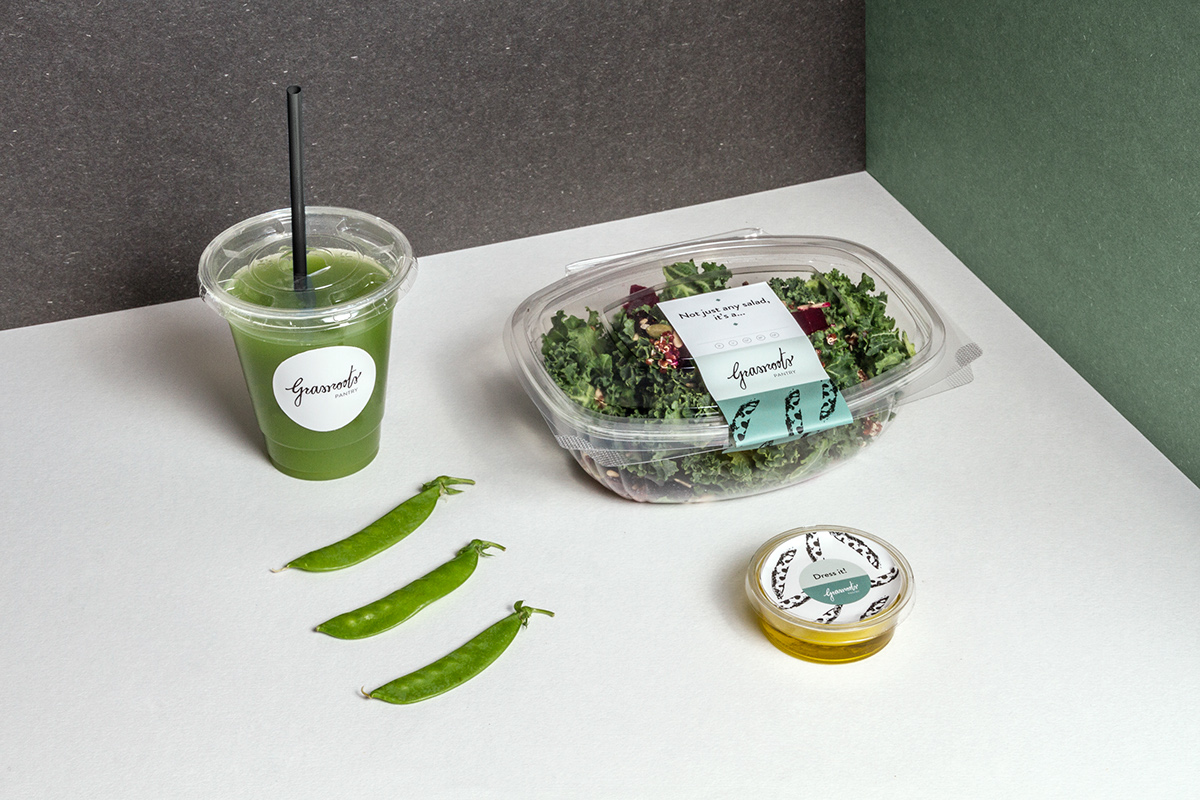
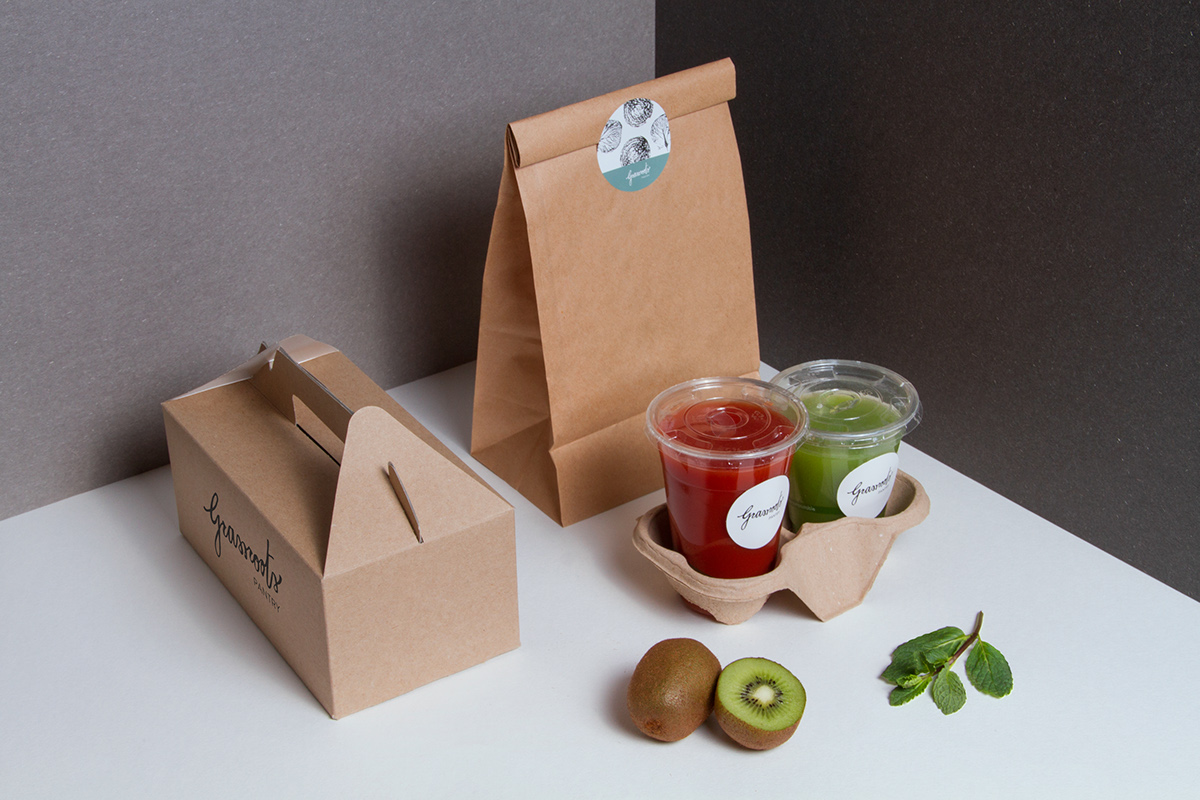
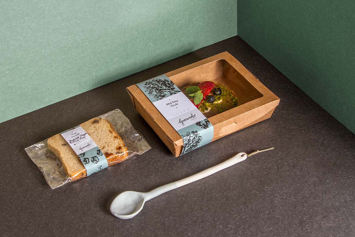
To complement the logo in the various branding materials I used vegetables as a matrix to generate ink printed patterns.
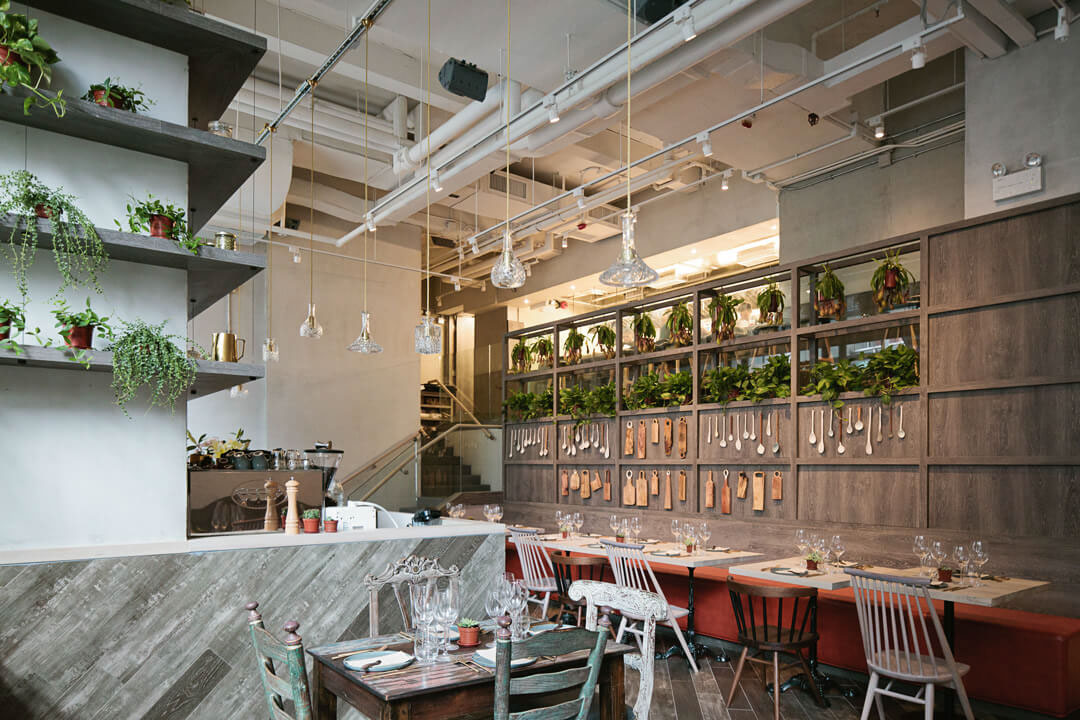
The colour palette references the appearance of copper during the weathering stages: the pistachio green is used on the furniture and the wooden doors, whereas the rust orange echoes the copper finishes and details present in the cutlery and lights.
In collaboration with NC Design and Architecture, for the indoor and façade signs.
photography: Linus Hui (branding materials) and Amanda Kho (photography of the venue), Styling: Cristian Checcanin.
photography: Linus Hui (branding materials) and Amanda Kho (photography of the venue), Styling: Cristian Checcanin.


Greeting cards


Process