Products with heritage
Nahua is a Swiss brand for women that appreciate nature. The idea behind the products is to make use of the wonder of Aztec's heritage - the chia oil. All Nahua product include this wonderful oil which makes them completely pure and non-processed.
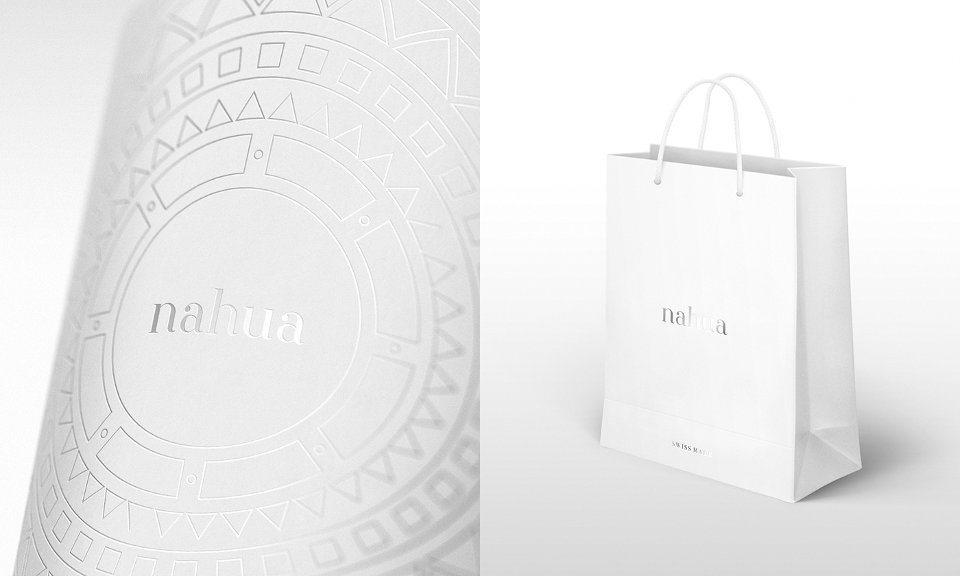
From the very beginning, the goal was to design as pure and honest brand image as possible, combining together the elements of Aztec influence with Swiss nobility. The project scope involved a logo design, brand identity and a packaging design for the complete Nahua lineup.
Odżywcza moc prastarego dziedzictwa
Nahua to szwajcarska marka kosmetyczna dla kobiet, które cenią moc dóbr natury. Ideą przyświecającą marce jest dziedzictwo plemienia Azteków - olejek z nasion chia. Ten wyjątkowy składnik znajduje się we wszystkich kosmetykach marki, dzięki czemu skóra jest odżywiona prawdziwą, czystą recepturą.
Od samego początku zależało mi na stworzeniu wizerunku, który łączyłby najistotniejsze elementy idei Nahua - nieskazitelne dobra naturalne i prastare dziedzictwo Azteków w anturażu szlachetnej szwajcarskiej precyzji. Zakres prac obejmował stworzenie logo, identyfikacji marki i zaprojektowanie opakowań dla wszystkich produktów Nahua.

Swiss and Aztec harmony
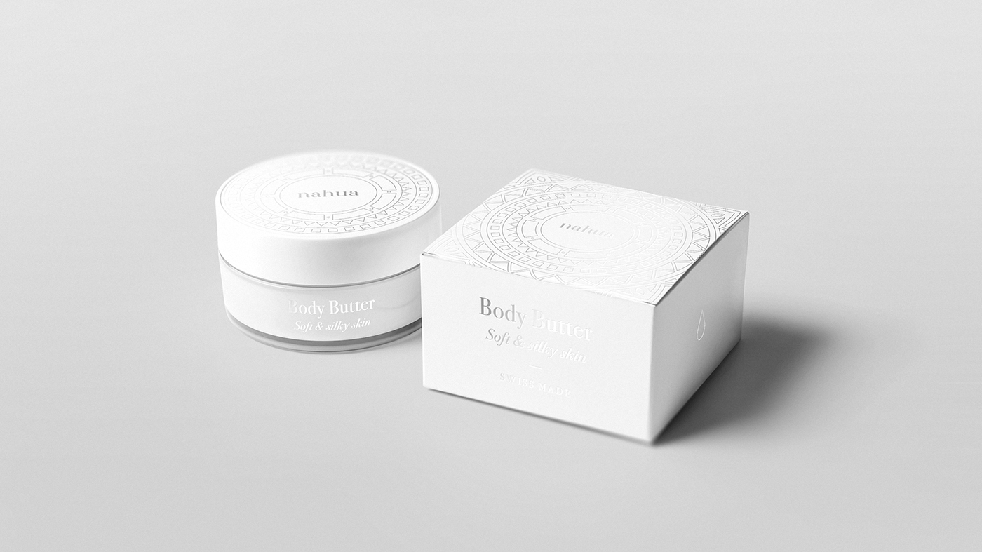
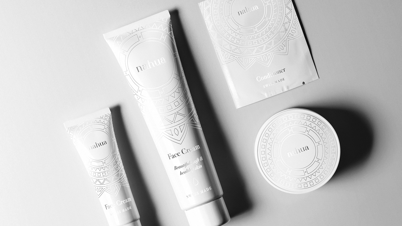
I started with developing brand's visual language. To identify the lineup and refer to its roots, I came up with a unique theme based on ornaments of ancient Aztecs. Despite its complexity, the theme can be easily reproduced across different kind of packaging and brand’s touchpoints. To highlight purity even more, color scheme is limited only to white and completed with a silver varnish.
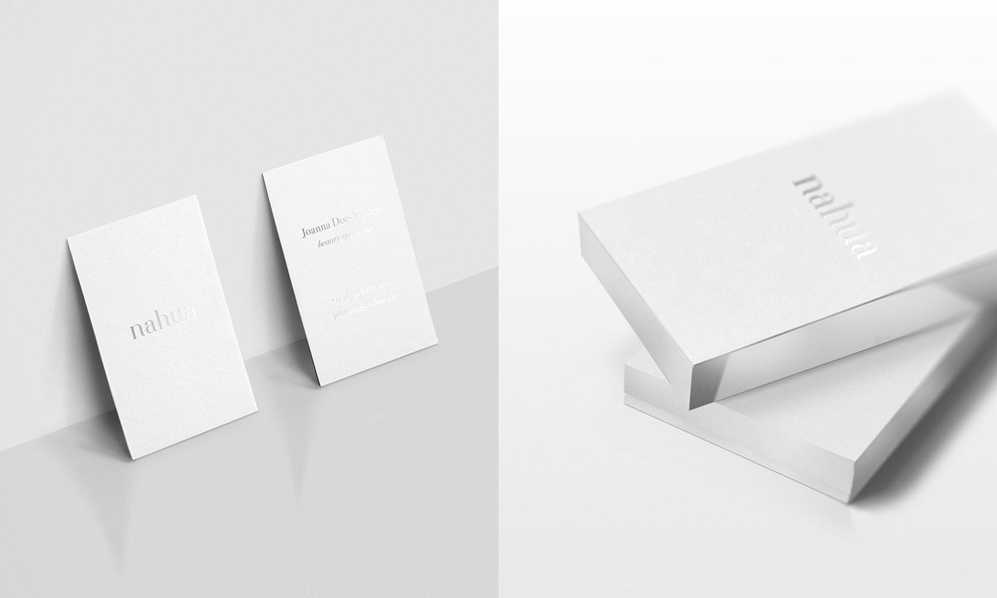
The logotype is a custom-made piece that highlights brand's elegant and feminine feel.
Harmonia dwóch stron świata
Na początku skupiłem się na języku wizualnym marki. Aby nadać wyrazu wszystkim produktom i odnieść się do głównej idei, stworzyłem unikatowy wzór oparty na azteckich ornamentach. Pomimo misternych kształtów, cały projekt może być łatwo dostosowany do różnych typów opakowań oraz wykorzystany we wszystkich punktach styku marki. By dodatkowo podkreślić czystość produktów, kompozycję kolorystyczną ograniczyłem do bieli z subtelnymi akcentami srebra.
Logotyp został stworzony od podstaw i oparty na odręcznym piśmie, aby uwypuklić elegancki i kobiecy wyraz produktów.