


L A U R E N R O S E N S T O C K _ B R A N D ––– 2016 ©
BRANDING . CONCEPT . CREATIVE DIRECTION
The alias 'Elle Wilde' was created by Ms. Lauren Rosenstock–by combining two areas of her life that carry significant sentimental value:
'Elle' stands as a visual rendition of the pronunciation of the first letter of her given name. When pronounced, the sound seems to elicit the charm of the French word for 'she'. 'Wilde', on the other hand is the last name of her favorite novelist and playwright, Oscar Wilde.
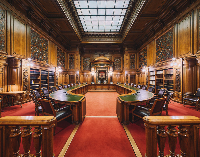
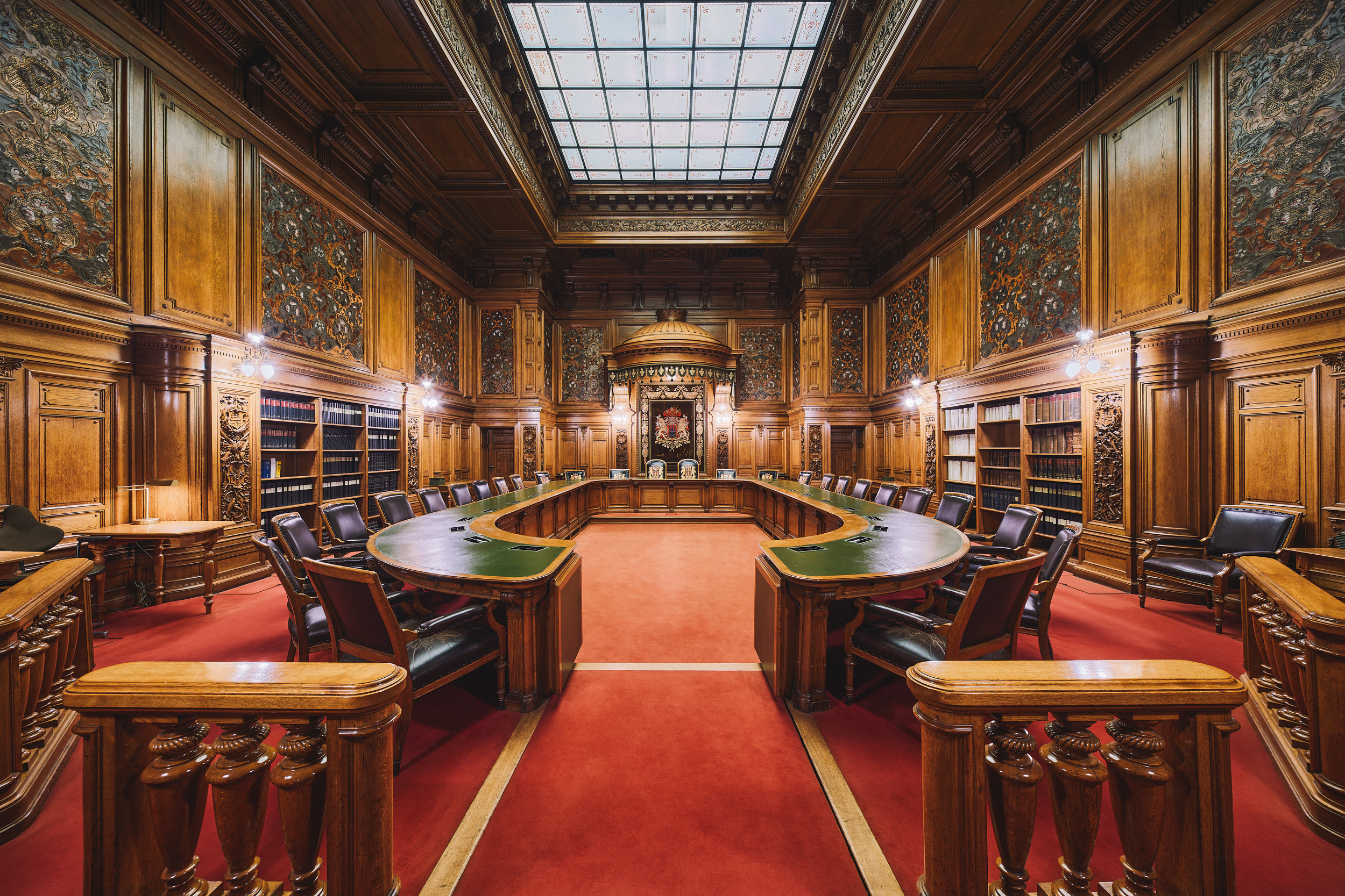
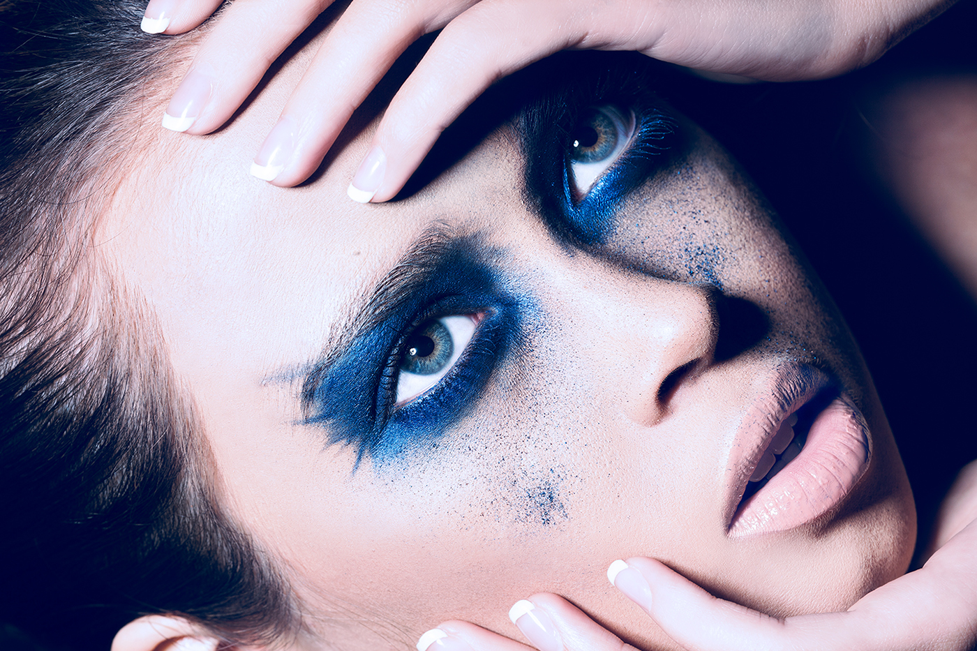
Amongst other personal achievements, Lauren has founded her own photography studio. It serves as the home for various photographic works of which many are displayed in select venues, as well as online.
www.ellewildephoto.com
-

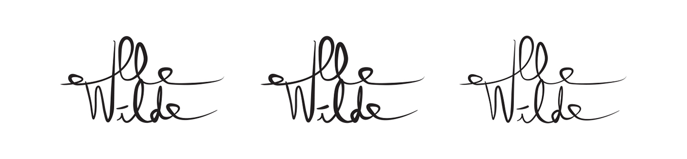
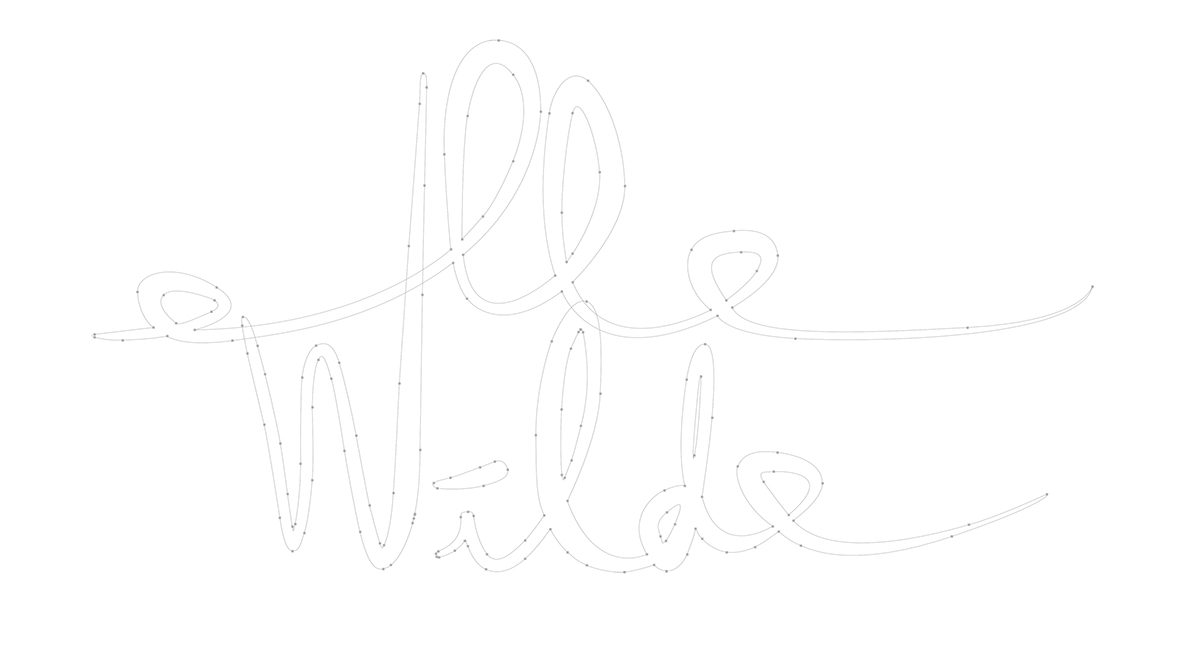
SIGNATURE • CONSTRUCTION
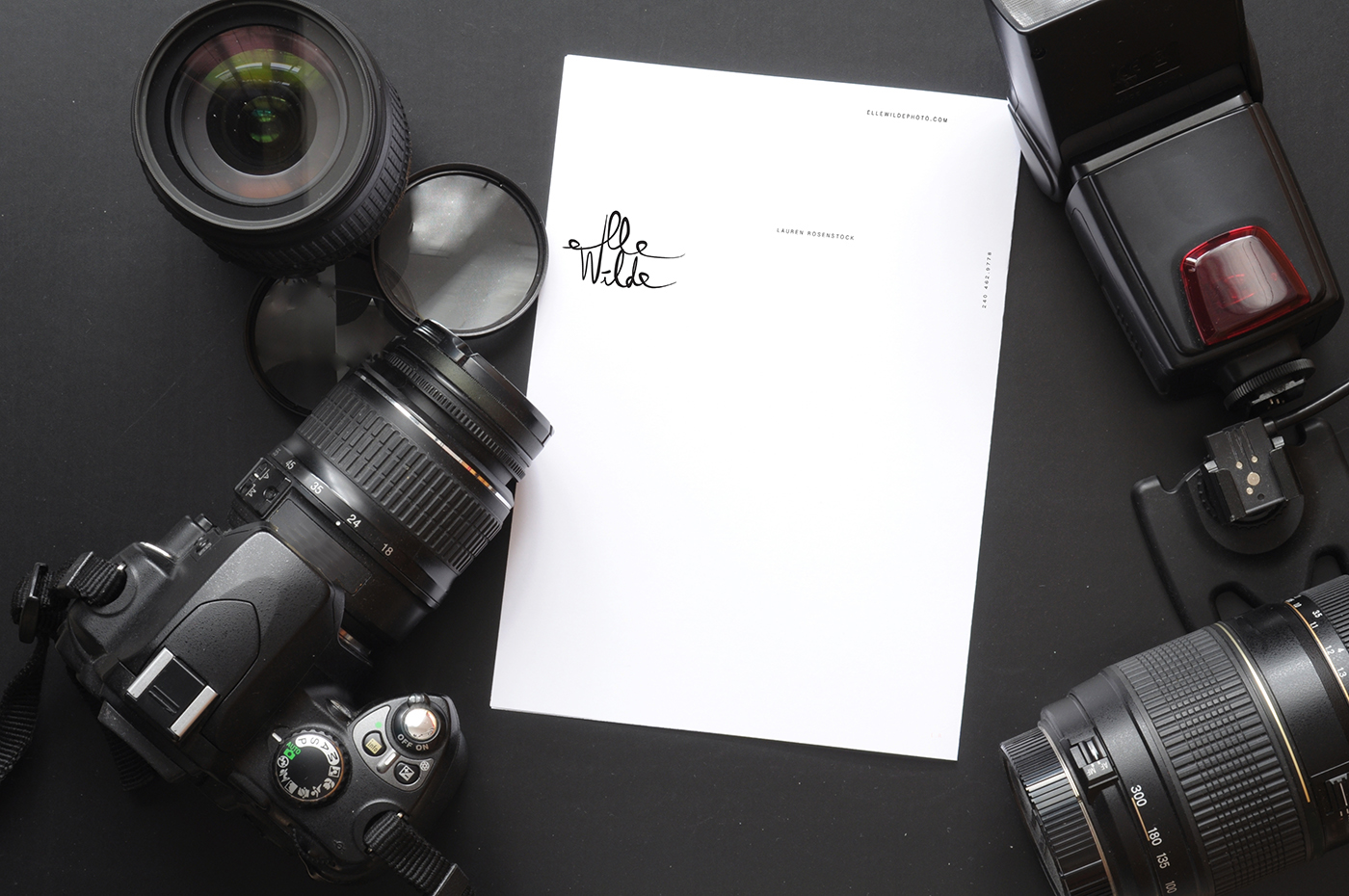
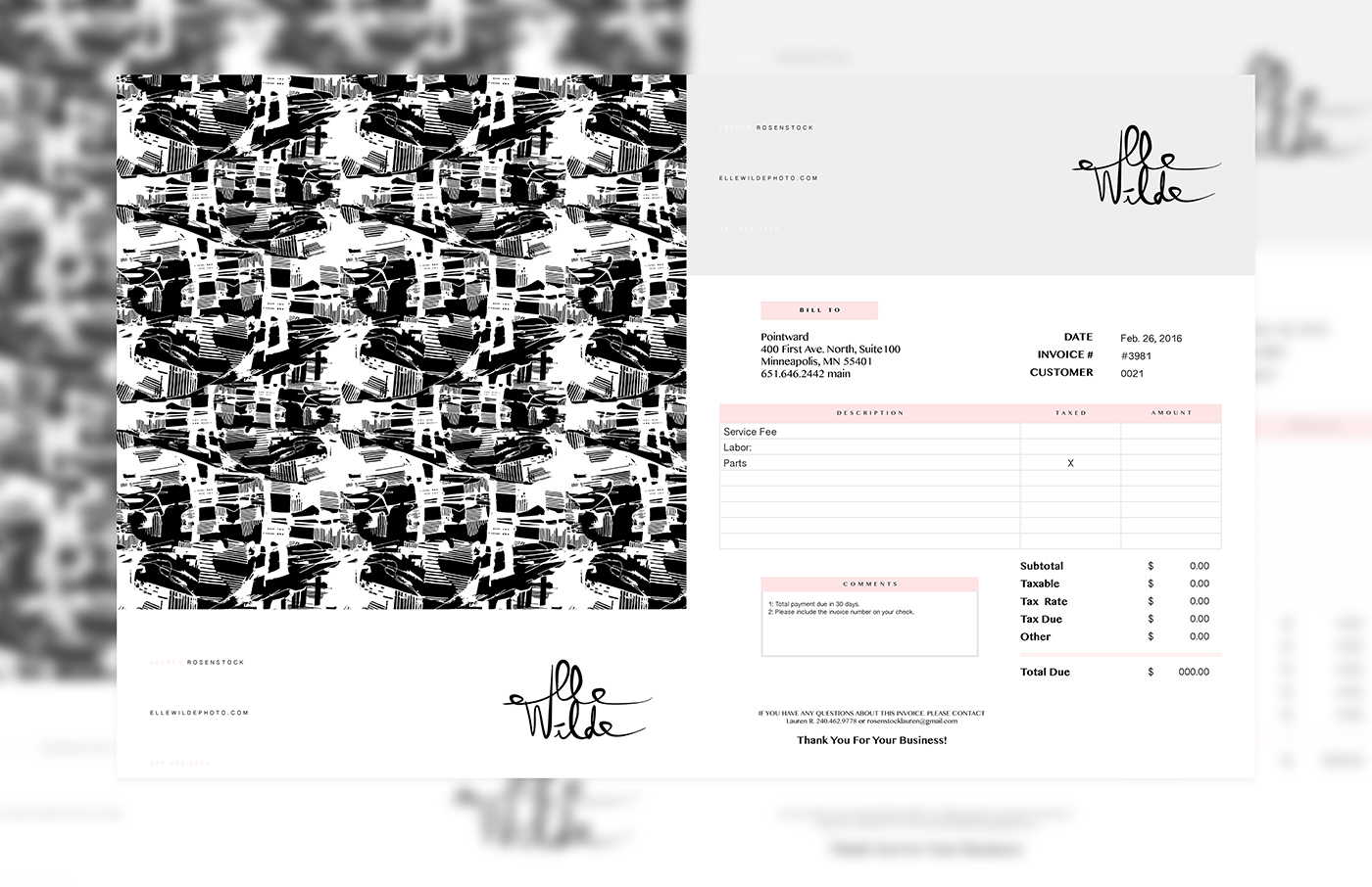
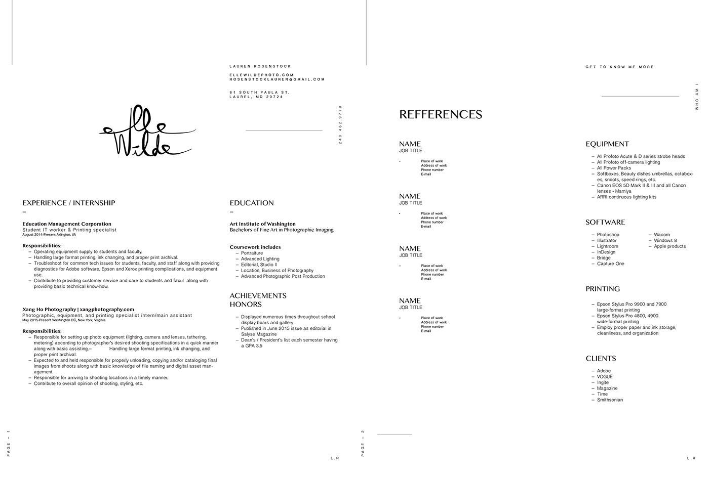
Using Lauren's handwriting as a base for the design of her logo gave this branding process a personal touch. Handwriting in itself is a very personal form of expression after speech and body language, and is one of the quintessential forms of human communication. As a result, the logo captures and represents a raw and unique form of Ms. Rosenstock's own self-expression. This allows everything stamped with her logo to act as a sign she's left her mark in a very personal manner.
-
Comparing three variations of her signature (which differ only in thickness), chosen from a list of many other pencil-drawn examples, the right width had to be chosen for a clean presentation. The process of choosing the correct one was completed with input regarding personal preference provided by the client.
COLOR • REFLECTION
The brand is intended to be playful, colorful, and visually appealing. Color plays one of the most significant roles in the overall imagery. The use of both bold and subtle–as well as dark and light colors invites a sense of wonderment, as if engaging the viewer's imagination.
As part of the logo, a playful font was created by Ian to meld with the style of the artwork.
-


APPEARANCE / LOOK
The appearance of the brand reflects Ian's personal intentions regarding how it is supposed to be received by the observer. Light red as the dominant color communicates a sense of passion and serves as the primary accent to a brand indicative of a classic and elegant appearance.
In combination with the dark grape and white, the logo offers a modern look and appeal.
-
• Front / Back - Business Card
• Resume
• Letterhead
• Invoice
• Front / Back - Business Card
• Resume
• Letterhead
• Invoice


PORTFOLIO WORKS
Below is a montage of some of Lauren's best work from 2015 to 2016–while pursuing a Bachelors of Photographic Imaging from
The Art Institute of Washington [Arlington].
[Class of 2017]
-

FIND LAUREN ROSENSTOCK
THANK YOU
It is considered an uncommon privilege to be able to continue to share with you. Myself and others would like to take the opportunity to thank you for viewing this project titled 'Lauren Rosenstock Branding'. Your viewing is much appreciated.
After extensive work, planning, and dedication, 'Lauren Rosenstock Branding' as well as the website are officially live.
I would like to let you know that the dedication and focus is both present and available to partner with you as well.
-
CREDITS
Creative Director & Designer: Ian Vicknair
Presentation Development: Ian Vicknair
Photography: Lauren Rosenstock
Videography: Abel First-Quao
Photography: Lauren Rosenstock
Videography: Abel First-Quao
Logo Designer: Abel First-Quao
Co-Writing, Editing & Revising: Abel First-Quao
-
ian-vicknair.com
Art Direction / Brand Development / Editorial Design / Communication by Ian V.
Year 2015 ®
FOLLOW ME / FACEBOOK / DEVIANTART / FLICKR