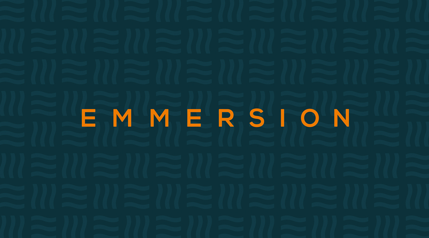
E M M E R S I O N
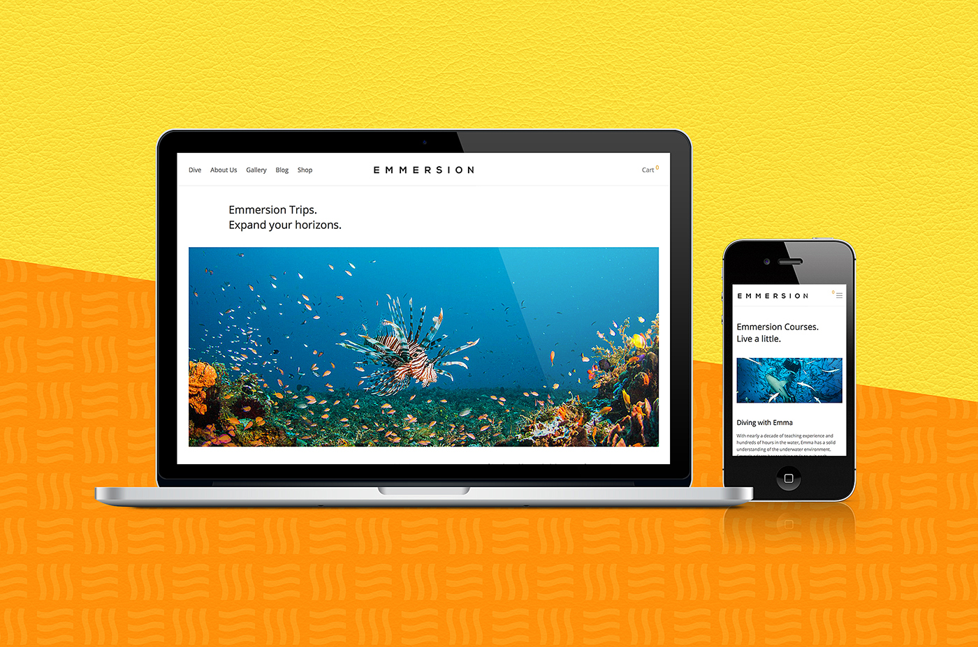
Emmersion is a new scuba-diving company that offers underwater expeditions and immersive photography within Australia and the Pacific Islands. The identity needed to appeal to an exclusive international client base, to be modern, professional, and project the scuba world in a fresh, eye-catching manner.
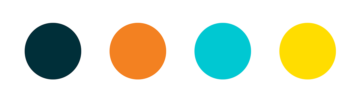
We developed a sea-inspired brand with a powerful visual punch that encapsulates the vibrancy of the underwater world. Pulling on the bright hues of the coral reef and its exuberant wildlife, the new identity balances bright colours with a deep-sea navy. This dark tone provides the brand formality, while also creating a contrasting platform for the vibrant tones to bounce upon.
The identity utilises clean sans-serif typography with a slight round edge implemented within the logotype to connote the soft waves of the sea. The accompanying wave icon and pattern were born out of the first four letters of the company name, 'EMME'. The bright and bold aesthetics are functional and also provide an appealing, enticing visual experience that appeals to the neo-modern adventure seeker.