CASA Spaghetti Sauce
Packaging
Packaging
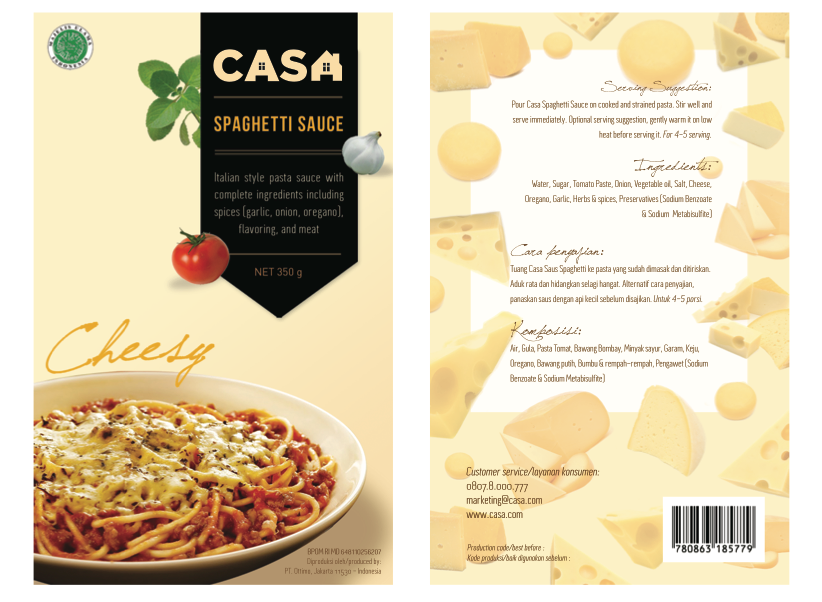
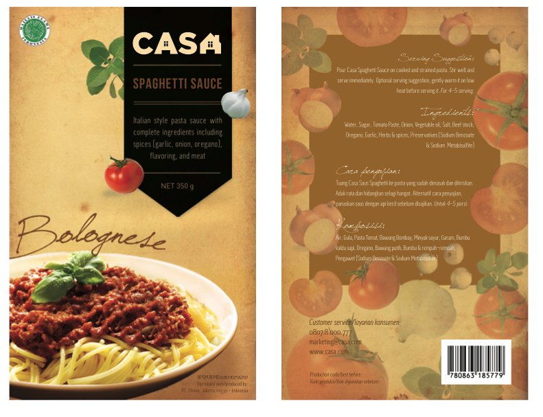
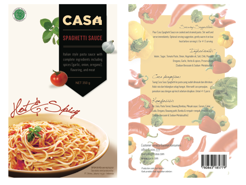
Brief: design packaging for a spaghetti sauce. Variants: Cheesy, Bolognese, Hot & Spicy.Target market: A, B. Should show the picture of real spaghetti on the package. The look and feel should represents the product: Tasty, Fresh, and Modern.
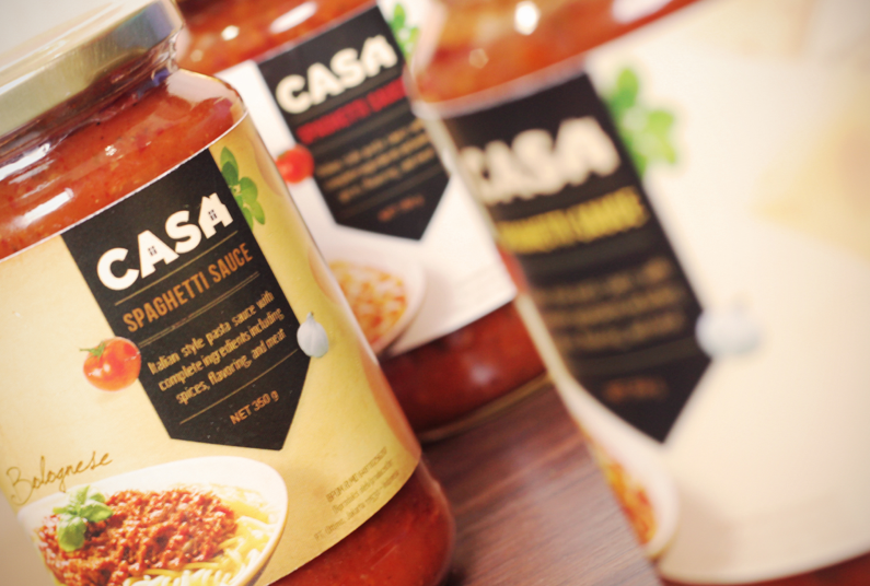
Response: My concept for this product is "a homestyle spaghetti sauce", but instead of using vintage look, I tried to make it into modern style, but still has the feel of 'homemade cooking'. The name CASA means Home (in Italian). To show the tastiness of the product, I put the image of the real spaghetti in the front. To show its freshness, I put the image of fresh ingredients around the black label. I put only oregano, garlic, and tomato because the combination of those items represents the color of Italy (red white and green) since pasta is an Italian food. The modernity of the product can be shown by the black label (the color and its shape), also the layout and typography.
Challenge: It was quite challenging to find good photographs of spaghetti with those specific variants (one with cheese on top, one with meat, and one should show that the spaghetti is spicy). The most difficult part is to maintain the consistency - to make the three of those spaghetti pictures look in line with each other, even though what I found are spaghetties in different angles and in different plate (even one of them has been half-cropped so I had to manipulate them). To solve the problem, what I did is doing the digital imaging for those 3 images. I did some manipulation to the spaghetti and put them into a plate in separate picture, in order to make them look in the same plate.
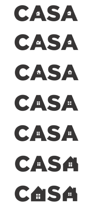
Logo development

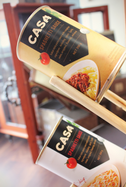
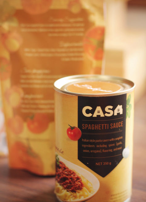
Labels for can
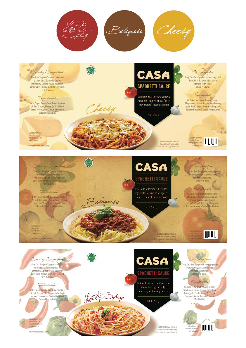
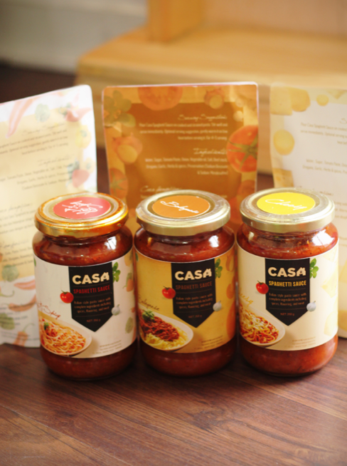
Labels for jar. The 3 round stickers above are to identify each variant (put on the top of the jar).
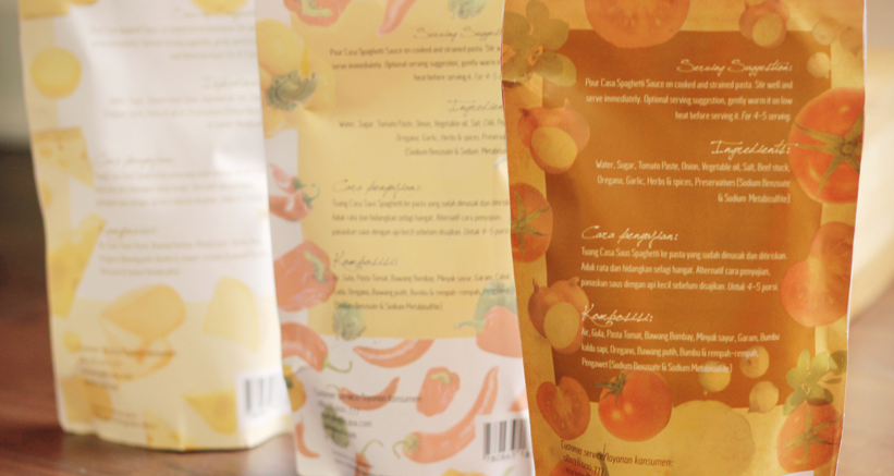
Pouch
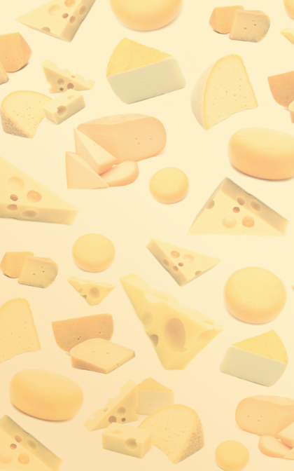

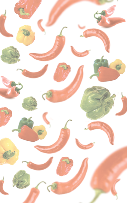
The patterns: 1) Cheesy, 2) Bolognese, 3) Hot & Spicy