Pirogov Bureau
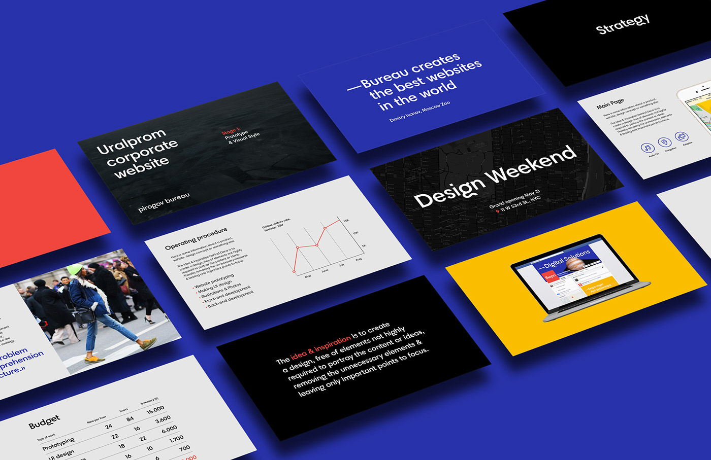
The agency, formerly known for its intricately illustrated websites and powerful retouching, and after several years of transformations, has finally obtained a new look and substance. Today, the Pirogov Bureau is a technological company specializing in the development of highly complicated portals and integrated digital business solutions. During our cooperation we have created a new look for the bureau: the logo has been reworked, and a proper company branded font, color palette and basic style rules have been developed.
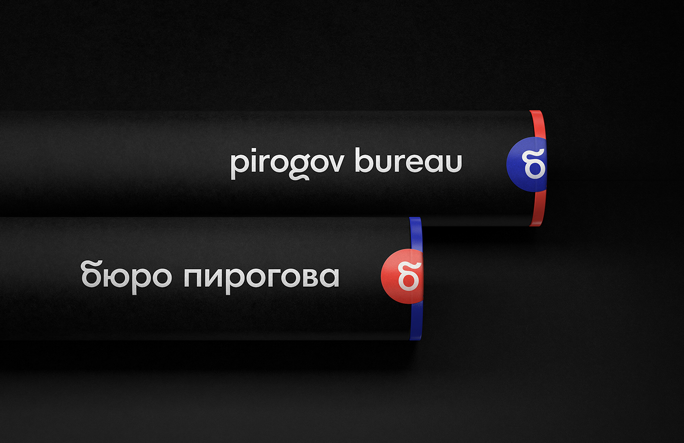
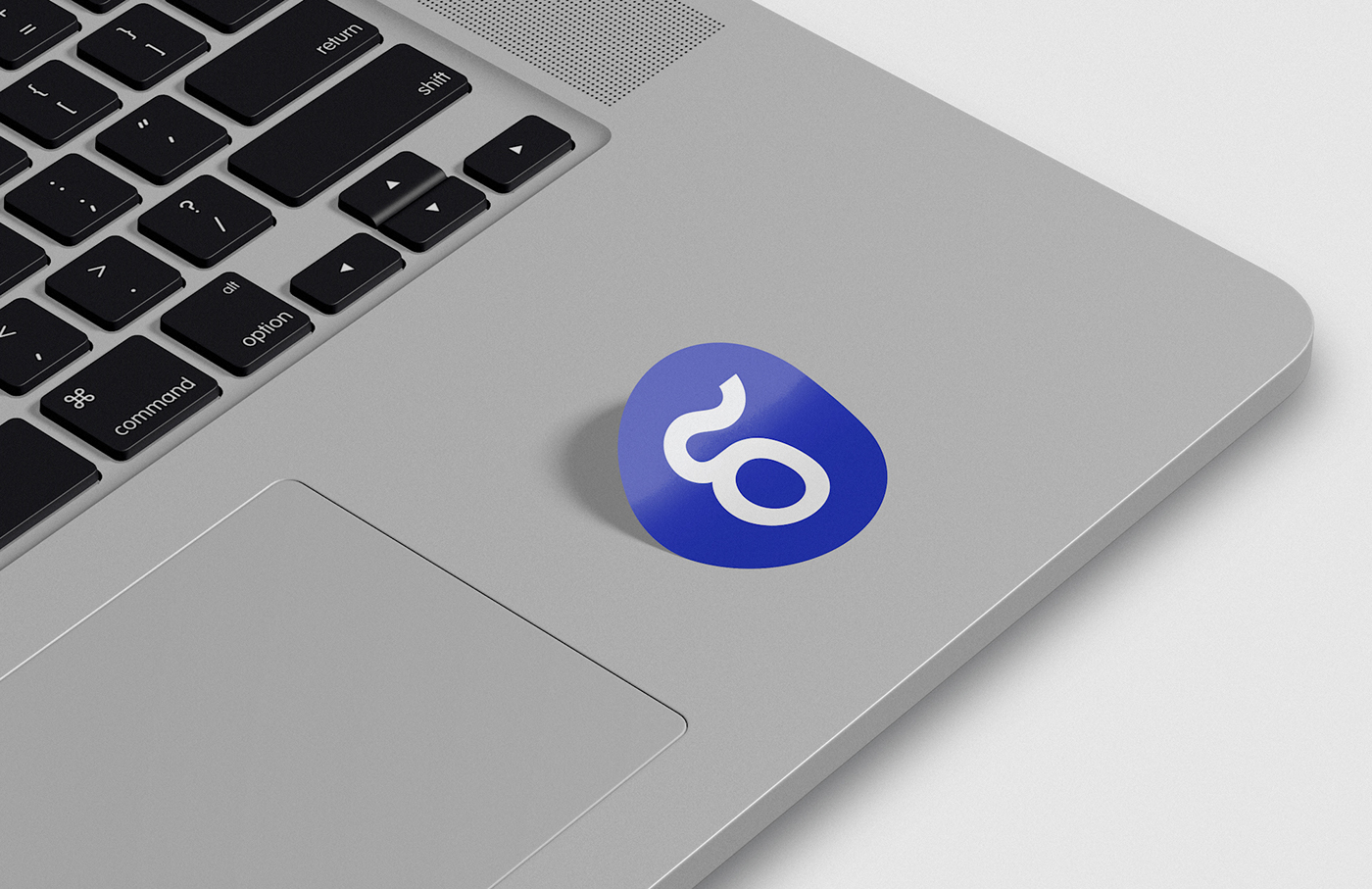
The "~" symbol is hidden in the new logo in order to commemorate the previous one. The branded letters "б" and "g" are united by a modern geometric grotesque and an affective handwritten from. The same technique
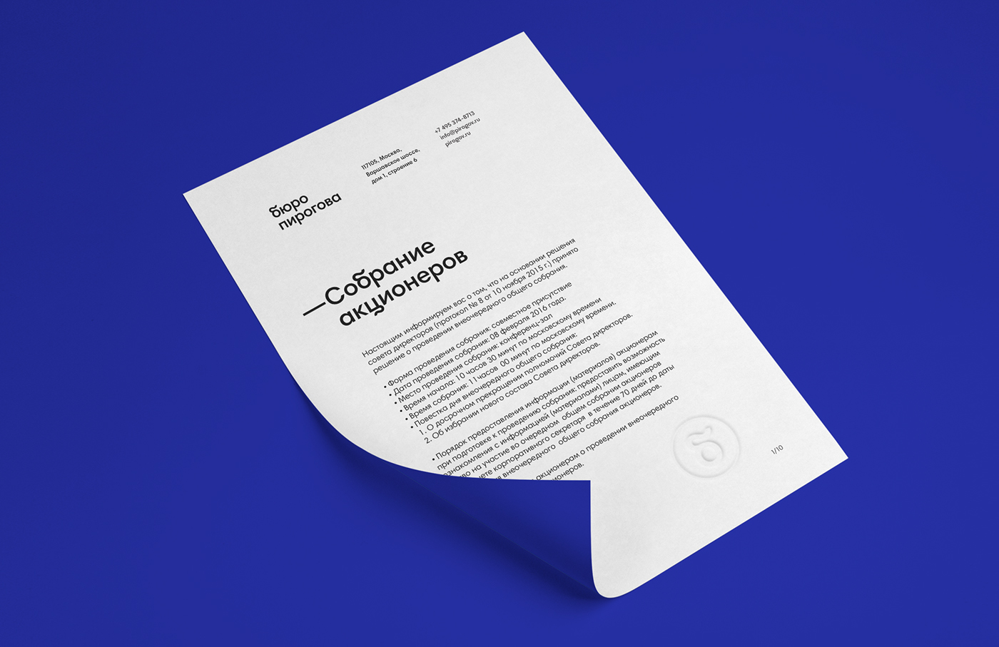
has been used to create the jobbing font.
As the Pirogov Bureau is often referred to simply as "The Bureau" in everyday life, a short version
of the logo has been designed as well. This is the version that is used when indicating the company's areas of activity.
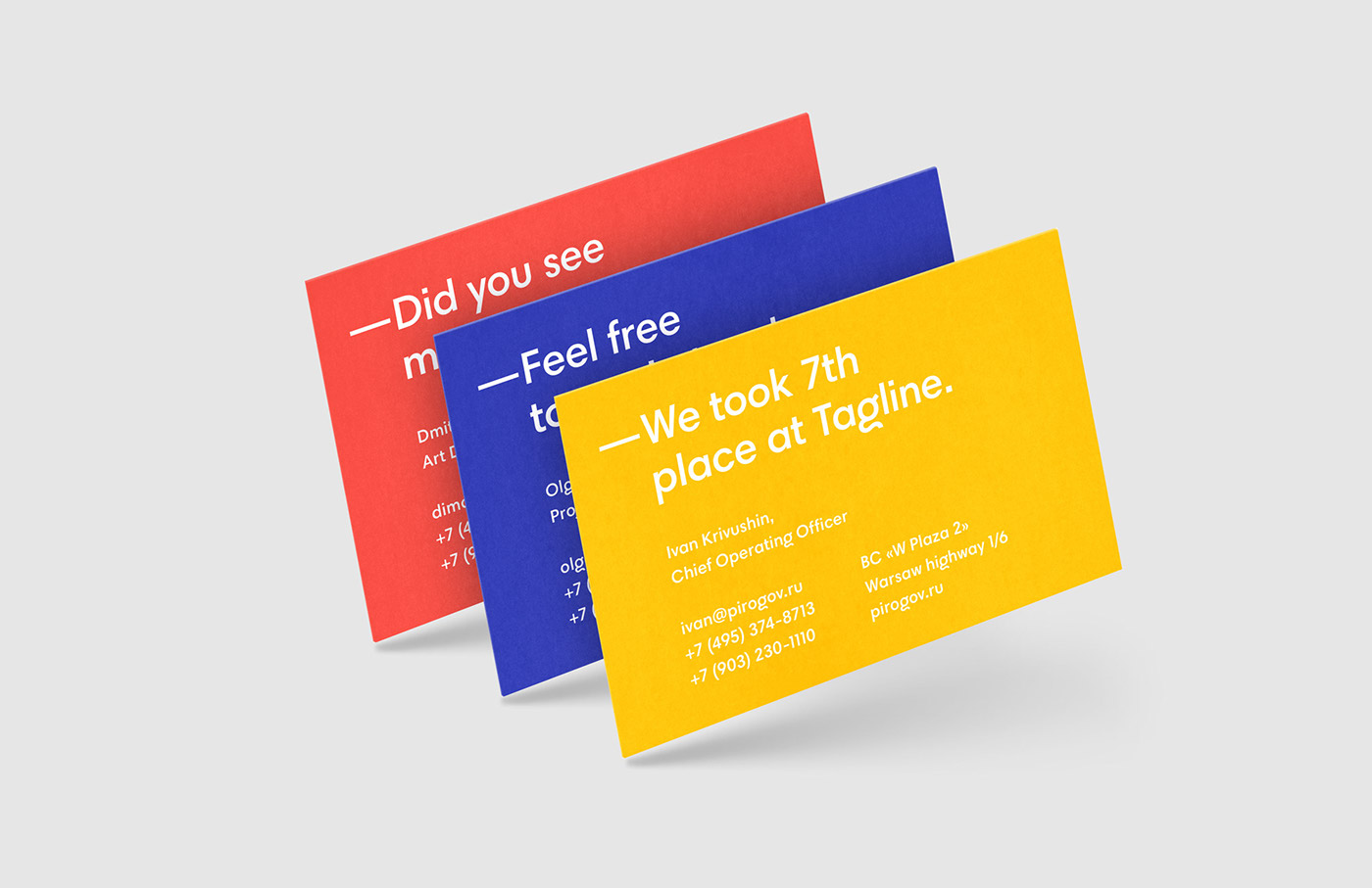
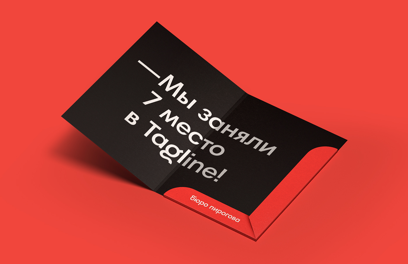
Talking identity
In the process of developing the Bureau's identity, we have invented a new channel for communication between agency and client – Talking Identity. The ability to embed a text message has been provided
in a series of media, with which one can congratulate a client on a holiday, tell them about operating principles, or announce a new product.