


Paige Italic
Paige Regular was originally a display typeface. Paige Italic can be used at all sizes (it is quite legible at 3 Pt) .
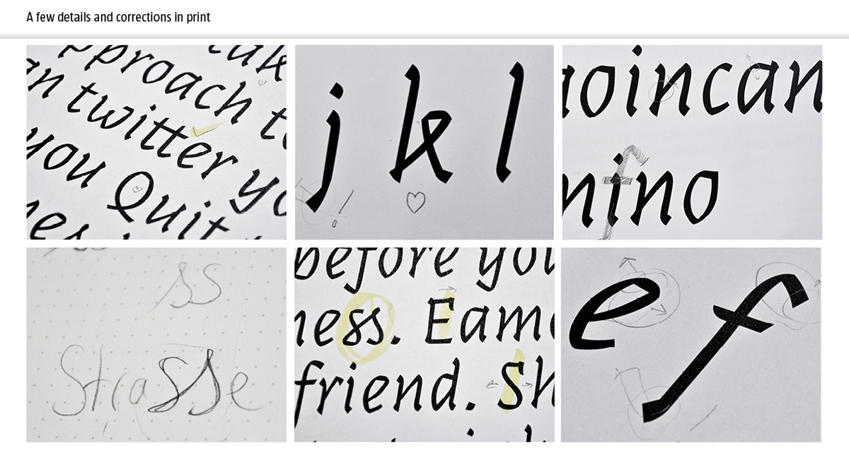
The principle behind Paige was to make a typeface that would look as if someone folded strips of paper. This would give it a calligraphic feel, but a distinctive look, because a virtual strip of paper in space bends differently than a broadnib-pen on a piece of paper. The breaks give it an edge at large sizes and make it perfect for logos and headlines. At small sizes, Paige Italic is very melodic, with letter shapes inspired from cursive writing. Paige has a highly unconventional lower case k, which is worth taking a look at.
Paige is an unusual typeface. The serifs of the Italic are a bit more accentuated than those of the regular, giving it more stability. Nevertheless, it still is a mix between sans and serif.
Paige was created by me during a type-design workshop in Ljubljana, Slovenia in the Winter of 2012. The workshop only lasted for one week, but we all worked very intensively, and each managed to create a unique typeface. It was organized by tipoRenesansa. The faces and typefaces of the other participants as well as an awesome video of the workshop can be viewed here.


Don't forget to check out Paige Regular here. I appreciate suggestions and feedback.


